High-Class
In the calibrator test, the MFM-HT75W showed surprising fidelity.

We'll recall that this graph shows the difference between the desired color shade and the one actually displayed.
- If DeltaE > 3, the color displayed is significantly different from the theoretical one, meaning that the difference will be perceptible.
- If DeltaE < 2, LaCie considers the calibration a success, with a slight difference remaining, but one that will be all but undetectable to the user.
- If DeltaE < 1, color fidelity is excellent.
You can see that the color rendering was excellent. 100% of the colors were good, and 89% were perfect.
| Black spot | White spot | Contrast |
|---|---|---|
| 0.54 | 400 | 740: 1 |
A value of 400 nits is very bright. In fact, it's too bright for our taste. For comparison, these are the kind of values you usually see on a 32" LCD TV set. Concentrated in a 17" area, the brightness comes on very strong. Yes, a TV set always needs higher brightness, but Sony could have been a little less heavy-handed.
You can adjust the backlighting and get a brightness level that's more acceptable for working on a PC, but in my opinion you'll have to limit yourself to office applications and forget photo retouching. The contrast is very good (740:1) and was also fairly stable through the monitor's brightness range.
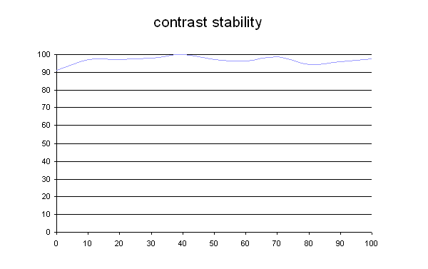
This curve indicates the contrast value measured at a given brightness adjustment on the OSD. In theory, brightness and contrast are two independent parameters, and good contrast is a requirement regardless of the brightness adjustment. Unfortunately such is not the case in practice.
The brightness adjustment is shown on the X-axis, contrast on the Y-axis. Contrast is expressed here as a percentage of the maximum value measured using the ANSI test protocol.
Tested with the Gretag Eye-One Display 2, the MFM-HT75W showed a richness of color that's quite compatible with the sRGB standard.
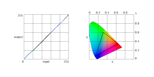
The color gamut represents the richness of the palette of colors displayed. The corners of the triangle are the primary colors (in additive synthesis, of course). The surface of the triangle represents all colors that are displayable by combining those three primary colors with more or less intensity for each. So the greater the area of the triangle, the richer the colors.


