Color Fidelity, Continued
Here again, a pleasant surprise! The contrast was excellent; sure, it was a good deal short of the 1000:1 claimed in the specs, but it's always a nice surprise to see the black level go down while the brightness remains stable. The new AU Optronics panel got off to a good start in our standard battery of tests.
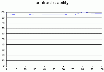
This curve indicates the contrast value measured at a given brightness adjustment on the OSD. In theory, brightness and contrast are two independent parameters, and good contrast is a requirement regardless of the brightness adjustment. Unfortunately such is not the case in practice.
The brightness adjustment is shown on the X-axis, contrast on the Y-axis. Contrast is expressed here as a percentage of the maximum value measured using the ANSI test protocol. If you want to read more about this topic, see our tech article .
The contrast ratio remained fairly stable when changing brightness levels. Let me point out once again that dynamics has nothing to do with contrast. I see people complaining on newsgroups and blogs that varying brightness flattens contrast. That's not true. What it can do is cause some gray levels to blend into one another. That's a loss of dynamics, not contrast.
Tested with the Gretag Eye-One Display 2 , the VP930 again came out looking good. The 6500K mode built into the monitor was a little warm (6300K); the sRGB mode was more convincing. Of course, you can always adjust the color channels yourself, but a calibrator is a good idea if you can get your hands on one.
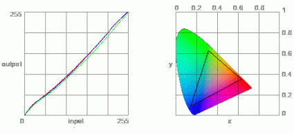
The color gamut represents the breadth of the palette of colors displayed. The corners of the triangle are the primary hues (in additive synthesis, of course). The surface of the triangle represents all the colors that are displayable by combining the three primary colors with varying levels of intensity for each. So the broader the surface of the triangle, the richer the range of colors.


