Google Gives Search a Fresh Coat of New Paint
Google has given search a makeover.
Get Tom's Hardware's best news and in-depth reviews, straight to your inbox.
You are now subscribed
Your newsletter sign-up was successful
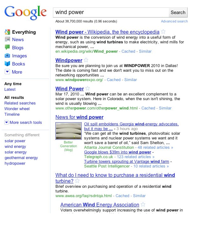
Some of you may have noticed some changes to Google over the last couple of days. One of these is the Google logo, which has lost some of its definition in favor of a much plainer version of the iconic logo. The company has also changed the colors slightly. Google concedes that although these changes are minor, it believes they add a whimsical and minimalist feel to the site.
The other, bigger change is to search itself. Google's Marissa Mayer calls it a 'spring metamorphosis' but those of you who have used Google news will notice some similarities. Google has added a panel of search options to the left hand side, ditching the options (like images, video and news) we're used to seeing on the top left. You'll also noticed that Google has pared down the search options, showing only the ones it thinks are the most relevant for you.
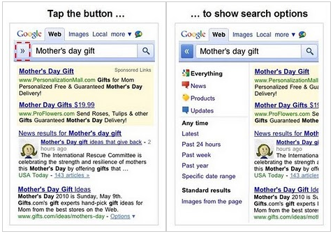
Google also announced a mobile version of the search, which it has already started rolling out. It looks much the same as the new Google as engineers Reza Ziaei and Mike Buchanan explain that it's about achieving a certain amount of uniformity across all of Google's products. The mobile version features an expandable menu that takes up less room than the side panel present in the full version of Google search.
Check out Google's demo video of the new, refreshed search below!
Get Tom's Hardware's best news and in-depth reviews, straight to your inbox.

Jane McEntegart is a writer, editor, and marketing communications professional with 17 years of experience in the technology industry. She has written about a wide range of technology topics, including smartphones, tablets, and game consoles. Her articles have been published in Tom's Guide, Tom's Hardware, MobileSyrup, and Edge Up.
-
killerclick My Google looks as it always has, I can't see any of the changes described in this article.Reply -
Snipergod87 I really hate the new search results layout it looks like Bing or Yahoo now. Luckily one of my PC's is still unaffected by it, Going to copy my cookies and try to fix my other PC's... If i cant revert it I might as well find a new search engine..Reply -
JMcEntegart killerclickMy Google looks as it always has, I can't see any of the changes described in this article.Reply
You'll see it eventually. They just started rolling it out in the last day or so. It'll take a while to reach everyone. -
zaixionito I've had this for a massive amount of time. I think google should stay unique instead of copying some other companies, and making everything harder to use.Reply -
hellwig I find it disturbing that a website hasn't rolled out to everyone yet? Does this just mean the Google center my traffic is routed to hasn't been updated yet, or does this mean Google is tracking my computer and actively deciding not to send me to the updated layout? I mean seriously, shouldn't a publicly accessible website be the same for everyone who visits?Reply
It's one thing for a company to slowly roll-out software updates to not inundate their servers, I think it's another for google to say "cookie #123445542221 being redirect to the old site", what benefit does that have? -
nforce4max "a fresh coat of paint" but it was the wrong color and I don't like it at all. The search results are awful and like youtube I want it to go back to what it was. They had it right the first time but these changes make proper searches more difficult as well rating content. Than you google for going backwards....Reply -
schmich I've had this a while as well. I like it, they eg. finally added "Month" to the time-line. It was a pain to always do it manually. Though I wish they added a field next to each one so you easily search the last Month(s) or Week(s).Reply
The Google logo with all its colours reminds me of early websites when everyone tried to add as many effects as possible and as many colours as possible. -
ta152h I looked at the changed Google, and it doesn't look like these pictures. In fact, the colors are more vibrant, not more washed out. They did get rid of the "tm", and the shadows, which does give it a more simplistic, child-like appearahce they probably wanted. I don't think a move pastels work in creating that mood, and the more vibrant colors seem to be more consistent with that, so I think they did go with more vibrant, brighter, colors.Reply


