Microsoft Surface Review, Part 2: Battery Life, Multi-Monitor, And More
Get Tom's Hardware's best news and in-depth reviews, straight to your inbox.
You are now subscribed
Your newsletter sign-up was successful
Color Gamut Revisited: Illustrating The Surface's Weakness
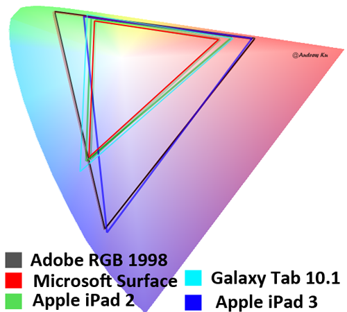
In Microsoft Surface Review, Part 1: Performance And Display Quality, we specifically complained that the Surface's color saturation (that is, the range of colors it can reproduce) is just 41% of the AdobeRGB 1998 and 60% of the sRGB gamut. You might have seen that, scratched your head, and said, "Geez, OK. Whatever."
Admittedly, it's difficult to explain our results without a few pictures. So we're back to help clarify what the Surface's screen means to you.
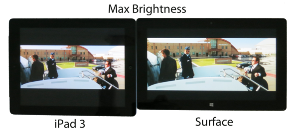
For the most part, you won't notice an issue with the Surface, even when it's sitting side by side next to a third-gen iPad, which we've praised in the past. The Surface's contrast ratio is so high that its weak gamut is not obvious.
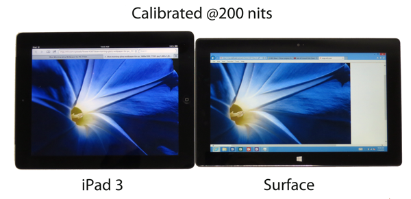
Article continues belowBut if you dial back brightness in order to achieve the better battery life we demonstrated on page one, Microsoft's tablet doesn't look as hot. Readers and vendors alike want to see tablet and smartphone screens tested at the same luminescence, so we oblige by presenting performance a couple of different ways. But there are consequences. Behold...
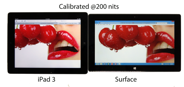
Both tablets are calibrated to the same brightness setting. However, colors appear lighter because of the level of color saturation. For example, on the third-gen iPad, the blue morning glory appears richer and more vivid, since the display can reproduce dark blues more accurately while still providing enough differentiation from the lighter border regions. If you look at the Surface, the same areas are harder to tell apart.
In short, any image with a wide array of colors won't look as pretty, and you're not going to come away as impressed by the Surface's screen quality compared to some of the other tablets we've reviewed.
Get Tom's Hardware's best news and in-depth reviews, straight to your inbox.
Current page: Color Gamut Revisited: Illustrating The Surface's Weakness
Prev Page Is The Surface Any Good For Gaming? First, We Need Apps Next Page We Like The Surface; We're Waiting For Surface Pro-
mayankleoboy1 Tegra3 is the biggest weakness in Surface. This SoC is already outdated.Reply
I wouldnt buy a device today which i know is going to be upgraded in a few months with atleast a better SoC, and probably a better display. -
tedx "Windows Internet Explorer (Not Responding)"Reply
Its comforting to see that not everything has changed with Windows RT. -
apache_lives Already have an ASUS Windows 8 RT tablet for the mrs -- she loves this thing, and from the lounge if my media center decides to play up i can use the tablet to remote desktop inReply
The ASUS also claims up to 16 hours battery life for theirs (im thinking less but still amazing if its 12+).
These things simply WORK -
kyuuketsuki apache_livesThe ASUS also claims up to 16 hours battery life for theirs (im thinking less but still amazing if its 12+).I'm assuming that's with the keyboard dock.Reply -
apache_lives KyuuketsukiI'm assuming that's with the keyboard dock.Reply
That is correct, but for documents and on the run its not a bad thing at all. -
besterino (Even though) being an hardware (PC) enthusiast I have bought the Surface (64GB, touch and type cover) for my wife and both she and I are seriously impressed.Reply
For her it is simply perfect: she can do with it all she would do with an ipad (she's not much of a gamer though) AND it actually replaces her desktop-PC... she's using office without macros and addins so the RT-Office is "good enough". She just plugs in an extra monitor and USB hub (for full-size keyboard and mouse), and she is all set for productivity. We did not experience any hardware limitation related issues (obviously office doesn't start as fast as it does on a x86 PC with SSD).
Based on our experience with the Surface RT I will definitely buy a Surface Pro for myself (I need Office with macros and addins for work) and hopefully finally have a PC that works both as a productivity tool as well as entertainment gadget. Yay! And *poof*, there goes the business notebook...
Too bad I will still need my desktop gaming rig (HD 4000 still not powerful "enough")... -
monsta The Asus Vivo Tab is much better than Microsoft's own version of surface, the display is much brighter, the keyboard dock has a battery, usb and SD card inputs. The battery life is amazing.Reply -
andrewcarr I hate when I'm looking at a computer screen and from that trying to see which picture is better of another computer screen. There seems a flaw in this logic.Reply


