Microsoft Saying Goodbye to Aero in Windows 8
Microsoft says the old Aero UI is dated and cheesy.
Microsoft is unsurprisingly saying goodby to the "Aero" user interface with Windows 8, calling it "dated and cheesy." Aero has been a mainstay since the debut of Windows Vista back in 2006, requiring a bit more GPU horsepower from machines than those running 2001's Windows XP, both of which are still currently being used worldwide.
"Aero was designed to help people focus less on the window chrome itself, and more on the content within the window. It draws the eye away from the title bar and window frames, and towards what is valuable and what an app is about," writes Jensen Harris, the director of program management for Windows 8's user experience team,in a very lengthy blog.
"And of course, the Start menu changed again, most notably by making it possible to press the Windows key (introduced in Windows 95) and then just start typing to search from anywhere in Windows. Of course, as with every change along the way, some people expressed reservations about the changes," he adds.
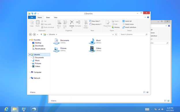
Article continues belowBut for Windows 8, the team ripped out the "glass and reflections" look and went with a "clean and crisp" presentation after sifting through "hundreds" of different UI designs. The team wanted to bring visual harmony to Windows while still preserving much of the familiar feel of the Windows 7 desktop, and not sacrificing the compatibility of existing apps.
"In the end, we decided to bring the desktop closer to the Metro aesthetic, while preserving the compatibility afforded by not changing the size of window chrome, controls, or system UI," Harris writes. "We have moved beyond Aero Glass -- flattening surfaces, removing reflections, and scaling back distracting gradients."
Microsoft released the Windows 8 Consumer Preview back in April, and plans to unleash the Windows 8 Release Preview in the first week of June. Neither public build offers the complete new UI although users will see "visual hints" in the latter release. Microsoft's was nowhere this secretive with the UI for Windows Vista and Windows 7.
"The Windows 8 user experience is forward-looking, yet respectful of the past," he writes. "It reimagines what a PC is capable of, the scenarios for which it is optimized, and how you interact with it. It enables tablets and laptops that are incredibly light and thin, with excellent battery life, which you can use with touch and keyboard and mouse in any combination you prefer. It is also the most capable, lean, and usable OS ever to power desktop PCs and gaming rigs."
Get Tom's Hardware's best news and in-depth reviews, straight to your inbox.
"The new Windows 8 user experience is no less than a bet on the future of computing, and stakes a claim to Windows’ role in that future," he adds.
To read the entire blog, head here.

Kevin Parrish has over a decade of experience as a writer, editor, and product tester. His work focused on computer hardware, networking equipment, smartphones, tablets, gaming consoles, and other internet-connected devices. His work has appeared in Tom's Hardware, Tom's Guide, Maximum PC, Digital Trends, Android Authority, How-To Geek, Lifewire, and others.
-
lpedraja2002 Well, the only times I did use Aero was to show off. Apart from looks I didn't find any uses for it. But I'm starting to get worried about all these changes Microsoft is making. I mean, what if they suddenly decide to eliminate alt+tab? :OReply -
mirage1974a The real reason is that tablets don't have the horsepower to run Aero, so they had to dumb down the OS for everybody. Way to try to downplay advances in a UI Microsoft.Reply -
dalethepcman ReplyBut for Windows 8, the team ripped out the "glass and reflections" look and went with a "clean and crisp"
Clean and crisp my ass. Have the ribbon and favorite bar remove by default and then you would have clean.
Opening a default explorer windows is like launching my grandmothers browser, the top 30% of every page is full of crap. While this is somewhat useful for touch enabled devices, there should have been logic built in for a "touch pack install" or a "Non-touch pack install" Metro overall doesn't work for non touch enabled devices, and neither does the HUGE ribbon atop every window. -
But I LIKE Aero! Tsk.Reply
When they took away the Start Menu, I felt a bit sad since it's like a tradition, but really, I didn't care since I use a program (yes, "program" not "app" *cringe*) called "Launchy" which is infinitely better than a Start Menu and Microsoft should have had this from the beginning.
I used to not care about Windows designs, then I took an Aero in the knee.
Don't pull out the Aero. Leave it in there. Pretty please? Don't even get me started on "skinning programs" ugh.
