Microsoft Tweaks Windows Explorer for Windows 8
Windows 8 will bring with it a host of new improvements, one of which is a redesigned Windows Explorer.
Get Tom's Hardware's best news and in-depth reviews, straight to your inbox.
You are now subscribed
Your newsletter sign-up was successful
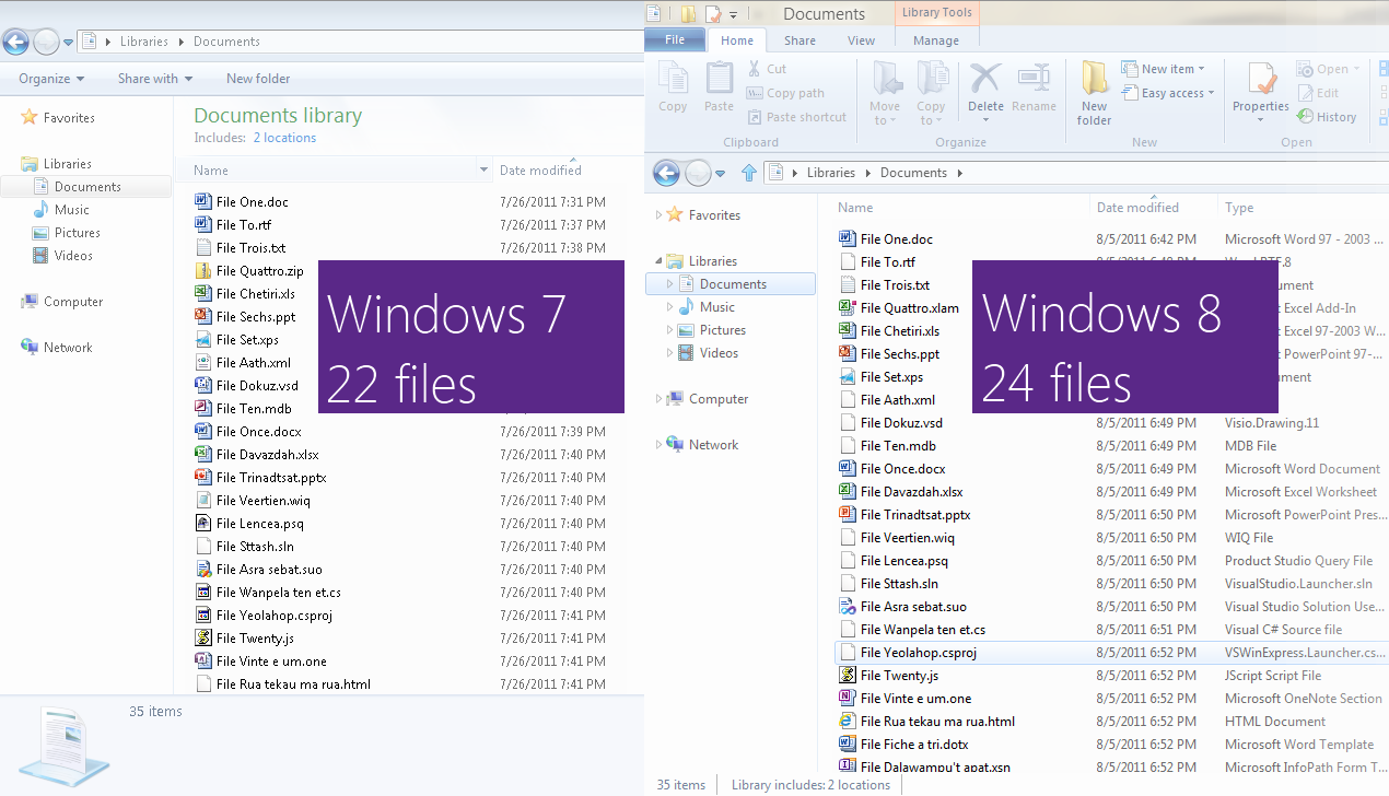
For over 99 percent of Windows users, Explorer is the tool used to manage files, be it moving, deleting, renaming, or even finding and opening. In Windows 8, Microsoft is giving Explorer the Ribbon UI interface that's slowly pervading the company's software offerings.
While realizing that the Ribbon UI isn't a popular design choice by its users, Microsoft program manager Alex Simons explained in a blog post why it was the best way to go for Windows 8. Here are some of his points in rapid fire form:
We set out to accomplish three main goals with this new version of Explorer.Optimize Explorer for file management tasks. Return Explorer to its roots as an efficient file manager and expose some hidden gems, those file management commands already in Explorer that many customers might not even know exist.Create a streamlined command experience. Put the most used commands in the most prominent parts of the UI so they are easy to find, in places that make sense and are reliable. Organize the commands in predictable places and logical groupings according to context, and present relevant information right where you need it.Respect Explorer’s heritage. Maintain the power and richness of Explorer and bring back the most relevant and requested features from the Windows XP era when the current architecture and security model of Windows permits. We evaluated several different UI command affordances including expanded versions of the Vista/Windows 7 command bar, Windows 95/Windows XP style toolbars and menus, several entirely new UI approaches, and the Office style ribbon. Of these, the ribbon approach offered benefits in line with our goals:Provides the ability to put the most important commands in very prominent, front and center locations.Makes it easy to find commands predictably and reliably. Every important file management command could be given a home in the ribbon, and customers would always know where to look for them.Exposes a large set of commands (~200) in one easy and consistent experience and organizes commands into scenario-focused groups without the use of nested menus, popups, dialogs, and right-click menus.Aids command identification with support for grouping, a variety of button sizes and icons, and aids deeper investigation with live previews and expanded tooltips.Takes a similar approach to Office, Microsoft Paint, and Windows Live Essentials, which means that many of our customers will be familiar with the model and not have a lot to learn.Provides a consistent, reliable UI that doesn’t degrade over time like traditional toolbar and menu-based user interfaces do. See Jensen’s earlier blog on this topic from the development of the ribbon. We knew that using a ribbon for Explorer would likely be met with skepticism by a set of power-users (like me), but there are clear benefits in ways that the ribbon:Exposes hidden features that they already use but which require third party add-ons to use in the Explorer UI today.Provides keyboard shortcuts for every command in the ribbon, something many people have been asking for.Provides UI customization with the quick access toolbar, taking us back to a customization level that is basically equivalent to Windows XP.
Article continues belowWhat do you think of the Windows 8 Explorer changes? Current Windows 7 users may not like it; but if there's one thing to love, it's more files displayed in a same-sized window. That's progress for you.
Get Tom's Hardware's best news and in-depth reviews, straight to your inbox.
-
back_by_demand Before anyone says "I hate ribbon", simple answer is DONT USE IT, whilst you are at it go back to using DOS.Reply -
I hate ribbon IU, the right click context menu has EVERYTHING without moving the mouse to the top of the screen for every step. How about a tabbed browser? Can't they copy Nautilus or Xbrowser and be happy?Reply
I like Windows 7 because its pretty minimal, don't start wasting screen area with garbage that can't be removed. If I'm browsing through 1000's of pics I want them to cover the as much screen area as possible, not the toolbars at the top! -
ravewulf Great, the space-waster.Reply
I would like to point out that the W7 Explorer Window in the comparison screen shot is in "Libraries" mode with the "Documents Library" heading and what seems to be the large Details Pane/meta-info bar at the bottom. The "normal" folders mode and medium to small Details Pane would hold a lot more files than the W8 Explorer Window.
Edit:
I'd like to add that the only commands on the Command Bar that I use frequently are "New Folder" and the "Views" button. I put the "Move to" and "Copy to" commands on the right-click menu so nearly everything I need is easy to get to from the right-click menu -
alexei1 I really like the idea of the ribbon at Windows 8 (from what I see at the screenshot).Reply -
Mystre316 Windows 7 that looks like my Microsoft Word/Excel/Powerpoint/Access. Epic win(dows 8)Reply -
Archean back_by_demandBefore anyone says "I hate ribbon", simple answer is DONT USE IT, whilst you are at it go back to using DOS.Reply
Absolutely!
I think ribbon isn't a bad idea at all, just one which take getting used to, and once you are there everything is pretty much routine/easy. -
plasmastorm " we wanted users to feel like the commands were in a reliable place and easy to access"Reply
So they changed the whole damn layout, Derpedy derpa derpa derp....


