In Pictures: Google Android L Feature Tour And Preview
Get Tom's Hardware's best news and in-depth reviews, straight to your inbox.
You are now subscribed
Your newsletter sign-up was successful
Beta Now Available!
Lollipop? Licorice? Life Savers? The mystery remains as to the final codename that Google will assign to the next version of Android. Currently known only as “Android L”, this version presents a major design overhaul for Android. This release contains many user interface changes, so Android L looks great, but it won’t become available until this fall. Fortunately, inquisitive Nexus 5 and Nexus 7 (2013) owners can explore Google’s new mobile OS today by installing the public beta.
To do this, you need a host machine with the Android SDK tools. Simply download the system image available on the Android developers page and then flash it to your Google Nexus device.
Warning: This procedure will erase all data from the device! This beta is not stable!
Article continues belowHomescreen
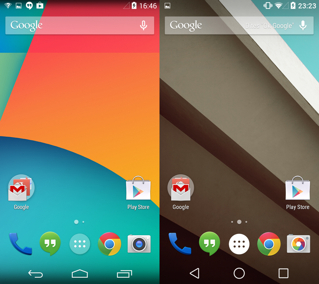
When starting the phone, the first thing you notice (apart from a new boot animation) is the absence of any significant fundamental changes. The home screen and default apps are largely identical to that of KitKat (Android version 4.4.4). We do note a different grouping of the icons in the top bar, along with the three navigation buttons under the dock. The new appearance of these buttons is our first encounter with Google’s “Material Design” of Android L. The new form is definitely simpler, but whether it makes the function any more understandable is a matter of opinion.
Onscreen Keyboard
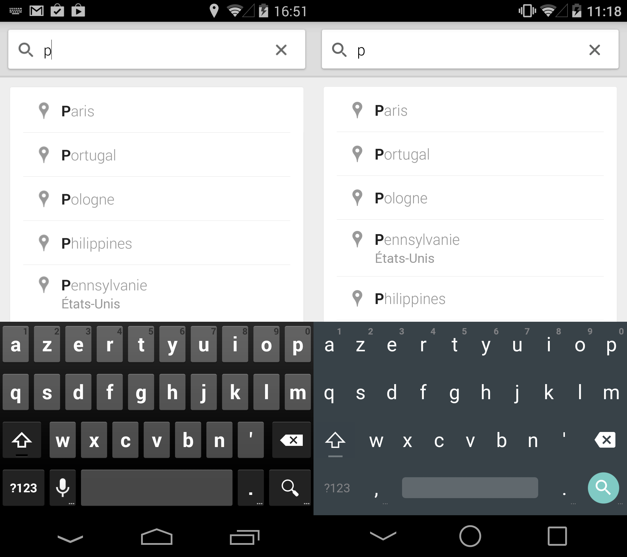
Google gave Android L a bold new keyboard, daring to remove the visual separation between keys. While this might appear to be detrimental to accuracy, on the contrary, our experience has been largely positive, and other third-party keyboards have already adopted this borderless design. We find that the eye is less distracted by unnecessary graphics, and our fingers find their way directly to the intended letter without worrying about accidentally hitting metaphorical keys.
Aside from its appearance, the keyboard doesn’t receive any big changes. It can still be used by either typing each letter one at a time, or by dragging your finger from one letter to another.
Notifications
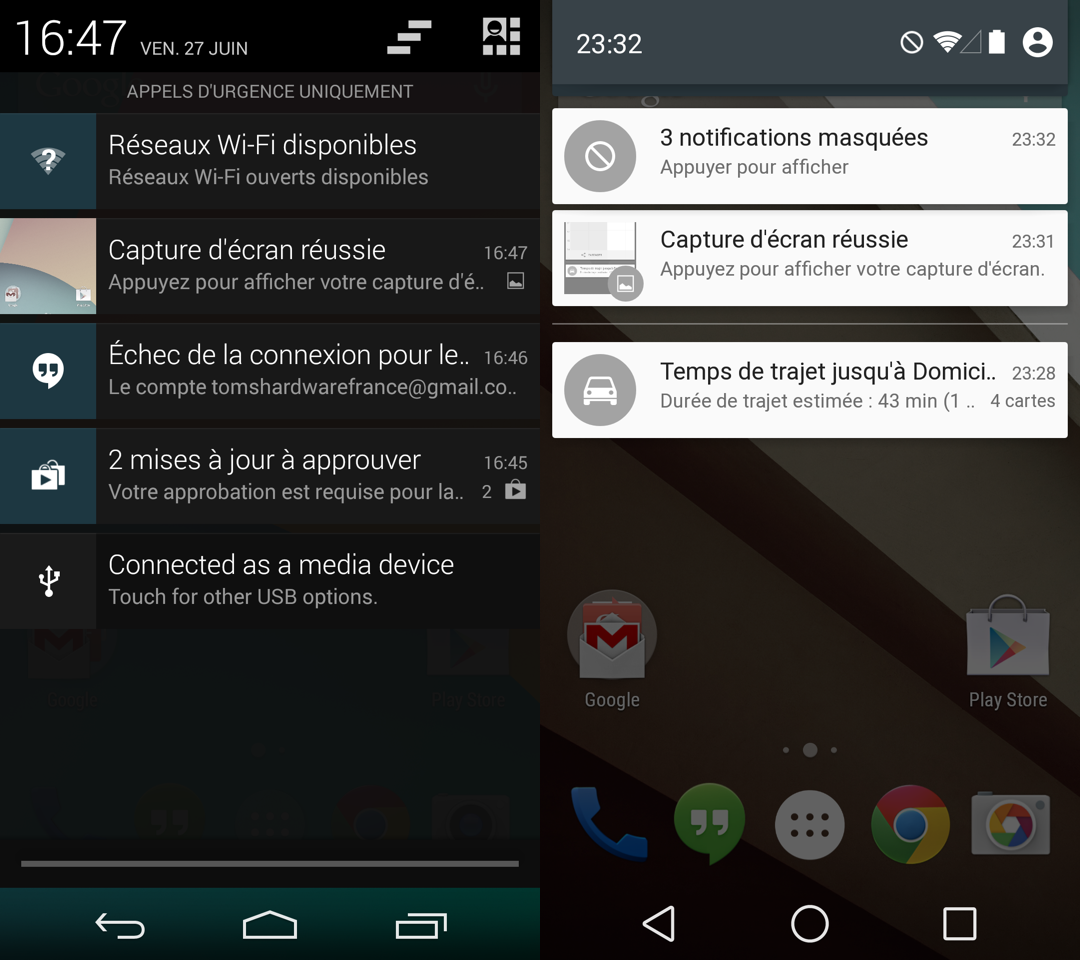
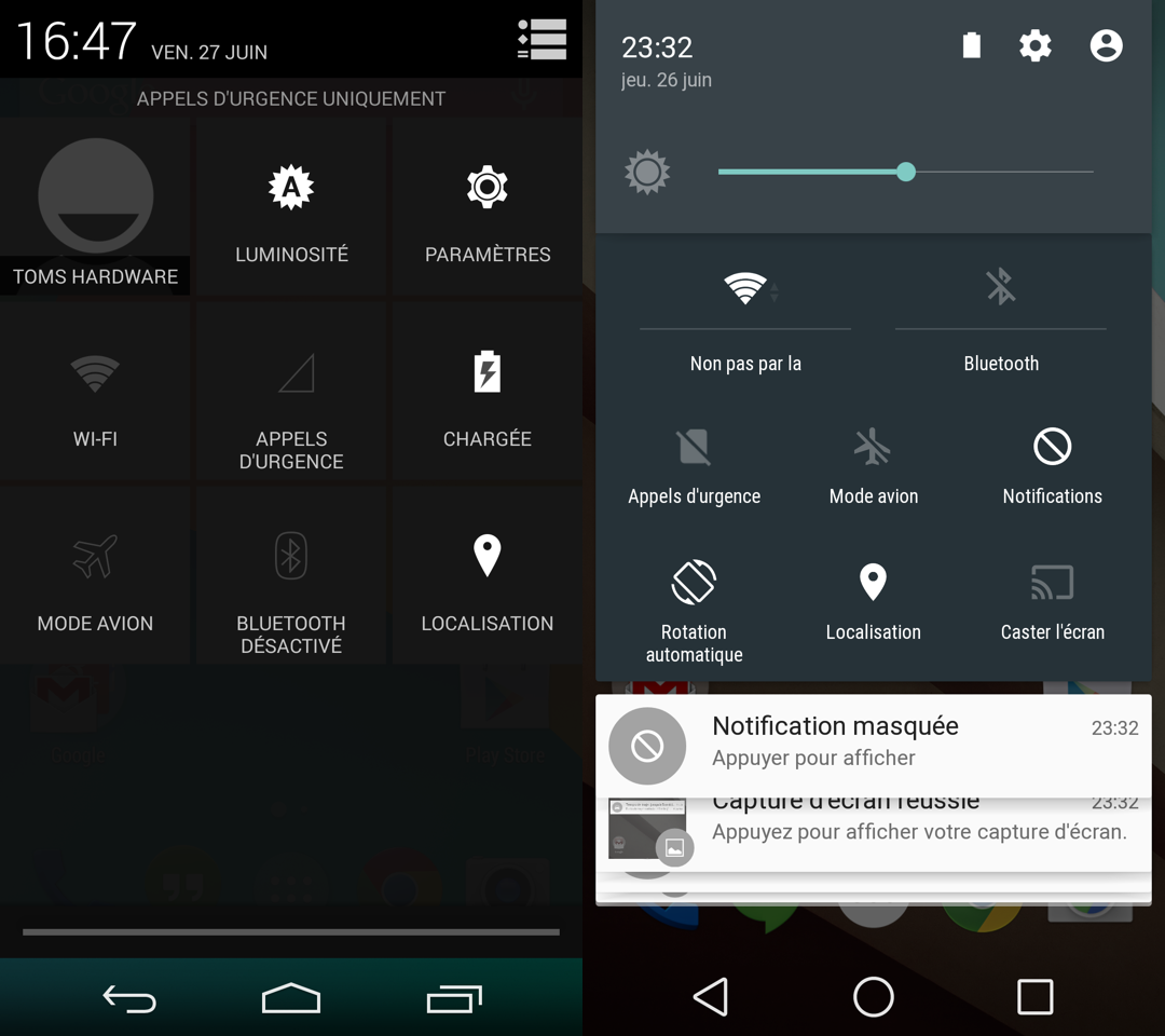
One of the main developments of Android L is in notification management. The notifications dropdown now appears on a far more transparent background, and battery status can be hidden or expanded as needed with a simple swipe. The independent notification “cards” have a reversed color scheme from the previous version of Android - going from white text inside a black bubble, to black text on a white background. Similar notification cards stack on top of each other in case their number would prevent them all from being displayed onscreen at once. This new type of notification card can also float above the current application.
Get Tom's Hardware's best news and in-depth reviews, straight to your inbox.
System Shortcuts
In Android 4.4, you can display a panel of system shortcuts with two actions: pull down the notifications bar, then press the settings icon. Android L eliminates a step: after bringing down the notifications bar, pull a little lower to show the system shortcuts panel. Notification cards pile up below the system shortcuts, but remain visible. In this instance, Google has produced true ergonomic progress, as it is now possible to complete the same action with less input.
Lock Screen
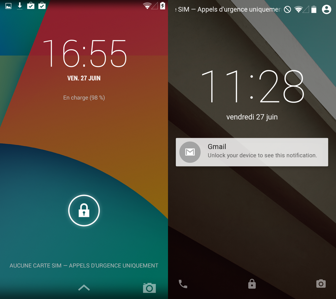
The lock screen of Android 4.4 is pretty bare, so Google added the ability to display notification cards on the Android L lock screen. For security and privacy purposes, two distinct types of notifications are defined: ones that plainly display their content immediately, and others that obscure their content and require unlocking the device. Most notifications we received (GMail, Hangouts, and other Google apps) are the first type. Luckily, it’s up to the user whether or not to allow notifications on the lock screen at all.
Multitasking
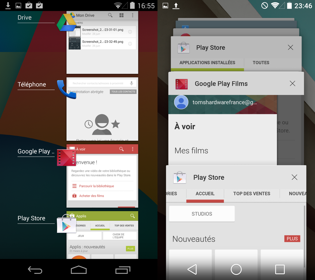
Multitasking management has also evolved in Android L. Like the new notifications system, Android L’s view of running applications also employs depth effects introduced by the Material Design. App windows are aligned one behind another in the manner of an old school carousel Rolodex. This allows you to see more of the app thumbnails, and in our opinion, the scrolling paradigm is more successful than the simple stack in Android 4.x
What’s more, multiple windows of the same application (e.g. Chrome tabs) are shown individually in the multitasking mode of Android L. Depending on how many browser tabs and other applications you have going, this could either be a navigational boon, or a hindrance.
Settings App
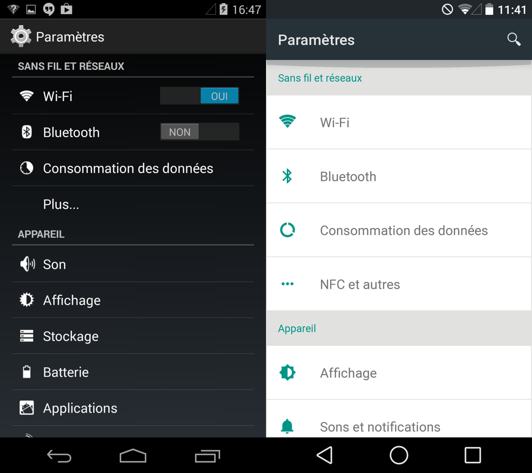
Despite the notifications and multitasking overlays, Google’s Material Design is still quite discreet in Android L, as few apps have been adapted. Possibly the most visible example is the Settings app. The background has changed from black to white, icons are tinted green, and the space allotted to each entry has significantly increased. The new list has far more white space, but it’s not really any less confusing. It’s quite possible that the interface will be further adjusted by the time Android L goes final.
Battery Saver
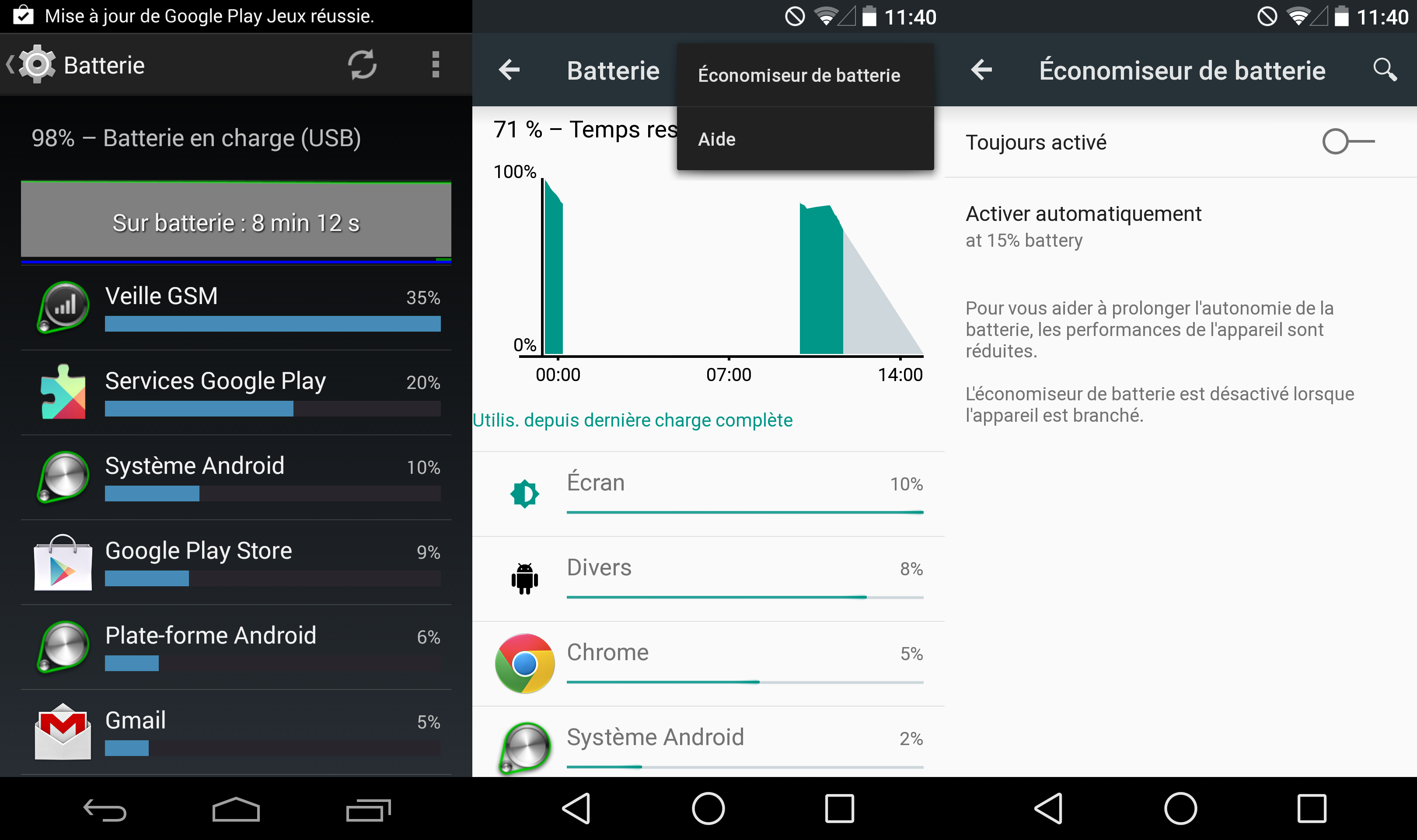
Android L is not only a graphical and ergonomic redesign, it also brings real under the hood improvements. One such improvement is known as project Volta, and it’s an attempt to further optimize device battery life. On one end, Volta takes the form of a suite of tools to help developers minimize the power consumption of their apps. On the other side of the curtain, users will enjoy a better view of their battery usage, and a new Battery Saver mode that can be automatically enabled whenever your device’s battery life falls below a certain threshold.
Performance Preview
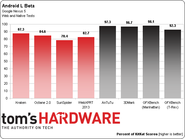
Finally, Android L removes of one of the foundational elements of earlier versions: the Dalvik virtual machine. It is replaced by ART (Android Run Time), which takes a very different approach than Dalvik. Rather than compile Java code on the fly, ART operates upstream, when installing applications. The advantage, according to Google, is a performance gain. Of course, we wanted to test that claim using some native and Web-based tests from our mobile benchmark suite.
Unfortunately, the results do not support Google’s claims at this time. Android L proves consistently slower than Android 4.4.4. However, it's nothing to be alarmed about since both ART and the version of Chrome that we tested are still in beta. We’ll repeat these tests for the final version, but for now, there’s no reason to install Android L with the hope to achieve performance gains.
ART also seems to have an effect on app size. The 24 apps we installed occupied a total of 2.05 GB on Android L, versus just 1.955 GB on Android 4.4.4 - five percent less than the newer version.
-
ohim Am i the only one who hates this new simplistic design style ? And why the hell do they keep on using white background on settings / phone dialer etc... when i`m in low light and i use my phone to actually blind me ? ..and they don`t offer the possibility to change it to black.Reply -
blackmagnum Am so excited and eager to get the update asap. I hope they will give my old girl Galaxy Nexus one more update.Reply -
bipbap No, you aren't. I loved the dark interfaces. Everything on my Note 3 is that way.Reply
And I despise the card-style interface that is popping up everywhere now, it seems. What is the point of all these beautiful displays if all you are going to us is black text on white squares? Do I even need to mention that for some displays, like the Note 3, bright colors use more battery?
Forcing eye-piercing white down our throats, minor, meaningless graphical changes, a a parameters screen that now shows LESS information, no meaningful performance gain? For what? A couple of nice things (rotating view of running apps) and a tiny gain in storage space? It looks like the took the worst design ideas from Apple and M$ and decided to out-ugly both. Bleh. -
Heironious Really? Everything is going to be white and square?? That keyboard looks horrendous! The notifications, is a step back...Reply -
zodiacfml I hope they fix the problem with Auto brightness in nexus 5 and some Google camera bugs.Reply -
10hellfire01 Guess I'll poke my eye out.Reply
Horrible puns aside, it's as if they kept the people who designed Android into a decent thing to look at and brought back some of the original designers who made the original Android look like crap.
A circle for the home button, a back arrow that makes me want to skip to a different scene, and a square that infers nothing...I feel like a 4 year old with that shape toy (triangle/square/circle).
Still don't understand the fascination with flatness and oversimplification either. It's like we're going backwards technologically.
