Microsoft Rolling Out Windows 10 October 2020 Update With UI Changes, Throttled Availability

Windows logo in rainbow colors.
(Image credit: Microsoft)

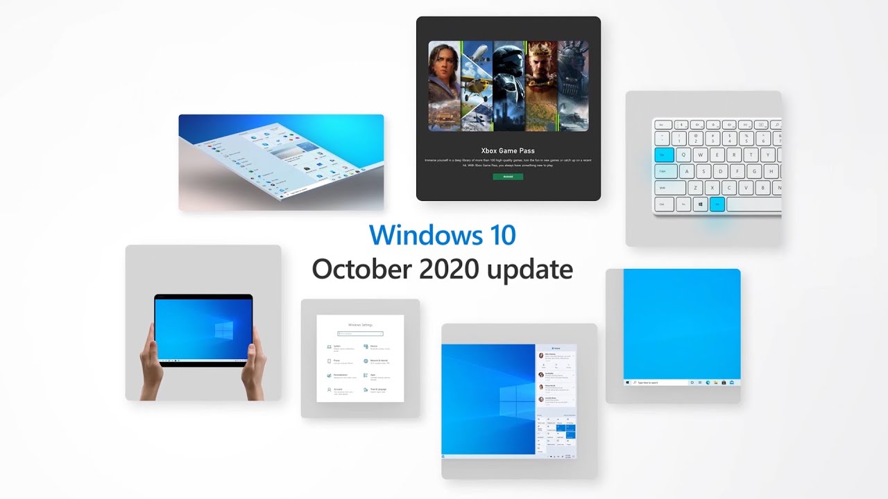
Microsoft is beginning to roll out the Windows 10 October 2020 update, formerly known as 20H2, with a bunch of changes to the UI including changes to the start menu and tablet mode, Alt + Tab in Edge and Xbox Game Pass.

The Start menu will be getting a design with transparent tiles, which should make them look better with your theme or wallpaper. The taskbar will also become more touch friendly, and will change automatically when you go into tablet mode, without asking whether that's what you want. Additionally, Microsoft is making some changes to notifications to better indicate which piece of software it's coming from.

Those with high refresh displays will be able to change the refresh rates in settings, under Settings > System > Display, Advanced display settings.

There are some new Edge features, which are exclusive to the browser on Windows 10. Alt + Tab will let you tab through open, well, tabs. Additionally, when you hover over a favicon, it will highlight all of the open tabs from that site.

As is typical for major OS updates, Microsoft will be throttling the release of this update. The May 2020 update took quite some time to reach some PCs and also had quite a few bugs, so this approach may be for the better. The company wrote that "In this work, learn and connect from home environment where people are relying on their PCs more than ever before, we are taking a measured seeker-based rollout approach to the October 2020 Update."

Devices with hardware compatibility issues may also trigger safeguards, so it may be a bit until the October 2020 update hits your laptop or desktop.

If you want to see if the October 2020 update is ready for you now, go to Settings > Update & Security > Windows Update and click on Check for updates. If you want to roll the dice and force update your PC to the latest build, you can use the Media Creation Tool.

Andrew E. Freedman is a senior editor at Tom's Hardware focusing on laptops, desktops and gaming. He also keeps up with the latest news. A lover of all things gaming and tech, his previous work has shown up in Tom's Guide, Laptop Mag, Kotaku, PCMag and Complex, among others. Follow him on Threads @FreedmanAE and Mastodon @FreedmanAE.mastodon.social.

  • Giroro
    I don't like the new start menu look. All the bright colors meant contrast. Contrast means all the icons are easier to identify without reading or trying to figure out which of the near-identical (other than color) MS Office icons is Word. On top of removing the tile color, Microsoft made the icons for most of their products to be the exact same shade of "internet explorer" blue.
    Hopefully Windows will come with a toggle for colorblind mode... or I guess technically whatever you call the exact opposite of a colorblind mode. I mean, I know it won't have a user-friendly option because these are the poeple who though Windows 8 had a functional interface..They even thought people who use Excel for work want to be forced to wait on watching every single cell individually animate like a slot machine whenever you fill it in... but they still should someday look into giving users back the ability to personalize functionality back into their products without hacky 3rd party tools.
    Form over function is the definition of a bad GUI.
    Reply
  • Makaveli
    I'm still on 1909 on my desktop.

    I have a laptop on 2004 I will try the update there first and see how that goes.
    Reply
  • pelegbn
    So... basically Microsoft's Windows dev teams have been "scratching their balls" for half a year. Transparent-smart tiles? really?? This release is more about promoting their new "Game Pass" rather than actually improving Windows.
    Reply
  • samopa
    Giroro said:
    Form over function is the definition of a bad GUI.

    I, wholeheartedly, agree with this statement 👍
    Reply
  • excalibur1814
    Moan, moan, complain and moan.

    As long as you can still work, it's all good.
    Reply
  • Colif
    Microsoft is beginning to roll out the Windows 10 October 2020 update, formerly known as 20H2

    Formerly? Try actually. It seems Microsoft didn't get the message the name had changed

    Many of the changes are below the hood, and bug fixes. I hadn't even noticed the changes to start menu as i hardly go there.

    It was the fastest version update install I ever done.
    Reply
  • USAFRet
    Colif said:

    It was the fastest version update install I ever done.
    I just updated my test VM.
    Yes, very quick update. Maybe 7-8 minutes, including the reboot after.

    Start menu? Unless looking at old and new side by side, I don't notice much difference.
    Reply
  • Colif
    the apps listing appears to use different font now
    Reply
  • USAFRet
    Colif said:
    the apps listing appears to use different font now
    20H2 on the left, 2004 on the right:
    Reply
  • Colif
    there are differences there, they are just subtle. Doesn't help you use a dark theme

    https://www.xda-developers.com/microsoft-windows-10-20h2-update-new-start-menu-design/
    Reply