


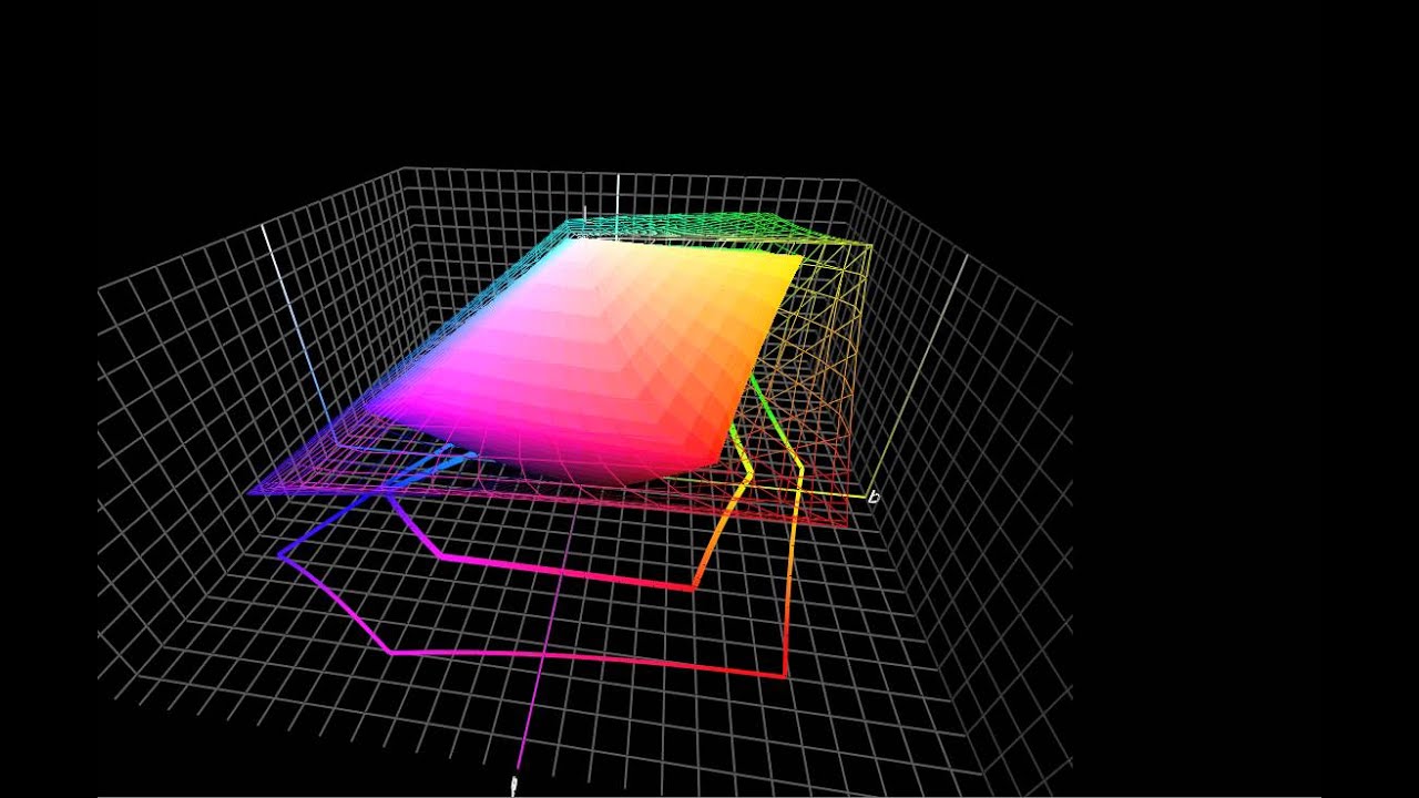
Display Quality: Color Gamut

The Xoom Family Edition employs an IPS panel, which is of course different from the original Xoom's VA panel. However, competing models like Asus' Eee Pad Transformer and Apple's iPad 2, both tablets that we know for certain employ IPS technology, offer better color performance.
In our opinion, the tablet's viewing angles are decent, but only horizontally. Move a few degrees in the vertical space and the image appears completely washed out.


Even though mobile operating systems don't honor ICC color profiles, native color management does occur at the hardware level. When a GPU sends 10 different hues of blue to an LCD only capable of displaying three, the subpixels display the closest matching color. So, in a way, smartphones and tablets behave as if they’re using relative colorimetric rendering. For more information, read Tom's Hardware Benchmarks Inkjet Printer Paper!
Most tablets still deliver less color quality than the cheap TN panels encountered on the desktop, so the Xoom Family Edition's performance doesn't surprise us. It's a value-oriented product, so despite its IPS panel, the Xoom Family Edition offers the least amount of color of the tablets we've tested thus far.
Overall, color gamut is extremely close to the Eee Pad Transformer, except that this new Xoom is much weaker in red production. The Galaxy Tab 10.1's Super PLS panel still sets the standard when it comes to display quality.


These gamut measurements are accompanied by a couple of caveats. First, we're disabling dynamic brightness because it doesn’t allow us to get an accurate (or reproducible) measurement of the display’s potential. Second, brightness is set to the highest value. If you don't use the same settings, your color gamut is going to look smaller than what we're showing here.

We calculate contrast ratio by dividing the maximum luminance value obtained for white and black at the center of the screen. As such, our benchmark vastly overstates the contrast ratio at 3700:1. The Xoom Family Edition's IPS panel has substantial light bleed near the edges, which means black luminance is, by default, lower towards the center. When you average the values out, the real contrast ratio falls somewhere close to 1500:1. This means the Xoom Family Edition still offers the best contrast ratio. However, that comes at the expense of a higher color gamut.

The display is slightly cool at 7300 K, but it's nothing out of the ordinary. White backgrounds have a faint bluish tint, though the difference is barely noticeable thanks to a fairly even gamma.
Understand that gamma doesn't affect black or white performance, but it does affect midtones. If gamma is set too high, the midtones appear dark. If it's set too low, they're pale. Adobe, Apple, and Microsoft all recommend a gamma of 2.2. It's an arbitrary value carried over from the NTSC standard, but it was originally chosen because it allows colors to appear more natural in slightly dim environments.
