How We Test Smartphones And Tablets
Today, we outline the strict testing procedures used to obtain accurate data and discuss each test that we perform on smartphones and tablets.
Display Performance
A mobile device’s display serves as its primary interface—the front is basically all screen—and, over the course of a day, we can spend many hours staring at it in lighting conditions varying from a pitch-black room to bright sunlight outdoors. Because display quality so profoundly impacts our mobile experience, we thoroughly scrutinize its performance.
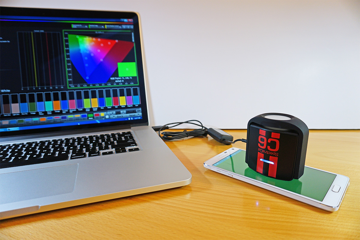
For display measurements, we use a SpectraCal C6 colorimeter, which measures color and luminance accurately and works equally well with LCD or OLED screens. The C6 is calibrated by SpectraCal with a Konica Minolta CS-2000 and comes with a NIST (National Institute of Standards and Technology) certificate of accuracy. Even though sealed designs like the C6 are more stable than designs whose color filters are exposed to air, the accuracy of all colorimeters can drift over time. Therefore, our C6 hardware gets calibrated as required.

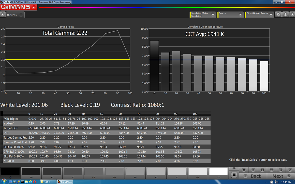
In conjunction with the C6 colorimeter, we use SpectraCal's CalMAN Ultimate for Business v5 software, which allows us to create custom workflows and provides us with a wealth of measurement options. The CalMAN software also makes the nice looking graphs you see in our reviews.
The C6 is placed at the center of a thoroughly cleaned screen during testing. The display testing patterns are controlled manually or by the CalMAN software working together with SpectraCal’s MobileForge app.
Display Brightness: Maximum & Minimum
A display’s brightness or luminance—measured in candelas per square meter (cd/m2) or nits—affects its visibility in different lighting conditions. A higher maximum brightness makes the screen easier to see in bright conditions such as a brightly lit room or in direct sunlight outdoors. For a dimly lit room or at night, a lower minimum brightness is preferable to keep your screen from blinding you or bothering others around you.
To measure the maximum brightness, the brightness slider is adjusted to its upper bound and a 100% white pattern is displayed onscreen. The minimum brightness is measured the same way, but with the brightness slider set to its lower bound.
The values we report for maximum and minimum brightness represent what’s achievable with the stock brightness slider. Sometimes, however, higher or lower values can be “unlocked” by using a third-party app to control the screen brightness—the mapping of slider positions to luminance values is set by the OEM and may be capped below the hardware’s true limits. These unlocked values may be reported in addition to the stock values if there’s a significant difference between the two.
Get Tom's Hardware's best news and in-depth reviews, straight to your inbox.
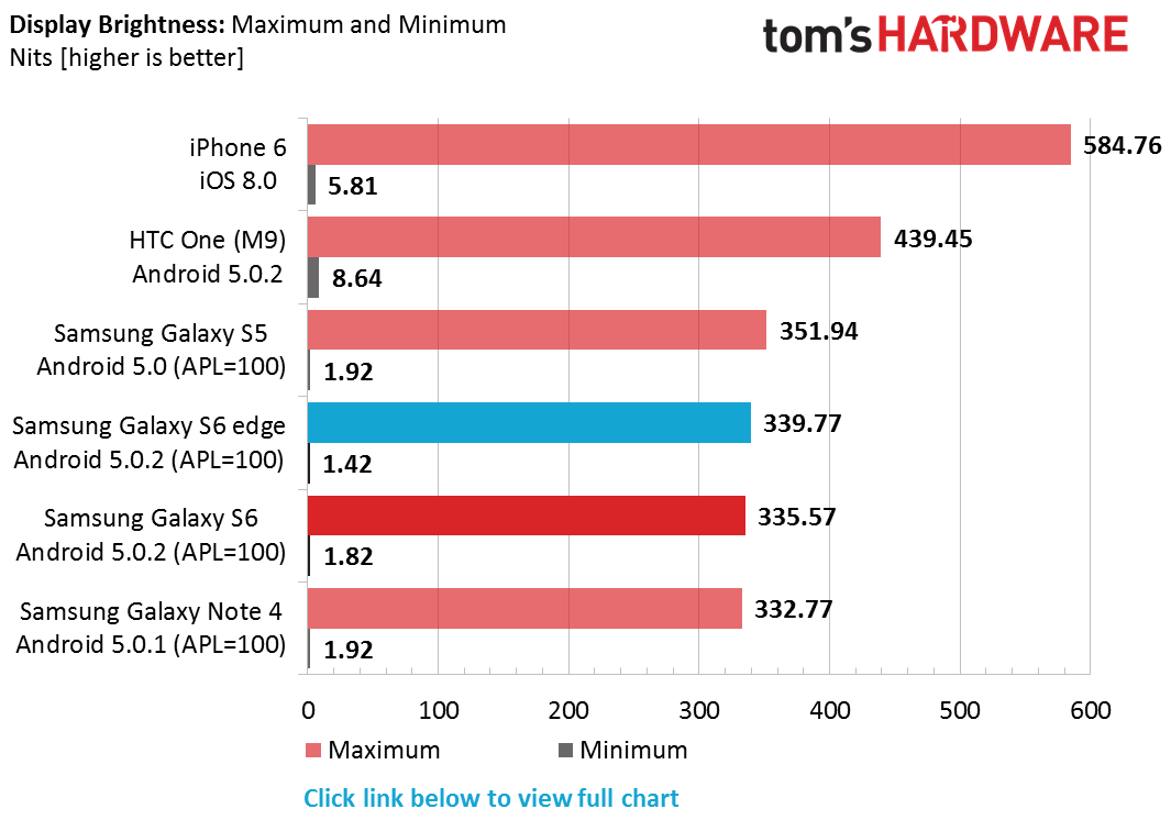
Full Brightness chart including values for APL=50.
We report two different brightness levels for OLED displays: APL=50% and APL=100% (APL stands for Average Picture Level). This is because the brightness of an OLED screen changes depending on what content is actually being displayed (here’s a more in-depth discussion on APL). The APL values we use provide a good upper and lower bound for real-world content.
A word of caution: Maximum brightness values for OLED screens that do not specify the APL used for the measurement are essentially useless. The spec sheets for many OEMs, and even some mobile review websites, list values much higher than we report by using very low APL levels—sometimes less than 10%—which will never be seen in real-world use.
Display Brightness: Calibrated
After measuring the maximum and minimum brightness, the screen is calibrated to 200 nits ±1% for the remainder of the display tests and all of the battery tests.
Since some OEMs manipulate luminance in subtle ways—usually decreasing it by a small amount after a few seconds to minutes after an adjustment is made—we continue to monitor screen brightness during the remaining tests to ensure it stays at 200 nits.
Black Level & Contrast Ratio
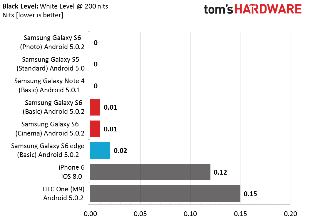
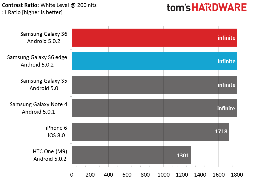
Black level represents the luminance of a full-black (0% white) pattern, which we measure after setting 100% white to 200 nits as mentioned above. Because OLED displays are self-emitting, they are capable of displaying a true black by turning pixels off. This is not the case for LCD displays which use a separate, always-on backlight. Even when an LCD pixel is off, it allows some of the backlight to leak through.
A display’s contrast ratio represents the luminance ratio between a full-white (100% white) and a full-black (0% white) pattern; similar to dynamic range, the higher the value the better. Written another way: contrast = (100% white luminance) / (0% white luminance). Clearly, having a lower black level is desirable, not just for better looking blacks, but for maximizing the screen’s contrast ratio. Because OLED displays have black levels at or very near zero, they essentially have infinite contrast ratios.
Gamma
The human visual system perceives light in a non-linear manner according to a gamma or power function, with better sensitivity to changes in dark tones than light ones. This quality improves our dynamic range and helps keep us from being blinded by bright sunlight outdoors (CMOS sensors in digital cameras perceive light in a more linear fashion, which is one reason they suffer from poor dynamic range).
If the luminance values in digital images were encoded linearly, matching the linear brightness levels displayed by the screen (non-CRT), then too many bits would be wasted encoding highlights we cannot perceive and too few used for encoding shadows, either leading to a loss in quality or larger files. By encoding luminance with a non-linear gamma function, however, bits are optimized for how we perceive light, leading to higher visual quality and lower file sizes.

The gamma value is actually the exponent used in the power-law expression to generate a specific gamma curve. A gamma of 2.2 is the ideal target value. A screen with a gamma less than 2.2 appears brighter or washed out with fewer shadows, while a gamma larger than 2.2 displays a darker image with a loss of shadow detail and fewer highlights. The sequence of images above show how a screen’s gamma curve affects the displayed image.
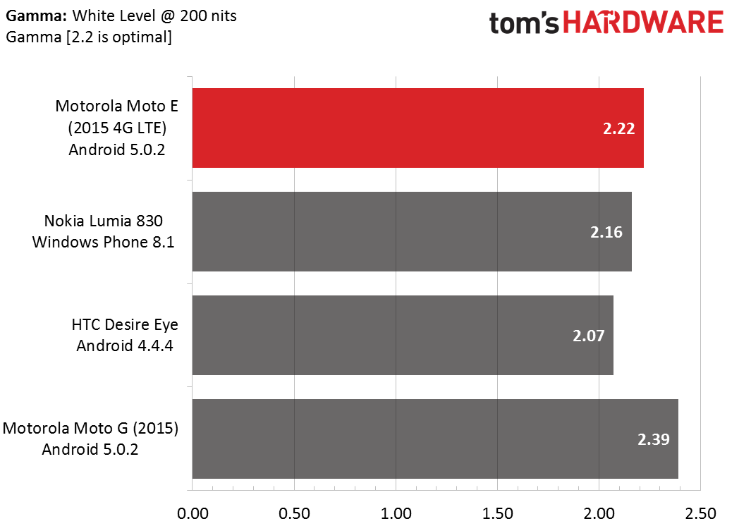
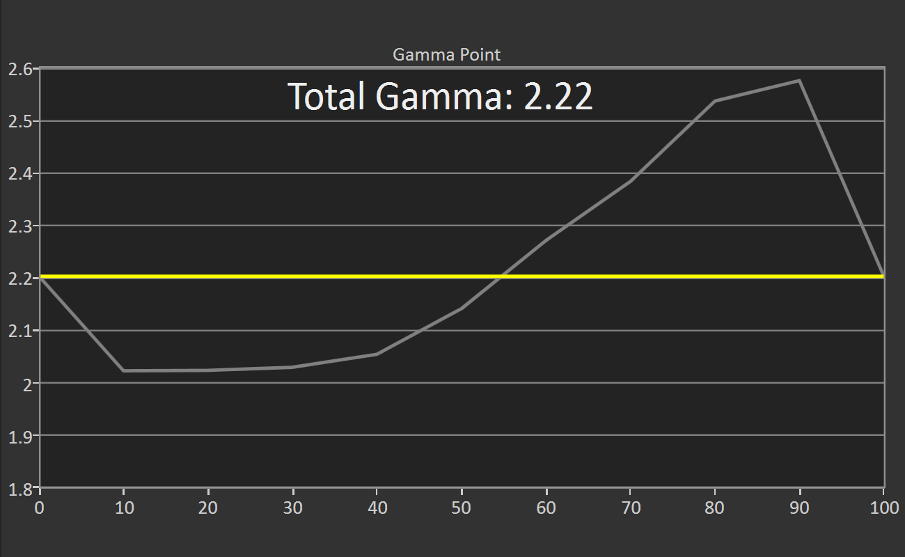
Gamma is measured in 10% increments from the display’s black level (0% white) to 200 nits (100% white). In our reviews, we show the average gamma for the whole luminance range in a chart for comparison with other devices. We also include a graph that shows the gamma value at each measurement point relative to the ideal value of 2.2, shown as a yellow line. The ideal display would match the flat yellow line at every point.
Color Temperature
Color temperature, also known as white balance or white point, describes the color of light emitted by an object and is measured in Kelvin. For example, an incandescent bulb has a color temperature around 2700 K and a fluorescent lamp is around 5000 K. The ideal correlated color temperature for a computer display, defined by the D65 standard, is 6500 K, which is the color temperature of sunlight on an overcast day.
To put this another way, if you take a white object and view it outside on an overcast day it will take on a specific color. If you look at the same white object in a room lit by incandescent bulbs with tungsten filaments, the object will appear more yellow or orange. In fluorescent light, the object would take on a green tint. Since light with a color temperature less than our standard 6500 K has more red than blue content, we describe it as being “warm.” Conversely, color temperatures above 6500 K skew towards blue, so we say the light is “cool.”
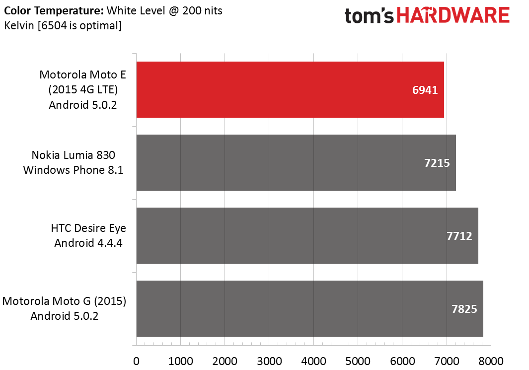
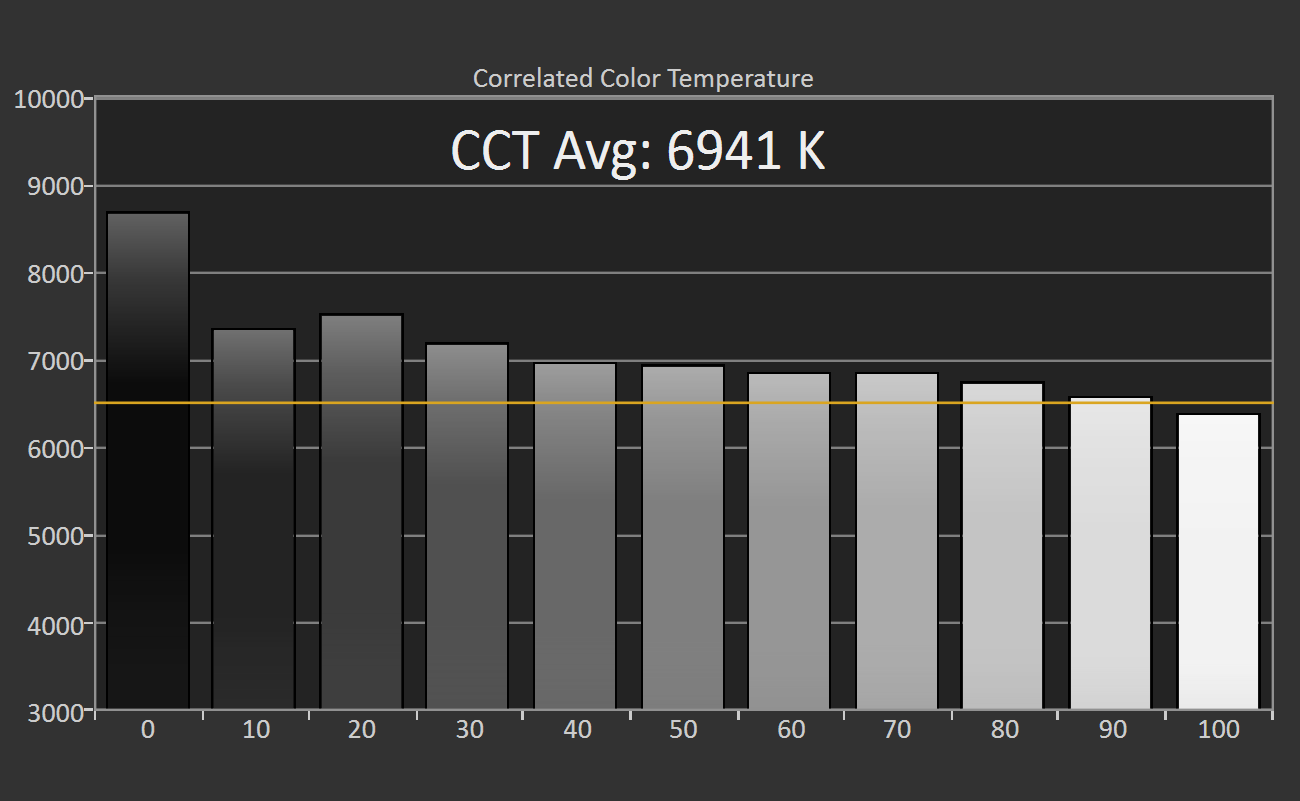
Similar to gamma, we measure color temperature in 10% grayscale increments from the display’s black level (0% white) to 200 nits (100% white). The average correlated color temperature (CCT) is compared to other devices in a chart, while the CCT at each measured grayscale value is shown in a bar graph. The yellow line represents the ideal value of 6500 K. Values close to 0% white are not accurate due to limitations of the testing hardware.
Grayscale RGB Balance
Every luminance or grayscale value between black (0% white) and 100% white is a mixture of the three primary colors red, green, and blue (abbreviated RGB), which also happen to be the colors of an LCD or OLED display’s sub-pixels.
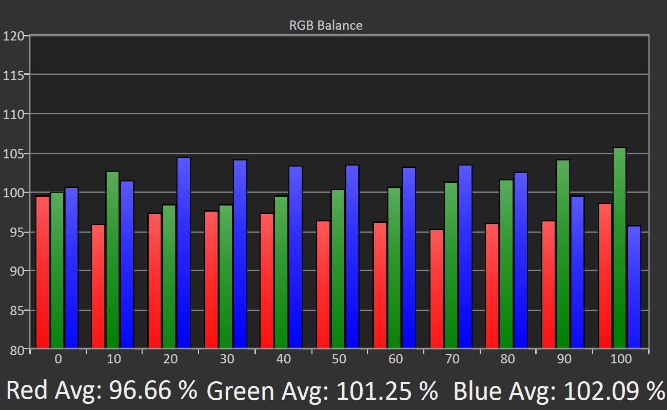
The RGB balance graph shows the individual levels of the red, green, and blue primary colors for grayscale (luminance) values ranging from black (0% white) to 100% white (200 nits) in 10% increments. The vertical axis is percent relative to a target value. Below the graph, the average value for each primary color is displayed for reference.
This graph does not give us any new information; it’s the same data from the color temperature and grayscale accuracy graphs, but plotted in a different way. We include this graph because RGB balance is fundamental to display performance and helps us explain most of the other charts.
Ideally, a screen would display red, green, and blue equally at 100% for each grayscale value. In the example graph above, we see that there’s too much blue (blue is greater than 100%) and not enough red (red is less than 100%) for grayscale values between 10% and 80%. This deviation results in grayscale error and produces a cool color temperature above 6500 K. At 100%, green is the dominant color, which gives a visible green tint to a 100% white screen.
Grayscale Error
Grayscale error is the mismatch between a target value and the measured value. There are several formulas for measuring error, but we’re using the most recent formula known as CIE ΔE2000 (luminance compensated).
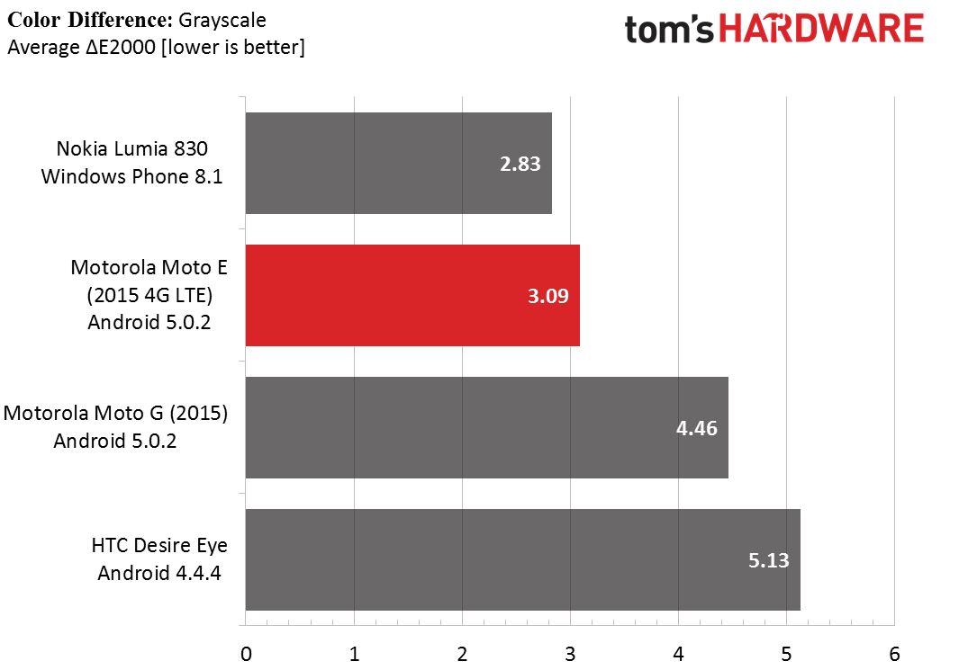
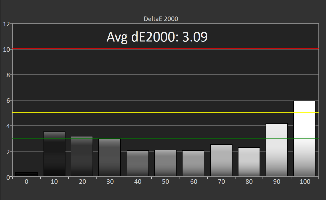
The grayscale error is calculated for the same data set used for the other grayscale tests, and the average value is shown in a chart for easy comparison to other devices. The bar graph shows the amount of error at each measured luminance level. Error values below one are imperceptible. The green line represents an error level of three, anything below which is considered good. Anything between the green and yellow line at an error level of five is clearly visible, but most people would consider the error acceptable. Error values above five signify unacceptable results.
The grayscale error, which is influenced by the RGB balance and gamma, influences more than just the color and luminance of white; it also effects the hue and saturation of other colors too. If a screen performs poorly in grayscale measurements, then it will also perform poorly when displaying colors.
Color Gamut
Current screen technology is not capable of displaying all of the colors we can perceive. Instead, a screen has a color gamut or subset of colors that it can generate. This also applies to other output devices such as projectors and printers; however, if you edit a video or design a poster using a screen whose color gamut differs from the projector’s or printer’s color gamut, the final output may not look as you intended. Using standardized color spaces ensures that different devices are capable of displaying the same set of colors.
There are many different color spaces, but the only one that matters for mobile devices is the sRGB standard. Most content intended for mobile or computer screens is created, and thus intended to be displayed in, the sRGB color space. Even if content is created in a different color space, Adobe RGB for example, it will be mapped into the sRGB color space because mobile apps and operating systems are not color space aware—they do not understand anything other than sRGB.
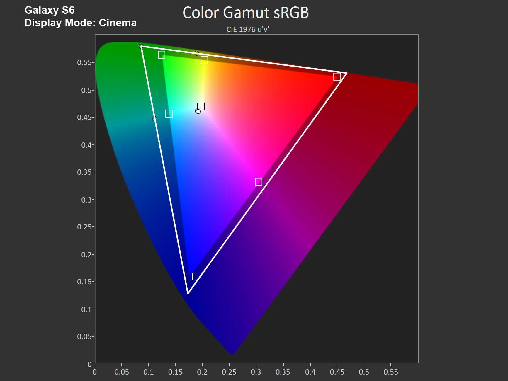
A display’s color gamut is displayed with a chromaticity diagram like the one shown above. We use the CIE 1976 u’v’ diagram because it more accurately represents our eye’s sensitivity to different colors: We are less sensitive to differences in green tones than blue tones. The goal is to create a perceptually uniform color space where equal distances anywhere on the diagram correspond to equally perceived color differences.
In this diagram, the larger, horseshoe shaped color region represents the total range of colors humans can perceive. The brighter, triangular region is the sRGB color space. Ideally, the tested display’s color gamut, defined by the white triangle, would match the boundaries of the sRGB color space exactly.
Color gamut is tested by measuring the three primary colors (red, green, and blue), which form the vertices of the gamut triangle; the three secondary colors (cyan, magenta, and yellow), which lie along the edges of the triangle; and the white point, which is inside the triangle where the primary colors combine, at a stimulus level of 75%. The small white squares represent the target values, while the dots are the measured values.
Color Saturation Sweep
Color saturation for the three primary and three secondary colors is measured in 20% increments, with 0% being white, at a stimulus level of 75%.
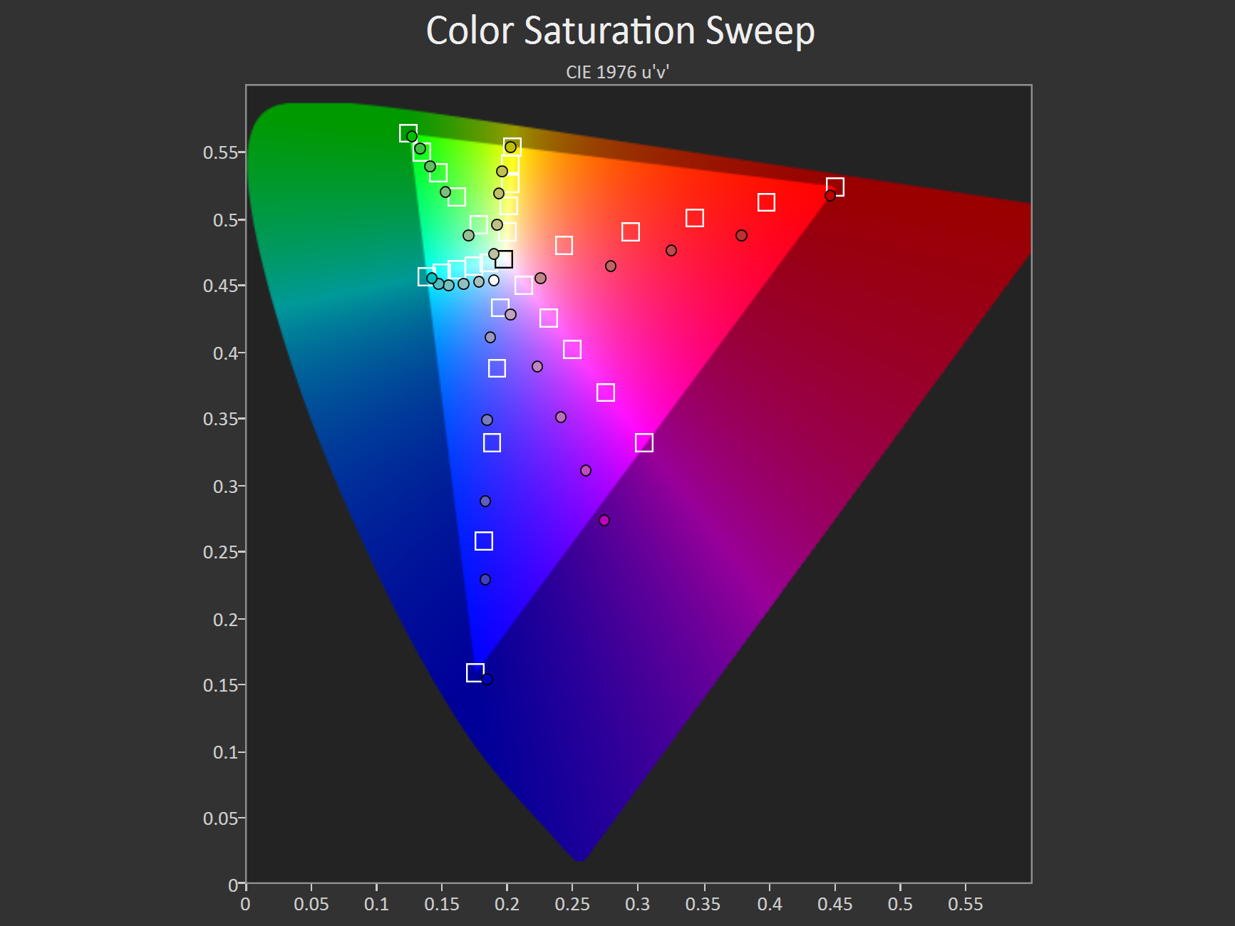
The results are shown in the CIE 1976 u’v’ chromaticity diagram, with the white squares depicting the target values and the dots the measured values. We’re looking for two things in this test: shifts in hue and color compression. In the example above, we can see that magenta tones are shifted towards blue, giving them a purple hue instead. There’s also evidence of color compression, signified by unequal spacing between the saturation levels for a particular color. Some OEMs will increase color saturation at the higher end of the scale to make colors look more “vibrant.” The side effect, however, is “color banding,” where smooth saturation gradients are replaced by discrete steps and regions of nearly constant color.
Color Accuracy
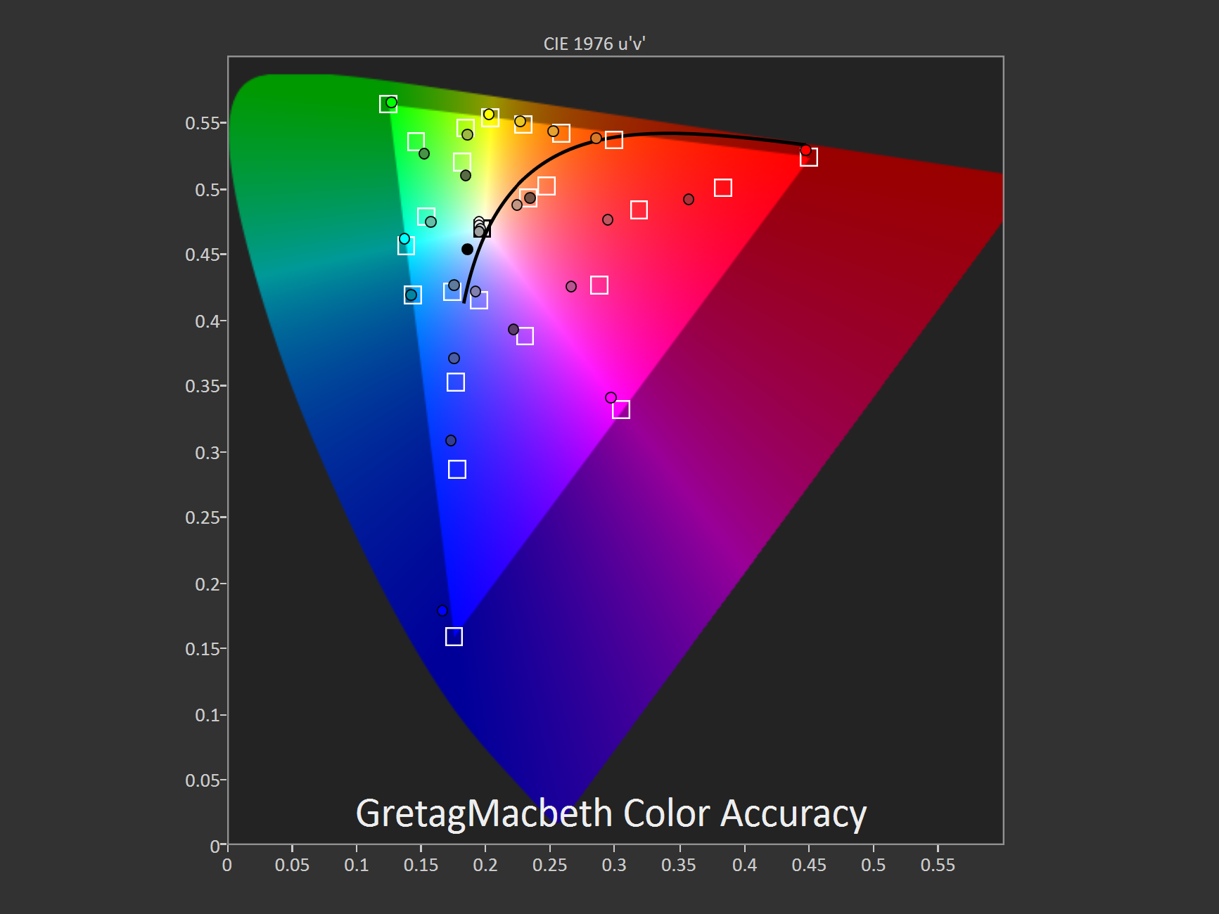
The color accuracy of a display is tested using a total of 30 colors: the 24 GretagMacbeth ColorChecker colors plus the three primary and three secondary colors. The measured values, represented by dots, are plotted on the CIE 1976 u’v’ chromaticity diagram relative to the target values, represented by white squares. The blackbody curve is shown for reference.
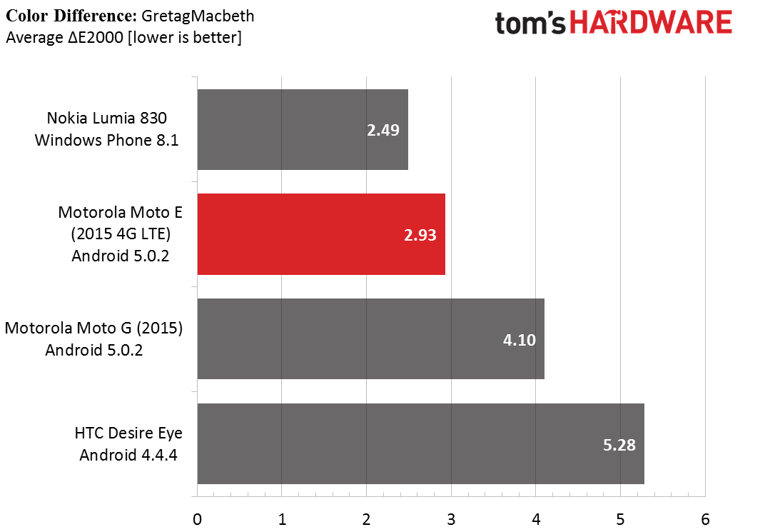
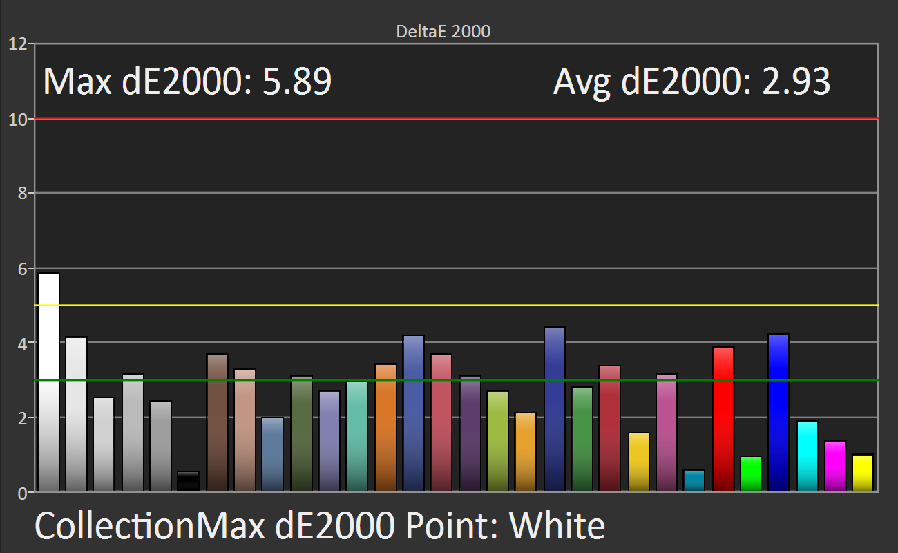
Color error, the mismatch between a target value and the measured value, is also calculated for this same data set using the CIE ΔE2000 formula. The average color error is shown in a chart for easy comparison to other devices. The bar graph shows the error values for each tested color. Error values below one are imperceptible. The green line represents an error level of three, anything below which is considered good. Anything between the green and yellow line at an error level of five is clearly visible, but most people would consider the error acceptable. Error values above five signify unacceptable results.
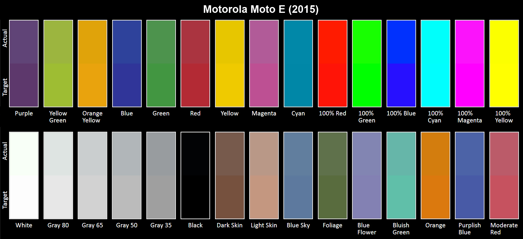
We also include a color swatch to better visualize the difference between the target color (bottom half) and the displayed color (top half). In our discussion about RGB balance above, we noted how this particular screen had a surplus of green and a deficit of blue at 100% white. This shows up as a visible green tint for White in the color swatch. Note that your display’s accuracy will influence the actual color and color difference you see in the swatch. If your display is not calibrated properly or is of low quality, what you see will not match the results of our analysis.
-
blackmagnum Thank you for clearing this up, Matt. I am sure us readers will show approval with our clicks and regular site visits.Reply -
falchard My testing methods amount to looking for the Windows Phone and putting the trophy next to it.Reply -
WyomingKnott It's called a phone. Did I miss something? Phones should be tested for call clarity, for volume and distortion, for call drops. This is a set of tests for a tablet.Reply -
MobileEditor ReplyIt's called a phone. Did I miss something? Phones should be tested for call clarity, for volume and distortion, for call drops. This is a set of tests for a tablet.
It's ironic that the base function of a smartphone is the one thing that we cannot test. There are simply too many variables in play: carrier, location, time of day, etc. I know other sites post recordings of call quality and bandwidth numbers in an attempt to make their reviews appear more substantial and "scientific." All they're really doing, however, is feeding their readers garbage data. Testing the same phone at the same location but at a different time of day will yield different numbers. And unless you work in the same building where they're performing these tests, how is this data remotely relevant to you?
In reality, only the companies designing the RF components and making the smartphones can afford the equipment and special facilities necessary to properly test wireless performance. This is the reason why none of the more reputable sites test these functions; we know it cannot be done right, and no data is better than misleading data.
Call clarity and distortion, for example, has a lot to do with the codec used encode the voice traffic. Most carriers still use the old AMR codec, which is strictly a voice codec rather than an audio codec, and is relatively low quality. Some carriers are rolling out AMR wide-band (HD-Voice), which improves call quality, but this is not a universal feature. Even carriers that support it do not support it in all areas.
What about dropped calls? In the many years of using a cell phone, I can count the number of dropped calls I've had on one hand (that were not the result of driving into a tunnel or stepping into an elevator). How do we test something that occurs randomly and infrequently? If we do get a dropped call, is it the phone's fault or the network's? With only signal strength at the handset, it's impossible to tell.
If there's one thing we like doing, it's testing stuff, but we're not going to do it if we cannot do it right.
- Matt Humrick, Mobile Editor, Tom's Hardware -
WyomingKnott The reply is much appreciated.Reply
Not just Tom's (I like the site), but everyone has stopped rating phones on calls. It's been driving me nuts. -
KenOlson Matt,Reply
1st I think your reviews are very well done!
Question: is there anyway of testing cell phone low signal performance?
To date I have not found any English speaking reviews doing this.
Thanks
Ken -
MobileEditor Reply1st I think your reviews are very well done!
Question: is there anyway of testing cell phone low signal performance?
Thanks for the compliment :)
In order to test the low signal performance of a phone, we would need control of both ends of the connection. For example, you could be sitting right next to the cell tower and have an excellent signal, but still have a very slow connection. The problem is that you're sharing access to the tower with everyone else who's in range. So you can have a strong signal, but poor performance because the tower is overloaded. Without control of the tower, we would have no idea if the phone or the network is at fault.
You can test this yourself by finding a cell tower near a freeway off-ramp. Perform a speed test around 10am while sitting at the stoplight. You'll have five bars and get excellent throughput. Now do the same thing at 5pm. You'll still have five bars, but you'll probably be getting closer to dialup speeds. The reason being that the people in those hundreds of cars stopped on the freeway are all passing the time by talking, texting, browsing, and probably even watching videos.
- Matt Humrick, Mobile Editor, Tom's Hardware