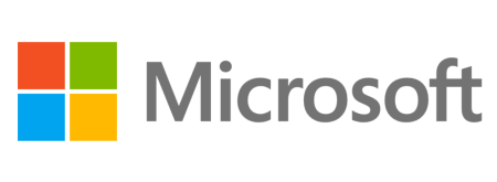
Microsoft Updates Its 25-year-old Logo
Microsoft is updating its corporate look in time for a big year of product launches.
Microsoft is hoping to reinvent the desktop experience with Windows 8 and its Modern UI. The OS represents a massive change in the traditional desktop user interface, and it looks like Redmond is looking to give itself a little makeover, too. Microsoft today unveiled a brand new corporate logo. This is the first major Microsoft logo change in the company's history.
Speaking via the Official Microsoft Blog, Microsoft's Jeffrey Meisner said that the change comes in anticipation of one of 'the most significant waves of product launches in Microsoft's history.'
"It's been 25 years since we've updated the Microsoft logo and now is the perfect time for a change. This is an incredibly exciting year for Microsoft as we prepare to release new versions of nearly all of our products," he wrote, later adding, "This wave of new releases is not only a reimagining of our most popular products, but also represents a new era for Microsoft, so our logo should evolve to visually accentuate this new beginning."
Over the next year, Microsoft will launch Windows 8, Windows Phone 8, its brand new Surface tablets, the next version of Office, and updates to Xbox Live. There's also rumored about an Xbox 720 announcement at E3 in June 2013. For those interested, the logotype uses the the Segoe font, the same font used across Microsoft products and marketing communications, and the colored squares are supposed to represent Microsoft's diverse portfolio of products.
Follow @JaneMcEntegart on Twitter.
Contact Us for News Tips, Corrections and Feedback
Get Tom's Hardware's best news and in-depth reviews, straight to your inbox.

Jane McEntegart is a writer, editor, and marketing communications professional with 17 years of experience in the technology industry. She has written about a wide range of technology topics, including smartphones, tablets, and game consoles. Her articles have been published in Tom's Guide, Tom's Hardware, MobileSyrup, and Edge Up.
-
A Bad Day How much money did Microsoft spent on designing their new logo? Some companies spent a large sum, only to get terrible results.Reply
Such as Enron, the name cost the predecessor InterNorth company around $100k (either in 1960's or 2010's money), but neither InterNorth or the design company realized Enron was also a Greek term for the digestive system or intestine.
The correction attempts nailed Enron another few millions after the market and competitors reacted accordingly. -
beayn Ugh... it's even worse than when they flattened the IE logo. This logo looks like something from 1983. I want contours, transparencies, gradients, and shadows, not... blocks.Reply
The same goes for Metro.
-
kcorp2003 :bounce: yayReply
i'll just throw this out there because its funny.
http://img.labnol.org/di/googlechrome.jpg -
edogawa They should just make it look like metro tiles instead of squares. (Troll Face)Reply
Seriously though, I think it looks clean and simple, but I think the old one was better.
