Microsoft Reveals New, Improved Blue e IE9 Logo
The icon that many Internet Explorer users will be clicking on for years to come.
Now that the Internet Explorer 9 beta is out for everyone on Windows Vista and Windows 7 to try, it's quite clear about what new direction Microsoft is taking with its new browser.
Not only is it hardware accelerated, it also tries to maximize the pixels dedicated to displaying the web. Along with this new design approach, Microsoft has made a new logo to help convey the new lightweight and slickness of IE9.
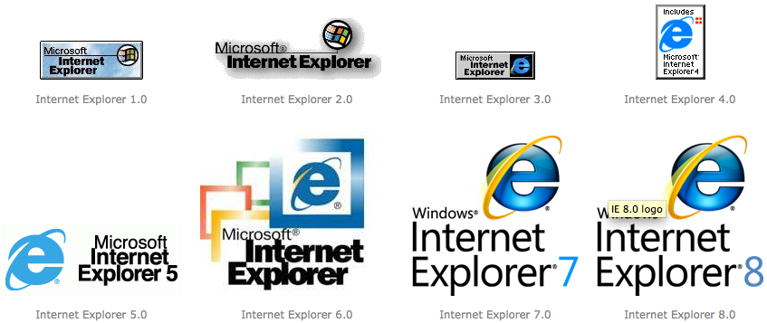
The logo itself, that blue "e", is the subject of a blog post on the IEBlog. First, a quick review of the evolution of the IE logos over the years:
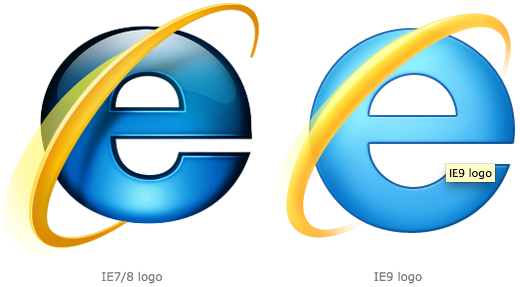
For the transition from the logo used in IE7 and IE8, Microsoft has ditched the Helvetica font and has made its own custom one for a more lightweight letter.
"First, we defined a shape for the e that focused on clarity and legibility: a true circle. Then we examined the details of the e. By reducing the contrast in stroke weight, we made it appear much lighter weight than the previous logo. The updated logo has more open negative space (counters) that maintain their presence at small sizes. The counters in the previous logo were very closed and disappeared at small scale. With no obvious horizontal or vertical variation in the character, the fluidity of the form is emphasized. The result is a simple, more open letterform."
Microsoft also changed the orbiting ring for a tighter look.
"We also updated the orbiter. To make it feel more alive, a small amount of transparency was added, and the stroke contrast and size of the shadow were decreased. Whereas the IE7/8 orbiter stops short of connecting to the e on the upper right side, the updated orbiter makes a full, more continuous connection. The updated orbiter is proportionally smaller when compared to the e than was its predecessor. These new proportions give more emphasis to the e, and give the logo a stronger presence."
Get Tom's Hardware's best news and in-depth reviews, straight to your inbox.
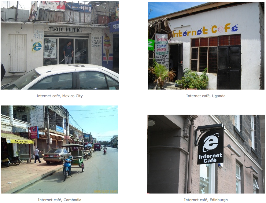
Evolving a logo is nothing new. Even Firefox went through a similar change. The IE logo, however, may be a bit more important since it's iconic in its representation of internet services, such as at internet cafes.
Tell us what you think of the new logo that you might be clicking on often (if it's your browser of choice).
-
nforce4max OH yea lets change the logo and leave the code the same so people think they are getting something else when it is all the same. -.-Reply -
ricardok I've IE9 beta installed, but that's all I have. Firefox 4 beta6 installed and in use here.Reply -
Ragnar-Kon nforce4maxOH yea lets change the logo and leave the code the same so people think they are getting something else when it is all the same. -.-So I definitely not an IE fan, but the code is MUCH different than IE7/8. Same rendering engine maybe, but much improved code.Reply -
Ragnar-Kon noname0000000000000000001Instead, it should look like a compass...Safari already stole that one =pReply
-
neoverdugo No matter what or how many "badge", "skin" or "suit" MS changes its IE software; as long that the programming code or any other critical functional system are not optimized, upgraded or changed for the best, a garbage will always be garbage.Reply


