Core i7-2600K Overclocked: Speed Meets Efficiency
Most of Intel's Core i5 and i7 CPUs lock out overclocking enthusiasts, which we hate. But the K-series chips win us back over with insane scalability. Would you believe that cranking the dial on performance doesn't necessarily tank overall efficiency?
Get Tom's Hardware's best news and in-depth reviews, straight to your inbox.
You are now subscribed
Your newsletter sign-up was successful
Overall Overclocked Power Efficiency
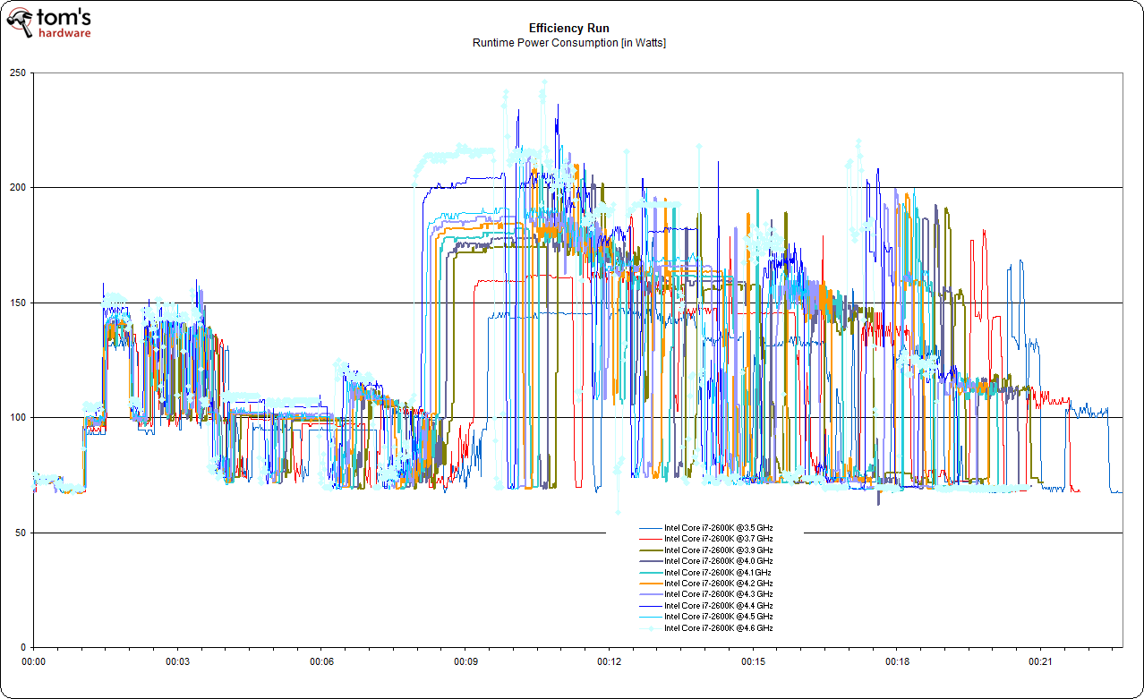
The efficiency diagram shows the specific power consumption at every moment of the efficiency workload, which includes all the applications listed on the benchmark setup page. You can also see that some setups complete the workload earlier.
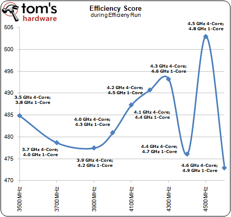
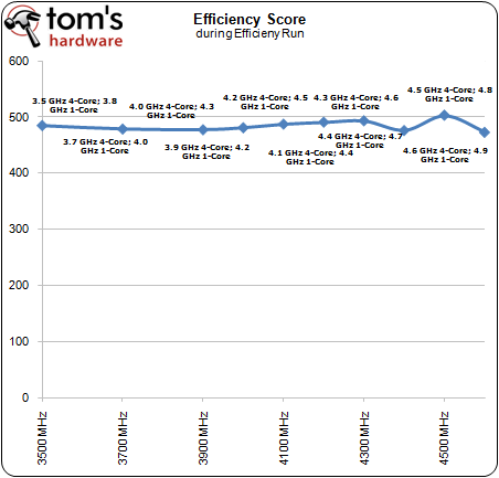
This is the efficiency chart for each of the clock speed settings we used. Overall efficiency decreases slightly as we add clock speed, but it increases again at 4+ GHz. Be aware that we used a distorted scale to be able to look at the differences in detail. If we have the chart display the full scale starting with zero, you’ll get this:
This is really impressive. The efficiency score is a calculated index that relates performance to consumed power in watt-hours. It is very obvious that the Sandy Bridge architecture, represented by a Core i7-2600K, is almost equally efficient at different clock speeds, which means that performance scales extremely well as you crank up clock speeds. The results would only start to fluctuate once we start to crank up the voltage a bit towards the top end of the clock speed testing range.
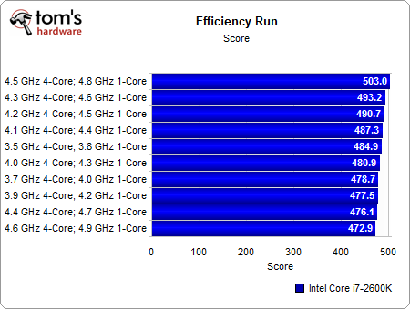
Article continues belowThese are the scores in bar chart format.
Get Tom's Hardware's best news and in-depth reviews, straight to your inbox.
Current page: Overall Overclocked Power Efficiency
Prev Page Combined Single/Multi-Thread Efficiency Next Page Conclusion: Overclocking Becomes Efficient


