Microsoft Unveils a Brand New Windows Logo
A window for Windows, of course!
Get Tom's Hardware's best news and in-depth reviews, straight to your inbox.
You are now subscribed
Your newsletter sign-up was successful
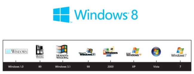
Windows 8's Metro UI is a pretty dramatic departure from what most Windows users are used to. In light of this, Microsoft has seen fit to redesign the Windows logo we've all come to know and love. The company unveiled the new logo via the Windows Team Blog late on Friday afternoon. Have a look at the brand new logo, as well as a timeline of Windows logos, below:
Microsoft's Sam Moreau explains that over the years, and as the operating system evolved from Windows 1.0 to Windows Vista and Windows 7, the Windows logo had evolved from a simple window to a waving flag. However, Microsoft is eager to take Windows back to the logo that started it all.
" [...] if you look back to the origins of the logo you see that it really was meant to be a window," Sam says. "'Windows' really is a beautiful metaphor for computing and with the new logo we wanted to celebrate the idea of a window, in perspective."
Article continues belowSo really, Microsoft hasn't done much in the way of re-designing so much as return to the old concept of a window to represent Windows. Obviously it's got a very Windows 8/Windows Phone 7 feel to it, but what's got us most excited is the fact that this likely means 'Windows 8' isn't just a codename. Microsoft hasn't ever confirmed that Windows 8 will be what the next version of Windows will be called, but it's hard to imagine the company unveiling a new logo featuring the Windows 8 name if it's not the official title.
Get Tom's Hardware's best news and in-depth reviews, straight to your inbox.

Jane McEntegart is a writer, editor, and marketing communications professional with 17 years of experience in the technology industry. She has written about a wide range of technology topics, including smartphones, tablets, and game consoles. Her articles have been published in Tom's Guide, Tom's Hardware, MobileSyrup, and Edge Up.
-
icepick314 looks like MS lifted that logo from a construction or vinyl replacement window company...Reply -
builder4 I have a feeling this design will look extremely dated in only a couple of years. This fad of requiring simplicity and clean lines won't last forever.Reply -
alidan SteelCity1981Micrsoft "We mess with things that already works fine"the saddest true thing i read all day... they changed an icon, into the most generic thing they possible could.Reply -
freggo Mercedes Star....3 points in a circle for 100+ yearsReply
BMW Logo white and Blue
Ford.... F O R D
Microcrap changes Logo -yet again- and this is worth a 2nd article?
Slow new day I guess ?
