Windows 11 Preview Hands-On: Much Ado About Menus
Windows 11 looks fresh, but often prioritizes form over function.
Get Tom's Hardware's best news and in-depth reviews, straight to your inbox.
You are now subscribed
Your newsletter sign-up was successful
It’s finally here! Microsoft has just released its first official Windows 11 preview build to Windows Insiders (the leaked build from a couple of weeks ago doesn’t count). I’m in the Dev ring of the Insider program via my laptop -- a ThinkPad X1 Carbon with 8th Gen Core i7, 16GB and 512GB SSD that easily meets the system requirements-- so I got the update today and have been using it for a couple of hours.
So far, the UI looks and feels pretty much as shown during Microsoft’s Windows 11 launch event, though some of the most interesting new features aren’t present yet, namely Android app support and Microsoft Teams integration. The system seems to function competently, doing what it promises, though as a long-time WIndows 10 user, I found some of the UI changes jarring to my workflow as menus become less information dense. There are definite positives for power users -- the snap features come to mind -- but also a lot of areas where you seemingly have to click more to get to the functions you need.
Installing Windows 11
If you’re already in the Windows Insider program in either the Dev or Beta rings, Windows 11 will be available in your Settings->Update and Security->Windows Insider Program menu. From there, you click the Download button and wait . . . .and wait for it to download and install.
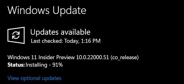
Article continues belowThe downloading portion took only about 20 minutes but the installation itself got stuck at 91 percent for the better part of an hour before it finally crept up to 100 percent. The laptop then asked me to reboot, took a couple more minutes setting up and was done.
Taskbar and Start Menu on Windows 11
The first thing you’ll notice about Windows 11, besides the flowery wallpaper, is the fact that the taskbar icons are all centered, including the Start button. You can change this in settings and have the icons and menu align to the left, but Microsoft clearly wants you to see it as “front and center.” The default taskbar icons -- for me anyway -- were the Start button, Search, Task View, Widgets and File Explorer. The store icon was not pinned by default, but that could be because I have unpinned it in Windows 10.
Compared with its Windows 10 predecessor, the Start Menu is both more prominent and less exciting at the same time. There are no flashy tiles and all the icons look rather plain. I haven’t taken a screenshot on the same computer and measured the pixels to be certain (and now it’s too late), but it looks like the new Start menu is far less information dense than the prior one. There’s more white space and it takes up more prominent screen real estate when opened. As someone who’s all about productivity and usually knows what apps I want, I like a tighter, less-obtrusive menu that makes it easy to launch my program and move on, without covering too much of my workspace.
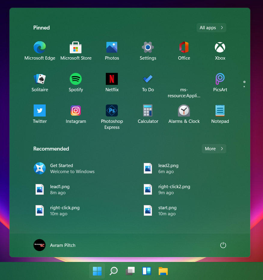
The top area of the Start Menu shows you a series of pinned apps and, on my machine, these appear to be a standard set of apps Microsoft wants you to try . . . aka a lot of crapware. My pinned list includes Edge, the Microsoft Store and icons to install Solitaire, Office, Twitter, Instagram, Photoshop Express and Picsart. All told there 18 pre-pinned apps visible (another 6 if you scroll) and only about half of them were built-in Windows utilities like Calculator and Settings.
Get Tom's Hardware's best news and in-depth reviews, straight to your inbox.
If you want to see all of your apps, you can click a button that makes the menu show “All apps,” which is an alphabetical list of all of your programs. On Windows 10, you got this just by scrolling down, which feels much more effortless. Again, the design philosophy seems to be that less is more.
The “Recommended” section of Start is more useful as it has six icons for documents you’ve opened recently. This is also supposed to sync and show documents you’ve opened on other devices, but so far, that has not happened for me. One of the icons is Get Started, which gives you a very brief tour of a few of Windows 11’s features, namely it’s ability to sync files with OneDrive (not a unique feature) and manage your Android phone (also not a new feature).
Crapware Installs on Click, With No Confirmation
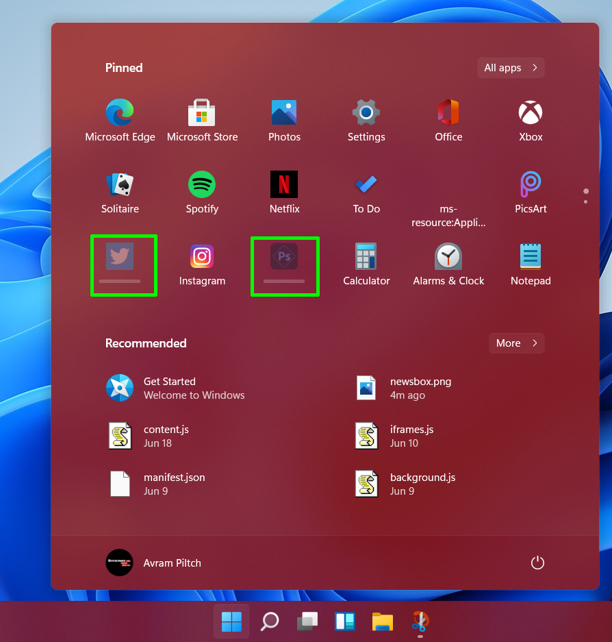
One huge and unwelcome change in the crapware is that, when you click the icon of an uninstalled app, Windows 11 doesn’t take you to the Microsoft Store page for it and give you a description with the option to install. Instead, you see a status bar below the icon as it downloads and then you get a notification telling you the app has been installed and giving you a button to launch it. For some that may be a convenience and for Microsoft it certainly helps with install numbers, but it’s also rude.
For example, I saw the Twitter icon on my list and wondered “is this new to me or do I already have it installed.” So I clicked on it, expecting to either have my app open or be transported to the Store. Instead, it just started downloading itself without giving me a chance to decline. The same thing happened with Photoshop Express.
Search in Windows 11: Who Moved My Box?
Of all the changes in Windows 11, the one I dislike most is how Search has changed from a box on the taskbar into a separate app that must be launched. It might be an odd habit, but I often launch apps in Windows 10 by going to the search box and typing the first few letters of their name so I can hit Enter to launch the top result (ex: typing “not” gets me Notepad++).
In Windows 11, you must first click the search magnifying glass or hit Win + S and start typing. As with the Start menu, search is a large window that sits in the middle of the screen and has lots of space between the icons. Functionality-wise, it’s not really any different than Windows 10 search as it combines results from your own computer with web search (from Bing) as needed. Perhaps the difference between clicking a text box on the taskbar and clicking an icon on the taskbar to search your stuff is immaterial, but it just feels less integrated into the workflow this way.
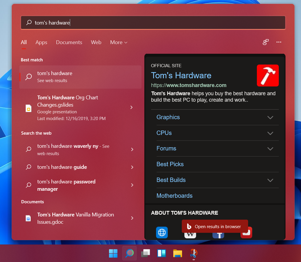
The less-dense, more-intrusive Start Menu and Search menu on WIndows 11 remind me a bit of what happened when Microsoft moved from Windows 7 to Windows 8. Windows 8 sparked outrage because the beloved Start Menu was replaced by a Start screen. In effect, you were still clicking a button and getting a list of app icons (or tiles) so, in theory, the difference shouldn’t have mattered. But many people, including me, hated the Start Screen because it took up the whole desktop and distracted you from your work. While the new menus in Windows 11 don’t go that far, they are designed to make everyday functions like launching apps more flashy, which is good for people who just want to browse around, but distracting for those who already know what they’re looking for.
Right-Click Menu in Windows 11: An Abomination
For some odd reason, Microsoft decided that having the standard, helpful right-click context menu we’ve had for years is too much for regular people to handle. So now, when you right click on the desktop or an icon, you get a menu with a larger font, a maximum of seven choices, which often but doesn’t always exclude third-party or non-default options like “Back up to Dropbox.”
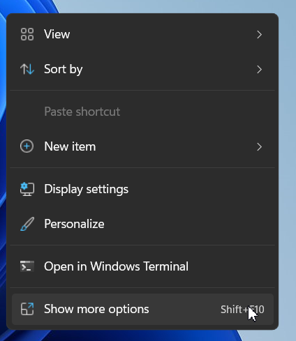
If you want to see your full context menu with all possible options and a normal-sized font, you can choose “Show More Options” and then you’ll see it. I understand why Microsoft wants to do this; it’s trying to make life easier by offering fewer choices, but the end result is just more forcing you to click more in order to perform some of the same tasks.
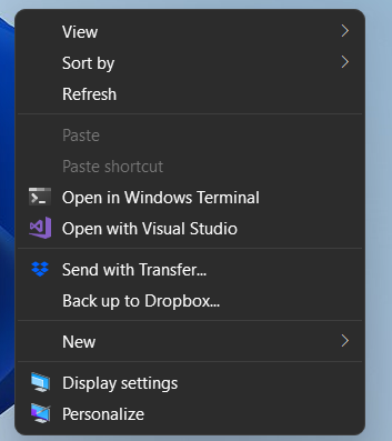
There's a small exception to this rule, which is that if you right click on a taskbar icon, you get a longer context menu like you did in Windows 10. For example, right clicking on the taskbar icon for Photoshop Elements 14, which had several pictures open, showed me a context menu with items for every picture.
One improvement: If you right click within a folder in File Explorer, you have an option to “Open in Windows Terminal” which will give you a Powershell window that is set to exactly that directory.
Snap Groups / Snap Layouts: A Big Improvement
The Windows 11 features I’m most excited about are the new ways the OS handles window snapping. When you hover over the maximize button in each window, you’re given a menu with a series of layout choices that will let you snap it either to one half of the screen, about 60 percent of the screen with another app taking the other 40, half of the screen with two apps taking up 25 percent each or in even quarters.
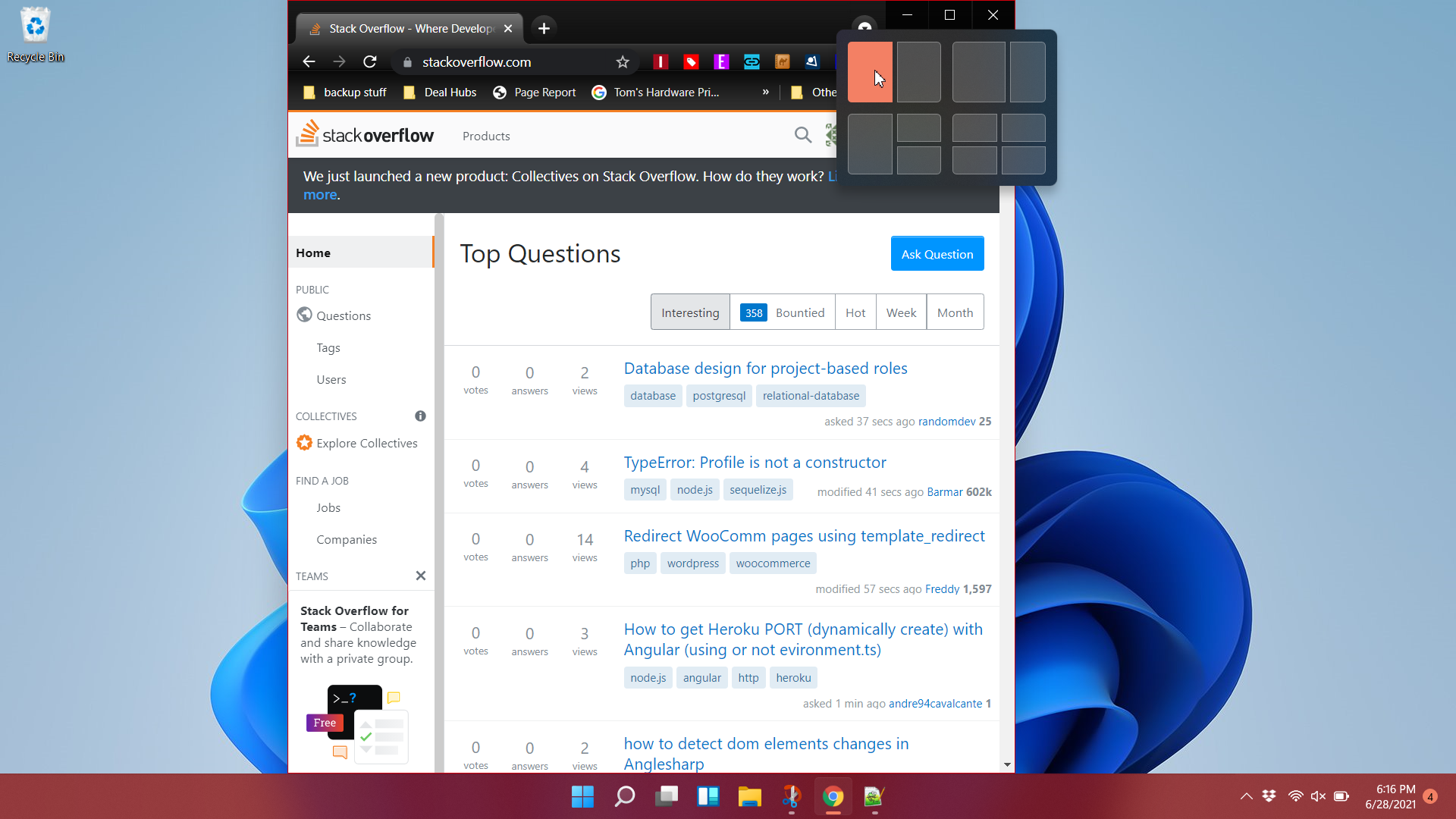
Interestingly, I found that the Snap Layouts menu did not appear on every application window I tried. It didn’t show up at all on Photoshop Elements 14, which has a somewhat atypical menu aesthetic, or on my favorite screenshot utility, PicPick.
Once you have a couple of apps snapped next to each other, Windows 11 automatically considers them to be a Snap Group that you can restore from the taskbar if needed. So if, for example, you suddenly have to open Spotify to skip an unwanted song or open Outlook to respond to an email, you can find the Snap group on the taskbar and click it to get that layout back (provided you didn’t move or close those windows).
The Snap groups don’t get their own icons on the taskbar but are instead available in the hover menus of any apps that are within that group. So, for example, I had Microsoft Edge and Notepad++ snapped next to each other and their groups were shown when I hovered over with the Edge or the Notepad++ taskbar icons.
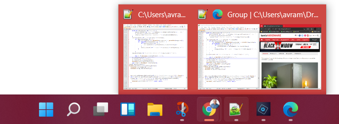
Microsoft also says that Windows 11 will automatically minimize groups of windows that are on an external monitor when you are docked and then undock your laptop. I didn’t have a chance to try this but it seems like a great convenience.
Windows Widgets: A Waste of Time
Since time immemorial or at least since Windows Vista, Microsoft has been trying to find new and exciting ways to show you the news and weather in little tiles, blocks or widgets. In Vista, it was Sidebar and in Windows 8 and for some part of Window 10’s lifecycle it was live tiles. More recently, Windows 10 added a news and weather button to the right side of the taskbar and I like it, because you can see the temperature right there next to the system tray, without clicking on anything.
In Windows 11, there’s a Window Widgets button that opens a translucent sidebar that shoots in from the left side and has little boxes showing different types of news, weather, stocks and sports scores. By default, my sidebar had a lot of content I couldn’t care less about, including values from stocks I don’t own, scores from leagues I don’t follow and plenty of useless celebrity news. At least my local weather was in the upper left corner. I will give Microsoft props, though, for surfacing a story from ZDNet that’s critical of Windows 11.
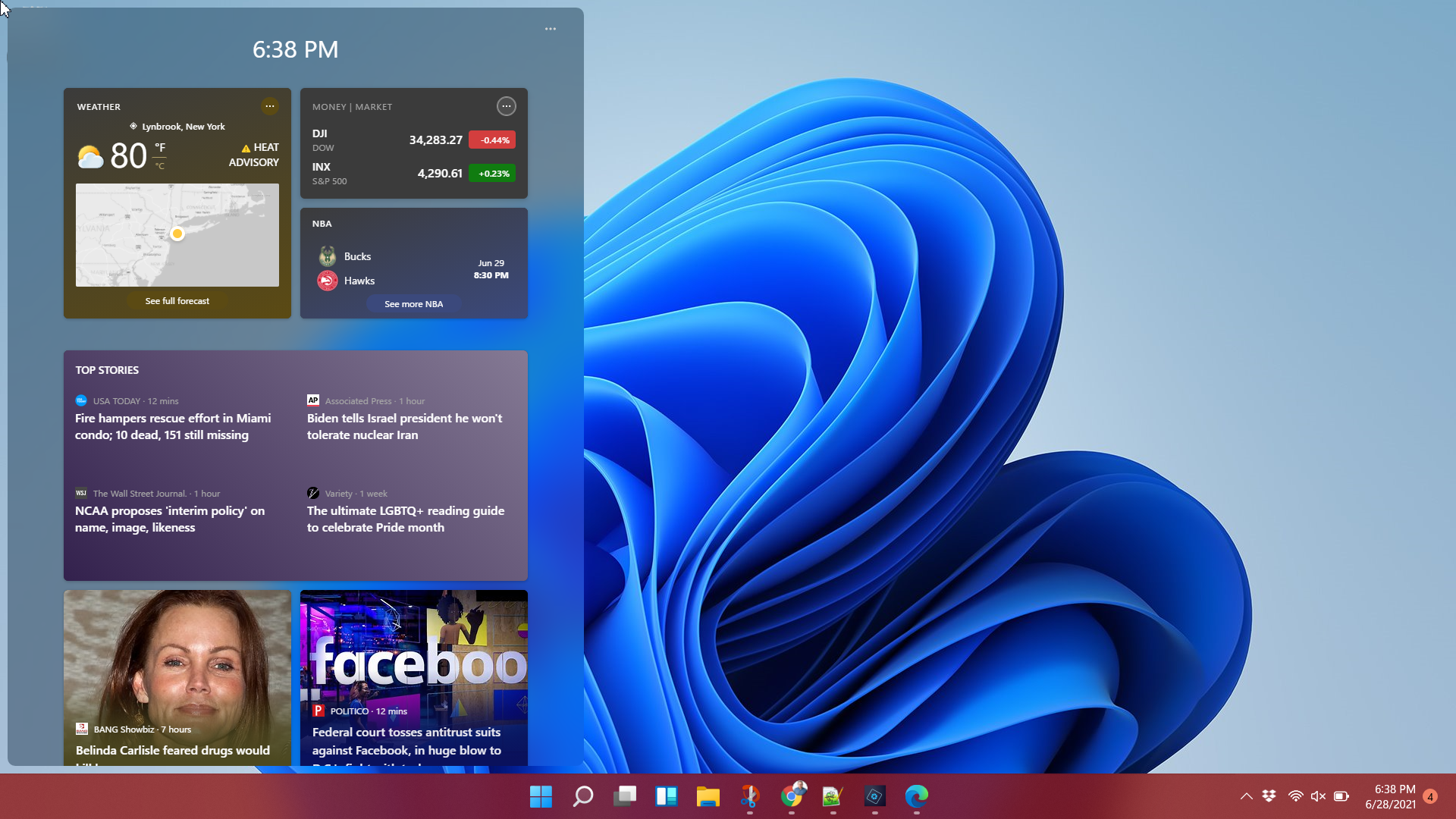
Sadly, the Window Widgets UI doesn’t give you a lot of ability to customize its layout right now. Some of the widgets have a little X in the corner when you hover over them and clicking it lets you hide that story. However, you don’t have that option for the weather, stock ticker, NBA scores or overall top headlines. You can’t drag and drop the widgets either, which would be helpful if you wanted to put something more important to you on top.
There is a little hamburger menu in the upper right corner of the Window Widgets sidebar where you click to “manage interests.” This opens a browser window that takes you to a tool on the MSN website where you can add interests or remove cards. However, even several minutes after I’d added new interests and removed the stock ticker card, nothing had changed. Perhaps it will eventually, but to be honest, this little sidebar is no more useful than navigating to the home page of any portal like MSN.
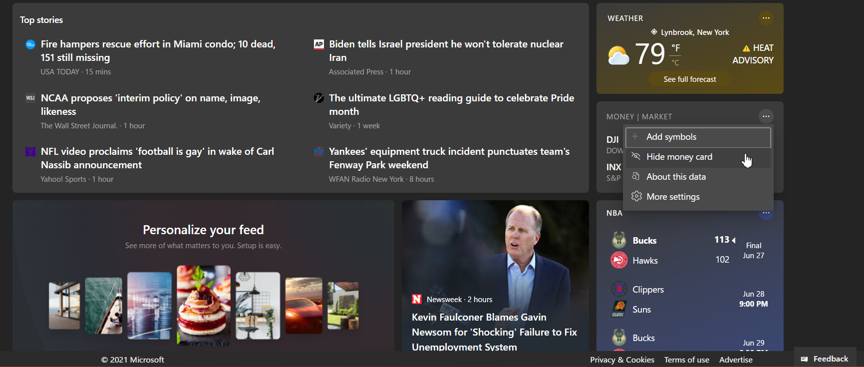
Having the weather on the taskbar in Windows 10 is an actual convenience, because it’s there in your face at all times, no clicking required. Opening a separate taskbar to get the same information, along with lots of unnecessary headlines, is just a waste of time. It has a nice translucence effect, though.
One huge annoyance is that closing the sidebar isn’t intuitive. If you click the Window Widgets taskbar icon after the sidebar is already open, nothing happens, even though you might reasonably expect it to toggle the bar off. However, clicking to an empty area of the desktop or focusing on a new window makes it go away.
Virtual Desktops: You Can Now Change the Look
If you like virtual desktops, there’s good news in Windows 11. You can now change the look and feel of different desktops, going so far as to give them different wallpapers and contrast settings. This can definitely be helpful if you are organized enough to really keep your different task groups (ex: work, home, play) separated, without losing track of your windows.
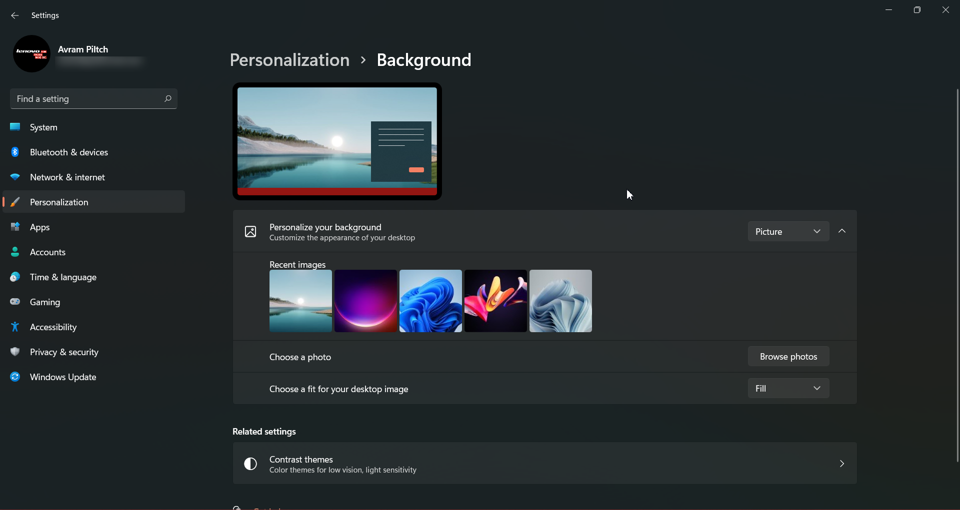
The menu for switching among virtual desktops, creating them and customizing them is a definite improvement. Instead of going into the Timeline menu -- Timeline itself is gone from Windows 11 -- it’s part of the Task View and the icons for each virtual desktop are on the bottom of the screen, close to the taskbar, instead of on the top as in Windows 10. Right clicking any of these icons takes you to a settings menu that lets you change its background.

UI Odds and Ends
Windows have rounded corners. This is a nice touch and a bit of modernization, but I don’t think this is going to be a make or break feature for anyone.
In the spirit of hiding information to make your choices simpler, you can no longer launch the Task Manager by right clicking the taskbar and choosing it as an option. In fact, the only option you get when you right click the taskbar is the taskbar settings menu. To get Task Manager, you must either hit the Windows + X menu or hit CTRL + ALT + Delete and choose it from there.

Snapiness: Well, It’s Early
We are not going to benchmark Windows 11 as this is an early beta and it just isn’t fair or accurate to judge performance at this point. What I can say is that, if you were planning to use Windows 11 preview as your daily driver OS right now, you may see some performance degradation. It almost goes without saying that that is a risk with any beta OS.
However, I can say that I have been running Windows 10 Insider builds on my ThinkPad for a long time and, even when I had an occasional bug, the OS was always snappy. However, with the Windows 11 Preview, a lot of simple tasks were sluggish. Launching first-party apps such as File Explorer, Calculator and Task Manager sometimes caused noticeable delays, even though they appeared almost instantaneously on the prior operating system.
The Task Manager and Device Manager were particularly sluggish. In the case of the Device Manager, the window appeared but showed a white box for a few seconds before filling in with the information.
Bottom Line
It’s early days and this is the first preview of Windows 11 so we should not take the lack of responsiveness I’ve experienced as indicative of the final product. We also haven’t seen the new Microsoft Store, the Microsoft Teams integration or the ability to run Android apps, all of which are key features. We also can’t tell how much more secure Windows 11 is than 10 and we know that security is supposed to be a major selling point so much so that millions of users who don’t have TPM will be shut out of Windows 11.
However, some of the current UI features like the Start Menu, context menus, search box and Window Widgets seem to prioritize form over function. There’s less information in a larger space and potentially more clicking to get to the feature you need. By hiding the search box, putting fewer icons on the first page of the Start Menu and burying lots of context menu options (including burying the Task Manager), Microsoft may be helping people who get confused by too many choices, but it’s making others work harder.
Avram Piltch is Managing Editor: Special Projects. When he's not playing with the latest gadgets at work or putting on VR helmets at trade shows, you'll find him rooting his phone, taking apart his PC, or coding plugins. With his technical knowledge and passion for testing, Avram developed many real-world benchmarks, including our laptop battery test.
-
nimbulan You do realize you don't need to click in a search box to search, right? Just press the Windows key and start typing - like it's always been since they introduced the functionality in Vista.Reply -
Matt_ogu812 I'm happy my pc will not be able to run Windows 11 because of no TPM.Reply
The thing to watch for is if Win10 more vulnerable to future attacks to poke and prod you to upgrade to Windows 11.
There are no such things as ethics when it comes to $. -
dimar Will MS force users to use Windows Toxic with DirectX 13? I wonder if it's just better to wait for Windows 12 Back to Normal Edition.Reply
update: so apparently DirectStorage is win11 exclusive?
If they keep Pro version with normal functionality, and Home version "dumbed down+", I'm ok with it. -
drtweak Reply
HAHA Windows 12 Back to Normal Edition. I bet it will. Seems like every other one is an experiment.dimar said:Will MS force users to use Windows Toxic with DirectX 13? I wonder if it's just better to wait for Windows 12 Back to Normal Edition. -
Giroro "In Windows 11, you must first click the search magnifying glass or hit Win + S and start typing. "Reply
Can you not just start typing after pressing only the Windows key? That one change alone would make me avoid the OS like the plague because its how I open apps and files 90% of the time. I don't want to have to add that extra key 100 times a day.
"Functionality-wise, it’s not really any different than Windows 10 search as it combines results from your own computer with web search (from Bing) as needed."
Can the web search be disabled? That's the first thing I do in Windows 10 (well, second after privacy ) because the bing results slow down the search by a LOT and they block me from my files/apps.
Even when the first screenshots came out, I called this as being a slower OS. More clicks, more bloat, more animations, less information. Form over function. So far, it seems like I was right. The worst parts of Windows 10, except moreso.
This is a team who has been trying to get rid of the control panel for 5 years, but still can't figure out how to design a functional settings menu to replace it. Its hopeless; a major step backwards.
The only thing that they've learned since Windows 8 is that the start menu shouldn't hide the taskbar. But.. They still thought that was a good idea in the first place. -
Giroro ReplyMatt_ogu812 said:I'm happy my pc will not be able to run Windows 11 because of no TPM.
The thing to watch for is if Win10 more vulnerable to future attacks to poke and prod you to upgrade to Windows 11.
There are no such things as ethics when it comes to $.
I'm probably going to disable my TPM. I don't want to wake up to find my computer installing windows 11 as an automatic update, which they almost certainly are going to do at some point. -
TCA_ChinChin This change feels just like a skin. Literally everything is still just as dysfunctional as before, it just looks different. Not even better, just different. It feels like downloading a different android launcher for android phones but this time, for a desktop OS.Reply -
Kamen Rider Blade I hate the fact that every Windows UI change in every Version of Windows is done by some idiot PM who skews whatever Focus Group results he needs to get to justify his BS UI change.Reply
My god, if it "Ain't Broke, don't fix it!".
It's not hard to get the Start Menu implemented correctly or design a useful UI.
And stop trying to dumb <Mod Edit> down and make things harder for Power Users. -
ingtar33 well looks like microsoft can't stop it's every other version of windows being completely trash cadence. Not that win10 was a masterpeice, mostly a sidegrade from win7... but compared to vista and win8 both of those are excellent (to say nothing for the me vs xp comparison).Reply
this looks like a tablet OS forced onto the desktop. and they are further integrating bing and teams into this monstrosity? no thank you. they're going to force me back to linux at this pace. -
excalibur1814 Please all remember that... IT'S FREE!! It's FREE. No-one is FORCING anyone to install the OS.Reply
P.s. Remove the ticks from animations in the ye-olde Performance options:
-Animate Controls and elements inside windows
-Animate Windows when...
-Animations in the taskbar
-Fade x3
-Slide open combo boxes
Let's hope that the person installing Windows 11 gave it enough time to index and mess with dotnet libraries. Or whatever it does. After that, it should be nice and fast.
