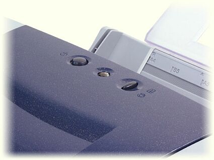
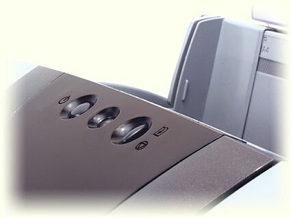
Alternatives to HP: Canon S520 and S750
Get Tom's Hardware's best news and in-depth reviews, straight to your inbox.
You are now subscribed
Your newsletter sign-up was successful
Quality Results
There is no way to tell an S520 print from an S750 one. They are exactly the same. Text characters are neat, and compound documents quite clean enough to be used for business purposes. Still, although it does I requires an expert eye to tell the difference, HP holds the advantage. This is most noticeable in graphics where the blocks of color and gray are more even and text on a colored background comes out perfectly clear, whereas they are a bit fuzzy with Canon. On the S520 and S750, background colors run slightly into foreground objects and reduce the legibility of the smallest characters.
In photo mode, which is in top resolution, we had to run a little informal survey (not representative at all) to find the winning competitor. With the makers' names hidden, everyone examined the S520 and Deskjet 5550 prints in turn before expressing an opinion. Four out of the seven editorial staff preferred the Canon photo prints, and three preferred the HP. But everyone agreed that the HP photos had more contrast, appearing more like proper photo prints, and that the ink drops on the Canon prints were more visible. They also agreed that you really had to look very closely to reach these conclusions. Seen from 12 inches, it was hard to distinguish between them, so the overall result is a tie.
But, it must be remembered that the HP photos were printed using a standard cartridge set of three colors plus black. With a photo cartridge, the HP prints are unquestionably better. The ink drops are invisible, the colors truer, etc.
The Score
Canon, 2 - HP, 1
Get Tom's Hardware's best news and in-depth reviews, straight to your inbox.

