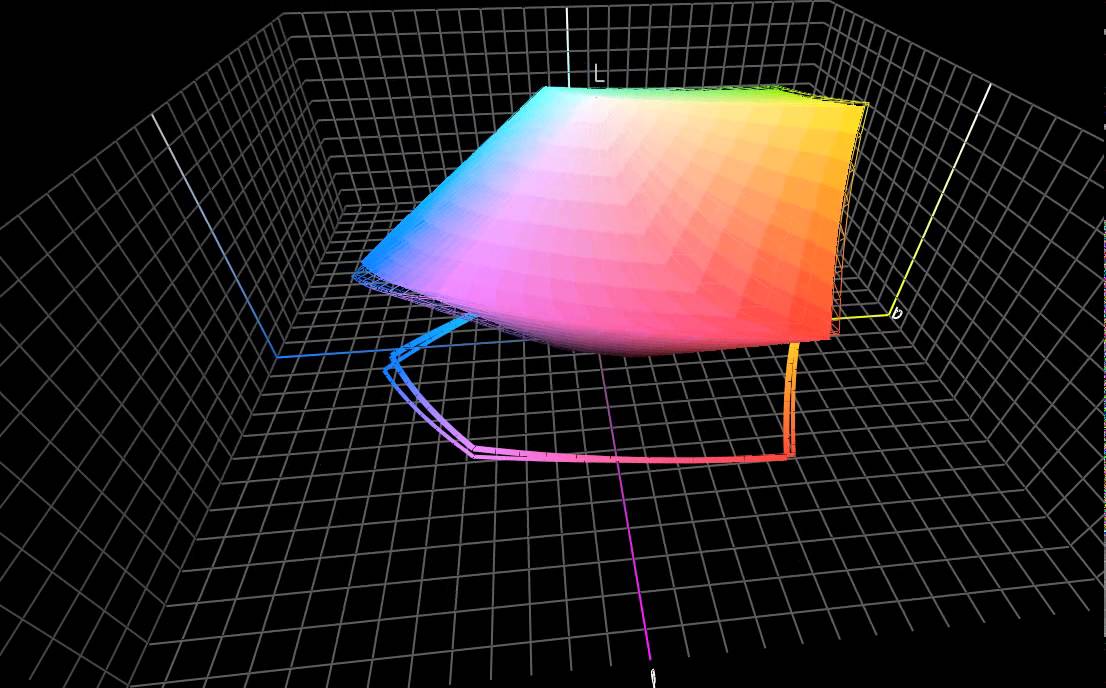
Display Quality: Color Gamut
Gaming is only good when you have a good LCD to match, but that also holds true for anything you do on a tablet. I don’t like to rely on subjective opinions in order to evaluate the quality of a display, but there is almost no way to benchmark the Xoom's VA panel. On the desktop, we have programs like CalMan and ColorEyes to test a monitor’s performance, but these programs don’t work on mobile operating systems. Even if they did work, Android doesn’t honor ICC profiles.
No program currently exists to test the performance of a tablet's LCD panel, which is why I spent a few weeks last month creating a custom program. The whole process is a little complex, but briefly, I’m measuring the color gamut at the display’s native settings (native gamma and white point) with a Spectracal NIST-certified i1Pro.


Even though mobile operating systems don't honor ICC color profiles, native color management does occur at the hardware level. When a GPU sends 10 different hues of blue to an LCD only capable of displaying three, the subpixels will display the closest matching color. So in a way, smartphones and tablets behave as if they’re using relative colorimetric rendering (for more information, read Tom's Hardware Benchmarks Inkjet Printer Paper!).
Tablets seem to offer similar performance as cheaper TN-based LCD monitors. That was an unexpected conclusion from our iPad 2 review. Yet, the Xoom delivers even less color quality than the iPad 2. It's close, but you lose noticeable highlights in primary colors. Secondary color performance is more similar, but you still sacrifice a lot of detail in yellow highlights.


Understand that these gamut measurements bear a few assumptions. First, we're disabling dynamic brightness because it doesn’t facilitate an accurate (or reproducible) measurement of the display’s potential. Second, brightness is set to the highest value. If you don't use the same settings, your color gamut is going to look smaller than what we're showing here.


The Xoom has a slightly better contrast ratio thanks to deeper blacks, but that doesn't translate to better performance. The color temperature is a little too cool, resulting in a bluish white, while the low gamma distorts color perception. Understand that gamma doesn't affect black or white performance, but it does affect midtones. If gamma is set too high, they appear too dark. If it's set too low, midtones appear too pale.
Adobe, Apple, and Microsoft all recommend a gamma of 2.2. It's an arbitrary value carried over from the NTSC standard, but it was originally chosen because it allows colors to appear more natural in slightly dim environments. The Xoom's lower gamma value suggests that it's best used in a completely dark environment. Apple sets the gamma on the iPads much closer to 2.2, which is why colors appear less washed-out when you're outdoors and in well-lit spaces.


The Xoom uses a 1280x800 VA panel with 150 PPI (pixels per inch). That's slightly better than the 1024x768 IPS panel on both iPads (132 PPI). However, under the microscope, we get a slightly different story. The square pixels found in the iPads help achieve good detail, regardless of orientation. The pixel in Xoom’s AUO panel is slightly more rectangular, which means that you get more image detail in landscape mode.