Motorola Xoom: The First Android 3.1 (Honeycomb) Tablet
Get Tom's Hardware's best news and in-depth reviews, straight to your inbox.
You are now subscribed
Your newsletter sign-up was successful
Motorola Xoom: The First Android Tablet
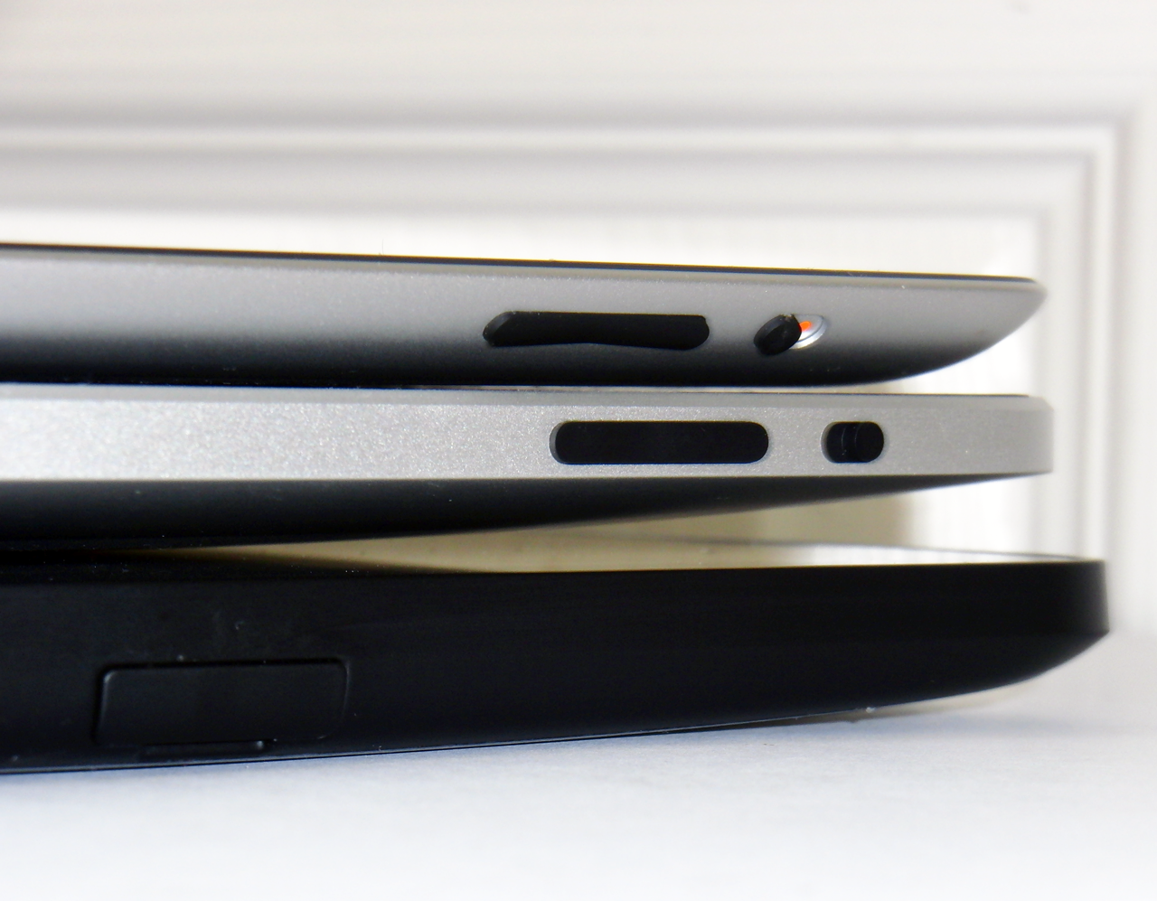
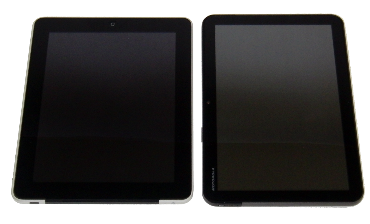
The Xoom is nowhere near as thin or light as the iPad 2, but perhaps that's to be expected from a first-generation Android-based tablet. Apple’s already at work designing its third-generation iPad, so the Xoom’s physical size comes across as a disappointment.
| Header Cell - Column 0 | iPad (3G) | iPad 2 (3G) | Xoom |
|---|---|---|---|
| Length | 9.56" | 9.5" | 9.8" |
| Width | 7.47" | 7.31" | 6.6" |
| Height | .5" | .34" | 0.5" |
| Screen Size | 9.7" | 9.7" | 10.1" |
| Aspect Ratio | 4:03 | 4:03 | 16:10 |
| Weight | 1.6 lb. | 1.33 lb. | 1.5 lb. |
Compared to Apple's hardware design, the most obvious physical difference is Motorola’s use of a wide (16:10) aspect ratio panel, which is naturally narrower than the iPad's 4:3 screen with a 1024x768 resolution. As a result, you’re going to find yourself holding the Xoom mostly in landscape mode.
As its name not-so-subtly suggests, Apple is going for the pad of paper approach, which is why it sticks to a standard (4:3) aspect ratio. It’s possible to use the Xoom in portrait mode, but we find it to be a slightly awkward experience. You lose a lot of horizontal workspace. Think about flipping your widescreen monitor 90 degrees for a sense of what we're talking about.
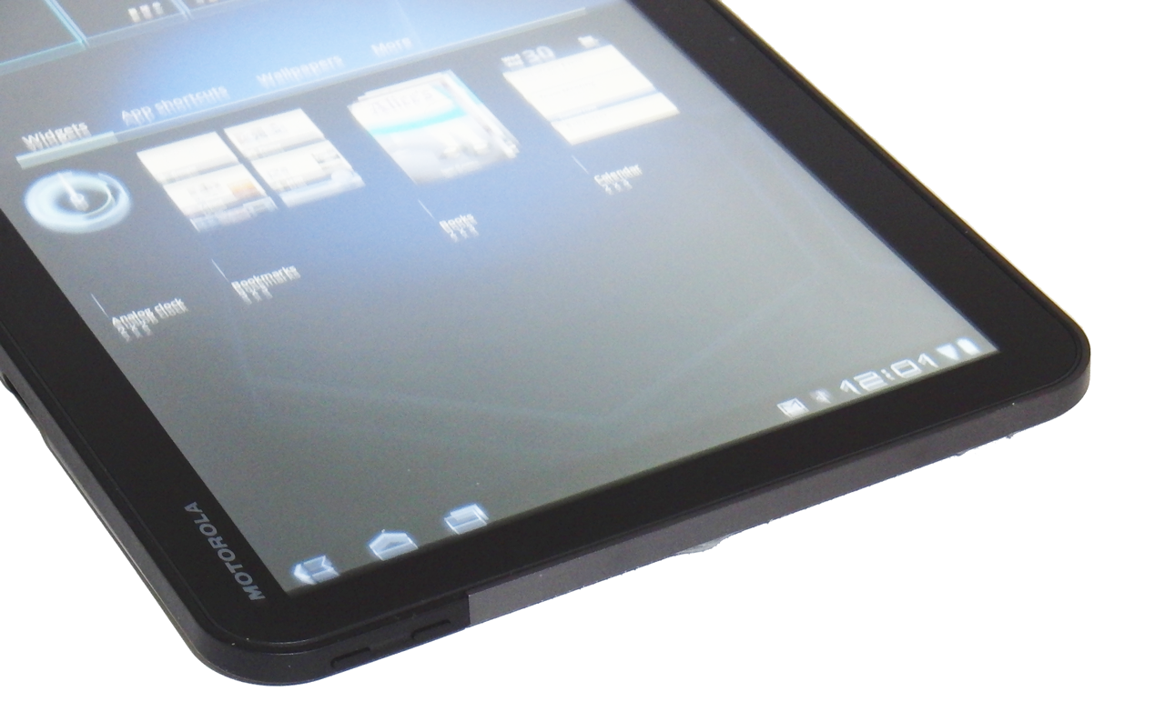
Article continues belowThe physical layout of the Xoom lends itself to use in landscape mode anyway. For example, if you hold the tablet with two hands, you’ll find the volume controls located on the left side. Unfortunately, the buttons are so small that there’s almost no tactile feedback. The benefit is that you don’t have to worry about accidentally increasing (or decreasing volume). But bigger buttons with higher depression resistance would have solved that problem, while still letting you increase the volume without using fingertips.
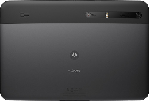
Motorola has a good eye for aesthetics, but it doesn’t have Apple's industrial design accolades. For the first time though, the Xoom looks and feels like a tablet that I don’t have to coddle. On the back-side, the black portion of the Xoom is made of rubberized plastic, while the grey larger grey portion is made of brushed aluminum. Both areas have excellent finishes. If you drag the Xoom across a table, you don’t hear the noise of particles grinding against its surface. Better yet, I don’t even see a single scratch after a full week of use.
| Camera | iPad 2 | Xoom |
|---|---|---|
| Front-Facing | 0.3 MP (640x480) | 2.0 MP (1600 x 1200) |
| Rear-Facing | 0.7 MP (960x720) | 5.0 MP (2592 x 1944) |
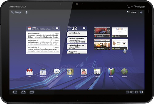
While the front of the Xoom is equipped with a 2.0 MP camera, the back-side sports a more generous 5.0 MP camera with a dual-LED flash. That’s a substantial benefit compared to the <1.0 MP cameras on the iPad 2 (more on that in a bit). Two stereo speakers next to the rear camera lens are supposed to offer better audio performance than the iPad's mono speaker, but they're weak to be of any practical use other than the generic audio notifications. If you plan to watch a movie or listen to music, use the audio port on top of the tablet to connect a pair of headphones.
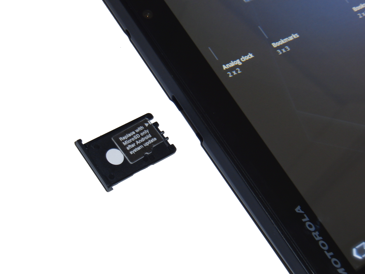
The Xoom comes with a microSD slot, but this remains unsupported, even with the new Android 3.1 update. Hopefully, Motorola enables this feature soon. I like the idea of a single tablet model with the option to upgrade capacity later, but the company seems to be dragging its feet supporting expandable memory, even though other Android-based tablets don’t suffer this limitation.
Get Tom's Hardware's best news and in-depth reviews, straight to your inbox.
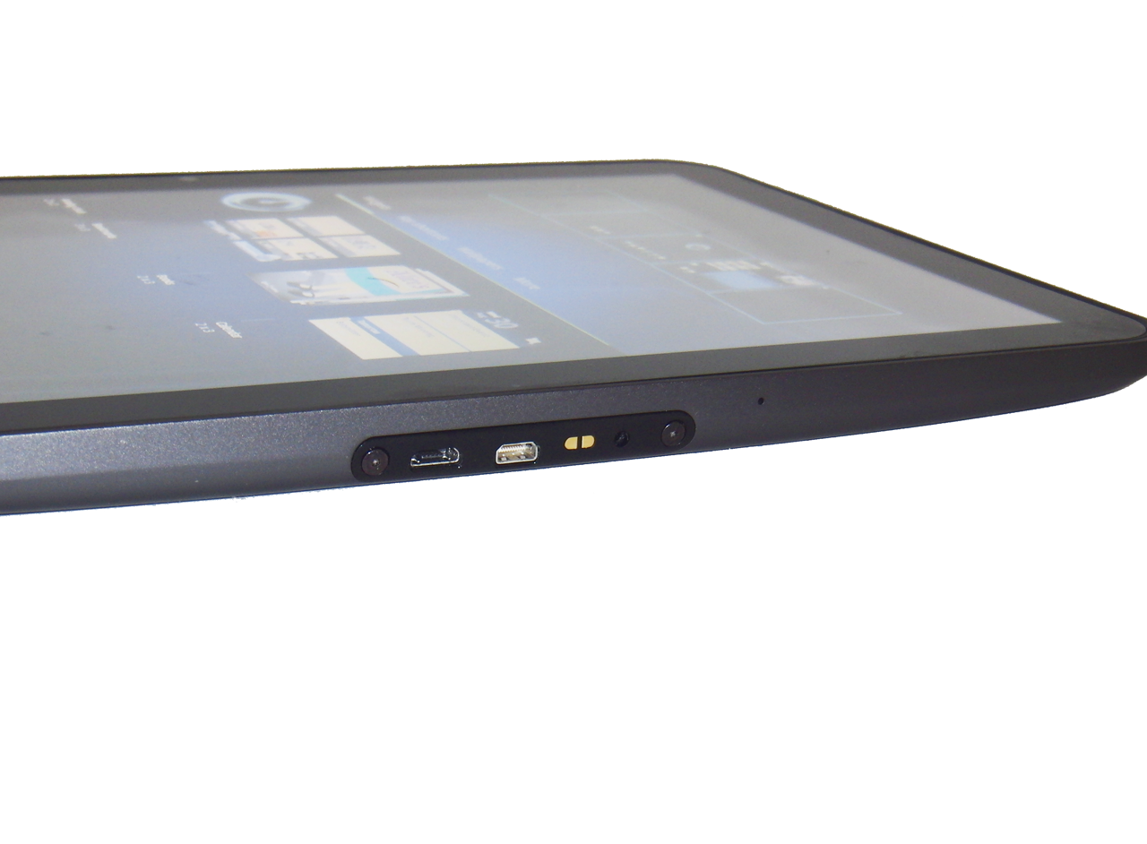
All of the I/O ports are predictably located at the bottom, but cable management is three times more complicated than Apple’s single-connector setup. Motorola makes accessibility easy by sticking to the USB standard. Unfortunately, you can’t charge over USB; you have to use a separate power charger, which makes traveling with the tablet a little less convenient. Now you need to keep track of two cables. Outputting video is easy, since you only need a Mini HDMI-to-HDMI cable. But again, this increases cable complexity if you want to dock, charge, and output video at the same time.
Current page: Motorola Xoom: The First Android Tablet
Prev Page Motorola Xoom: Tablet Mania Next Page Honeycomb: Navigation, Browser, And Music-
dragonsqrrl Very impressive review, especially the display quality page. A lot of in-depth information.Reply -
joytech22 Excellent! Covered everything I was interested in when comparing the iPad 2 to the Xoom.Reply -
tramit Excellent review. I also agree that the excuse of Android coming later in the game does not mean it cannot have the same growth in apps in the same alotted time frame that it was released.Reply
I personally feel that the iPad is a better device for gaming just by going through the app store and being able to find games ranging from Monopoly to FF3 and Infinity Blade. I have a Nexus S right now and the list of attractive games is not as long.
I like having both devices however. I plan to stay the course with continuing to purchase Android Nexus phones and having Apple supply me with their iPad. I get to enjoy the best of both worlds and not narrow my enjoyment of tech like most Droid and Apple fanboys. -
Maziar Excellent review.Reply
I'm impressed with the honeycomb but I think it has 2 major drawbacks
1)UI is somehow laggy and not 100% smooth
2)Lack of apps.
If these 2 issues get fixed,then we're going to see a better competition -
fstrthnu A little late, but very good quality review. Very nice to see custom benchmarks, it really shows you guys put in the effort here.Reply
I'd probably go for a Samsung Galaxy Tab 10.1, but that's just me. -
Seems HD video playback was not tested. Nice to have a HDMI option, but not really useful if most HD movies cannot play smoothly as is the case with the XOOM.Reply
Also, and probably related to the slow video, Tegra 2's CPU has no NEON extensions, limiting applications that use signal processing.
Yes, I do own a XOOM (also iPad 2 by the way) -
acku ReplySeems HD video playback was not tested. Nice to have a HDMI option, but not really useful if most HD movies cannot play smoothly as is the case with the XOOM.
Also, and probably related to the slow video, Tegra 2's CPU has no NEON extensions, limiting applications that use signal processing.
Yes, I do own a XOOM (also iPad 2 by the way)
Check out page 13. We tested H.264 battery life using a ripped 1280x720 Blu-ray movie.
On page 12, we also show HD playblack when you're mirroring the display.
@Everyone else. Thanks for the comments guys. If there's anything else you guy want to see in future reviews please let us know.
Cheers,
Andrew Ku
TomsHardware.com -
house70 Took quite a while to get this review done. Other tablets are already available that sport Honeycomb. Not to mention they are better than both contenders described in this article. I have a Transformer and no matter what I throw at it, it does it well. A review of that would be nice (maybe in another year or so...).Reply
Good effort, but as others have said, late to the table. -
house70 What the reviewer perceives as weaknesses, others perceive as strength. Example: the apps installation process. Not having to deal with iTunes is a bonus in itself, and having the option to make your own backups using whatever application you prefer is also a plus. The reviewer got a bit carried away by his personal bias towards iTunes/iOS environment. There are people that prefer to be led by hand while operating their tablet and there are others that prefer to pick and choose their options without limitations. It's a matter of personal preference. But this should not transpire into an objective review. Other than that, not too bad.Reply -
Wow - I couldn't disagree more with some of your views. Obviously you love you some Apple... I'm not an Apple hater - I have a Macbook Pro, I have an iPad, and I have a Xoom. I tell everyone the Xoom is 5X the tables the iPad is (Granted it's an iPad, not an iPad2 - but my beef with iPads are how much Apple controls what you can or can't do with it - that has not changed in the new generation of iPads). The iPad I can use as a toy, or as a cool media gadget - I actually basically gave it to my 6 year old son now bc that's all I can do with it. The Xoom I can use as so much more - it is was more useful on so many levels. Yes rendering takes a bit longer when you flip th screen, yes there are a few small quirks in it's behavior occasionally, but from an overall usefulness point of view I like it TONS betters than the iPad. Widgets - MultiTasking - OpenSource app development with an App store NOT controlled by Apple. Android IS the future for tablets. Apple needs to take note - they are just lucky at this point bc of their following, but Android will leave them in the dust. MS isn't even in the game and won't be even when Windows 8 hits. And you price comparison is off too IMO. $599 (now $499) for 32MB on the Xoom was in line (and is now better) than Apple's price point. Take it a step further and look the the Asus Eee Pad Transformer (very similar to Xoom with some things done even better) at $399. Android is taking hold, and will gain on Apple quickly, and eventually blow them away.Reply
