Samsung Galaxy S5 Smartphone Review
Will the gravity well from Galaxy S5 capture your interest, or will you streak past with escape velocity?
Why you can trust Tom's Hardware
Results: Display Measurements
In the past, Samsung equipped its devices with decent panels but didn't perform any screen calibration, resulting in poor image quality. Fortunately, market pressure forced a change in policy, and Samsung has been gradually improving the calibration of its screens. While the S5's display looks much better than the previous-generation S4, it still doesn't match the performance of some of its peers.
The Galaxy S5 uses a Samsung 5.1-inch 1080p SAMOLED screen paired with several different software modes that tweak the display settings for different use cases. The default mode is Standard, but there are also Cinema, Dynamic and Professional photo modes too. We include results for each of these settings in our benchmark charts when appropriate. However, we weren't able to examine the adaptive display mode, which "automatically optimizes the color range, saturation and sharpness of your display" when using the Gallery, Camera, Video, Smart Remote or Google Play Books apps.
Brightness
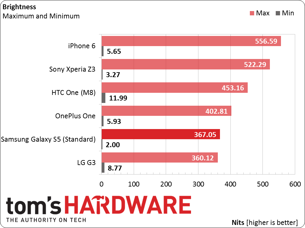
Brightness (also known as white level) measurements are taken by recording the luminance output of each device displaying a full white pattern, with the device's brightness slider set to both minimum and maximum values.
Unsurprisingly, the SAMOLED display in the Galaxy S5 turns in the lowest brightness value, although all the phones can dim their screens to an acceptable level for a dark room. At the other end of the scale, the S5 fails to break the 400-nit mark. This is a worst-case value however, based on displaying a full white image (100% APL). If auto-brightness is turned on, the S5 provides additional power to the display to boost its output under bright ambient light conditions. While the value can vary, we measured 452 nits with auto-brightness on and 100% APL. This boost makes the S5's screen much easier to view outdoors, but is detrimental to battery life.
For the Cinema and Professional photo modes, brightness drops slightly to 354 nits, while the Dynamic mode remains at 367 nits.
In order to make device comparison possible, the rest of our display measurements, along with our battery testing, are performed with the screen set to a standardized white level of 200 nits.
Black Level
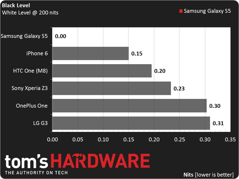
Our black level measurement is the luminance output of a full black pattern after the luminance output of full white has been standardized to 200 nits. It's important to note that AMOLED displays will always measure a black level of zero, since their pixels simply turn off to render black.
Get Tom's Hardware's best news and in-depth reviews, straight to your inbox.
The SAMOLED screen in the Galaxy S5 achieves a true black, since the organic LEDs are switched off and not emitting any light. Turned off, the screen has dark green-gray tint when viewed at an angle.
Contrast ratio, the difference between a full white pattern and a full black pattern, is essentially infinite, because of the S5's zero reading on the black level tests.
Gamma
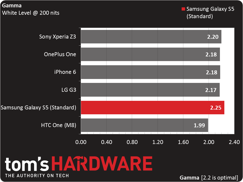
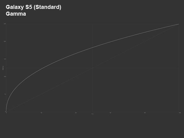
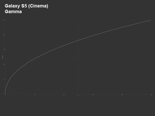
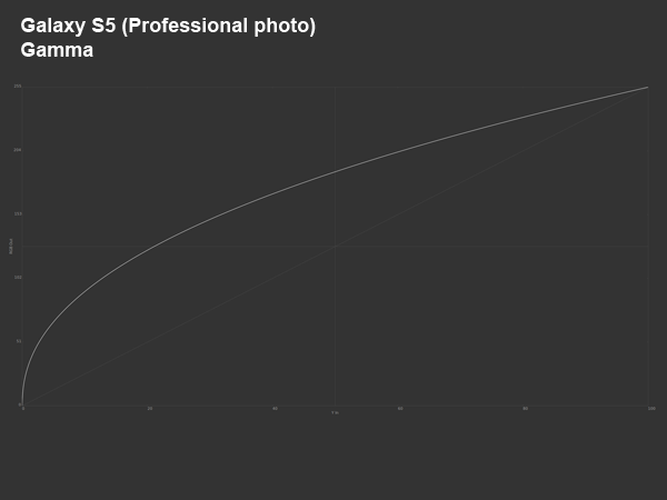
Gamma compensates for the linear brightness levels displayed by a screen versus the nonlinear way our eyes perceive light. A gamma curve of 2.2 is what we optimally want to see, as a screen with a gamma less than 2.2 appears brighter and with less shadow detail, while a gamma larger than 2.2 displays heavy shadows with fewer highlights.
This is one test where all of the phones do well. The S5 just overshoots the ideal value by an amount not noticeable in everyday use. In the Cinema and Professional photo modes, gamma increases slightly to 2.30.
Color Temperature
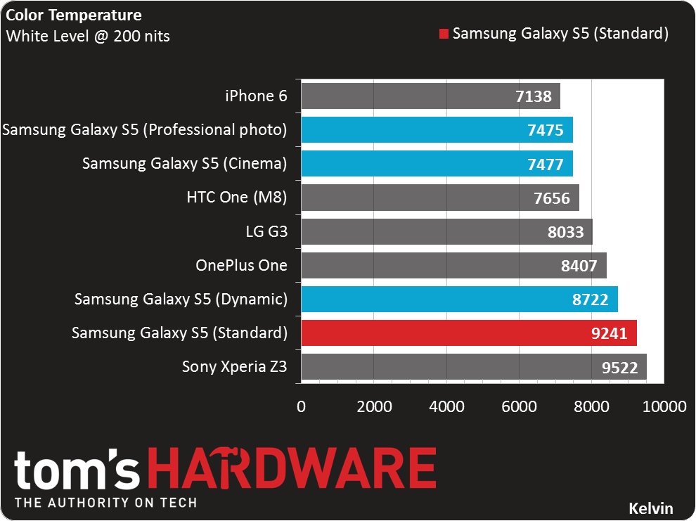
Color temperature is a measurement in Kelvin, which is used to describe how “warm” or “cool” a given display is. Ideally, as long as you're not viewing your device in direct sunlight, this should be in the 6500 range. Higher color temperatures result in a bluish hue, while lower temperatures deliver a warm or reddish tone.
All of the smartphone displays we’ve seen lately tend to use cooler temperatures above 6500 Kelvin due to the color of the LED backlights being used. Definitely on the high end of the scale, the S5 in both the Standard and Dynamic mode exhibits a noticeable blue tint when viewing an all-white background. This effect is reduced but not eliminated when using the Cinema or Professional photo modes, where the tint looks a bit more green.
Color Gamut
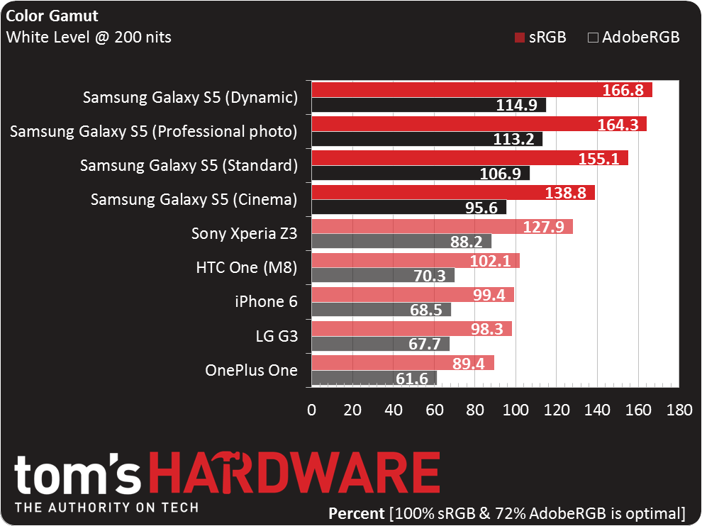
Our volume measurements are compared against both the sRGB and AdobeRGB color gamuts. A reading of 100 percent on sRGB and 72 percent on AdobeRGB is ideal for viewing the vast majority of digital consumer content. A lower reading is typically accompanied by an overly red or yellow image, and a higher reading is usually too blue/green.
AMOLED panels are capable of reproducing a broader spectrum of color than LCD screens, which the S5 demonstrates. This isn't necessarily a good thing though. When viewing content targeted for the sRGB color space (which is most content) on a wide gamut display like the S5's, colors appear oversaturated, almost neon, in appearance. Some people prefer such vivid colors, which make images "pop", while others find the bright colors overpowering and unpleasant. When comparing the screens of the S5 and iPhone 6, which covers about 100% of the sRGB color space, the effect is especially pronounced; primary colors in particular look very unnatural on the S5. Using the Cinema mode helps produce more accurate colors, but a true sRGB mode would be preferred.
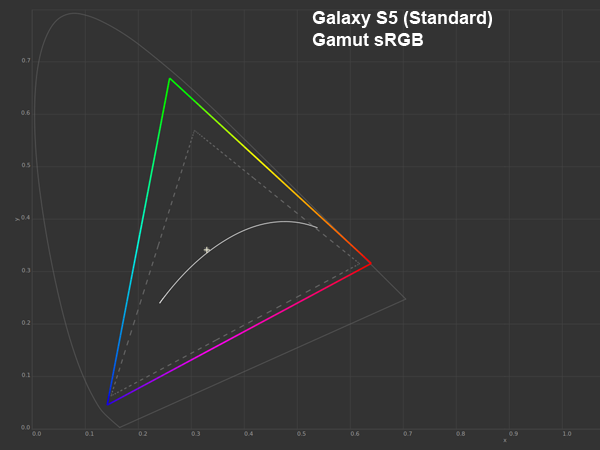
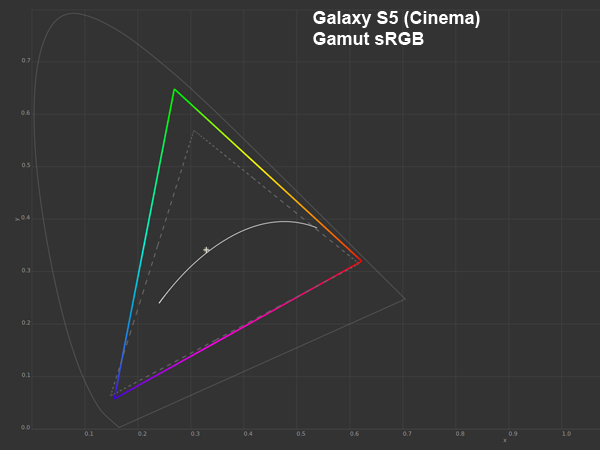

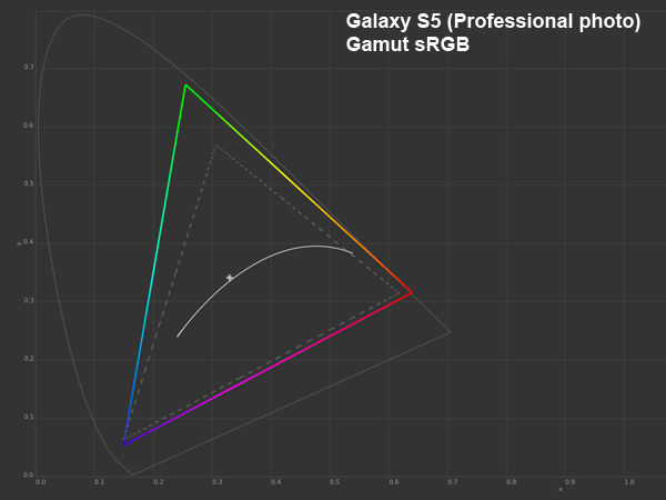

The SAMOLED display in the Galaxy S5 improves upon its predecessor, but still doesn't match the best IPS LCD screens. For starters, Samsung's PenTile sub-pixel matrix creates grainy or noisy-looking images in certain situations, like when turning the brightness down or viewing gray backgrounds. Grayscale gradients also exhibit a noticeable amount of banding, which isn't present when viewing the same image on the iPhone 6. Gray backgrounds also show a green tint, another side effect of the PenTile pixel arrangement, which becomes progressively worse as viewing angle increases.
Current page: Results: Display Measurements
Prev Page Results: GPU Core Benchmarks Next Page Results: Battery And Throttling-
grumpigeek My Galaxy S5 in in an Urban Armor Gear case that looks great and protects the phone, so I don't really care what it looks like.Reply
The device is 100% reliable and I have found the battery life to be excellent - way better than any smartphone I have had previously.
-
implantedcaries Guys you are reviewing a mobile which was released a year and then calling it average compared to competitiReply -
firefoxx04 I have an s5. This review would have been welcomed a year ago.Reply
The phone is top notch. I've known this for a while. -
implantedcaries Guys you are reviewing a mobile which was released a year back and then calling it average compared to competition?? Seriously? Yes I agree S5 is not the most exciting prospect out there for new mobile buyers now, but it wasn't so in 2014 when it was actually launched. Also its one of the very few mobiles already receiving lollipop updates.. No mention of that.. Any hidden agenda against Samsung?Reply -
FritzEiv Folks, you're right. This review is quite late. We began testing the S5 a long time ago, but we've had a bit of a backlog of smartphones to review since Matt (our senior mobile editor) started on staff and we're just catching up. We aren't trying to pretend it's a new phone, thus we haven't put it up in our main feature carousel; but we did want to publish this and others just to have them for archival and future referral and comparison purposes. We are working on other smartphones that are little more current and then we hope to be "on time" as new ones arrive. Hence, for example, Matt's performance preview of Qualcomm's Snapdragon 810 earlier this week. We've been a bit more timely on devices like the OnePlus and the iPhone reviews as well. But hey, continue your sarcasm, because we probably deserve it. Just want you to know why we are doing this, that we're not trying to fool anyone, and that we'll be caught up in short order. Thanks for your patience.Reply
- Fritz (Editor-in-chief) -
Mac266 One thing in this review irritated me: the whole "it's ugly" thing. It might not suit you, but lots of people like the way it looks. Aesthetics are purely subjective, and should definitely not be judged a con on one mans opinion.Reply -
peterf28 Iam not buying a smartphone again where the chipset drivers are not open source. Like what samsung did with the S3, it is stuck on Android 4.3, and there is nothing you can do. All the custom roms are unstable crap because there are no up to date drivers For current kernels. It is like buying a PC without the possibility to update the OS . Would you buy that ?Reply -
jdrch FYI phone speakers are placed on the back of phones to take advantage of acoustics when the phone is laying on a surface. The surface spreads and reflects the sounds back to the user much better than the speaker itself would. Try it yourself.Reply
