Samsung Galaxy S5 Smartphone Review
Will the gravity well from Galaxy S5 capture your interest, or will you streak past with escape velocity?
Why you can trust Tom's Hardware
Galaxy S5 Look And Feel
Samsung has invested heavily into building marketshare and a reputation for creating all-plastic, cheap-looking devices. The Galaxy S5 is no exception. Offering no visual improvement over the Galaxy S4, the S5 highlights a period in Samsung's history of increasing profits and an apathy towards design. Since the S5's release, increasing competition, primarily from Chinese handset makers, has led to a marked downturn in sales and, subsequently, more attractive phones (Galaxy Alpha, A3/A5, Note 4). The design of the S5 is only significant in that it marks the end of an era.
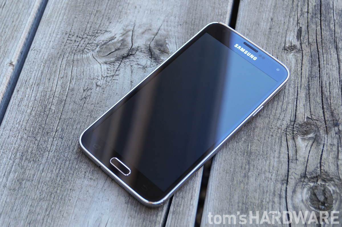
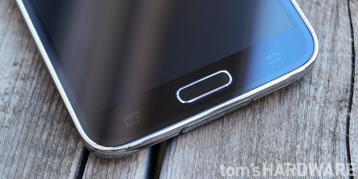
The S5 is patently Samsung, and even Apple's lawyers will have a hard time confusing it with an iPhone 6. The clickable home button remains an easily recognizable rounded rectangle, and while it requires a larger lower bezel than a phone with on-screen controls, it does allow for a smaller bezel than the iPhone with its circular button. Capacitive back and app-switching buttons flank the home button on the right and left, respectively. Since the inclusion of a fingerprint scanner necessitates a physical home button, it makes sense to use the required bezel area for capacitive buttons and forgo on-screen controls.
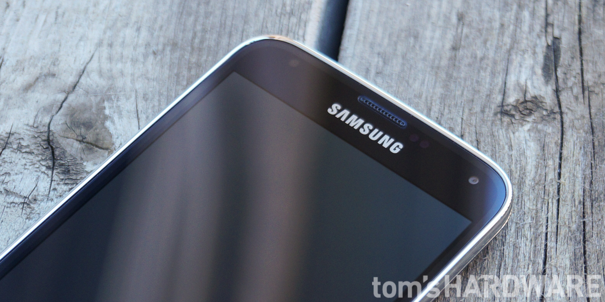
Above the screen and to the left of the centered speaker and Samsung logo are a notification LED and ambient light sensor. The proximity sensor, gestures sensor (for detecting Air View and Air Gesture motions) and front-facing camera are on the right side, with the camera in the upper-right corner.
Around the perimeter of the S5 is a ribbed chrome band made of plastic. In my opinion, this is one of the ugliest phone adornments I've had the displeasure to see. It looks cheap and out-of-date. With Samsung moving to a much more stylish and premium-feeling aluminum band in later devices, hopefully we will never see this corrugated siding again.
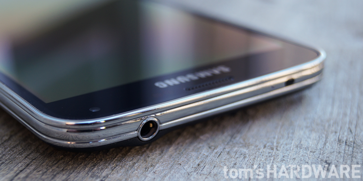
The 3.5mm headphone jack is located on the top edge, as is the noise canceling microphone. There's also a temperature and humidity sensor that's used for calculating calories burned within S Health and an IR transmitter for controlling devices old-school.
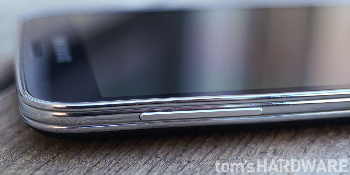
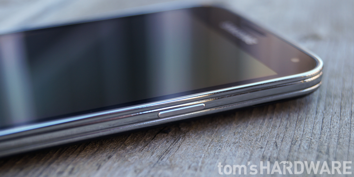
The long, slim volume rocker is on the left edge near the top, while the power button is in a standard position on the right edge, also near the top. Both buttons make a positive click when pressed, and they fit snugly in the frame without any looseness or rattle.
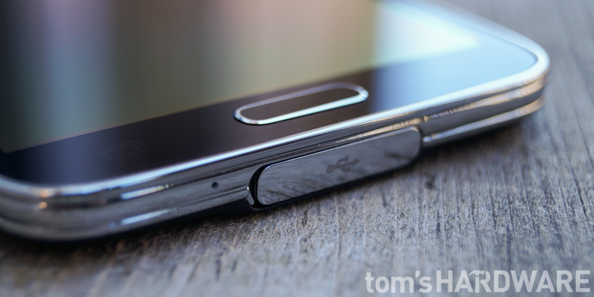
The second microphone is located on the bottom edge. Like the Note 3 before it, the S5 uses the rather ridiculous micro-USB 3.0 port, but hides it behind a flap to keep out dust and water.
Get Tom's Hardware's best news and in-depth reviews, straight to your inbox.
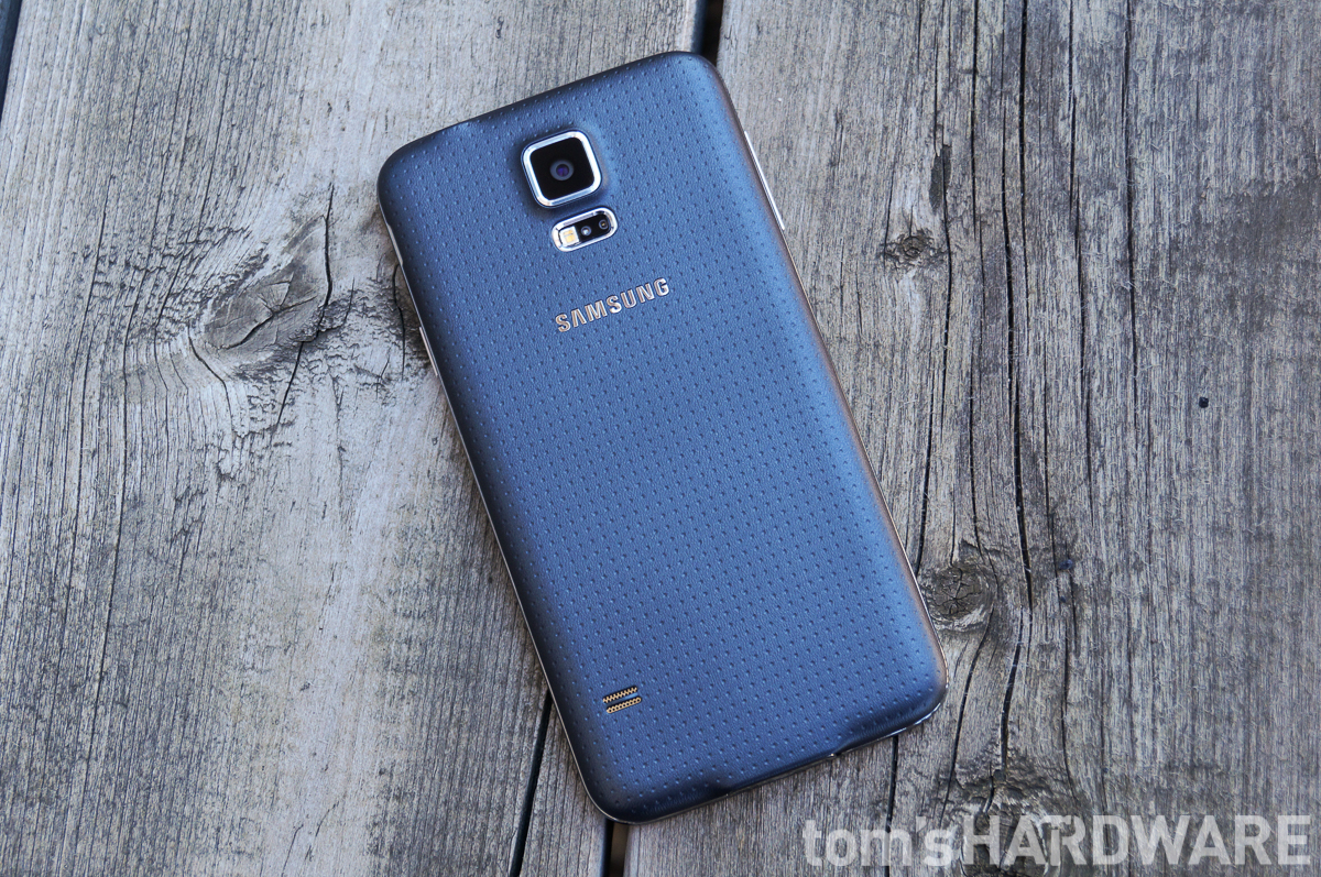
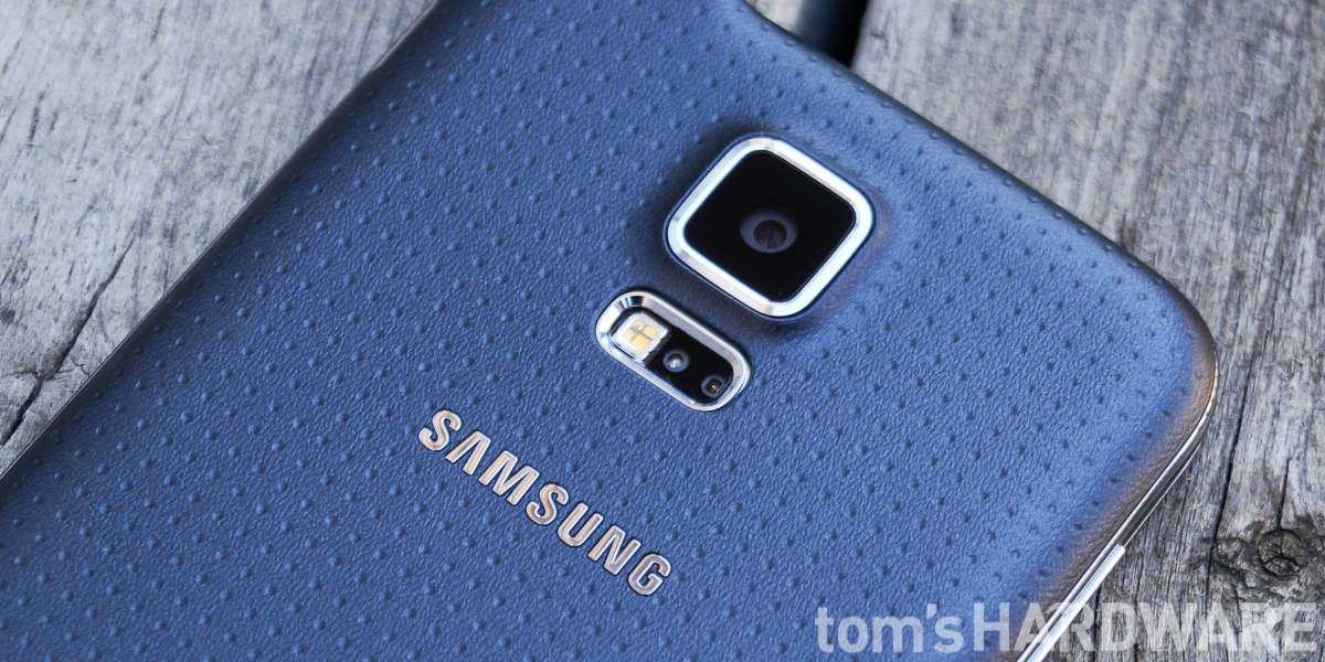
For this iteration, Samsung ditches the shiny plastic back, replacing it with a stippled pattern and a matte finish. The soft-touch, almost rubbery plastic makes the S5 easy to grip and less likely to slip from your hand. While we definitely like the in-hand feel of the new back panel, opinions regarding its appearance vary; some people like the professional look. Personally, I think it looks like a golf club handle.
The primary camera is centered on the back near the top edge and sits within Samsung's signature protruding rounded rectangle. Below the camera and recessed below the surface are the LED flash and heart rate sensors. Both the camera and flash are trimmed with a plastic chrome ring to match the shiny chrome sides.
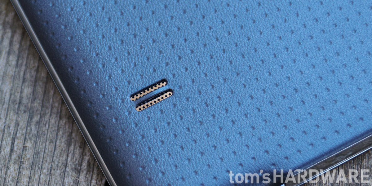
The single speaker is also located on the back near the bottom-left corner. Why OEMs continue to place the speaker on the back of phones baffles me. In a best-case scenario, it's pointing away from you. If you're holding the phone or resting it on a table, the speaker is muffled by your hand or the table top.
Overall, the Galaxy S5 doesn't look much different than the S4, and it isn't going to win any design awards. Opinions will vary, but to me the S5 is the ugliest flagship phone on the market. The only real positive is the new soft-touch feel on the back, which makes it easy to hang on to, assuming the dated aesthetics don't keep you from picking it up in the first place.
Current page: Galaxy S5 Look And Feel
Prev Page Does Samsung's Star Still Shine Bright? Next Page Taking A Look Inside: Dust And Water Resistance-
grumpigeek My Galaxy S5 in in an Urban Armor Gear case that looks great and protects the phone, so I don't really care what it looks like.Reply
The device is 100% reliable and I have found the battery life to be excellent - way better than any smartphone I have had previously.
-
implantedcaries Guys you are reviewing a mobile which was released a year and then calling it average compared to competitiReply -
firefoxx04 I have an s5. This review would have been welcomed a year ago.Reply
The phone is top notch. I've known this for a while. -
implantedcaries Guys you are reviewing a mobile which was released a year back and then calling it average compared to competition?? Seriously? Yes I agree S5 is not the most exciting prospect out there for new mobile buyers now, but it wasn't so in 2014 when it was actually launched. Also its one of the very few mobiles already receiving lollipop updates.. No mention of that.. Any hidden agenda against Samsung?Reply -
FritzEiv Folks, you're right. This review is quite late. We began testing the S5 a long time ago, but we've had a bit of a backlog of smartphones to review since Matt (our senior mobile editor) started on staff and we're just catching up. We aren't trying to pretend it's a new phone, thus we haven't put it up in our main feature carousel; but we did want to publish this and others just to have them for archival and future referral and comparison purposes. We are working on other smartphones that are little more current and then we hope to be "on time" as new ones arrive. Hence, for example, Matt's performance preview of Qualcomm's Snapdragon 810 earlier this week. We've been a bit more timely on devices like the OnePlus and the iPhone reviews as well. But hey, continue your sarcasm, because we probably deserve it. Just want you to know why we are doing this, that we're not trying to fool anyone, and that we'll be caught up in short order. Thanks for your patience.Reply
- Fritz (Editor-in-chief) -
Mac266 One thing in this review irritated me: the whole "it's ugly" thing. It might not suit you, but lots of people like the way it looks. Aesthetics are purely subjective, and should definitely not be judged a con on one mans opinion.Reply -
peterf28 Iam not buying a smartphone again where the chipset drivers are not open source. Like what samsung did with the S3, it is stuck on Android 4.3, and there is nothing you can do. All the custom roms are unstable crap because there are no up to date drivers For current kernels. It is like buying a PC without the possibility to update the OS . Would you buy that ?Reply -
jdrch FYI phone speakers are placed on the back of phones to take advantage of acoustics when the phone is laying on a surface. The surface spreads and reflects the sounds back to the user much better than the speaker itself would. Try it yourself.Reply
