Design and Finish
NEC isn't in the business of making bargain-basement monitors, and this product is no exception. The finish is exemplary, featuring a metal base with black plastic sheathing and a panel frame of high-quality gray plastic. However, this monitor lacks the height adjustment present on the previous series. That's one of the few obstacles that keeps NEC from achieving perfection in this area.
The adjustment mini-joystick is still as practical as ever, settings are easy to find, and the 20WGX2 has inherited a very complete OSD with pro-level adjustments like color temperature. There is also a tilt adjustment.
Connectivity

Connectivity is also good, with dual DVI/VGA connectors and a two-port USB hub.
Watershine?
It's become a common affliction, so yes, the NEC 20GX2 uses an OptiClear glare filter. But for once, it doesn't ruin a good screen!
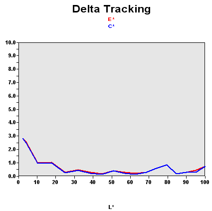
Recall that this graph shows the difference between the desired color shade and the one actually displayed.
- If DeltaE >3, the color displayed is significantly different from the theoretical one, meaning that the difference will be perceptible to the viewer.
- If DeltaE <2, LaCie considers the calibration a success, with a slight difference remaining, but one that will be all but undetectable to the user.
- If DeltaE <1, color fidelity is excellent.
For once, the factory calibration is good: 90% of the colors were perfect, 96% were correct. Had we finally found a glare-filtered monitor capable of doing decent photography work?
| Black spot | White spot | Contrast |
|---|---|---|
| 0.5 | 200 | 400: 1 |
The black level wasn't very good, which is a real shame for the photographers out there. On the other hand, the brightness is well calibrated, and though the monitor can be set to brightness levels that could induce a suntan, the middle of its adjustment range is where it delivered the nicest colors. The resulting contrast, however, wasn't great, as you can see, and remember that we're talking about contrast as measured by a sensor - that is, virtually in the dark. When the light from a window hits the display's surface, the actual contrast becomes much less.
The contrast was also quite stable on this model. It was most comfortable with a brightness setting of around 60%, which is where we recorded our calibration curve.
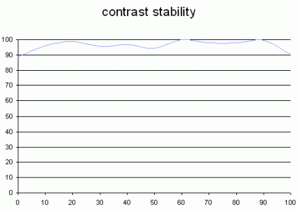
This curve indicates the contrast value measured at a given brightness adjustment on the OSD. In theory, brightness and contrast are two independent parameters, and good contrast is a requirement regardless of the brightness adjustment. Unfortunately such is not the case in practice.
The brightness adjustment is shown on the X-axis, with contrast on the Y-axis. The contrast is expressed here as a percentage of the maximum value measured using the ANSI test protocol.
Tested with the Gretag Eye-One Display 2, the 20XGX2 showed a satisfactorily broad range of colors. The graph on the right also shows the accuracy of the colors displayed, in a different form.
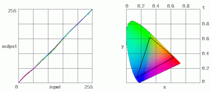
The color gamut represents the richness of the colors displayed. The corners of the triangle are the primary colors (in additive synthesis, of course). The surface of the triangle represents all the colors that can be displayed by combining the three primary colors with more or less intensity for each. So the greater the area of the triangle, the richer the colors.