


Compaq TFT7020

The very similar brand names and designs could cause confusion: the TFT7020 in this review is unrelated to the TFT5030 that we previously tested. The former was built on a Sharp panel, the latter on an Acer panel.
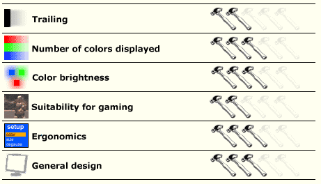
The TFT7020 connects to the analog port of the graphics card and is one of the few monitors in which the signal phase and clock have not been correctly adjusted. The phasing needed to be increased slightly, the timing significantly. Only after making these modifications did the images appear clearly.
The best settings are brightness at 75, contrast at 90, and a color temperature of 6500 K. The 9300 K setting is unusable because it is far too blue. Note that, as in all the other panels, this one tends to favor a dominant color, in this case, red.
| Color | Darkest color displayed | Palest color displayed |
|---|---|---|
| Gray pattern | 0 | 254 |
| Red pattern | 11 | 254 |
| Green pattern | 0 | 252 |
| Blue pattern | 3 | 254 |
The panel's response time is acceptable, although Compaq could have opted for a more responsive screen. The wake is not particularly troublesome, but it remains visible both in the faster games and in certain scenes of DVD films. Furthermore, the colors are very warm and dominated by green.
In short, this is really a monitor for corporate use and office work. It is best avoided for image editing. The panel has a few gaps in the reds.