Display Calibration 201: The Science Behind Tuning Your Monitor
Levels: The Key To Contrast And Detail
We’ve established that dynamic range is the most important element in image quality. Just like audio, the greater the difference between the extremes (soft and loud, light and dark), the greater the realism and sense of depth. And in a rare bit of good fortune, this is the one thing a user can achieve with a monitor that doesn’t require a meter or fancy software! What we’re talking about are black and white levels, or, as they’re more commonly known, brightness and contrast.
At some point in history, a not-so-clever television engineer decided that the controls affecting dynamic range should be called brightness and contrast rather than black level and white level. This has created confusion as to what these adjustments are actually for. It’s actually quite simple, though. Brightness is black level and contrast is white level.
Now, what are we doing when we change those controls? Black level/brightness refers to the minimum level of light a display will produce. White level refers to the maximum level of light. Obviously, by minimizing black and maximizing white, you'll achieve the highest contrast ratio and the greatest dynamic range possible for a given display. The trick is to set the levels properly, while retaining all of the image's detail.
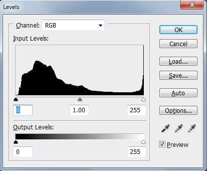
To illustrate the importance of setting black and white levels correctly, let’s check out an actual photograph. We modified the original in Photoshop by using the Levels dialog to manipulate the black and white levels. This is functionally the same as adjusting the brightness and contrast controls on your monitor. No adjustments were made to color.
Here’s a shot of singer Gavin Rossdale performing with Bush.
This is a pretty detailed photograph. You can clearly see the definition in his arms, his hair, and his jeans. Plus you can see the audience far in the background. And check out the subtle outline of his right hand against the guitar’s body.
Here’s the histogram.
Get Tom's Hardware's best news and in-depth reviews, straight to your inbox.
Nearly the entire brightness range is represented, except for a few steps at the dark end. And there are one or two steps at the bright end that get crushed. This image is straight from the camera with no post-processing.
Here’s the same shot with the black level set too low.
The audience and Gavin’s hair get obliterated. His right hand now blends into the guitar’s pick guard. And his jeans have far fewer wrinkles than before. This is what we mean when we use the term crush or clip in reference to black. The darkest information is crushed together and shadow detail is lost. Where there were perhaps 50 gradations of black, there is now only one. While an artist may purposely modify an image like this for extra impact, the fact is that some of the original information was lost.
Now let’s see what happens when you set white level too high.
Gavin’s face and right arm turn into formless white shapes, and we lose the dimension we saw in the original. The many shades of white that created detail in his face are now blended together. Since the audience in the background is also brighter, the sense of depth is significantly reduced. It’s harder to tell just how far away they are.
Here’s the same photo with the black level set too high.
You can still see the detail, but now there’s a hazy look to the photo, as if a filter was put in place. Any sense of image depth is drastically reduced.
Our final example shows the effect of setting the white level too low.
Again, the detail is all there, but the photo looks dim and underexposed. This and the previous image retain all of their detail. However, by reducing the dynamic range, the vibrancy and impact are significantly lower.
We’ll show you how easy it is to fix these problems with a couple of test patterns you can download from the Internet. Setting black level and white level properly doesn’t require instruments or software. And it’s one of the best things you can do to improve your monitor’s image. By maximizing dynamic range, you’re well on your way to better pictures!
To fully take advantage of a display’s dynamic range, we also need to understand what’s happening to the points in between black and white. This is where the discussion turns toward gamma.
Current page: Levels: The Key To Contrast And Detail
Prev Page The Two Reasons To Calibrate Your Monitor Next Page Gamma: The Key To Maximum Image Depth
Christian Eberle is a Contributing Editor for Tom's Hardware US. He's a veteran reviewer of A/V equipment, specializing in monitors. Christian began his obsession with tech when he built his first PC in 1991, a 286 running DOS 3.0 at a blazing 12MHz. In 2006, he undertook training from the Imaging Science Foundation in video calibration and testing and thus started a passion for precise imaging that persists to this day. He is also a professional musician with a degree from the New England Conservatory as a classical bassoonist which he used to good effect as a performer with the West Point Army Band from 1987 to 2013. He enjoys watching movies and listening to high-end audio in his custom-built home theater and can be seen riding trails near his home on a race-ready ICE VTX recumbent trike. Christian enjoys the endless summer in Florida where he lives with his wife and Chihuahua and plays with orchestras around the state.
-
MANOFKRYPTONAK For TVs CNET posts the color levels they use to test each TVs picture by model. They also give great advice on how to adjust too! I used there settings with my 50" vizio and could not be happier. Don't get me wrong loved this article, but you can never get too much info, am I right?Reply -
yolosweg I've adjusted the gamma on my laptop but it keeps reseting. Does anyone know how to fix this? (I used the default windows program btw)Reply -
Vladimir83 Fantastic article.....TomsHardware style!Reply
I have no idea how my monitor was off until i saw the patterns ;)
Now perfectly set for brightness/contrast:first,third,and fourth pattern(although on this i notice cliping on the blue).
However second pattern couldn't set it right.Darkest bar which should be almost cliping to the background is too "black",and the next "12" bar is more closely match to the background in colour.
Any thoughts someone? I use Philips 227Eqha IPS monitor. -
rezzahd Great display calibration guide. I would recommend this to anyone new to display calibration.Reply -
clonazepam Every time I took a support call for pro graphics products, and it centered around getting accurate color, I started off with "Color is a 3-dimensional space..." It was just my way of saying we might be here for awhile.Reply
I love these articles. =) -
ojas Second page, second last photo, article should say that you've set the black level too low, not too high.Reply
Seems to be an interesting read so far, and I've really wanted to read an article like this, so thanks in advance! -
ojas Doesn't the first picture of Gavin on the 3rd page have low gamma and the second bright one is where the gamma is too high?Reply
It's written the other (incorrect?) way around in the article, i think. -
ojas ReplyNow we’ll make the color temp too warm; in other words, below D65.
Shouldn't it be "above D65"? :/ -
gwolfman Reply
It's opposite. Lower gamma makes the dark areas of an image brighter, hence the entire picture looks brighter. Higher gamma makes the lighter areas darker (i.e., it takes a lot brighter white in the image data to actually be displayed white). Check here for a great tutorial on gamma, especially the section titled "Display Gamma."11718866 said:Doesn't the first picture of Gavin on the 3rd page have low gamma and the second bright one is where the gamma is too high?
It's written the other (incorrect?) way around in the article, i think.
http://www.cambridgeincolour.com/tutorials/gamma-correction.htm
That's incorrect. It actually works backwards/opposite from what one might think. Color temperature originates from the color a flame radiates in relation to the temperature at which it burns. Think back to grade school and playing with the Bunsen burner... the hottest part of the flame (i.e., higher Kelvin) is in the darkest blues, not the reds (i.e, lower temperature/Kelvin). This simple picture helps explain the difference.11719001 said:Now we’ll make the color temp too warm; in other words, below D65.
Shouldn't it be "above D65"? :/


