Display Calibration 201: The Science Behind Tuning Your Monitor
Grayscale: Why White Is The Color Of Everything
The one calibration control that every monitor has is color temperature. And to alleviate any confusion over terminology right now, let’s establish that color temperature, grayscale, white balance, and white point are all the same thing.
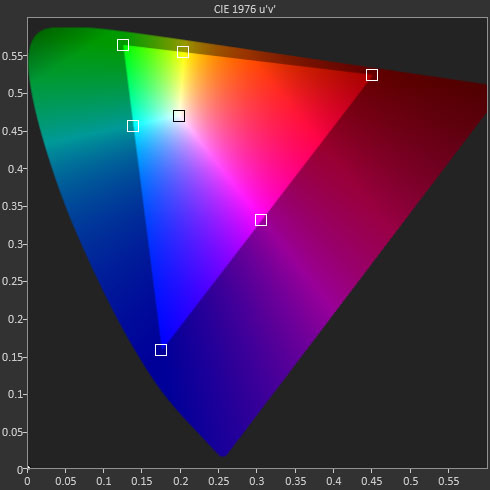
Fixed-pixel displays produce color, and white, using red, green, and blue sub-pixels. How does white come from that? Let’s look at the CIE chart to find out.
This is the CIE chart we use in our monitor reviews. The square inside the gamut triangle represents the white point, where the three primary colors combine to produce white. Of course, the color of white is open to interpretation and that’s where we need to apply a standard. For the purposes of video and computer imaging, that standard is a color temperature of 6500 kelvins or D65.
Where did this value come from? 6500 K is the approximate color temperature of the mid-day sun, and white objects viewed under this light will take on a particular color. You can try this yourself by taking a piece of white paper and viewing it under different kinds of light. Fluorescent lighting looks a little green, while tungsten appears orange or yellow. And even sunlight at different times of day will change your perception of white.
Of course color temperature doesn’t just apply to white. For the purposes of calibration it does, but think about how lighting affects the color of any object. Remember the last time you bought paint for your home and it looked different in the store than it did on your wall? The color temperature of the light shining on that paint can drastically alter your perceptions.
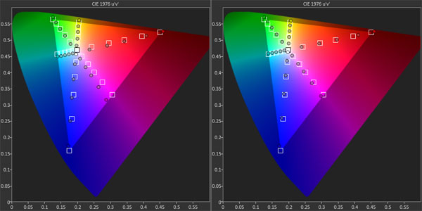
So what happens when you adjust the color temp on your monitor? While we are only adjusting the white point, this procedure has an additional benefit. Correcting a display’s color temperature also aligns the secondary colors (cyan, magenta, and yellow) more closely to their targets.
It may be a little hard to see in the photo below, but look closely at cyan and magenta.
Get Tom's Hardware's best news and in-depth reviews, straight to your inbox.
All we did to this monitor was correct the color temp from its default state to D65. You can see that cyan and magenta are now much closer to their targets than before. Why is yellow not affected? That is an anomaly of this particular monitor, an AOC Q2963PM. It’s not a flaw. It’s just the way that screen reacts to calibration.
Let’s bring Gavin out again. Here is the unedited shot for reference.
This is typical stage lighting that gives a natural and even look to the performer. Notice that the all-important flesh tones look exactly as they should.
Now we’ll make the color temp too warm; in other words, below D65.
This is done by editing the color balance in Photoshop. We simply turned up the red as one would do with the red slider on their monitor. It looks as if a red filter has been placed over the spotlight. It doesn’t look awful, but it’s not what we saw at the concert, is it?
Here’s the effect of having too much green.
Gavin looks very unnatural here. Green is the most obvious kind of error because the human eye is more sensitive to that color than any other. We doubt anyone would want their photos to look this way on purpose.
The last example shows the most common color temperature error.
This doesn’t look too bad, right? That’s because blue makes things appear brighter. Again, this is science coming into play. If your display is going to be off, blue errors impact image quality less severely than red or green. If you look at our monitor reviews, almost all screens measure a little too blue out of the box.
We have our feet wet with color adjustment via the RGB controls and white point. Now let’s look at color gamuts and how they’re implemented and measured.
Current page: Grayscale: Why White Is The Color Of Everything
Prev Page Gamma: The Key To Maximum Image Depth Next Page Gamut: What Color Is Your Monitor?
Christian Eberle is a Contributing Editor for Tom's Hardware US. He's a veteran reviewer of A/V equipment, specializing in monitors. Christian began his obsession with tech when he built his first PC in 1991, a 286 running DOS 3.0 at a blazing 12MHz. In 2006, he undertook training from the Imaging Science Foundation in video calibration and testing and thus started a passion for precise imaging that persists to this day. He is also a professional musician with a degree from the New England Conservatory as a classical bassoonist which he used to good effect as a performer with the West Point Army Band from 1987 to 2013. He enjoys watching movies and listening to high-end audio in his custom-built home theater and can be seen riding trails near his home on a race-ready ICE VTX recumbent trike. Christian enjoys the endless summer in Florida where he lives with his wife and Chihuahua and plays with orchestras around the state.
-
MANOFKRYPTONAK For TVs CNET posts the color levels they use to test each TVs picture by model. They also give great advice on how to adjust too! I used there settings with my 50" vizio and could not be happier. Don't get me wrong loved this article, but you can never get too much info, am I right?Reply -
yolosweg I've adjusted the gamma on my laptop but it keeps reseting. Does anyone know how to fix this? (I used the default windows program btw)Reply -
Vladimir83 Fantastic article.....TomsHardware style!Reply
I have no idea how my monitor was off until i saw the patterns ;)
Now perfectly set for brightness/contrast:first,third,and fourth pattern(although on this i notice cliping on the blue).
However second pattern couldn't set it right.Darkest bar which should be almost cliping to the background is too "black",and the next "12" bar is more closely match to the background in colour.
Any thoughts someone? I use Philips 227Eqha IPS monitor. -
rezzahd Great display calibration guide. I would recommend this to anyone new to display calibration.Reply -
clonazepam Every time I took a support call for pro graphics products, and it centered around getting accurate color, I started off with "Color is a 3-dimensional space..." It was just my way of saying we might be here for awhile.Reply
I love these articles. =) -
ojas Second page, second last photo, article should say that you've set the black level too low, not too high.Reply
Seems to be an interesting read so far, and I've really wanted to read an article like this, so thanks in advance! -
ojas Doesn't the first picture of Gavin on the 3rd page have low gamma and the second bright one is where the gamma is too high?Reply
It's written the other (incorrect?) way around in the article, i think. -
ojas ReplyNow we’ll make the color temp too warm; in other words, below D65.
Shouldn't it be "above D65"? :/ -
gwolfman Reply
It's opposite. Lower gamma makes the dark areas of an image brighter, hence the entire picture looks brighter. Higher gamma makes the lighter areas darker (i.e., it takes a lot brighter white in the image data to actually be displayed white). Check here for a great tutorial on gamma, especially the section titled "Display Gamma."11718866 said:Doesn't the first picture of Gavin on the 3rd page have low gamma and the second bright one is where the gamma is too high?
It's written the other (incorrect?) way around in the article, i think.
http://www.cambridgeincolour.com/tutorials/gamma-correction.htm
That's incorrect. It actually works backwards/opposite from what one might think. Color temperature originates from the color a flame radiates in relation to the temperature at which it burns. Think back to grade school and playing with the Bunsen burner... the hottest part of the flame (i.e., higher Kelvin) is in the darkest blues, not the reds (i.e, lower temperature/Kelvin). This simple picture helps explain the difference.11719001 said:Now we’ll make the color temp too warm; in other words, below D65.
Shouldn't it be "above D65"? :/


