Display Calibration 201: The Science Behind Tuning Your Monitor
Gamma: The Key To Maximum Image Depth
You’ve seen us devote a fair amount of space in monitor reviews to the measurement of gamma. Here we have the opportunity to explain that concept in greater detail.
What is gamma, exactly? Each brightness point between zero and 100 percent has to have a certain value (luminance) in order to match the gamma of the camera that created the image. One might think this relationship is linear. For example, a 50-percent signal equals 50-percent light output. But this is not the case. Look at the table below.
| Signal Level | Y (cd/m2) |
|---|---|
| 0% | 0.40 |
| 10% | 2.02 |
| 20% | 7.36 |
| 30% | 17.35 |
| 40% | 31.73 |
| 50% | 52.06 |
| 60% | 76.90 |
| 70% | 108.99 |
| 80% | 145.97 |
| 90% | 190.37 |
| 100% | 239.68 |
This is a series of measurements from a monitor that tracks a 2.2 gamma value very closely. The minimum black level is .39 cd/m2 and the max white is 239.67 cd/m2. If the display’s gamma were linear, a 50-percent signal should result in a light level of 119.84 cd/m2. The actual value is less than half that figure at only 52.01 cd/m2. Why? We need a short history lesson to find the answer.
The first displays used cathode ray tubes to create their images. Electrons were fired at an array of chemical phosphors, which in turn produced light. As it turned out, the intensity of light produced did not vary in a linear fashion. As in the table above, it was logarithmic. Obviously, cameras and other recording devices had to match this output curve. And they still do to this day, even though the CRT is no longer with us. Nearly all imaging devices, whether they are input- or output-oriented, are engineered to a gamma of 2.2. While there are variations, 2.2 is the accepted norm for video and still photography. If your monitor tracks 2.2, it will match the incoming signal from pretty much any source.
How do we measure this? It’s easy to gather the data when we measure grayscale. The patterns are windows that represent signal intensity from 0 to 100 percent. For each measurement, we record a Y (luminance) value. Then our software calculates the difference between the measured and target values. From that difference, a gamma number is generated. The closer this number is to 2.2, the better.
This window pattern is just like the one generated by our Accupel DVG-5000. The center square is 100 percent brightness and the background is 0 percent. When we measure gamma, the window varies from 0 to 100 in 10 percent increments.
Let’s look at the table again, but this time with the gamma values and Y targets.
Get Tom's Hardware's best news and in-depth reviews, straight to your inbox.
| Signal Level | Y (cd/m2) | Target Y | Gamma |
|---|---|---|---|
| 0% | 0.40 | 0.00 | 2.20 |
| 10% | 2.02 | 1.53 | 2.08 |
| 20% | 7.36 | 7.02 | 2.17 |
| 30% | 17.35 | 17.13 | 2.19 |
| 40% | 31.73 | 32.25 | 2.22 |
| 50% | 52.06 | 52.69 | 2.22 |
| 60% | 76.9 | 77.38 | 2.21 |
| 70% | 108.99 | 108.89 | 2.20 |
| 80% | 145.97 | 146.33 | 2.21 |
| 90% | 190.37 | 189.88 | 2.18 |
| 100% | 239.68 | 239.68 | 2.20 |
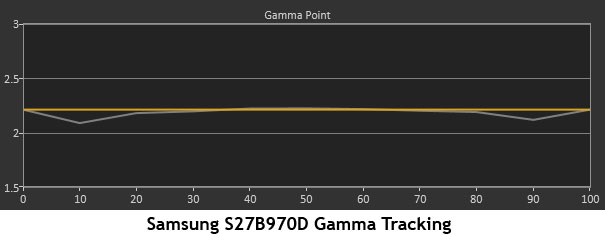
When the value is higher than 2.2, it means that output level is too dark. If the value is below 2.2, then the output is too bright. By comparing the actual measurements to the targets, you can see how far off you are. This display (a Samsung S27B970D) is pretty close to perfect.
This is the graphical representation we use in our reviews. It’s easy to see where even the tiniest errors are.
So how does this relate to a monitor’s calibration controls? It's actually fairly simple, since the vast majority of computer monitors with gamma controls only include presets. There’s no way to edit the gamma curve itself. What do we mean?
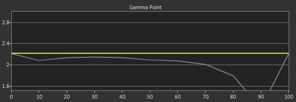
With presets, you have only one gamma curve available, which you can move up and down. The shape doesn’t change, only its relationship to 2.2. If you start with flat tracking, as illustrated above, you only need to find the preset that gets you closest to 2.2. If the tracking isn’t flat, like the chart below, there isn’t much to do except get at close to 2.2 as possible.
In this example, the gamma is OK until around 60 percent, where it starts to dip. Then it takes a huge dive at 90 percent. The only way to correct this is with multi-point gamma control, which lets you edit each brightness point individually. Unfortunately, these are quite rare on computer monitors (and on displays in general). We’ve only seen them on a few high-end televisions and projectors.
Here’s Gavin again,. This time, we’re simulating altered gamma by using the Curves editor in Photoshop.
By setting the gamma too high, we’ve reduced shadow detail almost to the point of clipping. Of course, you can do this to create a certain effect, but you’ve changed the original image and reduced much of the shadow detail to a minimum. It’s there, just very hard to see.
Now we’ll set the gamma too low.
This is similar to setting the white level too high. Detail in the bright areas is very difficult to discern and the whole picture looks over-exposed.
It’s obvious from the photos that poor gamma can have nearly the same effect on image quality as incorrect levels. That’s why it’s so important to a monitor’s perceived contrast that gamma be correct. You can have deep blacks, bright whites, and a fantastic contrast ratio. But if the gamma is off, much of that dynamic range is wasted.
Now we’ll move into grayscale, which, as we’ll see, is at the center of everything when it comes to color.
Current page: Gamma: The Key To Maximum Image Depth
Prev Page Levels: The Key To Contrast And Detail Next Page Grayscale: Why White Is The Color Of Everything
Christian Eberle is a Contributing Editor for Tom's Hardware US. He's a veteran reviewer of A/V equipment, specializing in monitors. Christian began his obsession with tech when he built his first PC in 1991, a 286 running DOS 3.0 at a blazing 12MHz. In 2006, he undertook training from the Imaging Science Foundation in video calibration and testing and thus started a passion for precise imaging that persists to this day. He is also a professional musician with a degree from the New England Conservatory as a classical bassoonist which he used to good effect as a performer with the West Point Army Band from 1987 to 2013. He enjoys watching movies and listening to high-end audio in his custom-built home theater and can be seen riding trails near his home on a race-ready ICE VTX recumbent trike. Christian enjoys the endless summer in Florida where he lives with his wife and Chihuahua and plays with orchestras around the state.
-
MANOFKRYPTONAK For TVs CNET posts the color levels they use to test each TVs picture by model. They also give great advice on how to adjust too! I used there settings with my 50" vizio and could not be happier. Don't get me wrong loved this article, but you can never get too much info, am I right?Reply -
yolosweg I've adjusted the gamma on my laptop but it keeps reseting. Does anyone know how to fix this? (I used the default windows program btw)Reply -
Vladimir83 Fantastic article.....TomsHardware style!Reply
I have no idea how my monitor was off until i saw the patterns ;)
Now perfectly set for brightness/contrast:first,third,and fourth pattern(although on this i notice cliping on the blue).
However second pattern couldn't set it right.Darkest bar which should be almost cliping to the background is too "black",and the next "12" bar is more closely match to the background in colour.
Any thoughts someone? I use Philips 227Eqha IPS monitor. -
rezzahd Great display calibration guide. I would recommend this to anyone new to display calibration.Reply -
clonazepam Every time I took a support call for pro graphics products, and it centered around getting accurate color, I started off with "Color is a 3-dimensional space..." It was just my way of saying we might be here for awhile.Reply
I love these articles. =) -
ojas Second page, second last photo, article should say that you've set the black level too low, not too high.Reply
Seems to be an interesting read so far, and I've really wanted to read an article like this, so thanks in advance! -
ojas Doesn't the first picture of Gavin on the 3rd page have low gamma and the second bright one is where the gamma is too high?Reply
It's written the other (incorrect?) way around in the article, i think. -
ojas ReplyNow we’ll make the color temp too warm; in other words, below D65.
Shouldn't it be "above D65"? :/ -
gwolfman Reply
It's opposite. Lower gamma makes the dark areas of an image brighter, hence the entire picture looks brighter. Higher gamma makes the lighter areas darker (i.e., it takes a lot brighter white in the image data to actually be displayed white). Check here for a great tutorial on gamma, especially the section titled "Display Gamma."11718866 said:Doesn't the first picture of Gavin on the 3rd page have low gamma and the second bright one is where the gamma is too high?
It's written the other (incorrect?) way around in the article, i think.
http://www.cambridgeincolour.com/tutorials/gamma-correction.htm
That's incorrect. It actually works backwards/opposite from what one might think. Color temperature originates from the color a flame radiates in relation to the temperature at which it burns. Think back to grade school and playing with the Bunsen burner... the hottest part of the flame (i.e., higher Kelvin) is in the darkest blues, not the reds (i.e, lower temperature/Kelvin). This simple picture helps explain the difference.11719001 said:Now we’ll make the color temp too warm; in other words, below D65.
Shouldn't it be "above D65"? :/


