Google Nexus 10 Review: Is 2560x1600 High-Def Enough?
LCD Performance: The Subjective Analysis
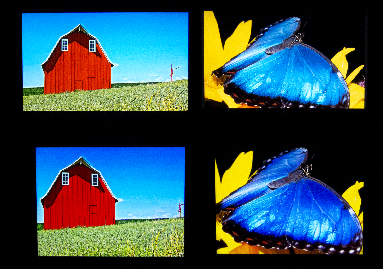
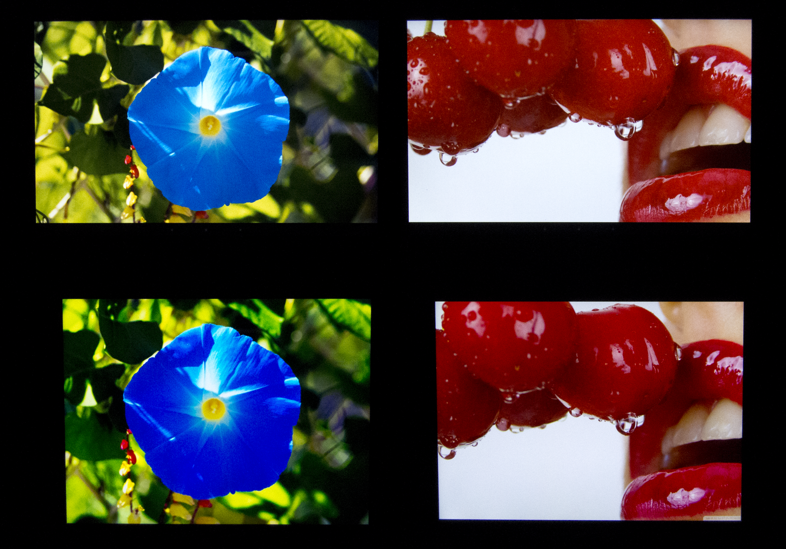
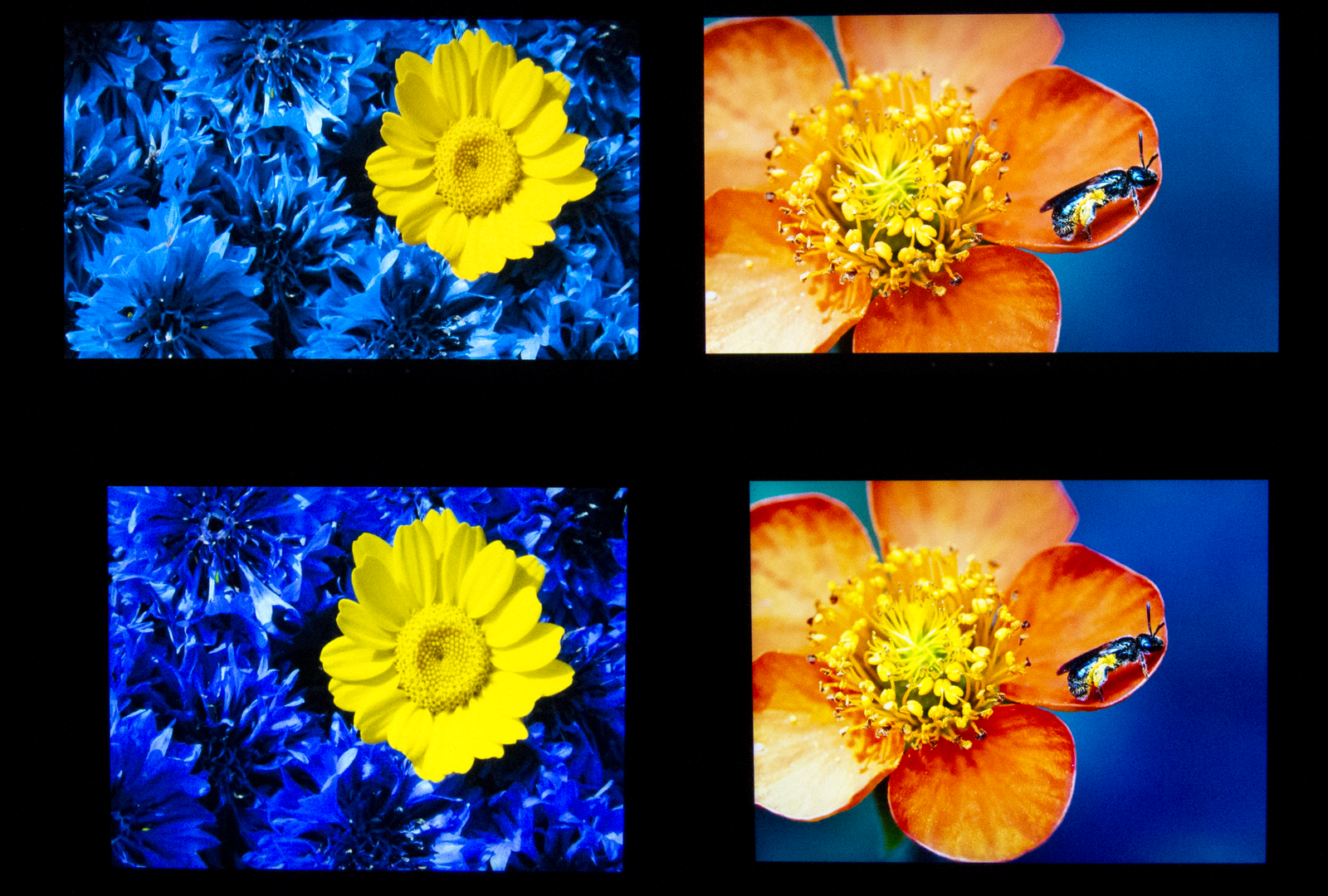
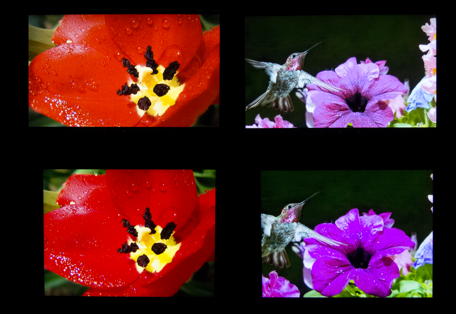
Numbers can only tell you so much. Based on reader feedback, we've toyed with the idea of introducing color accuracy tests using our spectrophotometer. It's not easy to derive meaning from those results though, since they're expressed in a distance metric for color space called Delta E. Instead, we chose to set up in a pitch-black room and capture images that reflect LCD performance.
But first, a couple of caveats. A camera is able immortalize the difference between two displays. If you were to rank hardware based on its color gamut performance, you'd see cameras, wide-gamut monitors, high-quality printer, and then mainstream monitors and printers, in that order. So, depending on the device you're looking at Tom's Hardware on, you may not see the differences in what we're about to present. If you're using a decent screen, though, you should get an image representative of what we're trying to show.
Further, these pictures haven't been optimized in any way. We're simply publishing them after converting RAW files to PNG, which means all six comparisons are made under the same conditions.
Article continues belowWe aren't labeling these pictures so that you evaluate them without the previous page's results in mind. Which tablet looks the best to you? Scroll to the bottom of the page if you want to know which is which.
At least to our eyes, the difference between these two is painfully obvious. The third-gen iPad is on the bottom, and its colors are both richer and more vivid. Google's Nexus 10, up top, doesn't look bad by any stretch, but a side-by-side comparison against a higher-quality screen makes the shortcomings we quantified on the previous page pretty easy to see.
Get Tom's Hardware's best news and in-depth reviews, straight to your inbox.
Current page: LCD Performance: The Subjective Analysis
Prev Page LCD Performance: By The Numbers Next Page Battery Life And Recharge Time-
joytech22 The Nexus 10 is one of the most powerful Android devices available, but why?Reply
A T604 can be configured up to what - 8 cores? The Nexus 10 has ONE and it performs just under a PVR 543MP4
The CPU is absolutely monstrous, as is RAM Bandwidth, resolution etc..
I often think to myself - Why aren't other manufacturers sticking specs like these into their own systems? Stick a T604MP4 in there and you've got performance numbers (mind you, numbers likely not real-world) close to 2.5x that of the fastest iPad in every single way (except battery.. Lol).
As for CPU, Stick a 1.7GHz S4 Pro in there with 2GB of RAM and combine it with the same screen.
The company that does that has my next purchase guaranteed. -
killabanks as much as i love this tablet it needs a beefier gpu to handle that res just look what apple crammed in the ipad 4th genReply -
bit_user Why does the Color Temperature graph say "Higher is Better"? That's just wrong. The standard for accurate video reproduction is 6500 Kelvin.Reply
Values higher than that will result in the image having a blue bias. Values lower than that will result is the image appearing reddish. Of course, this also depends on the ambient light, which will influence how the image is perceived. But 6.5k Kelvin was supposedly chosen to match natural daylight.
-
neon neophyte i disagree completely about the screen analysis. it is most obvious on the picture of the blue flower. with the nexus 10 i can see all the detail in the pedals, the ipad is over saturated and has lost its detail.Reply -
killerclick There was an article a while ago that showcased Tom's Hardware writers and various devices they use. Almost all of them had an iPad or a Macbook or both.Reply
Just sayin'...
Link is http://www.tomshardware.com/picturestory/605-toms-hardware-editors.html -
bit_user neon neophytei disagree completely about the screen analysis. it is most obvious on the picture of the blue flower. with the nexus 10 i can see all the detail in the pedals, the ipad is over saturated and has lost its detail.Well, as they didn't say what camera they used or how it was configured, you have to assume they didn't disable AWB and that they used autofocus (which can have unpredictable results, when photographing a screen). Even if they avoided those two pitfalls, we don't know anything about the camera's spectral response function. Alone, that would be enough to disqualify any such comparison. Add to that the effects of your display device (I'll bet it's never been calibrated), and you should see that you really can't trust how these images show the respective screens.Reply
They also used images that are so vivid and almost artificial that it's sometimes hard to tell which display is reproducing the images more faithfully.
-
neon neophyte eh, they said in the article that we could see the difference in the pictures. then they went on to say those pictures reflected that the ipad was better.Reply
i disagree completely. -
bit_user neon neophyteeh, they said in the article that we could see the difference in the pictures. then they went on to say those pictures reflected that the ipad was better.i disagree completely.I'm not disagreeing with you. I'm just pointing out that their methodology seems badly flawed.Reply
If they want to learn how to write better video reviews, Tom's could do worse than to check out David Katzmaier's reviews, on CNet.
-
senshu neon neophyteeh, they said in the article that we could see the difference in the pictures. then they went on to say those pictures reflected that the ipad was better.i disagree completely.You're nowhere close to alone on this.Reply


