Microsoft Paint and Photos Get A Fresh New Look With Windows 11 Styling
Out with the old, in with the new
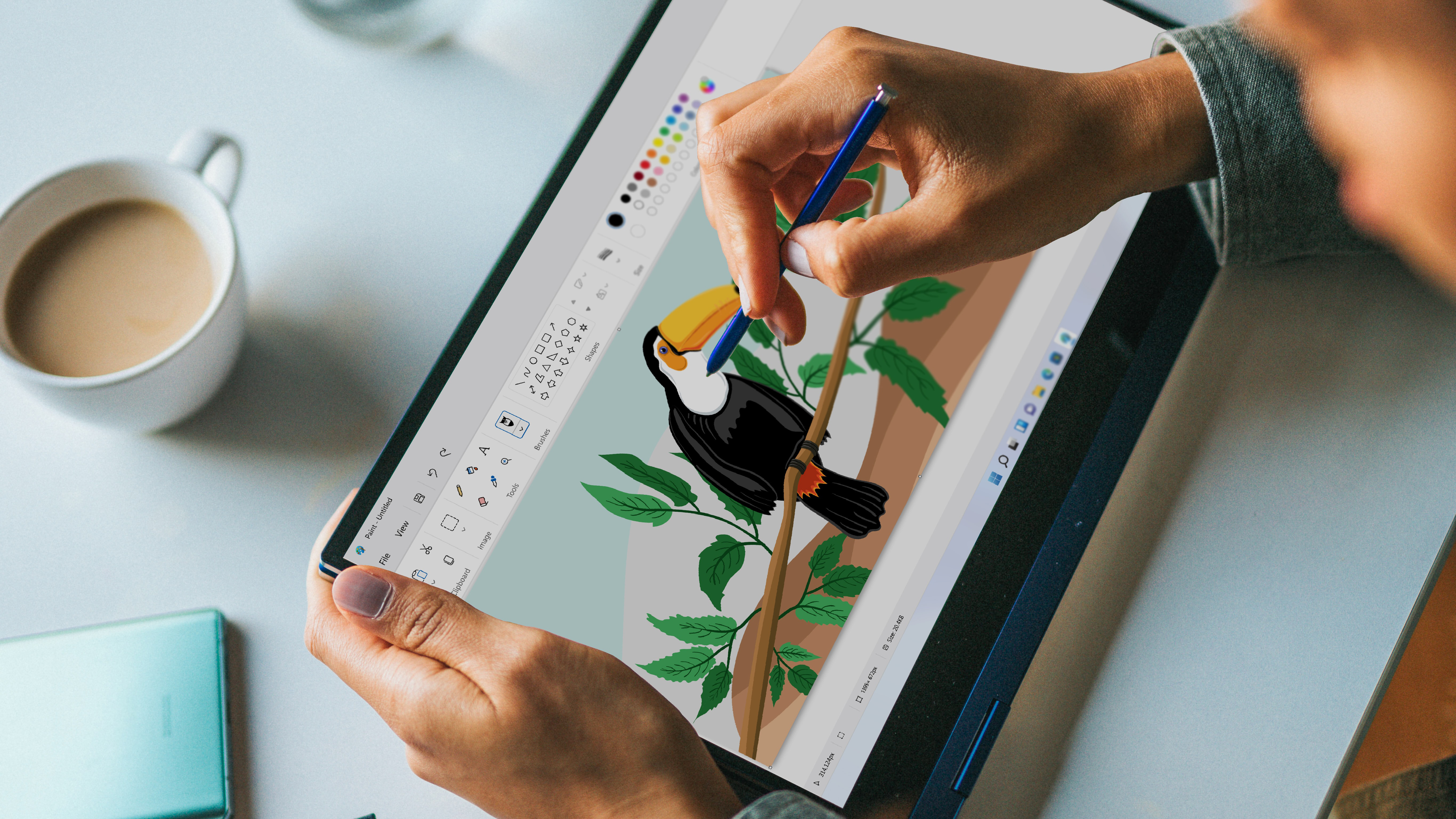
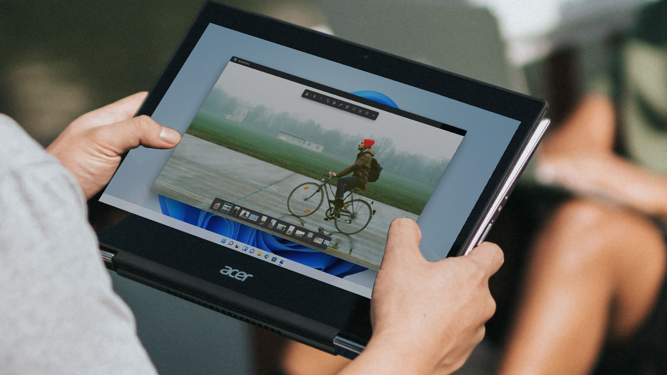
Microsoft has given us a sneak peek into the UI re-design for its Paint and Photo apps. These apps forgo the current Ribbon style UI, which was introduced with Windows 7, replacing it with the new fluent design language seen in Windows 11.
Microsoft plans to replace all of the apps built into Windows with this new fluent design language, including apps you wouldn't think of like Notepad. Microsoft's goal with the new UI changes is to bring uniformity to Windows 11, to ensure that all of the apps built into Windows 11 feel and look the same.

The new design aesthetic for the Microsoft Paint app is apparent from the current Windows 10 version. All the icons have been refreshed to feature a circular design with a black and white color theme to match Windows 11's aesthetic.
Article continues belowThe disappearance of ribbons is also apparent, with the File, View, Save, and arrow buttons featuring a more plain but modern theme with no visible edges or boxes around the text and icons.

Changes to Microsoft's Photos app are more significant compared to the Paint app. The static bar on top of the image is gone, replaced by a floating bar with all your tools such as magnify, delete, favorites, crop, and more.
Microsoft has also gotten rid of the "Edit & Create" and "Share" wording, replacing those with icons, giving Photos a more linear theme.
Another feature that's new to Photos is the gallery at the bottom of the image. Before, you had to go back to your Photos collection to see all your images, but now you can preview multiple images at a time from the gallery while looking at your main image in full screen.
Get Tom's Hardware's best news and in-depth reviews, straight to your inbox.
Microsoft's Photo and Paint apps are the first we've seen to get the new UI elements. Soon, we'll see this new fluent design language extend all the way down to all of Microsoft's built-in apps.

Aaron Klotz is a contributing writer for Tom’s Hardware, covering news related to computer hardware such as CPUs, and graphics cards.
-
husker Remember when they decided to take away the ability to have multiple windows open in Windows 8 until people objected? They seem to think that we all want a simplified tablet/phone experience on the desktop. Hmm... I wonder if they replaced all the furniture in their apartments with carpeted "levels" instead.Reply -
salgado18 Ok, but can they make apps such as the calculator to open fast? On a high-end PC, it shouldn't take one or two seconds to open an app that was near-instant a few years ago.Reply -
Eximo Replysalgado18 said:Ok, but can they make apps such as the calculator to open fast? On a high-end PC, it shouldn't take one or two seconds to open an app that was near-instant a few years ago.
Still under a second even on this older i5 ultrabook. Certainly not as crisp as it once was, I think mostly due to the way it looks now.
Though if you are serious about calculator apps, just download a third party one and point the system to it instead of the default. -
salgado18 Reply
I don't mean just the calculator, but most accessory apps are way slower than they used to be. Paint, Calc, Pictures all take a while to open ever since Windows 10, while in 7 they were near-instant. It's still useable, sure, but why the regression?Eximo said:Still under a second even on this older i5 ultrabook. Certainly not as crisp as it once was, I think mostly due to the way it looks now.
Though if you are serious about calculator apps, just download a third party one and point the system to it instead of the default. -
USAFRet Reply
I don't know the issue with your system, but on mine (specs below, Win 10 Pro), those 3 things open near instantly.salgado18 said:I don't mean just the calculator, but most accessory apps are way slower than they used to be. Paint, Calc, Pictures all take a while to open ever since Windows 10, while in 7 they were near-instant. It's still useable, sure, but why the regression?
Tenths of a second. -
Eximo ReplyUSAFRet said:I don't know the issue with your system, but on mine (specs below, Win 10 Pro), those 3 things open near instantly.
Tenths of a second.
I've certainly noticed calculator getting slower to load over the last few years. Still loads quickly, but there is significant stuttering with the fade in mechanic.
I imagine it also relates to your system settings. Classic shell would get rid of a lot of the graphical issues, as would turning off transparency.
Pictures and paint are going to look for images that you might load, would be my guess. All this effort to make things more seamless backfires I think.