Amazon's Kindle Fire HD: Better; Can It Compete With The Nexus 7?
Get Tom's Hardware's best news and in-depth reviews, straight to your inbox.
You are now subscribed
Your newsletter sign-up was successful
Kindle UI: If It's Not Broken, Don't Change It
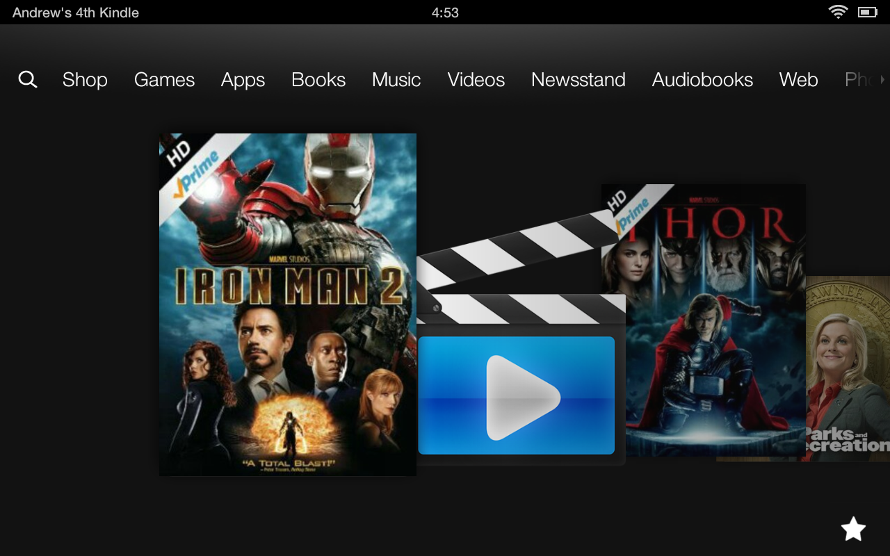
Amazon uses Android 4.0 (Ice Cream Sandwich) as the operating system on its new tablets. However, the user interface doesn't really change. Content is still arranged in a revolving carousel (view in portrait mode), where you'll find the most frequently used apps and programs. Recently-visited websites show up in the carousel as well, depicted with a small thumbnail snapshot of the site.
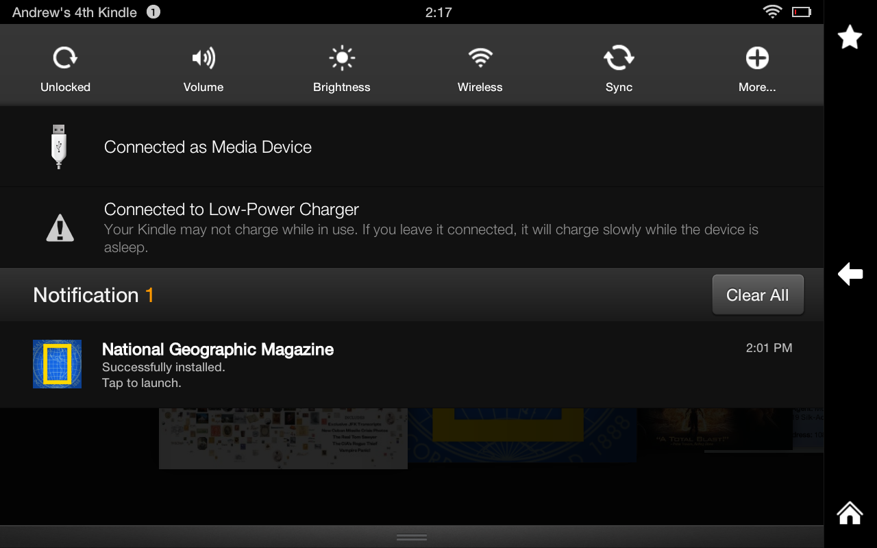
Swiping from the top displays a number of options, including Wi-Fi settings, brightness, volume, and more. This drop-down menu also serves as a notification tray and download tracker.
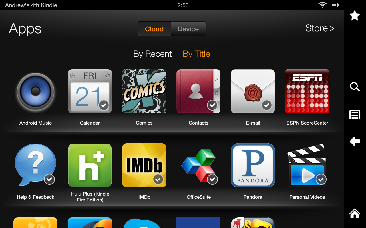
Applications are divided between those installed on the device itself, or those that exist in the cloud. Some of the options, like Contacts and Personal Videos, exist on both, enabling offline access. Other Web-based services like Hulu and Skype, obviously require network connectivity.
Article continues belowThe Kindle Fire and Kindle Fire HD are primarily consumption devices for content purchased through Amazon. This much is known and accepted. Clicking on a product link takes you to its page on amazon.com. An initial simplified product view hides user reviews, which only become visible when you switch to the more detailed product view. The UI is clean, and its focus is unquestionably designed to encourage transactions. Snagging a Bear Grylls Jacket on an Amazon Lightning Deal is quick and simple, with easy-to-select drop-down boxes for size/color, and simple checkout and payment, with or without Amazon’s 1-Click ordering.
Once purchased, books become available for offline viewing, and they're automatically formatted to enable viewing text at the appropriate size.
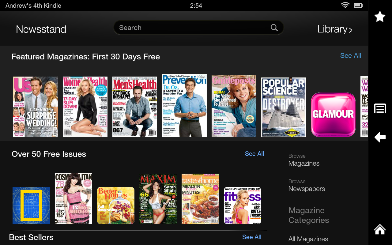
Magazines uniquely give you an animated motion when you flip through their pages.
Alternate Views For Newsstand In Portrait Mode
Get Tom's Hardware's best news and in-depth reviews, straight to your inbox.
Current page: Kindle UI: If It's Not Broken, Don't Change It
Prev Page Amazon's Second-Gen Tablets: The Kindle Fire And Kindle Fire HD Next Page Prime: Streaming Video And HDMI Output-
joepaiii Why not normalize to a constant brightness level on all tablets rather than max for the battery rundown tests? Since they all have different max brightness, your tests aren't that reliable for judging true battery life.Reply -
Another great article, as usual, from this site. However this statement in inaccurate:Reply
"Buying a Nexus 7 locks you into Google's Play store and its movies, newspapers, magazines, and music."
I have BOTH the Kinda Fire app and Barnes and Noble app installed on my Nexus 7. And that is one of the things I love most about Google's tablet: the ability to get content from any provider I want. I would also like to point out that my gf has the B&N tablet, and it is much better than the Kindle Fire for several reasons: 1) you can sideload your own content through a removable memory card, 2) it has a better screen, and 3) the build quality seems much better after holding both in your hand. It's a shame the Kindle get's more attention, the power of advertising I guess.... -
nitrium Given these devices are also intended to be used as eBooks, why won't anyone test battery life reading an actual eBook - i.e. Wifi/Bluetooth off, screen on (probably at ~50% brightness), no background tasks, just the occasional page flip every 30 secs or whatever the average reading rate is. Is that too much to ask? I tried to find this info with Google, but apparently no one but me cares.Reply -
freggo What turns be away from Amazon and on to the Nexus is, among other things, the multiple reports I ran into about Amazon messing with the content of the device.Reply
I don't care for a manufacturer remotely deleting things without my permission.
-
mrmike_49 no mention of printing - is it possible to print from ANY of these tablets to a net worked printer???Reply -
acku joepaiiiWhy not normalize to a constant brightness level on all tablets rather than max for the battery rundown tests? Since they all have different max brightness, your tests aren't that reliable for judging true battery life.Reply
There was an interesting case study a while back by AMD that pointed out most people use their devices at maximum brightness, and we've always strove to lean more toward real-world conditions. Having said that, a while back, we also started to standardize our battery life tests to a fixed brightness setting. While not real-world, it does provide a window into how devices compare to one another in that specific scenario. Bear in mind that a fixed brightness on one display may look different on another because of gamut differences. Often times you'll push the brightness up on a low gamut LCD to improve readability or visibility. The article has been updated to include those results. We always intended to do so but this understandably doubles our benchmarking workload and battery life tests take a lot of time. Thanks for being patient. -
acku ryedawgAnother great article, as usual, from this site. However this statement in inaccurate:"Buying a Nexus 7 locks you into Google's Play store and its movies, newspapers, magazines, and music."I have BOTH the Kinda Fire app and Barnes and Noble app installed on my Nexus 7. And that is one of the things I love most about Google's tablet: the ability to get content from any provider I want. I would also like to point out that my gf has the B&N tablet, and it is much better than the Kindle Fire for several reasons: 1) you can sideload your own content through a removable memory card, 2) it has a better screen, and 3) the build quality seems much better after holding both in your hand. It's a shame the Kindle get's more attention, the power of advertising I guess....Reply
Yes and no. You can use the Kindle Android app to view ebooks from Amazon. That's the case with Android, iOS, and Windows. However, this is not the integrated interface that the Nexus 7 provides. It's a little different for viewing ebooks and magazines.
More importantly is the difference in movie support. You cannot use the Nexus 7 to view Amazon Prime movies the same way on the Kindle Fire HD. H.264 streaming works when you're on an Amazon tablet, plain and simple. If you want to watch those same movies on the Nexus 7, you need to install Firefox and Flash. But that's still Flash, not the streaming H.264.
-
acku nitriumGiven these devices are also intended to be used as eBooks, why won't anyone test battery life reading an actual eBook - i.e. Wifi/Bluetooth off, screen on (probably at ~50% brightness), no background tasks, just the occasional page flip every 30 secs or whatever the average reading rate is. Is that too much to ask? I tried to find this info with Google, but apparently no one but me cares.Reply
That's a great idea! Unfortunately it's very difficult to implement from a programming perspective to keep consistent across all devices and platforms. -
nitrium ReplyThat's a great idea! Unfortunately it's very difficult to implement from a programming perspective to keep consistent across all devices and platforms.
I'd actually settle for "idle" battery life, since reading an eBook is effectively utilizing nothing but the screen. So Wifi/bluetooth/GPS/camera off (not just unused, but literally disabled in settings), screen on (at ~50% brightness). Do these things last for days under these conditions? I can't find data for that anywhere. My primary use for a tablet would be eBooks, but I have no idea which reader (except the original Kindles) actually gives the best battery life for that specific purpose. -
andrys1 Re the Barnes and Noble Nook Tablet HD that someone mentioned... A problem for marketing is that, despite the competition, it has NO cameras, not even one for Skype (important for family & friends who like to communicate via video chat), and, more important for many of us, B&N will not allow owners to enable installation of apps from non-B&N sources.Reply
Amazon does allow installation of apps from "unknown sources," so I have (from places like getjar.com or 1mobile.com) apps like Google Maps in satellite mode, Mantano and also Aldiko to read DRM'd ePub books legally. I also have the B&N Nook app, since I have the NookColor but prefer to just read on the Kindle Fire HD now.
Very accurate article. As for the Kindle Fire HD, I love the stereo speakers with Dolby and good separation because they're relatively strong and very clear. I hate using headphones or earbuds as a rule (unless in public but I don't usually listen to anything while around other people) unless I'm wanting best sound in music. For me, although my hearing is not ideal, dialog is MUCH better on these than on laptop units I've tried.
