Ubuntu 10.10: Maverick Meerkat Benchmarked And Reviewed
Mighty Minutiae
Now on to the subtle, often overlooked changes. When added together this detail work gives Ambiance/Radiance 2.0 a level of polish that is just not seen in other stock themes.
No More Neutrality
The desktop switcher in the far-right corner of the bottom panel now shows the currently selected desktop in an orange tone instead of the neutral gray employed by Lucid.
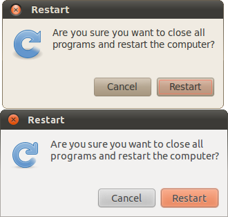
Orange is again put to good use in highlighted menu items and key buttons in pop-up windows.
The rest of the bottom panel also benefits from heavy tweaking. In Lucid, the panels are graphite, open windows are a darker shade of graphite with defined borders, and the currently-active window is a clay color. Instead of using three separate colors for the panel, open windows, and the active window, Maverick Meerkat keeps open windows the color and shade of the underlying panel. The currently-active window is a dark black which gives the illusion that the selection is depressed into the panel.
Clay was also the base color for much of the background elements in Lucid. Meerkat dropped this neutral tone in favor of a lighter, brighter gray. This change can be seen nearly everywhere in Maverick's interface, from window backgrounds to the font. Being so pervasive, this change brightens the entire GUI.
Shadows = Distance
Get Tom's Hardware's best news and in-depth reviews, straight to your inbox.
The enhanced Ambiance/Radiance themes in Meerkat also make masterful use of drop shadows to convey depth. One of the first things we noticed upon booting into Ubuntu 10.10 for the first time was the pronounced drop shadow attached to the upper panel. It really succeeds in drawing attention to the slim panel as an entity separate from the desktop wallpaper. The use of drop shadows doesn't end there. Windows and even menus now cast an extra swath of black as well. While the top corners of windows remain rounded, the bottom corners have become right angles. By making the bottom of windows flat, the new enhanced shadows are further accentuated, lending to the overall faux-3D look of Meerkat's theme. Menus benefit from these enhancements as well, making them appear as another layer on top of their underlying windows, just as the panel and windows 'pop' from the desktop.
Menus
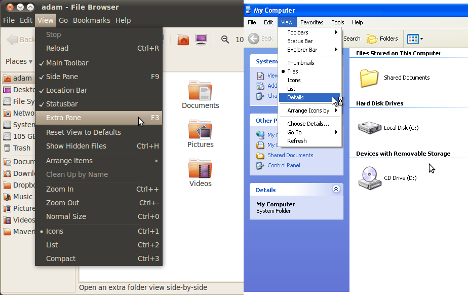
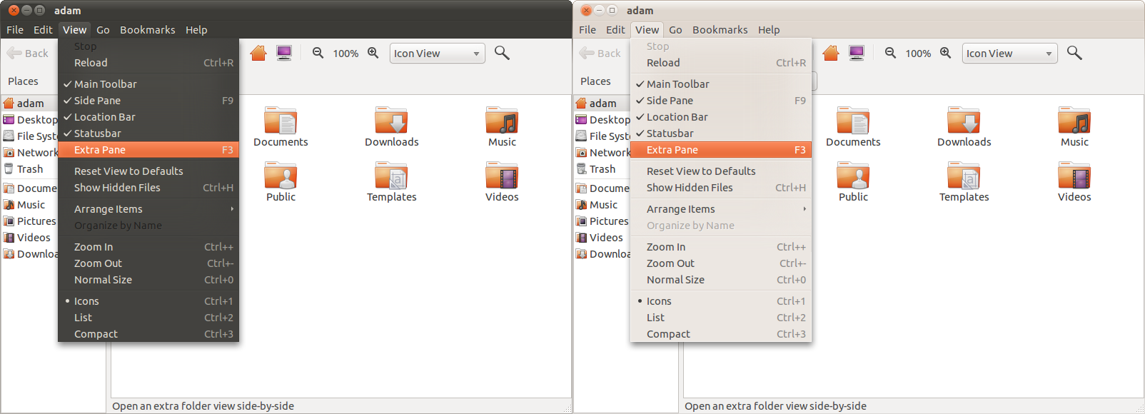
Menu bars (like Applications/Places/System in the top panel or in an application's file menu) were also not overlooked by the Ubuntu designers. In previous versions of Ubuntu and most other operating systems, the selected item in a menu bar becomes highlighted, usually with a 'hover' or 'selected' color. Another menu then drops down to show further options.
In Maverick Meerkat, the selected item in a menu bar doesn't highlight; it becomes a raised tab. When combined with the menu that drops down, this tab makes the selected menu take on a cohesive look that separates it from the other file menu items and application beneath. It's difficult to discern this effect with the black on black of Ambiance, but it becomes clearer with the lighter Radiance variant enabled. Combine this with the shrewd use of drop shadows on menus and you have yet another fine example of how to achieve a layered look of depth.
Dialog Boxes
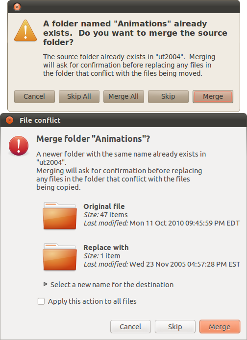
Even the error screens in Maverick Meerkat have a friendlier and certainly more informative aspect. Below is a screenshot of the merge/replace window that pops up whenever the user attempts to copy or move a file into a folder that already contains a file of the same name.
The big eye-opener in Ubuntu 10.10 is that everything is larger. The window borders are larger, the window buttons are larger, the panels seem larger, and even the font, which affects everything, is larger. People with poor vision should appreciate the changes in Maverick Meerkat.
As someone who has spent a good amount of time coding a GTK2 theme, I can tell you that it's not easy to make many of these subtle changes without totally breaking other elements. In GTK, the devil is in the details. Large, sweeping changes are relatively simple; it's the finesse that's hard. We are very impressed with what the Ubuntu designers were able to do with the aging GNOME 2 desktop. A slew of these minute but effective design choices give Ubuntu 10.10 a much smoother overall appearance than its predecessor. Simply put, Maverick's theme is what Lucid's should have been. I just hope that a lot this great work doesn't have to be scrapped for the impending switch to Unity.
-
"With the appearance of Windows 7 on slate devices in perpetual limbo"Reply
http://www.dailytech.com/HP+Slate+Powered+by+Windows+7+Launches+at+799+is+Business+up+Front/article19953.htm
http://h10010.www1.hp.com/wwpc/us/en/sm/WF06a/321957-321957-64295-3841267-3955550-4332585.html
How is that Limbo? You can buy one right now. -
adamovera I didn't know they were taking pre-orders yet, though HP Slate doesn't ship until the middle of November. Unfortunately, the HP Slate looks like a really half-hearted attempt. Business product? That pretty much means not to get your hopes up. It should have been out much closer to the iPad, but got pushed back repeatedly. Ever since they bought Palm it seems like their Windows efforts in this form factor will take a backseat until they try to make WebOS work - can't blame them really, WebOS is pretty slick and they paid a lot for it. But I still do want to get my hands on the Slate, but look forward to seeing what they do with WebOS more now.Reply -
arkadi If we "put all the issues aside", i love allot of things.....Don't get me wrong, i love to play with Linux at home, but at the moment I prefer to use it at work, in the server room ware it belongs (at the moment). Using it at home it just to much of an effort, to many issues, hardware compatibility etc...Hopefully one day...Reply
Any way Ubuntu came a long way to make it happen....But still few days ago i tried it and few others on a net book, with via chip set and CPU with no luck... -
TomSah "Ubuntu 10.10 Netbook Edition is also a mess. As a netbook operating system intended for actual people to use in a production environment, I have to say that UNE 10.10 should be avoided. From our experience on the Dell Mini 10v, UNE Meerkat is in no way ready for general consumption. Its many bugs and poor performance are just not acceptable or at all realistic for the average end-user. Loading almost anything on UNE 10.10 was clearly sluggish"Reply
Wow. Im running 32-bit Maverick UNE on my Asus eee 1000HA and i have to say that i fell in love as soon as it installed! As soon as i disabled the unity interface to get the desktop interface I was away laughing! I havnt had any of the problems you mention, app startup has been great, no crashes/bugs - And this is my first serious attempt at using a Linux distro. I had a lot of fun tweaking everything to my liking and i now feel like I have the perfect OS for me. Its really strange you had bad experiences like that, must be the dell mini haha. -
adamovera TomSah:Reply
As soon as i disabled the unity interface to get the desktop interface I was away laughing!
Well there you go, you got rid of Unity. I don't doubt it works fine now, LOL. I'm using the 10v with 10.10 32-bit Desktop Edition right now and it's absolutely fantastic, one of the best OSes on this thing by far. The track pad is a nightmare, and there's no fixing that, but in 10.10 it's much better than earlier versions. Tap to click is the best in Windows 7, but drag and drop in Ubuntu is much less maddening than Win7. -
randomizer Just moving the cursor up and down the launcher shows how slow Unity is. The delay between when the cursor moves over an application to when the application's name pops up gives the impression of playing a game at very low framerates.Reply
The Ubuntu font looks ok but it's really only usable in menus and window titles (which I think is all it is used for, fortunately). There's no way such a stylised font could be readable for long periods in a document.
Adam, you should see if any updates fixed the consistently inconsistent HDD to HDD file copy performance.
9503393 said:How come you don't compare the benchmarks to Windows?
Because Windows is not a Linux distro, and this review is for a Linux distro? -
adamovera randomizer:Reply
Adam, you should see if any updates fixed the consistently inconsistent HDD to HDD file copy performance.
As of 10/22/10, when I re-tested the HDD to USB times, they had not.
pinkfloydminnesotaHow come you don't compare the benchmarks to Windows?Workin' on it, stayed tuned. But randomizer is right, this is a review of the new Ubuntu release. As a review of the new version of a software product, this type of article isn't the appropriate forum for that comparison. -
64 bit vs. 32 bit? 32 seems much better all round, stability, compatibility etc.. Is there that much speed difference to be worth using 64 bit?Reply
gvnmcknz


