Ubuntu 10.04 LTS: Lucid Lynx Benchmarked And Reviewed
Canonical, the company behind Ubuntu, is pinning its hopes of OEM acceptance on the Lucid Lynx. We've put the screws to this new Long Term Support (LTS) release, comparing it to Canonical's previous LTS release, 8.04 Hardy Heron, to look for progress.
Look And Feel
Ambiance And Radiance
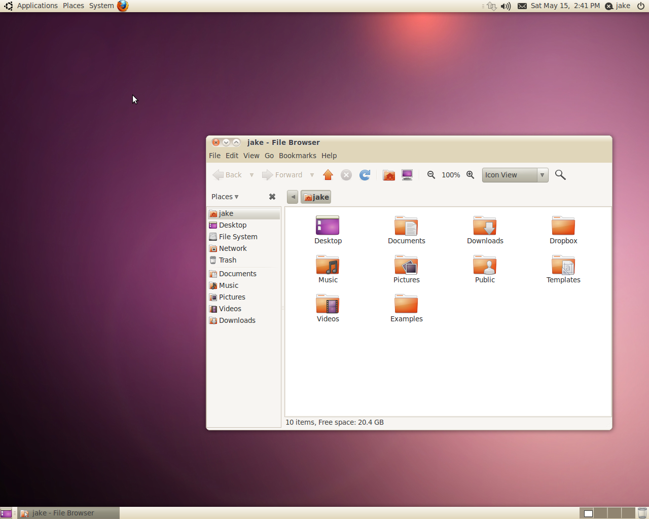
Ubuntu 10.04 LTS has moved beyond the Human theme that has been the default for every release that I can remember. In its place is the new Ambiance theme.
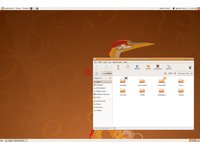
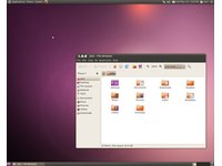
What the heck is aubergine? It turns out that it's the color of an eggplant. In fact, aubergine is just another name for an eggplant. On one hand, I am so profoundly elated to see the operating system shed its brown motif. On the other hand, purple? Really?
Thankfully, Canonical kept the orange that has been around for a few years, though that too underwent a transformation. Orange remains the primary color for icons and many of the buttons. But this time around, an infusion of red radiates up into the orange that gives the color a deep, rich glow. At first, all I could think about was how hideous orange and purple look together. But once you see them in the new dark Ambiance theme, the difference between purple and aubergine, and between orange and blood orange becomes crystal clear. It looks welcoming. It looks cohesive. And most importantly, it is sets itself apart from the default look of any other OS. There will be no mistaking Ubuntu for any other GNOME desktop distribution.
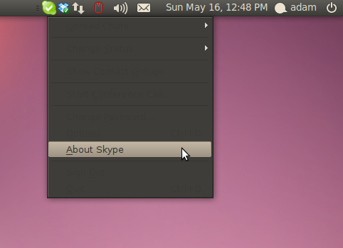
Ambiance is a dark theme, so there are bound to be some applications that have font color issues. One such application is the uber-popular VoIP client Skype, which employs right-click menus with black text on a black background. Hovering over the menu box illuminates the currently-highlighted menu item.
Besides the minor occasional dark theme issue, it is one of the best implementations of a dark theme yet. For anyone who can't deal with the bugs or just don't like dark themes, Canonical as included Radiance, a light, almost cream-colored twin to Ambiance. Which is pretty nice as well, but doesn't groove with the aubergine accents like the default dark theme.
Branding Overhaul
Get Tom's Hardware's best news and in-depth reviews, straight to your inbox.
10.04 LTS is not only a departure from previous versions of Ubuntu in system theme. Canonical is completely redoing the Ubuntu branding. Below are the new logo and lettering next to the old.


Personally, I've always liked the old Ubuntu lettering and logo, but the new branding looks good as well. If you look at the implementation of the lettering and logo with the new color scheme, it comes off as very professional.
Why Is Everyone Driving On The Wrong Side!?!
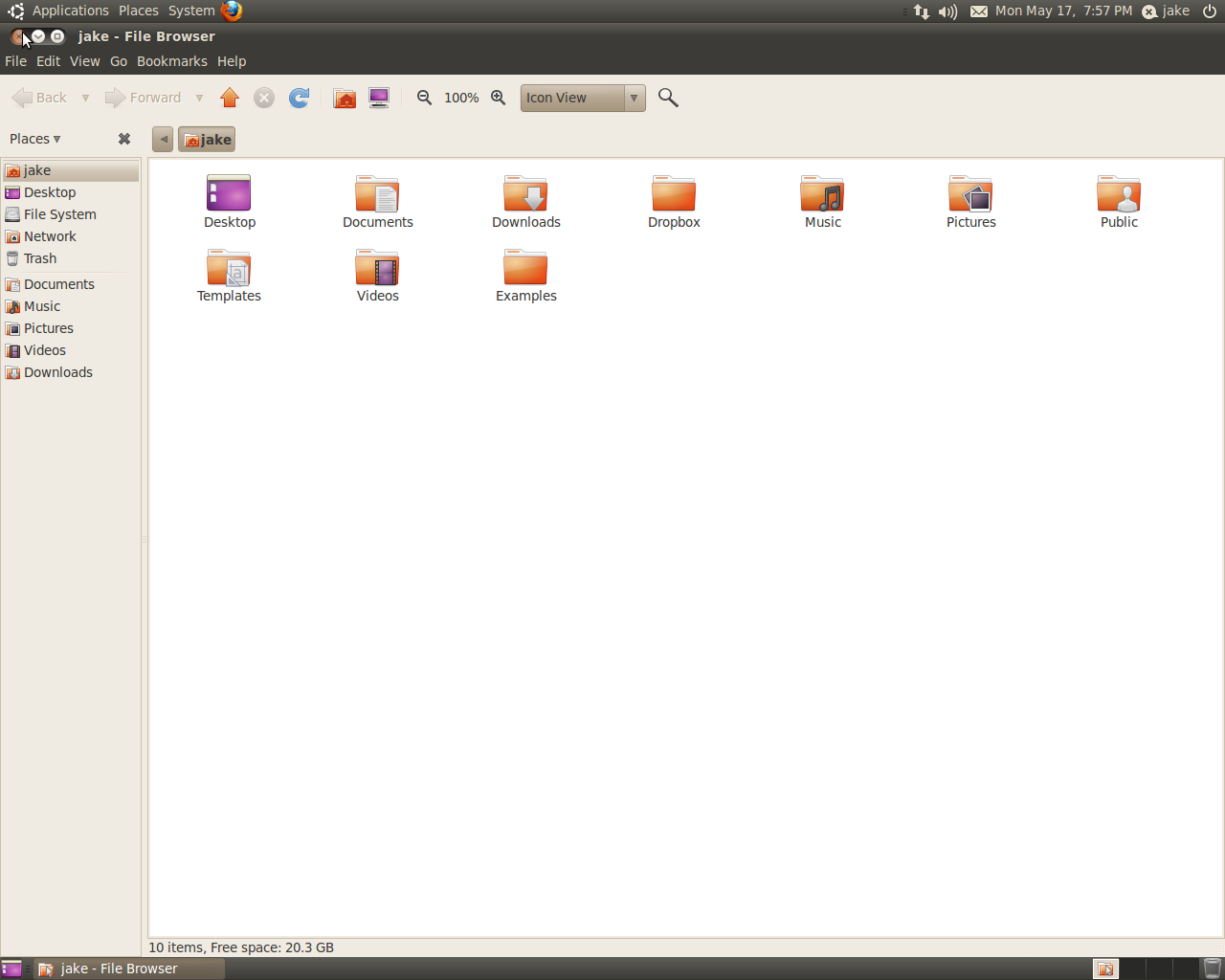
No Ubuntu 10.04 review would be complete without mentioning that the window controls (minimize, maximize/restore, and close) are now on the left-hand side - like on a Mac. Is it irritating? Yes. Is there a simple way to change it? No. Is it a deal-breaker? Not really. I made moves for the upper right-hand side of windows on a near-constant basis for the first 20 minutes of using Lucid, after that I grew accustomed to it. That said, I would like to know the rationale behind the move. Are the possible future appearance of “windicators” the only reason? Or are they really that serious about converting Mac customers? By imitation?
Let's face it, no matter how much Canonical wants to convert Mac users over to Ubuntu, that's a pretty tall order. Mac users aren't known to switch brands with the regularity of their PC counterparts. After all, once you go Mac you never go back, as they say. I'm not saying that using MacOSX as the gold standard to which Ubuntu is held is a bag thing. In fact, it's probably a good idea. By many accounts, MacOSX provides a far more polished end-user experience than Windows. Go for the gold and get silver on the way. The problem is that Mac has an estimated 7% market share, while Windows has over 90%. That's well over 10 times the number of people on Windows than Mac. Why go out of your way to make things more unusual for the most people? Sure, the 7% of computer users who have Macs will feel right at home with the new positioning of the window controls - but then again, they typically aren't the type to stray. On the other hand, more than nine in ten people in the world are already accustomed to the window controls being on the right-hand side – and they are historically much less loyal to any single tech OEM. From an ease-of-use standpoint, it makes no sense.

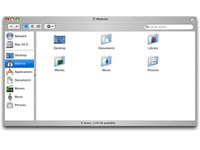
Then there is the functional side to window placement. Again, the decision to go to the left-hand side doesn't appear to be logical. There is the obvious issue of the menu bar being right below the close button. MacOSX doesn't have this issue. In that OS, the menu bar of the currently active window becomes part of the upper panel. You also have the Applications menu to contend with right above any maximized windows. I can easily imagine a former Windows user (or Mac user, for that matter) becoming intensely frustrated when they accidentally close their current window when trying to access the Applications menu to open another app.
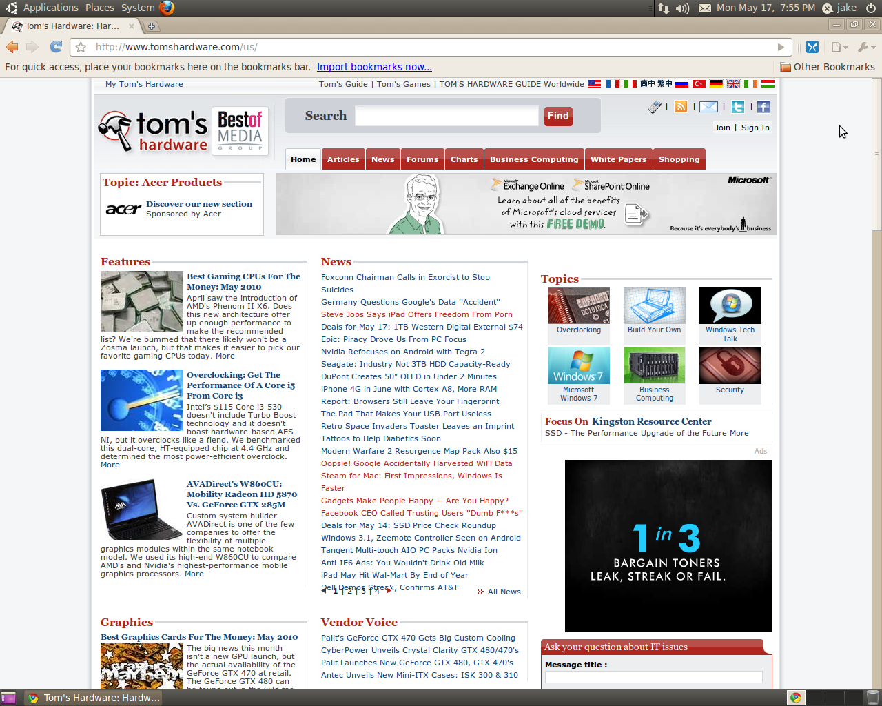
Also consider that the log out and shut down menu is on the far right-hand side of the upper panel. You must close the operating system from that corner of the screen, it only makes sense to close applications from there as well. This also creates a situation where non-GTK apps that use their own window controls are all on the right-hand side. A notable example being Google Chrome. Fortunately, you can fix this by right-clicking on the psudo-title-bar in Chrome, and choosing Use System Titlebar And Borders. Still other apps that have multiple works open at once, like OpenOffice.org, have the file close button in the top right corner. That's just the corner for closing things for most people and apps.
Now, about the planned “windicators”. If the future emergence of these window indicators are the sole reason for moving the window controls, then I suppose the change is a necessity. But not right now. I don't see any “windicators” in Lucid, so why move the window controls now? If the “windicators” are the why the window controls were moved, fine, I won't get into the concept. It just means that this is yet another example of Canonical jumping the gun and changing the current situation to make room for features that aren't here yet. It reminds me of the decisions to replace Pidgeon with Empathy and to replace Add/Remove Applications with the Ubuntu Software Center in 9.10. In both instances, the newer applications had less functionality than the ones being replaced. Also in these instances, the new applications had additional features and integration that were planned, but not yet realized. Since there appears to be no immediate need for this change, at the very least, Canonical needed to have a simple way to change the orientation of the window controls through the Appearances tool – yet another area where KDE has GNOME beat.
Current page: Look And Feel
Prev Page What's New And What's Changed Next Page Test System Experiences And Observations-
My Logitech Wireless Wave keyboard and mouse didn't work with Ubuntu 10.04 LTS Desktop x64 on VMWare Workstation 7.01. It works in the beginning with text screen, but once it goes to GUI screen keyboard function is lost. ;_;Reply
-
WheelsOfConfusion There's lots of talk on the Phoronix forums about how Ubuntu + nVidia binaries don't play nicely, while some other distros don't have that problem. This was reflected in an Ubuntu vs. Arch bench-off: surprisingly, Arch only really thrashed Ubuntu in the games and everything else was about even. This might be behind those pitiful scores with the game benchmarks.Reply
Compiz also has a measurable, negative effect on game benches with nVidia, but not so much with ATI hardware/drivers. I'm not surprised that turning off desktop effects changed the game so much.
What do you think is going on with 7zip, an ext4 issue? -
jsowoc With 10.10 planning btrfs and GnomeShell, it's a sure recepie for tragedy :-). Very nice article.Reply -
adamovera @WheelsOfConfusion:Reply
RE: desktop effects - I'll be adding an ATI card to the mix a little earlier than I had intended in order to look at the desktop effects issue. Stay tuned.
RE: Gaming FPS - The interesting thing is that the actual games didn't have that big of an impact from desktop effects. It was the unigine benchmarks that showed seriously significant drops in frame rates with them enabled.
RE: 7z - I suppose it could be EXT4, but I believe EXT4 is the reason for the speed gains in all other comp/decomp tests, as well as the copy time tests. Comprehensive filesystem and archiving benchmarks under the same release should tell us whether or not it's an EXT4 issue. -
apoq Why no benchmark against Windows. You yourself said Ubuntu should be aiming to convert Windows users more than Mac users (and I whole heartedly agree with you). I love Ubuntu and I use most of the time, but every time I boot into Windows (7) I am left with the feeling of a way snappier OS. I think this is where Ubuntu is really lacking.Reply -
killerclick Linux still doesn't have the software I need so I can't use it. However I've noticed a sharp decrease in stupid problems in the past three years (prolly thanks to Ubuntu). Currently my favorite distro is Mint but I remain a Windows user mainly because of a lot of software I own and am proficient in.Reply
As for the latest Ubuntu, why can't they have a bland business-like theme? Are the Phoenix Suns now paying them to use their colors? -
For your Skype visibility issues, go to Skype settings and change theme to GTK+. Did the trick for me.Reply
-
samspqr looks nice, but there are still a lot of unanswered questions, like:Reply
* will it play 1080p24 H.264 videos smoothly, with GPU acceleration?
* will it play vimeo/youtube high-res videos smoothly?
given how good you say it is on the other fronts, I'll give it a try and see for myself (I'm currently on 8.04, so convincing me to spend an afternoon updating my systems is no small feat) -
zybch So, will this year be another "Year of Linux on the Desktop" like its been claiming for the past decade year in year out? Or will it remain a niche OS which people needing to do actual work on 'real' programs can continue to dismiss out of hand?Reply -
flightmare You can set the minimize, close and maximize buttons to the right again in gconf-editor. Browse to apps/metacity/general and edit button_layout to your likings.Reply

