Display Calibration 201: The Science Behind Tuning Your Monitor
Application: How To Adjust Color Temperature
Assuming you’ve selected the User or Custom color temp preset, we can now adjust the RGB controls. You will need the meter again for this one. In fact, you’ve likely already gathered the data you need during the gamma adjustment step. If you’re using CalMAN, you might have a graph like ours.

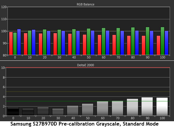
There are two data sets here, the RGB levels for each brightness step and the Delta E error. Delta E is a value that expresses the amount of error for a particular color; in this case, white. We believe three is the point where these errors are visible, so we aim to calibrate our review monitors to a lower value. In the example, you can see that 0 and 10 percent have a little too much blue and the rest of the steps have too much green. We like this graph because you can see exactly what’s happening at every measurement point.
How do we fix this? Every monitor we’ve reviewed has only one set of RGB sliders, so we have to figure out what brightness level is most affected by those sliders. We always begin with an 80-percent window, and as it turns out, that is always the right brightness level for our adjustments.
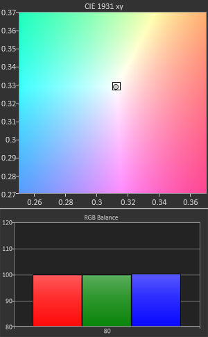
Display an 80-percent window, place your meter on it, and set your software for continuous readings. That way, you can adjust the sliders in real-time and observe their effect on the white point. Here are the indicators we like to use from CalMAN:

The upper portion is a bulls-eye that makes it very easy to see which way you need to manipulate the controls to get the dot into the square. Below that are RGB Levels, which are also very easy to use. The goal here is to get all three bars lined up at 100.
Now, there’s just one challenge to this.

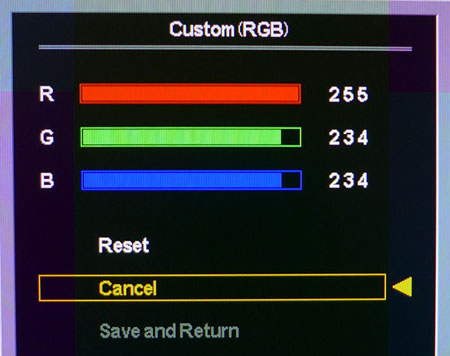
You’ll notice that the RGB sliders start at their highest settings, meaning your only option is to lower them. We would prefer they start in the middle, but most computer monitors are set up this way. Not to worry, though. If you need raise Red, just lower Green and Blue in equal amounts instead. That’s what we did for this monitor, HP's E271i.
Get Tom's Hardware's best news and in-depth reviews, straight to your inbox.
Once you’ve adjusted your 80-percent window to perfection, take another full measurement run. In most cases, you’ll find that all levels are greatly improved and will have errors of less than three Delta E. If this is not the case, you may need to adjust a different signal level. While this is rare, it does occasionally happen. Adjust the window pattern that gives you the best overall average Delta E.
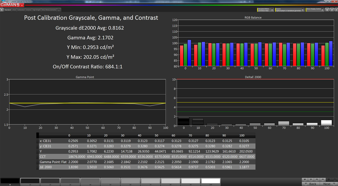
Here’s a sample of the final results.

This tells us everything about grayscale and gamma in one screen. The max white and min black numbers are in the upper-left, along with average gamma, Delta E, and contrast ratio. The gamma chart is in the mid-left. The upper-right has the RGB levels, followed by Delta E for every brightness step. And at the bottom is all the raw data. If your results look like this, you have a really good monitor. This one is a Samsung S27B970D.
If you’ve made it this far, you’re pretty much done unless your monitor has a color management system, or you’d like to create an ICC profile. We’ll explain how that works on the next page.
Current page: Application: How To Adjust Color Temperature
Prev Page Application: How To Adjust Gamma Next Page Application: How To Adjust Color
Christian Eberle is a Contributing Editor for Tom's Hardware US. He's a veteran reviewer of A/V equipment, specializing in monitors. Christian began his obsession with tech when he built his first PC in 1991, a 286 running DOS 3.0 at a blazing 12MHz. In 2006, he undertook training from the Imaging Science Foundation in video calibration and testing and thus started a passion for precise imaging that persists to this day. He is also a professional musician with a degree from the New England Conservatory as a classical bassoonist which he used to good effect as a performer with the West Point Army Band from 1987 to 2013. He enjoys watching movies and listening to high-end audio in his custom-built home theater and can be seen riding trails near his home on a race-ready ICE VTX recumbent trike. Christian enjoys the endless summer in Florida where he lives with his wife and Chihuahua and plays with orchestras around the state.
-
MANOFKRYPTONAK For TVs CNET posts the color levels they use to test each TVs picture by model. They also give great advice on how to adjust too! I used there settings with my 50" vizio and could not be happier. Don't get me wrong loved this article, but you can never get too much info, am I right?Reply -
yolosweg I've adjusted the gamma on my laptop but it keeps reseting. Does anyone know how to fix this? (I used the default windows program btw)Reply -
Vladimir83 Fantastic article.....TomsHardware style!Reply
I have no idea how my monitor was off until i saw the patterns ;)
Now perfectly set for brightness/contrast:first,third,and fourth pattern(although on this i notice cliping on the blue).
However second pattern couldn't set it right.Darkest bar which should be almost cliping to the background is too "black",and the next "12" bar is more closely match to the background in colour.
Any thoughts someone? I use Philips 227Eqha IPS monitor. -
rezzahd Great display calibration guide. I would recommend this to anyone new to display calibration.Reply -
clonazepam Every time I took a support call for pro graphics products, and it centered around getting accurate color, I started off with "Color is a 3-dimensional space..." It was just my way of saying we might be here for awhile.Reply
I love these articles. =) -
ojas Second page, second last photo, article should say that you've set the black level too low, not too high.Reply
Seems to be an interesting read so far, and I've really wanted to read an article like this, so thanks in advance! -
ojas Doesn't the first picture of Gavin on the 3rd page have low gamma and the second bright one is where the gamma is too high?Reply
It's written the other (incorrect?) way around in the article, i think. -
ojas ReplyNow we’ll make the color temp too warm; in other words, below D65.
Shouldn't it be "above D65"? :/ -
gwolfman Reply
It's opposite. Lower gamma makes the dark areas of an image brighter, hence the entire picture looks brighter. Higher gamma makes the lighter areas darker (i.e., it takes a lot brighter white in the image data to actually be displayed white). Check here for a great tutorial on gamma, especially the section titled "Display Gamma."11718866 said:Doesn't the first picture of Gavin on the 3rd page have low gamma and the second bright one is where the gamma is too high?
It's written the other (incorrect?) way around in the article, i think.
http://www.cambridgeincolour.com/tutorials/gamma-correction.htm
That's incorrect. It actually works backwards/opposite from what one might think. Color temperature originates from the color a flame radiates in relation to the temperature at which it burns. Think back to grade school and playing with the Bunsen burner... the hottest part of the flame (i.e., higher Kelvin) is in the darkest blues, not the reds (i.e, lower temperature/Kelvin). This simple picture helps explain the difference.11719001 said:Now we’ll make the color temp too warm; in other words, below D65.
Shouldn't it be "above D65"? :/