High-End LCD: Samsung and BenQ
Get Tom's Hardware's best news and in-depth reviews, straight to your inbox.
You are now subscribed
Your newsletter sign-up was successful
Ergonomics
We adored its design in November, and our taste hasn't changed. The screen is extremely well designed. On the back, there is the choice between an analog and a DVI interface. There is also the sector socket and an external transformer. Finally, the height of the screen is adjustable. For it to be even more practical, we would have preferred to have been able to attach it to a wall with nails or screws, but that wasn't possible. To do that, special brackets are required which many home users will find difficult to obtain.
The screen is also delivered with the MagicTune utility, useful for adjusting the display settings from the screen. A series of small patterns makes it possible to regulate brightness, contrast, etc. with the cursor.
Colors
Article continues belowThe screen's default setting for brightness was too high. It's hard to do more mundane office tasks such as word-processing when the screen is too bright (244 cd/sq. m.). This also means that the paler shades are burned out. Fortunately, calibration makes it possible to considerably improve the rendering.
Simply changing the screen setting in USER ADJUST to TEXT (by means of a button on the screen) makes it possible to obtain a setting that is easier on the eye.
In TEXT mode, the screen brightness is diminished while the color rendering remains just as faithful.
| Samsung SyncMaster 172X | Default setting | After adjustment |
|---|---|---|
| White | 244 cd/m² | 153 cd/m² |
| Black | 0.49 cd/m² | 0.32 cd/m² |
| Contrast measured | 497 : 1 | 478 : 1 |
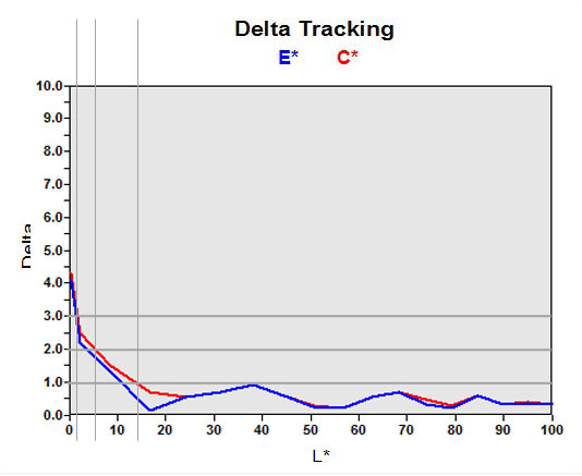
Once again, the color rendering on this screen deserves a medal. It should be noted however that although it is much more faithful than average, it remains one notch below that of the BenQ FP767-12.
Get Tom's Hardware's best news and in-depth reviews, straight to your inbox.
