Roccat Power-Grid: Turn Your Smartphone Into A PC Peripheral
Roccat's Power-Grid allows your smartphone or tablet to be used as a programmable PC peripheral interface device. We took the beta version through its paces to show you what the software can do, and how easy it is to create your own custom interface!
Get Tom's Hardware's best news and in-depth reviews, straight to your inbox.
You are now subscribed
Your newsletter sign-up was successful
How To Create A Custom Grid
To us, the ability to create and share custom Grids is by far the most impressive and appealing aspect of Roccat's Power-Grid software. It's surprisingly easy to put together a basic Grid, and users who are comfortable with creating graphics will find they are able to build Grids without a huge effort. We'll show you how we made our first Grid, and hopefully that will give you a good idea how you can make your own now that the software is available.
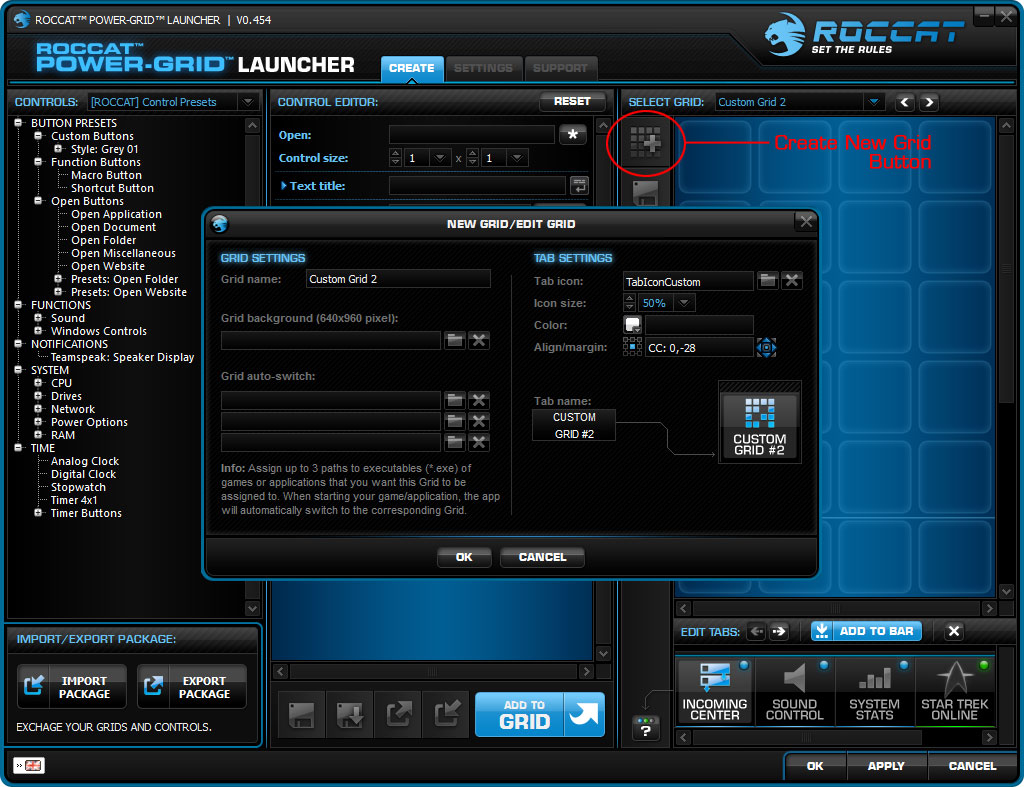
Power-Grid requires launcher software on the host PC and an app on the mobile device. The PC software controls what Grids are installed on the smartphone and lets you make custom Grids. When you open the Power-Grid Launcher software on the desktop, you see three sections: Controls (the left side, where control types are stored), Control Editor (center, where individual controls are modified), and Grid (right, where controls are placed on the Grid). At the bottom of the right-hand window is where the Grids are chosen and applied to the remote device. To create our first Grid, we select the create tab at the top of the right-hand window.
From here we can name the new Grid, add a background image, and modify the Grid's tab name and icon. New Grid tabs are automatically populated with a pixelated icon as shown, but this can be replaced if you have your own custom image. For now, let's accept the defaults and click OK at the bottom of the New Grid window.
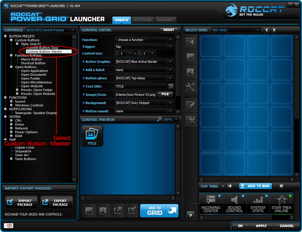
Article continues belowYou can see our new empty Grid on the right. Let's begin by populating it with a map button. To do this, we need to create a control. Our first control will be based on one of Roccat's control presets. Select Roccat control presets from the controls drop-down menu on the left and expand the custom buttons menu to select Custom Button: Master as shown in the image above. This selection gives us the most powerful settings to create and modify our control.
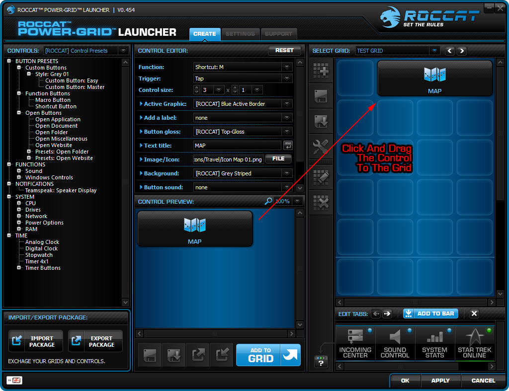
After this is selected, you will see the control in the Control Editor (center window). Set the trigger to Tap, simulating a single key tap on the keyboard. After the Shortcut function, we'll type the letter M to simulate a single tap of the M key. We want a large button for a map, so we can set the Control size to be three slots wide. In Image/Icon we can choose to select one of Roccat's bundled icons, in this case a map.
Once the control is created, we can drag it to the Grid on the right. This is how it will look displayed on the smartphone or tablet.
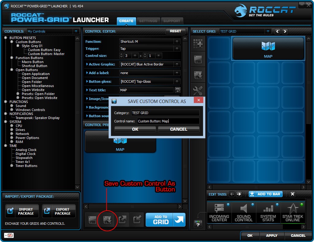
Instead of using Roccat's control set, you can create a custom control set for your Grid. This is done by saving each control to a custom category named after the Grid. For example, click the Save Custom Control As button at the bottom of the Control Editor window. Name the category after your Grid, and name the control appropriately as shown in the example above. Then click OK to save.
Get Tom's Hardware's best news and in-depth reviews, straight to your inbox.
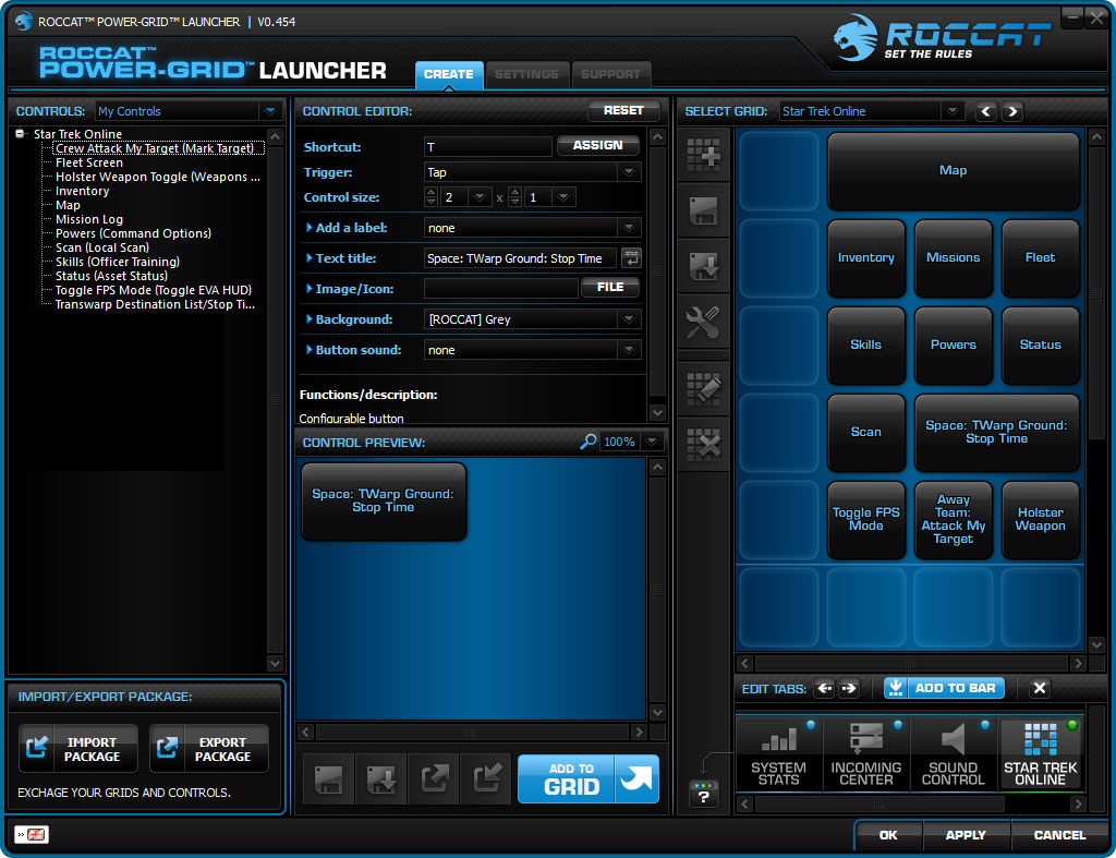
Now let's fast-forward to an example of a Grid we made for the MMO Star Trek Online. Notice that we've populated the grid with a number of custom controls. In the Control Window on the left, you can see we've selected My Controls from the drop-down, and all of our custom controls are displayed in the tree under Star Trek Online.
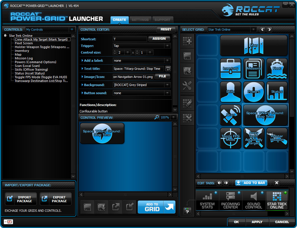
Now we'll get fancy and add some icons to the Grid. You can select an image to use as an icon by clicking the file button next to the Image/Icon field. There are a lot of icons included with the Power-Grid software, and you can customize the look of your Grid without any other graphic editing tools. That's all there is to it! You now know how to put together a basic Grid with the included icon graphics.
Let's say we have some experience with graphics and want to make our Grid look really special. In this case, we can make custom graphics to display. Roccat's software accepts 140x140 pixel PNG files, facilitating really unique custom control icons. Custom backgrounds can also be inserted behind the buttons. This is how users made some of the impressive interfaces you saw on the previous page.
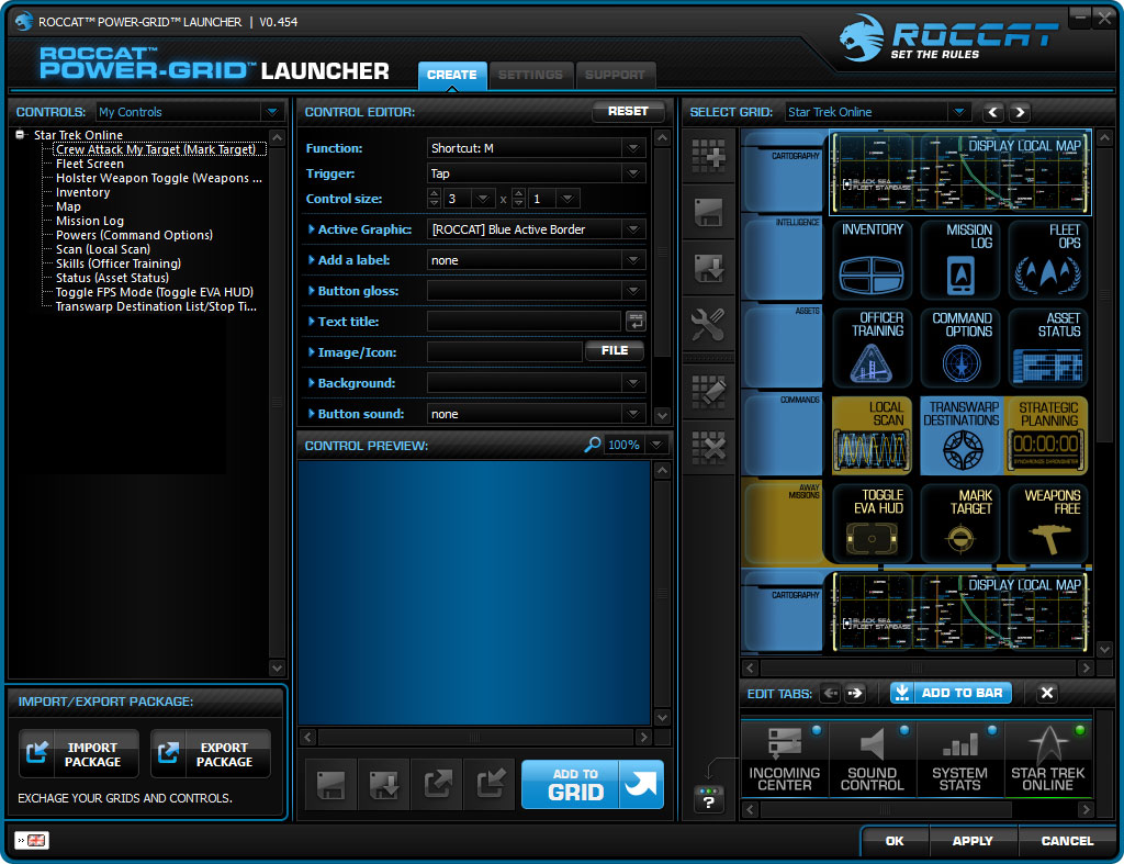
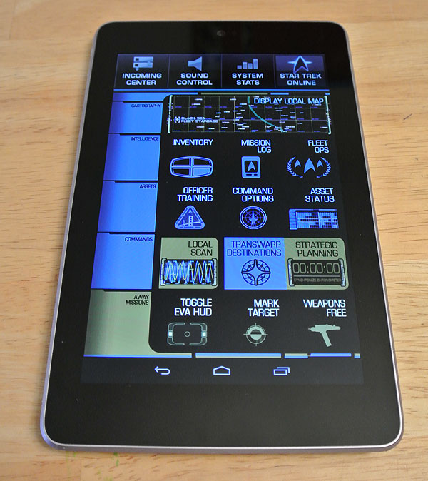
We want to take our Grid to the next level, so we made a custom background to simulate the captain's PADD device seen in the Star Trek TV series. Instead of making individual buttons, we decided to go a different route: we placed all of the control graphics on the background image. To give the user visual feedback when a button is pressed, the Grid will show the built-in semi-transparent highlight image. This is how our Grid looks in the Power-Grid launcher:
Note the control editor. We removed the label, title, and image from the button so the background image is seen at all times. In the grid window on the right you can see that we chose to leave the left column empty of controls to leave space for some background graphics.
You will also see that this grid appears to repeat itself with the sixth row. This is because we designed it for the Nexus 7 tablet and later discovered that other devices with different aspect ratios are able to show the sixth row. Android devices display the Grid selection tabs on top, while iOS devices show them on the bottom:
If you place more than five rows of controls on your Grid, whoever uses it can scroll up to access them with a finger swipe.
The tab logo and Grid background can be changed in the New Grid/Edit Grid window. The Grid background selection box specifies a 640x960 pixel image file for the background.
Let's talk a little more about those Grid selection tabs. As we understand it, the free version of Power-Grid allows four Grids to be installed at a time, and users can unlock more slots with paid upgrades. You can control which Grids are installed in the Edit Tabs section, under the Grid display window on the right. There, you're able to add a Grid to the tab bar, delete tabs, and change the tab order. This controls how the tabs are displayed and available on the mobile device.
Those are the tips and tricks we learned. To see a video demonstration of how our grid works in-game, and for a download link, check out the next page.
Current page: How To Create A Custom Grid
Prev Page Non-Bundled And Community-Authored Grids Next Page Demonstrating Power-Grid With Our Custom GridDon Woligroski was a former senior hardware editor for Tom's Hardware. He has covered a wide range of PC hardware topics, including CPUs, GPUs, system building, and emerging technologies.
-
qlum Or my note 3 for that matter. I do however think that I could use the gameklip I ordered as a stand. Or just some other stuf in my room. It is not that hard.Reply -
heero yuy so do I have to buy one of these roccat keyboard thingys or can I just install an app on my phone and go from there?Reply -
OcelotRex Reply11809382 said:so do I have to buy one of these roccat keyboard thingys or can I just install an app on my phone and go from there?
I too want to know this. I am in the process of building a lap desk to use for my KB/Mouse setup to the HTPC. My plan was to use a automotive dashboard mount for my Note 2 or Nexus 7 to have on the lapdesk to surf the web or use skype with. If this software works independently without hardware that'd be great. -
razor512 that is the worst thing you can do to a smartphone (short of just smashing it). All of the wide viewing angle displays (IPS like technology) get burnings if static content is displayed for too long and it eventually becomes permanent (just like with an HDTV)Reply
I would consider a product like this only useful if you have an old first gen android smartphone or an old windows mobile 2003 pocket PC or other old device to use with it and be compatible.
A person doing something like using their iphone 5 for this will be very sad when they see the screen burn-in.
These issues will not happen within a short while, but over time you will start to get burn in issues that won't go away. -
gadgety "instead of purchasing a separate, expensive peripheral device with customizable LCD display, what if you could just leverage your phone or tablet to get the job done?" Yes, I've been looking to get a CPU temperature, and fan and pump controller software. Found something called PC-monitor which is available for iOS, Android and and Windows Phone. Apparently there's something called Server control as well. Haven't used either, but really looking for these kinds of solutions, utilizing the power resident in the phone.Reply -
psycher1 Cant get it to connect. Any network oriented dudes out there that can help me find out what's up?Reply
My PC is wired to the router, don't know why that would hurt but it's the only thing I can think. Otherwise, got my LAN and WAN IP addresses, but the phone can't find either.
