CCFL Versus LED: Is There A Downside To Going Green?
With the display market quickly transitioning to LED backlighting, are we losing anything in the move away from CCFL? Sure, LED is supposed to be greener, with richer contrast and color...but is it? Before you jump to conclusions, check out our review.
Get Tom's Hardware's best news and in-depth reviews, straight to your inbox.
You are now subscribed
Your newsletter sign-up was successful
Quality Tests: Asus MS238H
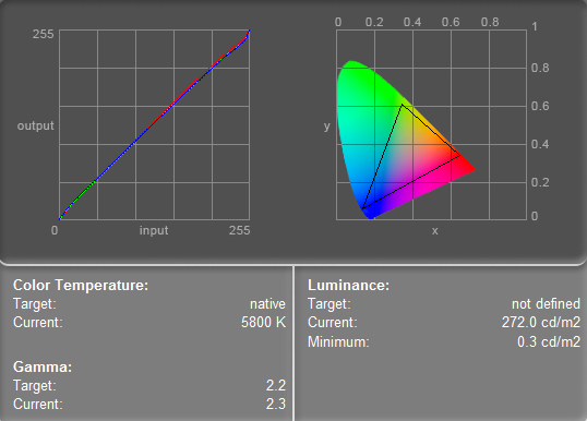
Let’s get to the meat of the matter. Out of the box, the Asus MS238H defaults to settings of 100 brightness, 80 contrast, and “normal” color. Here is an example of Eye-One Match Easy results showing a color temperature of 5800K, 2.3 gamut, and a true factory luminance (measured at middle-center) of 272.0. The minimum luminance, which is essentially the deepest black the screen can provide, was 0.3 cd/m2 before calibration.
You’ll notice the diagonal line on the graph on the left of this screen capture. This is actually three overlapping lines, indicating the strength of the red, green, and blue color channels. The fact that they’re overlapping so closely shows that they are all outputting at about equal levels. The strength of these color channels and the color temperature of the display are inextricably linked. Change one and you change the other. In general, it seems that such evenly balanced color lines yield the best-looking display, but this isn’t inherently true. There could be cases in which, say, a weaker blue channel could yield a superior image for a certain application. This is why many monitors come with various color presets in their on-screen display controls.
When we switched into User mode for color, the MS238H showed 100/100/100 for the three color channels. Running through calibration had us end up with a contrast of 98, color values of R52/G50/B58, and brightness at 100. This delivered final readings of 6500K, 2.2 gamma, 115.5 cd/m2 luminance, and a minimum luminance of 0.3 cd/m2. From here forward, we’ll only note gamma in cases where it’s not 2.2.
Article continues belowWe found early on that there is some leeway in adjusting brightness versus color channels. We achieved nearly the target luminance here because we dialed way back on color channel strength, but left the backlighting strength at 100%. Subsequent experimenting showed that we could alternatively reduce some brightness and bring up the color channels to get similar results. However, pursuing this put us in a tedious loop of calibrating and recalibrating, trying to strike the right compromise between temperature and luminance. It’s much trickier than it seems at first glance. Ultimately, we decided to stick with our original calibration results.
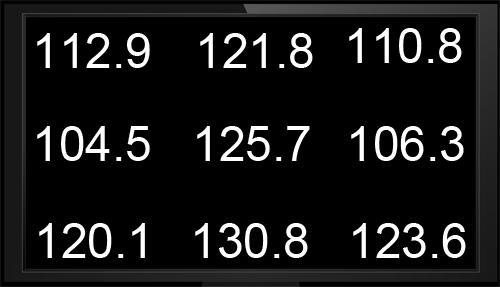
After calibration, we see some interesting results. The above graphic shows the nine luminance readings taken across the MS238H. That’s a little bigger spread that you might have thought, right? Yeah, we’ll be seeing more results like that. The good news is that in real life, you don’t perceive a 20% to 30% variance in post-calibration brightness across the screen. That said, a 104 cd/m2 luminance in one area could conceivably skew your work in a task like photo editing.
For the post-calibrated display, color temperature ranged from 6400K to 6800K, gamma only varied up to 2.3, and the minimum luminance dropped to 0.2 cd/m2 across the board. This is another good reason to calibrate your screen. Once you get down to a reasonable luminance level, you’ll probably find that your blacks improve.
Finally, the sRGB gamut volume for the calibrated MS238H was 882 665. In these gamut images, the wireframe represents the monitor’s output range, while the red-shaded object (as well as the corresponding red outline on the 2D plot) shows the sRGB gamut. Ideally, we want to see the monitor’s range volume be smaller than the wireframe. Areas in which the monitor range is significantly less than sRGB could signal a noticeable deficiency in color coverage. In short, we want to see the rainbow lines be outside the solid red. The MS238H does reasonably well here, but we’ve rotated the ColorThink Pro graph to illustrate light green, one of the monitor’s weaker areas.
Get Tom's Hardware's best news and in-depth reviews, straight to your inbox.
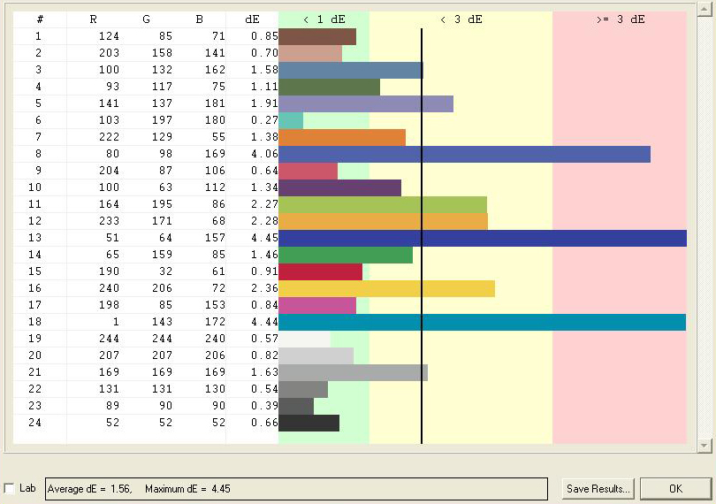
Last up, the MS238H chimes in with an average Delta-E of 1.56 and a maximum of 4.45. Overall, this is pretty decent. Don’t let the spikes in the deep blues unnecessarily prejudice you. Human eyes are less sensitive to color differences in deep blues and reds than they are with greens. We’ll discuss subjective impressions in a couple of pages.
Current page: Quality Tests: Asus MS238H
Prev Page Samsung And Viewsonic Power Draw Next Page Quality Tests: Asus MS246H-
nforce4max I am going to get such a monitor later this year. Imagine the leap from CRT to Led LCD.Reply -
Ragnar-Kon I personally can't wait until the OLEDs manufacturing process becomes cheaper. Having seen Sony's new OLED displays at this year's NAB in Vegas, I can say they are VERY VERY impressive.Reply -
scook9 I know that I have been rocking a pair of Gateway FHD2400's for a few years now and love them as they meet all my needs and have never left me wantingReply -
g00b Ummm ... LED? They are all LCD :).Reply
"Ultimately, we’d pick LCD for media consumption, but we’d pick CCFL for editing work where detail and accuracy are paramount. LCD is more fun to watch; CCFL is more reliable." -
theshonen8899 Basically the differences are very dramatic right? I'm gonna sound like a hippie for this but I'd definitely go for the greener option. Just being polite for our future generation is all.Reply -
wrxchris May not be too relevant here considering that this article was based around image quality, but as a gamer, I'm still plenty satisfied with my trio of 25.5" Asus TN monitors. Yes, they bleed a bit of light around the edges and the colors may not be very accurate, but they handle fast moving images with no problems and only cost $750 for the set. And my favorite feature is the 16x10 aspect ratio, which is becoming quite hard to find these days; not sure why people are so willing to give up vertical screen space.Reply


