Fedora 16 And GNOME Shell: Tested And Reviewed
Ubuntu and Mint don't want it; Linus called it an “unholy mess.” While most other distros are passing up or postponing GNOME Shell, Fedora is full steam ahead. Does Red Hat know something the rest of us don't? Or is GNOME 3 really as bad as everyone says?
Get Tom's Hardware's best news and in-depth reviews, straight to your inbox.
You are now subscribed
Your newsletter sign-up was successful
GNOME 3 Pros And Cons
| What GNOME 3 Got Right |
Now that you know the rationale behind GNOME 3 and have seen it in action, what are this UI's highlights and shortcomings?
Window/Workspace Switcher
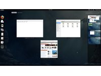
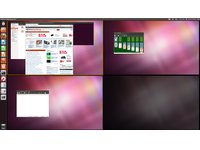
While workspaces in GNOME 3 lose a lot of the virtual desktop functionality they once had (like the ability to assign applications to specific desktops), manually grouping windows into different workspaces is very simple. The window spread display makes grabbing the correct window and dragging it to another workspace easier than the expo display in Ubuntu's Unity Workspace Switcher.
Article continues below

By combining the window manipulation of "spread" with the workspace management of its filmstrip-style "expo," the GNOME 3 implementation serves up the best of both worlds.
Annoying Pop-up Windows, Solved!
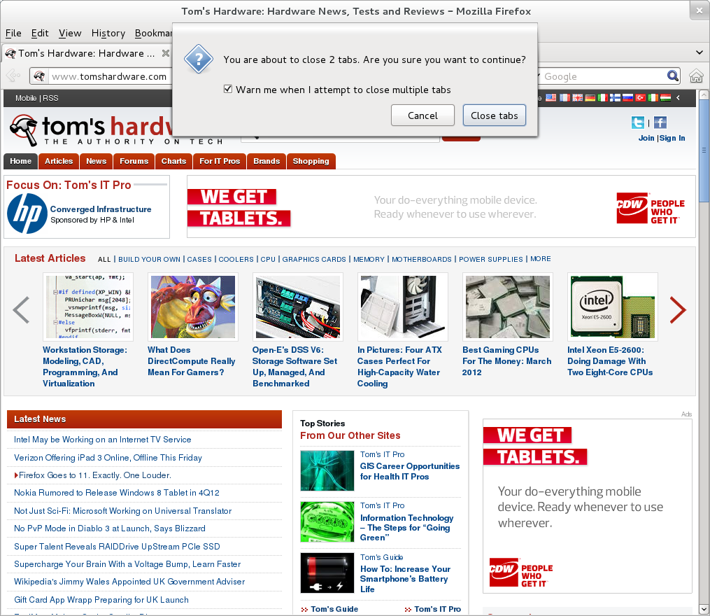
With no on-screen task management, pop-up windows had to be dealt with. Annoying pop-up dialog boxes no longer require their own independent window. Dialogs that previously appeared in another window now spawn from the title bar of the parent application's window, just like in Mac OS X.
Of course, we're certainly not Mac fan boys. But we've been wanting Microsoft and Linux to adopt this feature for a long time. It solves the problem of prompts getting buried behind the parent window, while simultaneously cutting down on taskbar clutter.
Get Tom's Hardware's best news and in-depth reviews, straight to your inbox.
Messaging Tray
The messaging tray at the bottom of GNOME Shell is a great idea. Instant messaging applications definitely qualify as a distraction. Allowing the user to read and respond to instant messages without shifting away from the task at hand is a much-welcomed change.
| What GNOME 3 Got Wrong |
Well, you just saw the short list of things that GNOME 3 got right. Now let's look at the laundry list of issues GNOME 3 gets wrong.
No On-screen Task Management
The lack of on-screen task management in GNOME 3 is a major concern. By incorporating application switching into the Activities overview, GNOME Shell places a serious burden on users.
Before you get to a usable task list, you have to click the Activities button (or move the cursor to the upper left-hand corner of the screen) any time you want to switch between applications. This is a ghastly problem for anyone accustomed to multi-tasking. A task as simple as switching from the main Firefox window to the Downloads window requires two times as much clicking around.
Another side-effect presents itself after a few weeks of regular use. I found that, without on-screen task management, I tended to forget which applications were left open. For instance, I use KeePassX as my password manager. At one point, I needed to open it on the Dell Inspiron Mini 10v to access my DropBox account via the Web. When I was finished, I closed the lid, suspending the Mini. Back on my desktop, KeePassX reported that my password database was locked. Not remembering that I accessed KeePassX on the Mini, I had no idea what was causing the problem. You see, after I got the password I needed from KeePassX on the Mini, the Web browser remained the focused full-screen application. Without an on-screen task list, I had no indication KeePassX was still open. More severely, the ODT document file for this very article fell victim to the same phenomenon, causing version inconsistency among my systems.
It seems that no matter what type of system you use, GNOME Shell's design has serious issues. What's more, in an unfathomable showing of apathy, the official fix is to, one, deal with it, or two, install an aftermarket dock. While add-on docks are highly configurable and often gorgeous-looking, they lack the reliability and integration of a native task list. In some cases, they hit performance, too.
No Desktop
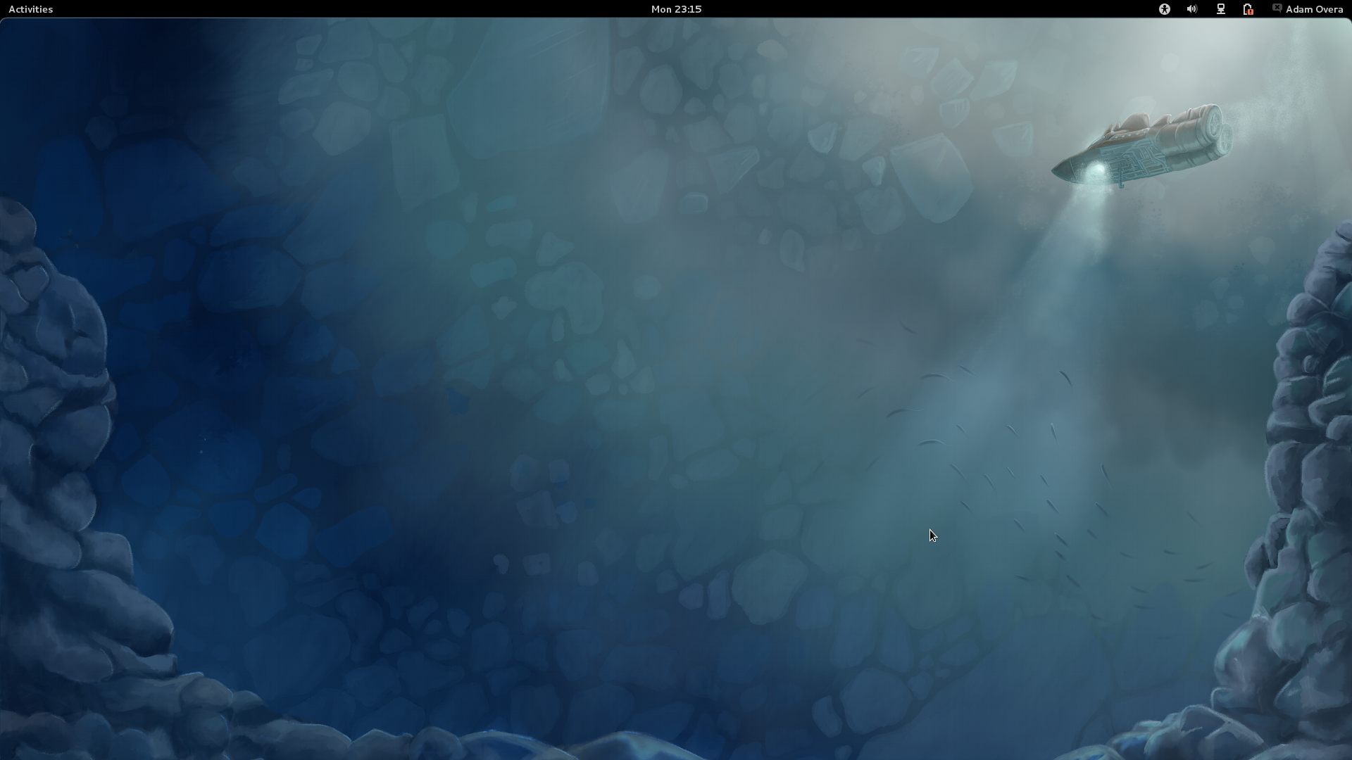
While the GNOME project succeeded in shoring up large plots of screen space, we can't help but ask why? From where we sit, the GNOME 3 desktop is completely empty.
There is nothing wrong with creating some extra space. Usually that's done to make room for something else, though. Without a functional desktop, on-screen task management, or widgets, the GNOME 3 desktop is literally vacuous. Creating room for nothing and killing off functionality in the process seems pretty pointless to us.
Even more puzzling is the inclusion of a Desktop folder in the Home directory. Even though the desktop doesn't show any files, folders, or shortcuts, the desktop can still contain those items.
No Advanced Virtual Desktops
While spawning workspaces as needed may appeal to users who only rarely use them, it leaves anyone accustomed to virtual desktops in the dark. Virtual desktops derive much of their utility based on the fact that there is a set number of them. True power users often assign applications to open and run in desktops other than the one that's active.
For instance, in KDE, I use one desktop for Web surfing and office work, while my second desktop serves as a graphics studio for GIMP, Shutter, photo viewer, and color picker. A third desktop is set up for virtual machines, and a fourth handles terminal work. The way GNOME 3 spawns new workspaces completely destroys that flow. Instead, you're left manually arranging applications across the other virtual desktops each and every time.
No Trash
The omission of easily-accessible Trash is even more puzzling. Items can still be deleted by selecting Move to Trash in the right-click menu. However, there is no obvious place for the trash can.
The only evidence I found of the Trash is in the Nautilus file manager. The left-hand sidebar of Nautilus holds a shortcut to the Trash directory. Right-clicking on the Trash shortcut or navigating to the Trash directory turns up an option to Empty Trash. While the Trash does exist, this is the first time we've seen an operating system obscure this functionality.
No Minimize
Without the ability to minimize, cooperative multi-tasking can be a real pain. Let's say that you have multiple applications open (for example, Firefox, LibreOffice Writer, RhythmBox, Terminal, and Gedit, and they were opened in that order). Now let's say you are doing something that requires three or more of them on-screen at once. So, snap won't cut it. Because the minimize button no longer exists, you need to go into the Activities overview and tile the windows in the right order.
Firefox needs most of the screen to display the contents of a help forum. A thread in the forum tells you to edit a config file in Gedit and then do some Terminal work to fix your problem. Because Firefox is below LibreOffice Writer and RhythmBox, you need to switch to Firefox, then switch to Gedit, then switch to the Terminal, in that order. That's three trips to the Activities overview and a lot of extra cursor jockeying for a relatively simple and common multi-tasking scenario.
No Hibernation
By default, the User menu contains an option to suspend, but not to hibernate. While it is possible to configure a notebook to go into hibernation when you close its lid (using the Power tool in System Settings), there is no way to enable this functionality on a desktop, which obviously lacks a lid.
No Customization
There is no way to change the screen saver, system theme, or icon pack in GNOME 3. The wallpaper is about the only preference that can be modified. While this has no major impact on functionality, nearly limitless customization was one of the high points of GNOME 2. A quick comparison of gnome-look.org and kde-look.org demonstrates just how passionate themers were about GNOME.
Extra Effort
The way GNOME Shell is currently arranged is less efficient than GNOME 2, Unity, XFCE, KDE, Windows, and OS X. Without an on-screen task list or dock, you must first click Activities before getting to some form of task management, and then click on the next task. That's two times more mouse clicks compared to every other desktop environment. Opening applications is just as bad. Since Activities holds the Start menu-equivalent, you must first click on Activities, then on Applications to get those same functions. Again, that's twice as many clicks.
In both of the above examples, cursor distance is also an issue. But the next example really drives that point home.
Switching from one app to another on a different workspace means your cursor is traveling from the current task in the center of the screen to the Activities button in the upper left-hand corner to the workspace switcher on the right side, to the window of another app in the center of the screen. So, to switch to an application on another workspace, your cursor travels the entire width of the screen, twice.
GNOME 3 forces you to do more in order to accomplish the same thing. This is a problem, period.
Fortunately, there are some ways to alleviate the laboriousness.
Current page: GNOME 3 Pros And Cons
Prev Page Input Shortcuts, Tips, And Tricks Next Page GNOME 3 Tweaks-
gz3ro I think the akmod graphics drivers (also found in the rpmfusion repository) would be better than simply the proprietary drivers because they also work after kernel updates.Reply -
Verrin I'm really disappointed with the direction Linux has taken in its user interfaces. I was a big fan of Ubuntu until they switched to Unity, and since then I've been jumping from distro-to-distro trying to find a desktop environment that feels comfortable, isn't terribly difficult to wrap my head around, and that is still powerful. I was using GNOME3 for a while with Linux Mint, but even with the heavy extensions, there are certain functions that I can't quite replicate from the GNOME2 heyday. I wasn't able to get into KDE or XFCE either. They feel aged and aren't quite as sleek as other modern desktop environments, even if you try to fix that by adding customs skins.Reply
In the end, I'm downgrading to a much older distro of Ubuntu, and supplementing it with Windows 7. I'll be keeping an eye in the coming years to see how these rusty GUI releases turn out-- hopefully for the better. But for now, linux has lost a lot of its useability and it's flare. I'll miss the days when upgrading to a newer distro actually felt like an upgrade, but maybe after all these mistakes, developers will learn and make Linux exciting again. I'll be waiting to see. -
Good grief. What I wouldn't have done years ago for a job that would ask me to write a review on something that would obsolete itself in six months.Reply
Nobody, IMHO, who actually uses a computer for anything of value wastes their time with Fedora. You can't upgrade it, so your own personal enhancements and bug fixes are lost. Features you like are abandoned for broken replacements. Fedora is a nightmare and has been since it began. I began the adventure years ago with Red Hat 5 and finally gave up and moved to more useful distros after Fedora 8. Fedora is now for the masochistic.
On the other hand, if you like superficiality, as in wallpaper and clock positions, and enjoy the animated struggle that comes with installing something new all the time and reporting bugs then Fedora is a good thing. -
yumri one thing which i would have liked to see on the comparesion would be open time of a Libre Word Processing file, close time of that file, open time of a database file, close time of it, open time of Firefox, close time of Firefox, open time of a typical website like this one, close time of it, install time of the OS, how fast does it run a batch file or equivalent in the OS, and etc. like that things which we actually do a lot besides gaming.Reply -
yumri It also seemed like they had a basis towards the GUI way of doing things and thought all users had forsaken CLI scripting for their installs and updates. as if you are getting Fedora you most likely know it was command line based in the start and really is still easier to do everything from command line then from any other route well Ubuntu is made with the GUI interface in mind so things are easier to do with that then with command line mainly because they hid the terminal screen in the newer versions of it.Reply
With that Fedora is also made for workstations and Ubuntu made for end user support 2 differnet applications so why only show benchmarks of end user things and not anything on network support, domain support, VM thin client viability, accessing files from the network, etc. like that things which Fedora is good at not just things which Ubuntu is I think this article was basised and another should be made with more benchmarks to not be as basised towards one or the other. -
amdfangirl One of these days, developers of GUIs will realise going "forward" doesn't equate to an increase of ease of use and functionality.Reply
Unity, Metro, GNOME 3, Etc.
Alas, I must suffer each day for the Wacom preferences panel in GNOME settings. Ties me to GNOME 3 (or a derivative). How silly. -
palladin9479 Now I'm waiting for them to do a Solaris 10 or 11 review. Their both available on x86 so they don't even need to purchase new hardware. Come on it's a "real mans" OS.Reply -
You've completely missed extensions.gnome.org and gnome-tweak-tool, and as a result your review is not an accurate reflection of gnome-shell. Gnome-tweak-tool gives things like "Have file manager handle the desktop" and "Trash icon visible on desktop", plus shell, window, and gtk theme selection, font configuration, and gnome-shell extension management. Extensions.gnome.org provides, well, gnome-shell extensions. Things like "Static Workspaces", which gives you a fixed number of workspaces. Or "Alternative Status Menu", which puts power, reboot, suspend, and hibernate on your status menu. Or "Applications Menu", which provides a Gnome2-like list of windows on the current workspace.Reply
Now, I admit that neither of these configuration options are immediately visible to a new user. Despite that, your review is bad, and you should feel bad. -
zhihao50 graph for POV-Ray is wrong, you said both of linux finished 4min before windows yet the graph show the other way around.Reply -
adamovera Cowardly AnonYou've completely missed extensions.gnome.org and gnome-tweak-tool, and as a result your review is not an accurate reflection of gnome-shell. Gnome-tweak-tool gives things like "Have file manager handle the desktop" and "Trash icon visible on desktop", plus shell, window, and gtk theme selection, font configuration, and gnome-shell extension management. Extensions.gnome.org provides, well, gnome-shell extensions. Things like "Static Workspaces", which gives you a fixed number of workspaces. Or "Alternative Status Menu", which puts power, reboot, suspend, and hibernate on your status menu. Or "Applications Menu", which provides a Gnome2-like list of windows on the current workspace.Now, I admit that neither of these configuration options are immediately visible to a new user. Despite that, your review is bad, and you should feel bad.See pages 12 through 16.Reply

