Fedora 16 And GNOME Shell: Tested And Reviewed
Ubuntu and Mint don't want it; Linus called it an “unholy mess.” While most other distros are passing up or postponing GNOME Shell, Fedora is full steam ahead. Does Red Hat know something the rest of us don't? Or is GNOME 3 really as bad as everyone says?
GNOME Shell Desktop, Panel, And Notifications
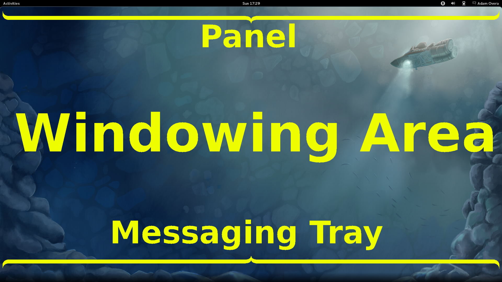
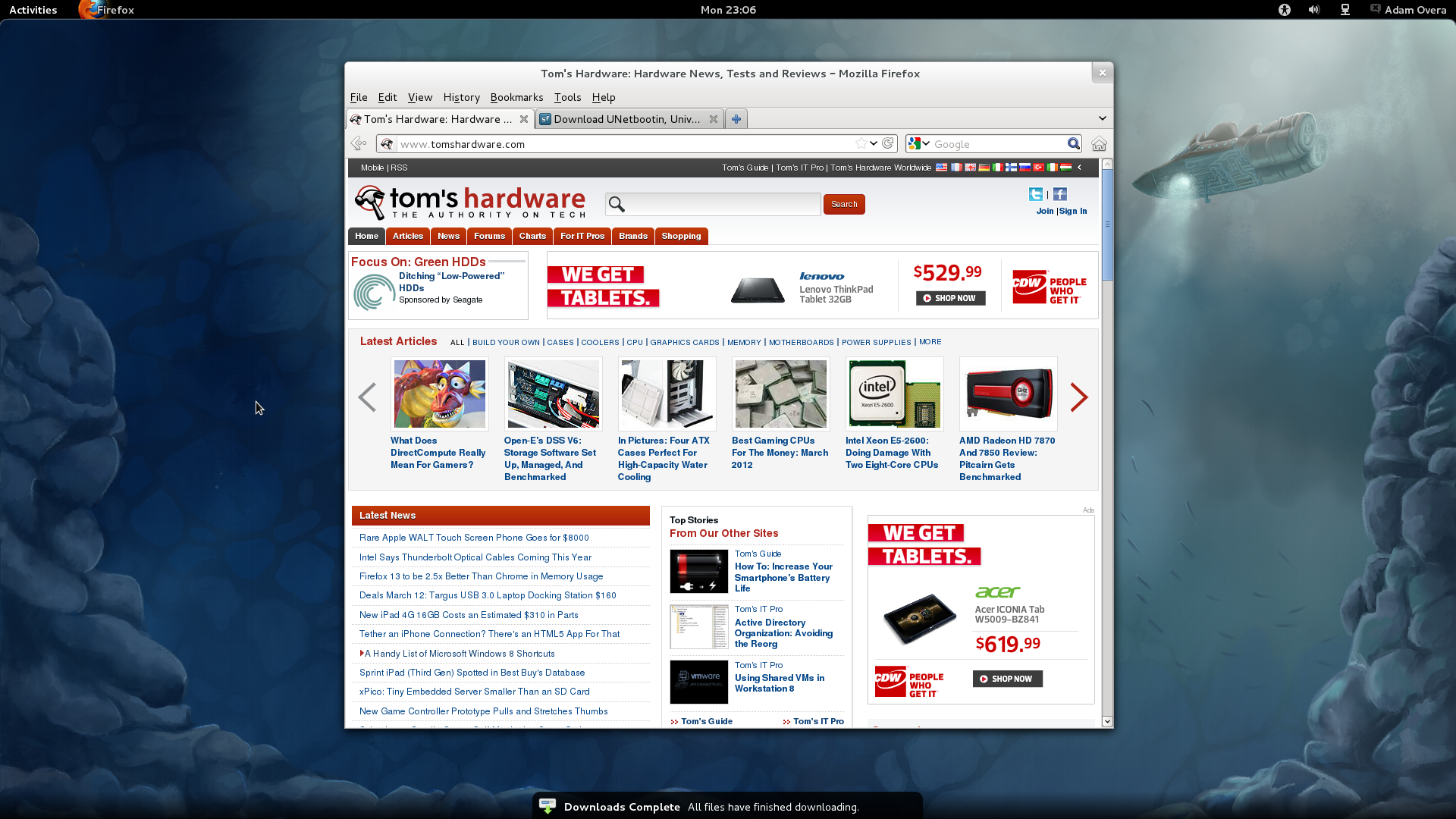
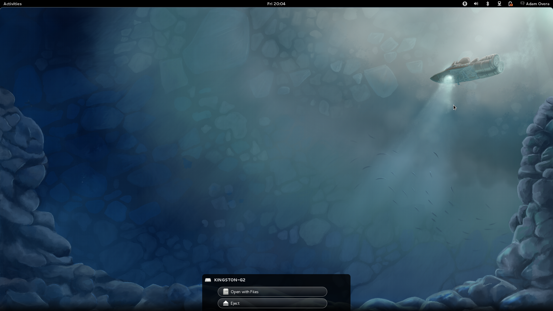
The empty GNOME 3 Shell contains three main elements: the panel, desktop, and notifications. In GNOME-speak, that's the Panel, Windowing Area, and Messaging Tray.
| The Desktop, Or Windowing Area |
Although you see wallpaper, it's simply a backdrop. No files, folders, shortcuts, or widgets appear on the GNOME 3 desktop. No file management functions or organization can occur on the GNOME 3 desktop. It is nothing more than wallpaper and an area for windows to populate.
While GNOME 3 is not the first GUI to do away with the conventional desktop, it may be the most strict in its implementation. KDE 4 made this move earlier. However, KDE 4 has the Folder View Plasmoid, which shows the contents of the Desktop folder within a widget. GNOME 3 has no comparable feature.
Article continues below| Panel |
GNOME 3's panel resides along the upper edge of the screen. While it may look similar, the GNOME 3 panel significantly differs from the upper panel in GNOME 2. The GNOME 3 panel consists of five major parts: the Activities button, focused application icon/name, clock, system status indicators, and the user menu. Let's go over the changes from left to right.
Activities Button
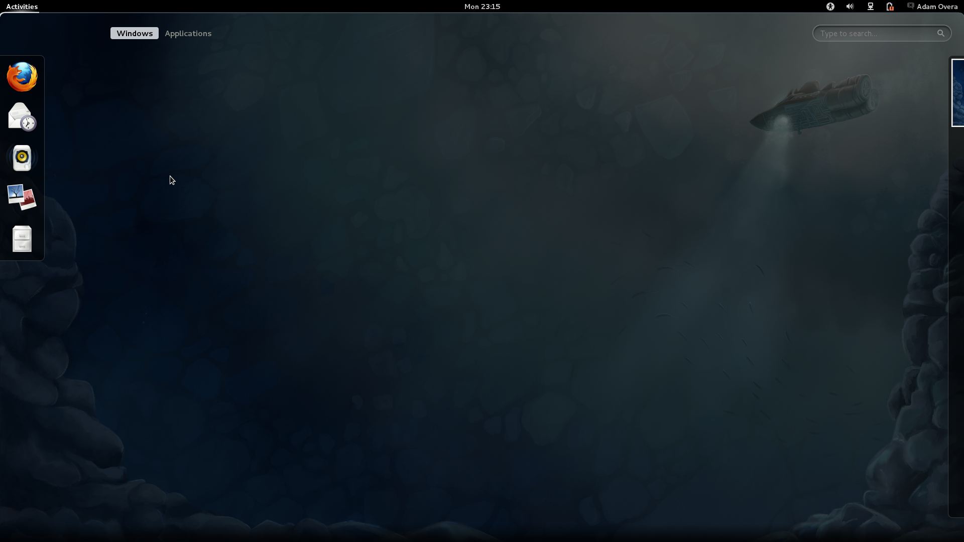
First up, on the far-left edge of the panel, is the Activities button. This replaces the Applications/Places/System menu in GNOME 2. Pressing the Activities button or moving the pointer to the upper-left corner of the screen activates the Overview, both of which are explained in detail on the next page.
Focused Application
Get Tom's Hardware's best news and in-depth reviews, straight to your inbox.
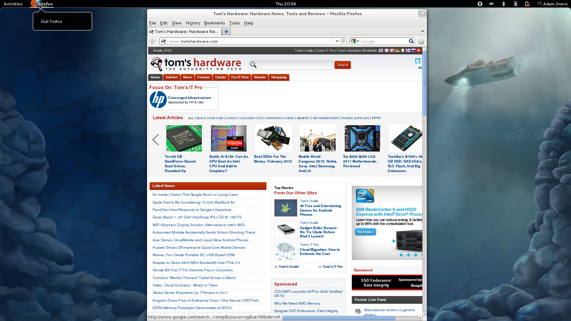
The empty space directly to the right of the Activities button is reserved for the icon and name of the foreground application. In the future, this icon will double as the application's menu bar, presumably in drop-down form.
Clock
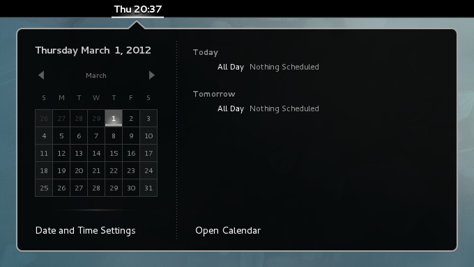
In GNOME 2, the clock was on the right side of the upper panel with the rest of the indicators. In GNOME 3, the clock shifts to the middle of the Panel. Click the clock to reveal a pop-out calendar. Integration with the Evolution personal information manager displays any upcoming appointments in the calendar.
System Status Indicators
There is new differentiation between system status indicators and application-specific indicators/notifications in GNOME 3. Only system-level indicators appear in the panel, while application-specific indicators and notifications are now housed in an auto-hide bar at the bottom of the screen called the Messaging Tray (explained later). The system status indicators remain on the right side of the GNOME 3 panel, and just like we saw in Ubuntu, left- and right-clicking yields the exact same menu. The ability to reorganize or add additional applets is gone, too. System status indicators include: Universal Access, Volume, Bluetooth, Network, Wi-Fi, and Battery Life indicators.
User Menu
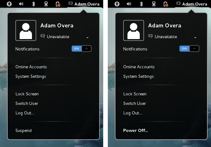
The user menu at the far right end of the panel hosts messaging status, a switch to enable/disable notification, Online Accounts, System Settings, Lock Screen, Switch User, Log Out, and Suspend functions. Upon first inspection, it appears that in order to restart or shut down the system, you must first log out to the log-in screen and shut down or restart from there. However, a more convenient (yet totally not obvious) method also exists. Holding down one of the Alt keys while the user menu is open changes the Suspend option to Power Off.
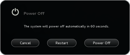
Selecting Power Off brings up the choice to Restart or Power Off (shut down).
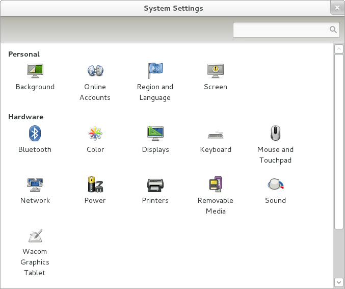
Also located in the user menu is a unified categorical listing of system tools, much like what you'd find in Windows, Mac OS X, KDE, and Unity. The System Settings menu replaces the alphabetically-listed System drop-down in GNOME 2's Applications/Places/System menu.
| Notifications Area, Or Messaging Tray |
Application-level indicators and notifications are now found at the bottom of the screen. Moving the cursor to the lower right-hand corner brings up the new Notification Area/Messaging Tray. Notification area icons for messaging applications like Skype and Pidgin are now found here. If you are using Empathy, the default chat client, messaging is even accessible within pop-ups from the tray. There's no need to switch to the actual application window.
Non-messaging applications also use the messaging tray for notifications. For example, Rhythmbox play controls, Firefox downloads, and device status now appear in the Messaging Tray.
Current page: GNOME Shell Desktop, Panel, And Notifications
Prev Page GNOME 3 And GNOME Shell Basics Next Page GNOME Shell Activities/Overview-
gz3ro I think the akmod graphics drivers (also found in the rpmfusion repository) would be better than simply the proprietary drivers because they also work after kernel updates.Reply -
Verrin I'm really disappointed with the direction Linux has taken in its user interfaces. I was a big fan of Ubuntu until they switched to Unity, and since then I've been jumping from distro-to-distro trying to find a desktop environment that feels comfortable, isn't terribly difficult to wrap my head around, and that is still powerful. I was using GNOME3 for a while with Linux Mint, but even with the heavy extensions, there are certain functions that I can't quite replicate from the GNOME2 heyday. I wasn't able to get into KDE or XFCE either. They feel aged and aren't quite as sleek as other modern desktop environments, even if you try to fix that by adding customs skins.Reply
In the end, I'm downgrading to a much older distro of Ubuntu, and supplementing it with Windows 7. I'll be keeping an eye in the coming years to see how these rusty GUI releases turn out-- hopefully for the better. But for now, linux has lost a lot of its useability and it's flare. I'll miss the days when upgrading to a newer distro actually felt like an upgrade, but maybe after all these mistakes, developers will learn and make Linux exciting again. I'll be waiting to see. -
Good grief. What I wouldn't have done years ago for a job that would ask me to write a review on something that would obsolete itself in six months.Reply
Nobody, IMHO, who actually uses a computer for anything of value wastes their time with Fedora. You can't upgrade it, so your own personal enhancements and bug fixes are lost. Features you like are abandoned for broken replacements. Fedora is a nightmare and has been since it began. I began the adventure years ago with Red Hat 5 and finally gave up and moved to more useful distros after Fedora 8. Fedora is now for the masochistic.
On the other hand, if you like superficiality, as in wallpaper and clock positions, and enjoy the animated struggle that comes with installing something new all the time and reporting bugs then Fedora is a good thing. -
yumri one thing which i would have liked to see on the comparesion would be open time of a Libre Word Processing file, close time of that file, open time of a database file, close time of it, open time of Firefox, close time of Firefox, open time of a typical website like this one, close time of it, install time of the OS, how fast does it run a batch file or equivalent in the OS, and etc. like that things which we actually do a lot besides gaming.Reply -
yumri It also seemed like they had a basis towards the GUI way of doing things and thought all users had forsaken CLI scripting for their installs and updates. as if you are getting Fedora you most likely know it was command line based in the start and really is still easier to do everything from command line then from any other route well Ubuntu is made with the GUI interface in mind so things are easier to do with that then with command line mainly because they hid the terminal screen in the newer versions of it.Reply
With that Fedora is also made for workstations and Ubuntu made for end user support 2 differnet applications so why only show benchmarks of end user things and not anything on network support, domain support, VM thin client viability, accessing files from the network, etc. like that things which Fedora is good at not just things which Ubuntu is I think this article was basised and another should be made with more benchmarks to not be as basised towards one or the other. -
amdfangirl One of these days, developers of GUIs will realise going "forward" doesn't equate to an increase of ease of use and functionality.Reply
Unity, Metro, GNOME 3, Etc.
Alas, I must suffer each day for the Wacom preferences panel in GNOME settings. Ties me to GNOME 3 (or a derivative). How silly. -
palladin9479 Now I'm waiting for them to do a Solaris 10 or 11 review. Their both available on x86 so they don't even need to purchase new hardware. Come on it's a "real mans" OS.Reply -
You've completely missed extensions.gnome.org and gnome-tweak-tool, and as a result your review is not an accurate reflection of gnome-shell. Gnome-tweak-tool gives things like "Have file manager handle the desktop" and "Trash icon visible on desktop", plus shell, window, and gtk theme selection, font configuration, and gnome-shell extension management. Extensions.gnome.org provides, well, gnome-shell extensions. Things like "Static Workspaces", which gives you a fixed number of workspaces. Or "Alternative Status Menu", which puts power, reboot, suspend, and hibernate on your status menu. Or "Applications Menu", which provides a Gnome2-like list of windows on the current workspace.Reply
Now, I admit that neither of these configuration options are immediately visible to a new user. Despite that, your review is bad, and you should feel bad. -
zhihao50 graph for POV-Ray is wrong, you said both of linux finished 4min before windows yet the graph show the other way around.Reply -
adamovera Cowardly AnonYou've completely missed extensions.gnome.org and gnome-tweak-tool, and as a result your review is not an accurate reflection of gnome-shell. Gnome-tweak-tool gives things like "Have file manager handle the desktop" and "Trash icon visible on desktop", plus shell, window, and gtk theme selection, font configuration, and gnome-shell extension management. Extensions.gnome.org provides, well, gnome-shell extensions. Things like "Static Workspaces", which gives you a fixed number of workspaces. Or "Alternative Status Menu", which puts power, reboot, suspend, and hibernate on your status menu. Or "Applications Menu", which provides a Gnome2-like list of windows on the current workspace.Now, I admit that neither of these configuration options are immediately visible to a new user. Despite that, your review is bad, and you should feel bad.See pages 12 through 16.Reply
