Fedora 16 And GNOME Shell: Tested And Reviewed
Ubuntu and Mint don't want it; Linus called it an “unholy mess.” While most other distros are passing up or postponing GNOME Shell, Fedora is full steam ahead. Does Red Hat know something the rest of us don't? Or is GNOME 3 really as bad as everyone says?
GNOME 3 And GNOME Shell Basics
| The Core Concept |
Because GNOME 3 (and its accompanying shell) is such a drastic departure from traditional desktop GUIs, there is one basic theme you should repeat to yourself before going hands-on. Coming to terms with this key concept may help to frame much of the frustration being voiced by other folks evaluating GNOME.
First and foremost, GNOME 3 is designed to reduce clutter and add focus. To do so, GNOME Shell emphasizes full-screen tasks. The two biggest elements of traditional operating environments affected by this new approach are the desktop and task list.
Desktop?
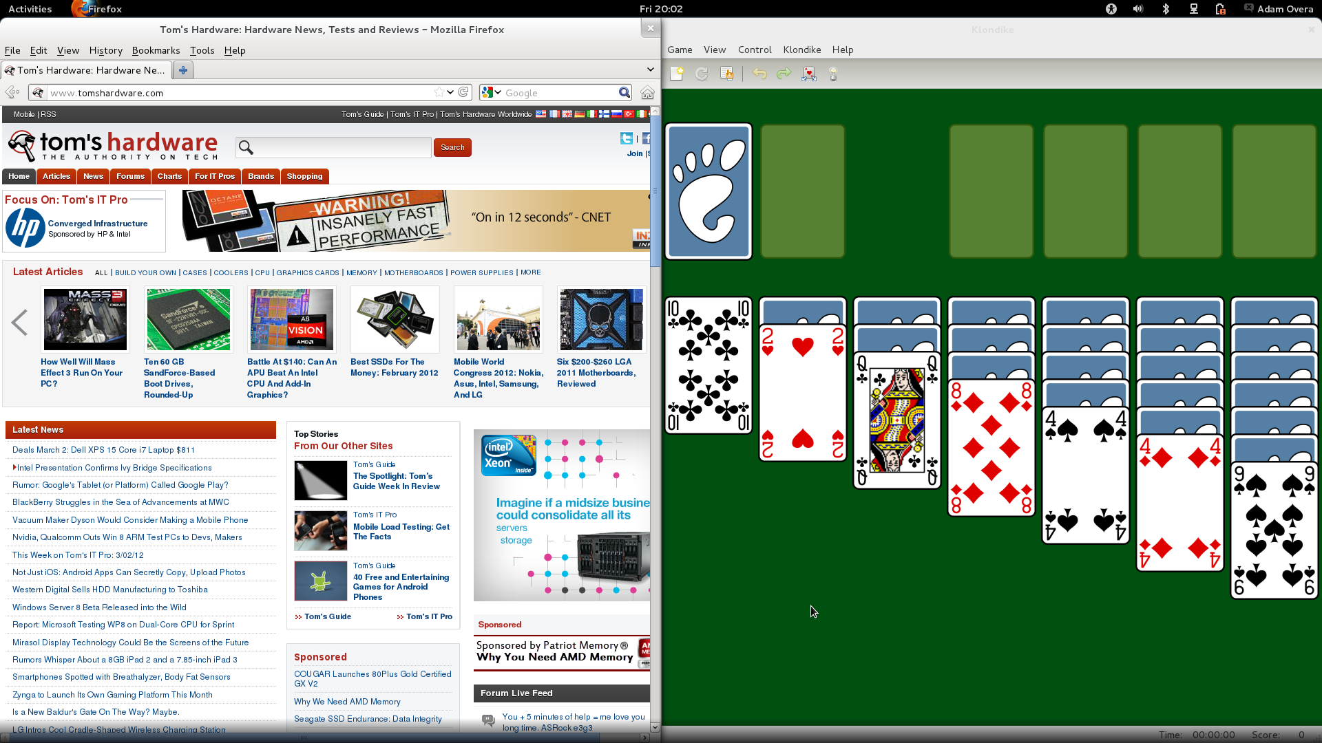
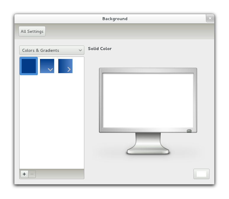
Article continues belowThe first familiar landmark to fall by the wayside in GNOME 3 is the functional desktop. GNOME Shell eschews the traditional desktop metaphor to which we've grown accustomed for more than 20 years. What was once called the desktop is now simply a windowing area.
If you've ever helped a hopeless technophobe with his or her PC, then you've probably seen a seriously cluttered desktop. Every single application shortcut and download often litters an average PC user's work space.
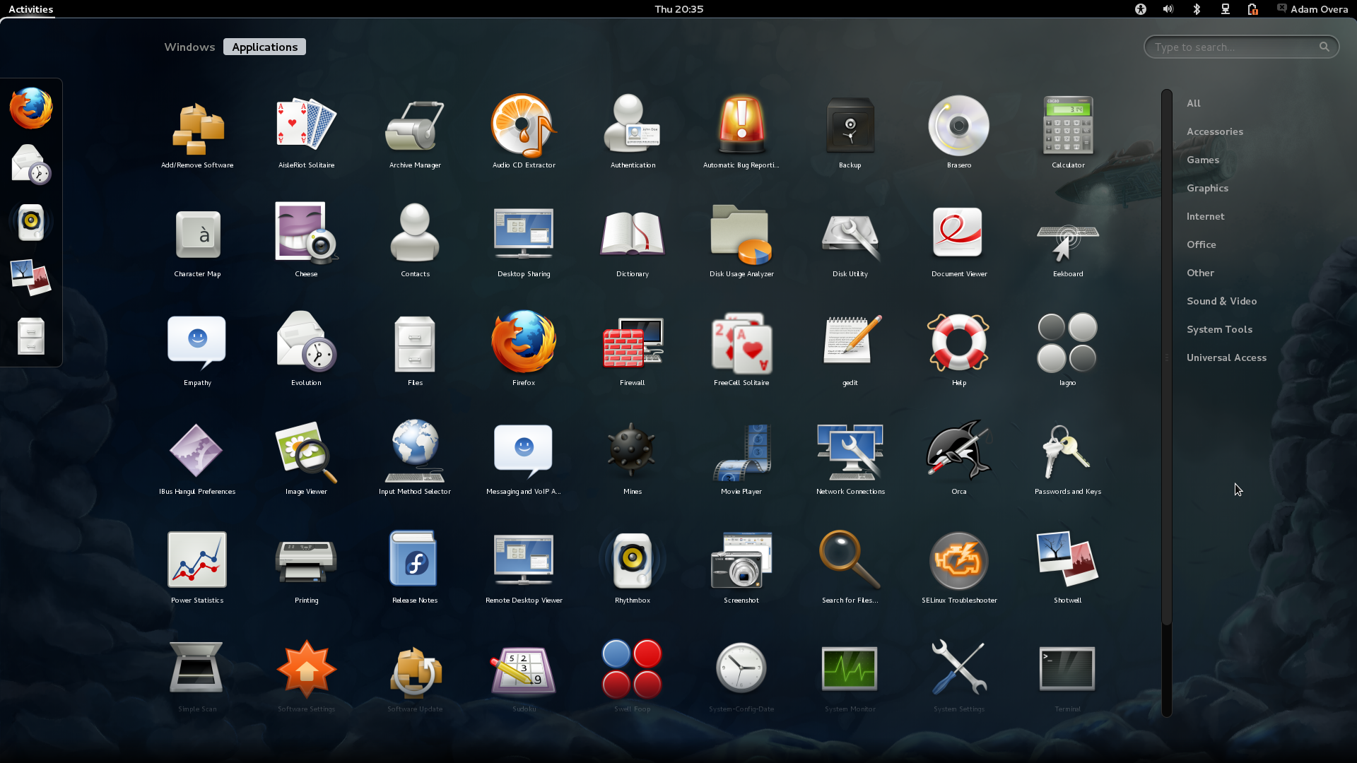
In GNOME 3, downloads go to the Downloads folder, and all applications are accessed through the new Activities overview (covered later). To the GNOME Project, removing files from the desktop is simply cutting the fat. The way GNOME sees it, old-school desktops eventually become a catch-all for anything and everything installed, downloaded, and saved.
Task List?
Get Tom's Hardware's best news and in-depth reviews, straight to your inbox.
The second familiar convention to disappear is on-screen task management. There is no pervasive taskbar, dock, or window list available in GNOME 3. The rationale is that the traditional task list is a distraction from the task at hand. The way the Activities overview handles task management off-screen helps encourage doing one thing at a time.
| Different Window Dynamics |
Like Ubuntu's Unity interface and Mac OS X Lion, GNOME 3 also attempts to emphasize full-screen apps. But GNOME 3 goes even further. As you've probably noticed from the screen shots, the minimize and maximize buttons are dropped from window title bars entirely. The goal is two-fold. First, the foreground application should be able to use all of the available screen real estate. Second, don't bother the user with window management. Instead, simply switch directly to the next task. That's achieved through the Windows section of the Activities overview, which we'll explain later.
The GNOME project also had to rethink how windows fit into the new paradigm. GNOME 3 implements a window snap feature that's identical to the way Windows 7 and Unity operate. Dragging a window by its title bar to the top of the screen causes the window to maximize. Dragging the title bar of a maximized window downward restores that window. Vertical snap is also possible. Dragging a window to the left or right side of the display fills that half of the screen.
Window snap is a great addition to Windows 7, Unity, and KDE. But without minimize and maximize/restore buttons, it's an absolute necessity in GNOME 3. Window snap is the way to maximize and restore windows here. Luckily, windows can still be resized in the traditional manner; hovering the cursor over a window border changes the cursor arrow into resize brackets.
| Shiny And New |
Mutter
GNOME Shell uses a new window manager known as Mutter. This is based on the Clutter toolkit, which first appeared in Moblin (then MeeGo, now known as Tizen). In fact, the name Mutter is a mixture of the words Metacity (the GNOME 2 window manager) and Clutter.
The video below, which showcases some of GNOME Shell's graphical effects, may look familiar to anyone who already knows MeeGo.
While not nearly as polished as Compiz, Mutter accomplishes the few effects currently available in an admirable manner.
Adwaita
In addition to the visual effects, 2D screen elements also receive a bit of polish in GNOME 3. The default GTK+ theme is called Adwaita. Its primary color palette consists of black, white, gray, silver, and blue. The new upper-panel and most of the Activities overview consists of black with whitish-gray text, icons, and accents. Title bars and buttons employ silver tones, while the window borders, scroll bars, and much of the window contents are in shades of gray. Window and application text remains black, creating a visual boundary between the white text on black backgrounds inherent to the OS controls.
There are now also heavy surround shadows applied to window borders.
Although pronounced drop or surround shadows are pretty much a cheap trick, they still deliver a faux-3D layered look effectively.
Icons
The default GNOME icon set is updated, too, sporting a glossy sheen. They now scale up to 256x256 pixels.
Most of the new icons are a major improvement, especially Calculator, Terminal, and Gedit. However, the simple brown folder icons in the updated Nautilus file manager are pretty weak-looking.
As a set, the icons look good. But the default applications available in Fedora 16 make them appear a little monochromatic. In a clean copy of Fedora 16, the Applications side of the Activities overview is a wash of dull grays, weak blues, drab browns, with black and white, and a few splashes of red thrown in.
Once more applications are installed, the monotony is broken up, and the icon set begins to shine.
Now that we've introduced some of the GNOME 3 basics, we'll walk you through GNOME Shell piece by piece, starting with an empty desktop.
Current page: GNOME 3 And GNOME Shell Basics
Prev Page Graphics, Wi-Fi, And 32-bit Libs Next Page GNOME Shell Desktop, Panel, And Notifications-
gz3ro I think the akmod graphics drivers (also found in the rpmfusion repository) would be better than simply the proprietary drivers because they also work after kernel updates.Reply -
Verrin I'm really disappointed with the direction Linux has taken in its user interfaces. I was a big fan of Ubuntu until they switched to Unity, and since then I've been jumping from distro-to-distro trying to find a desktop environment that feels comfortable, isn't terribly difficult to wrap my head around, and that is still powerful. I was using GNOME3 for a while with Linux Mint, but even with the heavy extensions, there are certain functions that I can't quite replicate from the GNOME2 heyday. I wasn't able to get into KDE or XFCE either. They feel aged and aren't quite as sleek as other modern desktop environments, even if you try to fix that by adding customs skins.Reply
In the end, I'm downgrading to a much older distro of Ubuntu, and supplementing it with Windows 7. I'll be keeping an eye in the coming years to see how these rusty GUI releases turn out-- hopefully for the better. But for now, linux has lost a lot of its useability and it's flare. I'll miss the days when upgrading to a newer distro actually felt like an upgrade, but maybe after all these mistakes, developers will learn and make Linux exciting again. I'll be waiting to see. -
Good grief. What I wouldn't have done years ago for a job that would ask me to write a review on something that would obsolete itself in six months.Reply
Nobody, IMHO, who actually uses a computer for anything of value wastes their time with Fedora. You can't upgrade it, so your own personal enhancements and bug fixes are lost. Features you like are abandoned for broken replacements. Fedora is a nightmare and has been since it began. I began the adventure years ago with Red Hat 5 and finally gave up and moved to more useful distros after Fedora 8. Fedora is now for the masochistic.
On the other hand, if you like superficiality, as in wallpaper and clock positions, and enjoy the animated struggle that comes with installing something new all the time and reporting bugs then Fedora is a good thing. -
yumri one thing which i would have liked to see on the comparesion would be open time of a Libre Word Processing file, close time of that file, open time of a database file, close time of it, open time of Firefox, close time of Firefox, open time of a typical website like this one, close time of it, install time of the OS, how fast does it run a batch file or equivalent in the OS, and etc. like that things which we actually do a lot besides gaming.Reply -
yumri It also seemed like they had a basis towards the GUI way of doing things and thought all users had forsaken CLI scripting for their installs and updates. as if you are getting Fedora you most likely know it was command line based in the start and really is still easier to do everything from command line then from any other route well Ubuntu is made with the GUI interface in mind so things are easier to do with that then with command line mainly because they hid the terminal screen in the newer versions of it.Reply
With that Fedora is also made for workstations and Ubuntu made for end user support 2 differnet applications so why only show benchmarks of end user things and not anything on network support, domain support, VM thin client viability, accessing files from the network, etc. like that things which Fedora is good at not just things which Ubuntu is I think this article was basised and another should be made with more benchmarks to not be as basised towards one or the other. -
amdfangirl One of these days, developers of GUIs will realise going "forward" doesn't equate to an increase of ease of use and functionality.Reply
Unity, Metro, GNOME 3, Etc.
Alas, I must suffer each day for the Wacom preferences panel in GNOME settings. Ties me to GNOME 3 (or a derivative). How silly. -
palladin9479 Now I'm waiting for them to do a Solaris 10 or 11 review. Their both available on x86 so they don't even need to purchase new hardware. Come on it's a "real mans" OS.Reply -
You've completely missed extensions.gnome.org and gnome-tweak-tool, and as a result your review is not an accurate reflection of gnome-shell. Gnome-tweak-tool gives things like "Have file manager handle the desktop" and "Trash icon visible on desktop", plus shell, window, and gtk theme selection, font configuration, and gnome-shell extension management. Extensions.gnome.org provides, well, gnome-shell extensions. Things like "Static Workspaces", which gives you a fixed number of workspaces. Or "Alternative Status Menu", which puts power, reboot, suspend, and hibernate on your status menu. Or "Applications Menu", which provides a Gnome2-like list of windows on the current workspace.Reply
Now, I admit that neither of these configuration options are immediately visible to a new user. Despite that, your review is bad, and you should feel bad. -
zhihao50 graph for POV-Ray is wrong, you said both of linux finished 4min before windows yet the graph show the other way around.Reply -
adamovera Cowardly AnonYou've completely missed extensions.gnome.org and gnome-tweak-tool, and as a result your review is not an accurate reflection of gnome-shell. Gnome-tweak-tool gives things like "Have file manager handle the desktop" and "Trash icon visible on desktop", plus shell, window, and gtk theme selection, font configuration, and gnome-shell extension management. Extensions.gnome.org provides, well, gnome-shell extensions. Things like "Static Workspaces", which gives you a fixed number of workspaces. Or "Alternative Status Menu", which puts power, reboot, suspend, and hibernate on your status menu. Or "Applications Menu", which provides a Gnome2-like list of windows on the current workspace.Now, I admit that neither of these configuration options are immediately visible to a new user. Despite that, your review is bad, and you should feel bad.See pages 12 through 16.Reply


