Gigabit Wireless? Five 802.11ac Routers, Benchmarked
Five years ago, we didn't have homes with a dozen wireless nodes and the need to run HD video to multiple screens. Today we do. Our 802.11n networks, especially on the 2.4 GHz band, are swamped. Can 802.11ac save the day? We test six routers to find out.
Get Tom's Hardware's best news and in-depth reviews, straight to your inbox.
You are now subscribed
Your newsletter sign-up was successful
Results: PerformanceTest 7 Graphs
Why you can trust Tom's Hardware
One of the things we love about PT7 is its data graphs. Now that we’ve seen the raw comparative results on the previous two pages, we want to look a little deeper into the data to show throughput over time. That said, we don’t want to get exhaustive and boring, so we’re going to cherry pick our results in order to illustrate points rather than be overly redundant.
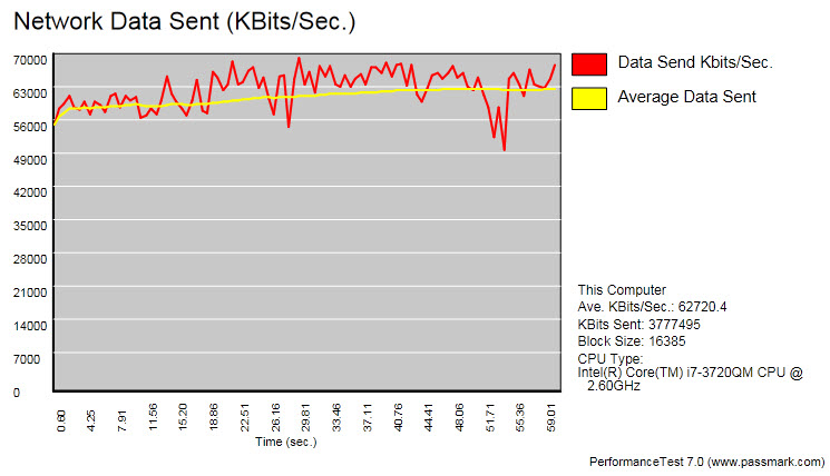
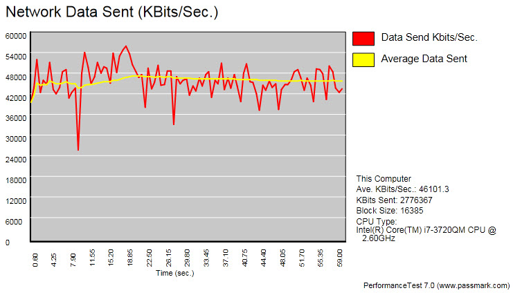
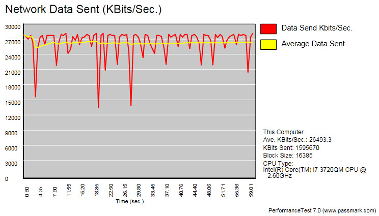
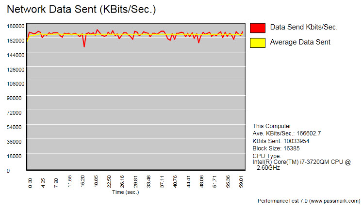
To begin, let’s look at the effect of distance on our AirLive router under 2.4 GHz TCP traffic. Ideally, you want to see a straight line, signaling that throughput isn’t getting hammered by interference and traffic is moving smoothly. With more distance and obstacles, the propensity to see drop-outs in the chart increases. Thanks to its beamforming, the AirLive does a very respectable job and shows minimal erratic behavior in the second chart.
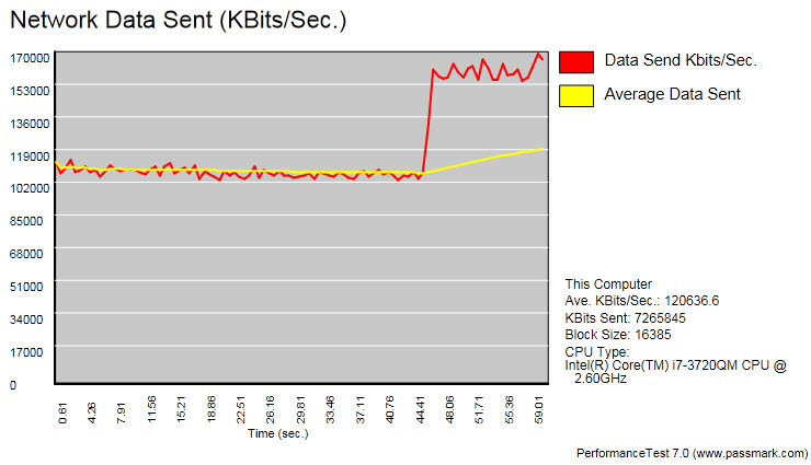
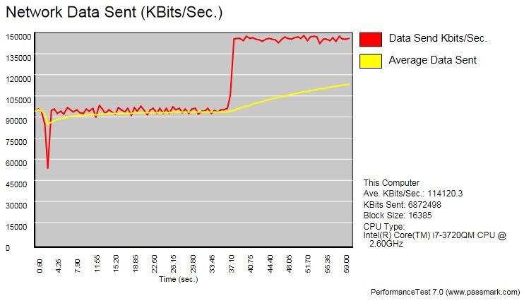
When we switch to 5.0 GHz for the same TCP tests, we see a much different and less expected story. Our same-room test with the AirLive looks blissfully even, although we see throughput take a sudden jump about 45 seconds into testing. This might signal something like a piece of interfering equipment suddenly turning off. While we ran our tests in fairly static conditions, we still saw such plateau hopping repeatedly in our test results across vendors.
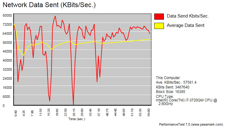
Throughput hopping aside, look at our distance test results. What looks like a fair 57.6 Mb/s on our bar chart looks more like a manic disaster here. Throughput ranges from almost 80 Mb/s down to 0 Mb/s during one precipitous drop. While a cursory glance at averages could lead one to think this router can support HD streaming at distance, you have to watch where the graph bottoms out. This is the real qualifier. If, for example, a stream needs 10 or 20 Mb/s before system overhead, than this router clearly cannot deliver reliably under these conditions.
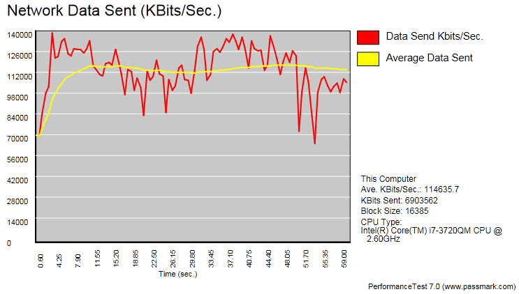
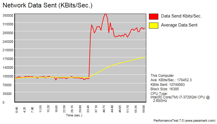
Lest anyone think we’re only picking on AirLive, let’s examine a TCP quartet from Asus. Looking at 11ac same-room performance, we get a little jiggle in the opening second or so as the connection stabilizes, then a long, stable plateau at 90+ Mb/s, then a sudden jump into the 140+ Mb/s range. Then when we switch to 802.11n, all semblance of stability vanishes. Performance swings across a 100% range from 70 to 140 Mb/s. This is obviously workable from an application standpoint, but it shows the striking variability of 11n throughput, even for such an excellent-performing router.
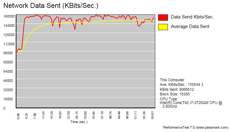
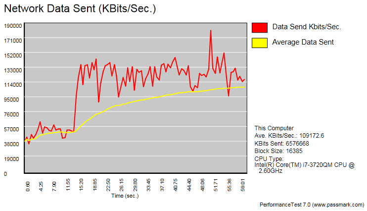
Going back to 11ac in our distance setting, we once more see a fleeting ramp-up in the connection, then an impressively narrow throughput band around 145 Mb/s. Seeing this performance level across the house still makes us giddy. Our 802.11n distance test shows another throughput leap in mid-test, but we again see a much broader performance band within the main plateau. Note, however, that we’re not seeing those drastic pits with Asus. Once it locks onto a throughput level, it’s very good about maintaining a floor.
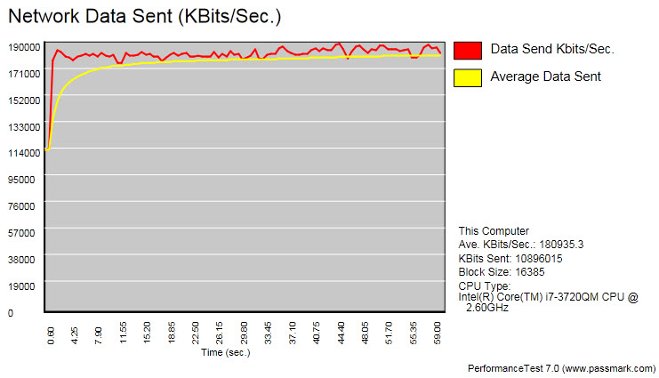
Finally, let’s look at our remaining four routers under best-case TCP conditions. Even without looking at the y-axis numbers, Belkin is obviously out. Buffalo has the most stable, perfect-looking chart of the bunch, though Netgear gives Buffalo an interesting challenge. While it has that little warm-up blip, Netgear’s sustained throughput is slightly better than Buffalo’s. Linksys looks much more erratic, but watch those y-axis values. Numbers over 300 Mb/s for TCP? Dang!
Why we sometimes see those performance plateau shifts remains a mystery. Since we’re only seeing upward shifts in our data, in future testing we may want to look at patterns over longer periods of time, say a half-hour or more. Maybe these stable plateaus aren’t so stable with a longer time scale. These shifts happen in both test locations, so it’s not a local effect, nor does there seem to be a correlation with router/bridge combinations. It could have something to do with the TCP/IP stack, but digging into this will require additional research. For now, it remains a question mark to revisit another day.
Current page: Results: PerformanceTest 7 Graphs
Prev Page Results: PerformanceTest 7, Across-House Next Page Results: IxChariot, Same-Room, 5.0 GHzGet Tom's Hardware's best news and in-depth reviews, straight to your inbox.
-
boulbox Well, i can't wait until i can make my router give wifi all the way to my to my work area.(only a few blocks away)Reply -
I've tested both the R6300 and the RT-AC66U in my home. The R6300 beats it hands down. The average homes won't have the traffic that your artificial software creates. Even your tests show that R6300 in 5ghz mode is faster. People will buy these for gaming and HD movie viewing and the R6300 has better range as well. I've paired my R6300 with an ASUS PCE-AC66 desktop wireless AC adapter and I can acheive 30 MB/S (megabytes) to my HTPC in a 2 story house. That's an insane speed. The RT-AC66U only managed about 15 to 18 MB/s. Also make sure the R6300 has the latest firmware, which is V1.0.2.38_1.0.33. But in conclusion, the R6300 and the RT-AC66U are like a SRT Viper and ZR1 Vette. They are both great pieces of hardware to fit most users needs. Get the ASUS If you got a ton of traffic and a lot of 2.4 ghz devices. Grab the R6300 if you are looking for a friendly setup, max speed, and max range.Reply
-
fwupow Man it sure sucks when you type a long comment and it gets vaporized cuz you weren't logged in.Reply -
DeusAres I'd be happy with a 2Mb/s connection. It'd be better than this horrible 512 Kb/s connection I have now. At least then, I may actually be able to watch youtube vids in 360p.Reply -
fwupow Here's the gist of what I typed before it was rudely vaporized.Reply
I have a dual-band router (Netgear N600). I also purchased a couple of dual-band client USB adapters Linksys AE2500 or something to that effect.
So the USB adapter works fine for a desktop, but having that crap sticking out the side of a laptop, netbook or tablet? Busted in 10 minutes. I hooked one up to my netbook and fried it within a couple of weeks because I'm a Netbook in bed guy. You wouldn't think it could get so hot from a USB port but it does.
So the reality is that you have all these devices that can't be upgraded to dual-band and enjoy very little if any benefit from the new-fangled dual-band router.
The other beef I have with routers is that they're terrible with the way they split up bandwidth between multiple devices. Instead of responsively reassigning bandwidth to the device that needs it, the router continues to reserve a major slice for a device that I'm not using.
If you live in an apartment building, it's actually rather rude to use the full 300Mbps capacity of the wireless N band, since you may well succeed in effectively shutting your neighbor down. There's so much happening in the 2.4GHz band nowadays, it's unreal. Your own cordless keyboards/mice/controllers etc can malfunction from being unable to get a packet in edgewise.
For these dual-band routers to be really useful, we need manufacturers of smartphones, tablets, laptops, netbook and such to build dual-band clients into them because adding the functionality with some sort of dongle just doesn't work. -
memadmax I was a 802.11g and n "adoption" tester....Reply
Never again...
I'll give ac a year or two before I jump on it... -
SteelCity1981 my wireless N produces 300 Megabits which would equal around 37 Megabytes. My highspeed internet doesn't come cloe to reaching 37 megabytes and i don't transfer tons of files wirelesly and my wi-fi rangs is pretty good .So i'm perfectly fine with my 300MB N wireless router right now. Besides that none of my devices spport ac anyhow so it would get bottlenecked from reaching its full potential.Reply -
chuckchurch iknowhowtofixit"Folks, the time to start your 802.11ac adoption is now."I think this review proved that it is time to wait for 2nd generation wireless AC routers to appear before rushing to purchase.Reply
Exactly. The 'client' adapter they used if anyone didn't catch it was a Cisco/Linksys router-sized device. Not practical by any means. It'd be totally insane to make any product recommendations prior to real client adapters being available, or more accurately, embedded ones are available. I think a wireless salesman wrote this article.
