Display Calibration 201: The Science Behind Tuning Your Monitor
Application: How To Adjust Color
We always measure color gamut and luminance in our monitor reviews, even though those parameters are not adjustable in most cases. To do this, you would need a color management system (CMS), and that is just not available on many displays. In fact, our only experience with this feature is from a few high-end projectors and TVs. If you have color gamut presets, they can help you achieve more accurate color. Choose the one that most closely matches your task (sRGB/Rec. 709 for most situations or Adobe RGB 1998 for photo editing). Then measure to see if it indeed meets the spec.
Let’s go through a brief anatomy lesson.
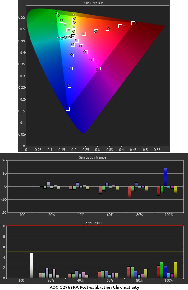
Here is the chart you’ve seen in all our monitor reviews. This one is from an AOC Q2963PM. At the top is the saturation sweep. The color saturation level is simply the distance from the white point on the CIE chart. You can see the targets moving out from white in a straight line towards each primary and secondary color. The farther a point is from center, the greater the saturation until you hit 100 percent at the edge of the gamut triangle. Rather than just measuring the 100-percent saturation level, we measure 20, 40, 60, and 80 percent too. Many monitors can generate a good-looking chart if only the 100-percent saturation is measured. This is a much more precise way of measuring color gamut.
The middle portion of the chart shows gamut luminance. This is the third dimension to color that is not shown on the CIE chart. We believe this has a greater impact on perceived color accuracy than the points on the gamut triangle. The shorter bars mean better performance. This monitor is superb.
The bottom chart is the Delta E information. Again, scoring below three means the error is not visible. Our chart shows the errors for each color, at each saturation level.
If you have one of the very rare displays with a color management system, we’ll give you a brief rundown of how to adjust it. Bear in mind that no two systems are quite the same, and some don’t work properly. Any use of a CMS should be done carefully, with instruments, and with the understanding that it may not actually improve your monitor.
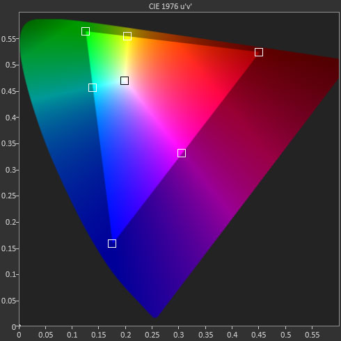
A traditional CMS has three adjustments for each primary and secondary color: Hue, Saturation, and Lightness. Obviously, each one has a different effect. Let’s look at a blank CIE chart once again.
Get Tom's Hardware's best news and in-depth reviews, straight to your inbox.
When you adjust the hue for green, for example, it moves that color point either towards cyan or towards yellow. If you adjust the hue of a secondary color, it moves closer to one of the primaries that make it up. For example, magenta moves between blue and red.
Adjusting saturation moves the color closer to, or further from, the gamut triangle. Just like our bulls-eye chart for adjusting grayscale, you can manipulate the hue and saturation controls to bring a color point into the target square.
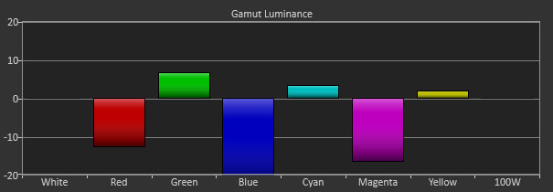
Now let’s consider the lightness control.
In a CMS, lightness is just another term for luminance. To adjust this, you dial in the color points to the CIE chart first. Then, starting with red, adjust lightness until the bars pictured above are as close to zero as possible. It sounds simple, and it can be. The likelihood is that all three controls will interact and you’ll have to go back and forth until you get the best result. Adjusting a CMS can be very time-consuming. The basic procedure, however, involves adjusting hue and saturation for each color, and then going back to adjust lightness.
Creating An ICC Profile
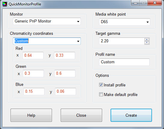
Most monitors have chromaticity data embedded in their firmware, but this assumes it was measured correctly at the factory. And we know from experience no two monitors are identical. The best way to create an ICC profile is to measure the primaries yourself. We use QuickMonitorProfile, a free download, to do this for our reviews.
Once you’ve gathered the CIE coordinates for each primary color, you have everything you need to create the profile. All you need to do is select Custom in the Chromaticity coordinates drop-down, and then enter the x and y values for each color. Once you save it, you can call it up at any time in the future.
Current page: Application: How To Adjust Color
Prev Page Application: How To Adjust Color Temperature Next Page Calibrate Your Monitor For A Better Picture
Christian Eberle is a Contributing Editor for Tom's Hardware US. He's a veteran reviewer of A/V equipment, specializing in monitors. Christian began his obsession with tech when he built his first PC in 1991, a 286 running DOS 3.0 at a blazing 12MHz. In 2006, he undertook training from the Imaging Science Foundation in video calibration and testing and thus started a passion for precise imaging that persists to this day. He is also a professional musician with a degree from the New England Conservatory as a classical bassoonist which he used to good effect as a performer with the West Point Army Band from 1987 to 2013. He enjoys watching movies and listening to high-end audio in his custom-built home theater and can be seen riding trails near his home on a race-ready ICE VTX recumbent trike. Christian enjoys the endless summer in Florida where he lives with his wife and Chihuahua and plays with orchestras around the state.
-
MANOFKRYPTONAK For TVs CNET posts the color levels they use to test each TVs picture by model. They also give great advice on how to adjust too! I used there settings with my 50" vizio and could not be happier. Don't get me wrong loved this article, but you can never get too much info, am I right?Reply -
yolosweg I've adjusted the gamma on my laptop but it keeps reseting. Does anyone know how to fix this? (I used the default windows program btw)Reply -
Vladimir83 Fantastic article.....TomsHardware style!Reply
I have no idea how my monitor was off until i saw the patterns ;)
Now perfectly set for brightness/contrast:first,third,and fourth pattern(although on this i notice cliping on the blue).
However second pattern couldn't set it right.Darkest bar which should be almost cliping to the background is too "black",and the next "12" bar is more closely match to the background in colour.
Any thoughts someone? I use Philips 227Eqha IPS monitor. -
rezzahd Great display calibration guide. I would recommend this to anyone new to display calibration.Reply -
clonazepam Every time I took a support call for pro graphics products, and it centered around getting accurate color, I started off with "Color is a 3-dimensional space..." It was just my way of saying we might be here for awhile.Reply
I love these articles. =) -
ojas Second page, second last photo, article should say that you've set the black level too low, not too high.Reply
Seems to be an interesting read so far, and I've really wanted to read an article like this, so thanks in advance! -
ojas Doesn't the first picture of Gavin on the 3rd page have low gamma and the second bright one is where the gamma is too high?Reply
It's written the other (incorrect?) way around in the article, i think. -
ojas ReplyNow we’ll make the color temp too warm; in other words, below D65.
Shouldn't it be "above D65"? :/ -
gwolfman Reply
It's opposite. Lower gamma makes the dark areas of an image brighter, hence the entire picture looks brighter. Higher gamma makes the lighter areas darker (i.e., it takes a lot brighter white in the image data to actually be displayed white). Check here for a great tutorial on gamma, especially the section titled "Display Gamma."11718866 said:Doesn't the first picture of Gavin on the 3rd page have low gamma and the second bright one is where the gamma is too high?
It's written the other (incorrect?) way around in the article, i think.
http://www.cambridgeincolour.com/tutorials/gamma-correction.htm
That's incorrect. It actually works backwards/opposite from what one might think. Color temperature originates from the color a flame radiates in relation to the temperature at which it burns. Think back to grade school and playing with the Bunsen burner... the hottest part of the flame (i.e., higher Kelvin) is in the darkest blues, not the reds (i.e, lower temperature/Kelvin). This simple picture helps explain the difference.11719001 said:Now we’ll make the color temp too warm; in other words, below D65.
Shouldn't it be "above D65"? :/


