PresentMon: Performance In DirectX, OpenGL, And Vulkan
Get Tom's Hardware's best news and in-depth reviews, straight to your inbox.
You are now subscribed
Your newsletter sign-up was successful
Frames Per Second: Bars Or Curves?
Frames Per Second
In the end, time-based averages only tell you how many frames were rendered in a given second. There's no way for you to know how well-paced those frames were, or if a long pause interrupted the action at one point, negatively affecting the experience. After all, a one-second interval with lots of fast frames and a single frame that took 100 ms to display is going to "feel" less smooth than the same interval with slower, consistently-rendered frames, even if their averages appear similar.
The following two bar charts correspond to our enthusiast and mainstream PCs. Each includes minimum, average, and maximum frame rates. They're all rough indicators of performance, mostly useful for comparing many cards at a glance. But even then, all three figures are commonly maligned for over-simplifying the real-world gaming experience.
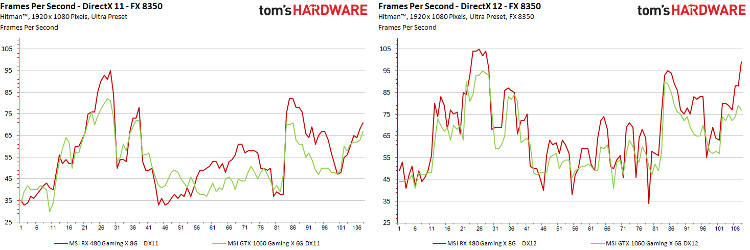
Charting frame rate over time shows instantaneous performance at any point in our benchmark run. These charts are more interesting than the simple bars, though they don't quantify a test's outcome as succinctly. Still, it's pretty obvious which configurations fare better in this type of comparison.
Article continues belowFor 108 seconds of our test run, we have 108 points on our X axis with the corresponding frame rate at each second on the Y axis. But we still know nothing about dropped frames or micro-stutter within each one-second interval. These are still rough averages.
Properly representing and interpreting the rendering times is so important because the two FPS indicators already discussed, whether they're bars or lines, tell us nothing about how a game actually "feels." Of course, we want to retain those averages, peaks, and floors. But it's important to add that sub-one-second dimension as well.
Frame Times And Rendered Frames
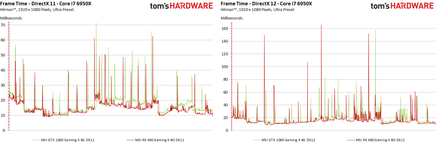
Presenting the render time of each individual frame as a line chart looks simple enough. However, it gets a lot more complicated when you start comparing cards at different performance levels, which generate different numbers of frames during a defined benchmark interval. For instance, in our DirectX 11 test on the enthusiast system, MSI's Radeon RX 480 Gaming X 8G creates 8090 frames. In the DirectX 12 benchmark, it outputs 8446 frames. Meanwhile, the GeForce GTX 1060 Gaming X 6G pushes 7362 and 7332 frames, respectively.
Ideally, we'd want to compare the render times of individual frames in order to better understand the graphical flow of each card. But we can't simply overlap variable-length recordings on a common horizontal axis like we do in the FPS graphs, which are based on 108 data points in our example.
Get Tom's Hardware's best news and in-depth reviews, straight to your inbox.
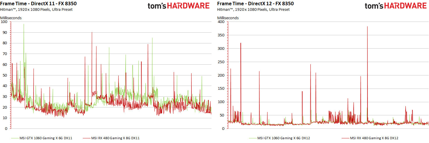
For the two test systems, starting with the faster one, we end up with this:
On both graphs, the Y axes scale based on the render time results we measured. We do this to show as much chart detail as possible; simply keep it in mind to avoid comparing the left and right diagrams at a glance. Though it'd certainly be possible to extend the left graph's Y axis up to a 160-second maximum, doing so would sacrifice resolution.
So now we know what it looks like when you compare the frame-by-frame histories of two GPUs on a single graph's X axis, even when their outputs differ. Excel can't do this on its own though, so we use our software to create optimized curves of equal length for each card. But how do you get 8446 or 7362 individual data points onto an axis able to fit, say, 1000 values?
We preserve the benchmark run's peaks and values exactly as they'd appear in a graph with however many thousands of points were actually captured as losslessly as possible. Everything is interpolated cleanly, so that the visual representation matches exactly.
MORE: Best Graphics Cards
MORE: Desktop GPU Performance Hierarchy Table
MORE: All Graphics Content
Current page: Frames Per Second: Bars Or Curves?
Prev Page PresentMon And Our Proprietary Software Next Page Performance Versus Smoothness
Igor Wallossek wrote a wide variety of hardware articles for Tom's Hardware, with a strong focus on technical analysis and in-depth reviews. His contributions have spanned a broad spectrum of PC components, including GPUs, CPUs, workstations, and PC builds. His insightful articles provide readers with detailed knowledge to make informed decisions in the ever-evolving tech landscape
-
godfather666 Great stuff. I hope Directx 12's disappointing performance is a Hitman-specific problem.Reply -
tomspown The title says "Performance In DirectX, OpenGL, And Vulkan" am i missing pages or just going blind, i read the article then i skimmed through it twice and has nothing to do with Vulkan only power consumption at the end.Reply -
maddad Apologies to TOMSPOWN; Accidentally voted your comment down. I too really didn't get what this article was about.Reply -
jtd871 Igor, some of the charts mislabel the 1060 as the 480. Noticeable especially when the red and green coloring is used. Interesting stuff. I'm pleased to see you digging deeper with the data gathering, analysis and interpretation. It makes for more informed purchasing decisions.Reply -
neblogai This is great- a lot of important data is revealed when doing diligent analysis like this. I have only two notices/questions:Reply
1) Is CPU load measured as total average of all cores, or maximum of a single most loaded core? Single cores at 100% might explain some of the slow frames-it would be great to have a graph with those two together.
2) In the forum when people ask for builds, or about bottlenecks, they rarely tell what monitor, resolution, adaptive or fixed frame rate will be used. Similarly here- article could make note of available monitor technology. Frame times will get a special treatment on most popular- 60Hz fixed refresh rate without VSync, making actual frame times, and user experience completely different than can be expected from frame-time graphs here. Monitors with adaptive sync can also change frame-times, as well as their functions like Low Frame Compensation. It would be great if this was taken into account by few extra tests, or at least by giving notice with links to explanation of frame-time effect on different types and abilities of monitors. That would make it a full picture, and an excellent guide for intelligent purchase decision. -
blazorthon When it comes to digging deep into the numbers for performance, Tom's tends to be ahead of the crowd and this just brings that margin up further. Excellent read.Reply
@TOMSPOWN and MADDAD:
The techniques and software used in this article is compatible with Vulkan, that is the point they were making related to Vulkan. Unlike Fraps, what they're doing now is compatible with more than just DX11, in fact it's apparently compatible with all of the graphics APIs we care about, which makes testing both more accurate and easier for them to manage. -
FormatC @tomspownReply
The translated title is a little bit misleading, I agree. The exact translation of the original title is:
THDE internally: How we measure and evaluate the graphics performance
Just for interest:
Our interpreter also works with OCAT (AMDs free GUI for PresentMon) and FCAT (in all versions).
@jtd871:
Which chart? I can't find it. -
chimera201 ^ Both charts in 'Performance Versus Smoothness' -> 'Frame Rate Versus Frame Time Difference' has the bottom left chart with RX 480 label.Reply
Are you going to make game bench articles with this? Haven't seen any game benches on TH lately. -
jtd871 @FormatCReply
Under "Frame Rate Versus Frame Time Difference", 3rd page. I am presuming that the red chart is for the 480, the green for the 1060. Some of the green charts are labeled as the 480 card. -
erad84 The TechReport's 99th percentile frame time graphs are a great way to summarise how smooth or not a cards results are.Reply
Their frames spent beyond X fram time bar graphs help convey this too.
You article is good and the graphs are nice but I think TechReports graph ideas are the best I've seen for performance smoothness summaries. Plus they're easier to understand and glean info from at a glance as they're simpler to look at.


