Sign in with
Sign up | Sign in

Chrome Goes to 11, Brings Flattened Logo With It

By - Source: Tom's Hardware US

The numbers all go to eleven. Look, right across the board, eleven, eleven, eleven and...

Google's Chrome browser has been evolving faster than your Pokemon. Today the stable version of the browser reached version 11, which is quite remarkable considering that version 10 was released just in March.

Of course, it could be just a numbers game to see who can count up the fastest – but there are still a number of new improvements in the browser. Google Translate now supports microphone input via HTML5 (and your microphone). This speech recognition technology could have far reaching implications for more than just translations – especially for those who aren't able to use a keyboard.

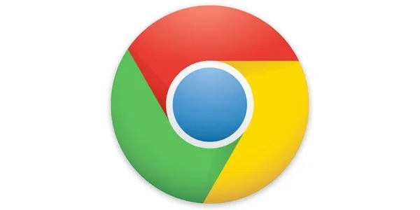
Also new in version 11 is an update to the built-in Adobe Flash plugin and other security improvements. Immediately noticeable by all users, however, will be the new Google Chrome logo, which looks a little less like a pokeball.

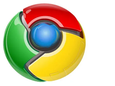
Gone is this old logo:

And new is this flat one that follows the modern trend of minimalism:

Download Chrome 11 here.

There are 61 Comments. B
Other Comments
  • 7
    draxssab , April 28, 2011 8:10 PM
    Prefered was the ancient logo
  • 0
    phoenix777 , April 28, 2011 8:11 PM
    wow, love the logo.
  • -2
    jednx01 , April 28, 2011 8:12 PM
    This is news? Rofl. I've been using that logo with my beta version for months...
  • 9
    Big Daddy Rhino , April 28, 2011 8:12 PM
    Hate the new logo. Gimme back my ball.
  • 4
    -Alessandro- , April 28, 2011 8:15 PM
    :s
    it's a going-backwards logo... like more the 3D logo
  • 0
    casperstouch , April 28, 2011 8:19 PM
    Does the old logo look similar to the portal character?
  • 4
    fritter87 , April 28, 2011 8:25 PM
    the old one looks much better!
  • 0
    Accidental , April 28, 2011 8:27 PM
    Ubuntu 11 came out today. [Licks thumb, holds to the wind].. I feel 11s coming today.
  • 2
    derwin75 , April 28, 2011 8:29 PM
    I like the old Google Logo better than the new one....I wish Google changes it back.
  • 2
    renami9 , April 28, 2011 8:31 PM
    this is just my opinion, but i think the old logo looks more modern than the new logo.
  • 2
    bloodlover , April 28, 2011 8:34 PM
    Totally useless "news"
  • 2
    vafik , April 28, 2011 8:39 PM
    So is this logo going to be faster the the last logo? About time we get some fast stable logos around here. Thank God someone is on the ball!
  • 1
    ericburnby , April 28, 2011 8:41 PM
    I can see why they changed the logo. Old one reminds me of Hal looking over your shoulder. Google probably doesn't want a logo that reminds people of a thinking computer that'll take over the world some day.
  • -1
    mrgreggie , April 28, 2011 8:43 PM
    The old logo looks cool in my book, but the new one is much more modern, mainstream, and marketable.
  • 1
    dalta centauri , April 28, 2011 9:01 PM
    Shading, depth, vibrance of colors?
    We don't want these designs apparently, we want a flat simplistic design.
    Speaking of which, I wonder how much they spent a Graphics Designer to make it...
  • 0
    anonymous@guest , April 28, 2011 9:15 PM
    offline gmail anyone? bring back some offline support after they've disabled it? something?
  • 0
    truchonic , April 28, 2011 9:20 PM
    the first logo is nice and the second is like 1990 logo even the company have 2 years with google crome
  • 0
    anonymous@guest , April 28, 2011 9:29 PM
    Im just going to keep the old logo, looks better. Good thing windows lets you choose.
  • 0
    Krnt , April 28, 2011 9:36 PM
    I always loved the way the old logo felt like a pendant or a star in my desktop or in my taskbar shining with light and hope to the users of my computer, now the new one feels so dim and dead, that is even hard to find.

    If you want to keep the old logo for some time, use the 12.0.712, this one still uses the old logo, and is the one I use, because this new logo is awful, newer versions use also the new logo.
  • 1
    syrious1 , April 28, 2011 9:41 PM
    very remennicent of a "Simon Says" Green, Green, Blue, Green, Blue, Red, Yellow!
Display more comments