The Good, the Bad and the Beautiful: 17" LCDs Reviewed
Get Tom's Hardware's best news and in-depth reviews, straight to your inbox.
You are now subscribed
Your newsletter sign-up was successful
Exemplary Design
The new ViewSonic looks elegant in its black-and-silver attire. The materials are plastic, but of good quality. The base is black lacquered metal covered with metallic gray PVC. The three parrots of the brand's logo add a touch of color in the upper left corner of the monitor. The total effect is that of a very good finish. This monitor doesn't have the pretensions the FP785 does in this area, but it can hold its head high alongside such a rival. The monitor is relatively thin despite the power supply unit being built in behind the panel. If the LG1720B weren't in the running, the VX715 would have the best price/finish ratio in the entire group.
Ergonomics
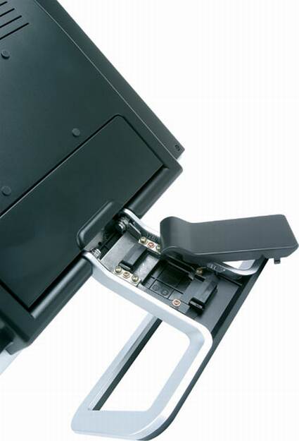
The ergonomics of the VX715 aren't perfect. True, the buttons are all on the front below the panel, but they are large. You don't need to be a contortionist to adjust the brightness of this monitor. On the other hand, there's no height adjustment, and the tilt adjustment is very limited. The OSD is not the most intuitive we've seen - the brightness and contrast adjustments don't use graduations, but percentages. This is not extremely bothersome, but it does make the tester's job a little more complicated. This isn't the first time I've had to make this comment about ViewSonic's monitors. You can never tell what point of the scale you're at and you're forced to guess. And it's impossible to go back exactly to an earlier adjustment unless you memorize the number of times you pressed the button. Please, design engineers, show the adjustment values in your OSDs! Surely it can't cost much more, and it makes users' lives easier.
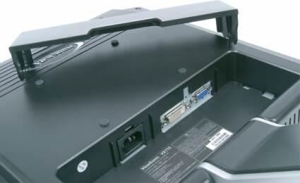
Article continues belowConnectivity is fairly complete - the unit has both DVI and VGA inputs. And both are of good quality. Certain manufacturers have the unfortunate habit of cutting costs on the analog input of monitors that have both connectors. The result is that those monitors have poor output in analog mode.
Get Tom's Hardware's best news and in-depth reviews, straight to your inbox.

