L1740P: Color Fidelity
A monitor that's called "artistic" should have a reasonable level of color fidelity, and this one does, at least to a certain extent.
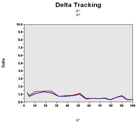
Recall that this graph shows the difference between the desired color shade and the one actually displayed:
Here, all shades were "calibratable" (DeltaE<2) and calibrated. However, that meant that only 70% of the colors were rendered perfectly. Not bad, but the competition does better.
The black level is higher than average. The brightness at the optimum calibration point is clearly unusable; a value of between 180 and 200 nits is better for domestic use. So you'll need to lower the brightness, even if that means sacrificing a little accuracy in the color rendering.
Contrast Stability
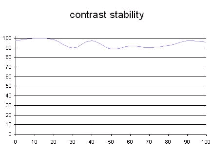
This curve indicates the contrast value measured at a given brightness adjustment set via the OSD. In theory, brightness and contrast are independent parameters, and good contrast stability is required regardless of the brightness adjustment. Unfortunately that isn't the case in practice.
The brightness adjustment is shown on the X-axis, contrast on the Y-axis. The contrast is expressed here as a percentage of the maximum value measured using the ANSI test protocol. The maximum contrast was at a brightness adjustment of 100%.
Here, the contrast is stable enough to guarantee that all the brightness levels will be usable and offer the same contrast performance.