Join Tom’s Hardware today


LG Flatron LCD 782LE

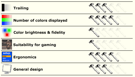
The casing of the LG monitor has a fairly narrow border to the screen: less than three centimeters on the top and sides. The base has a USB hub. Ergonomically speaking, the 782LE is a success.
In Windows, intermediate colors are sharp and clear and character precision is excellent. When it comes to desktop icons and backgrounds though, you soon notice one of the two main failings of the 728LE: all the colors are on the dark side, even when brightness and contrast are set at the maximum.

To get the widest possible range of colors, it is best to work with brightness at 100 and contrast at 80. But it's not worth changing the color temperature, since the default setting of 6500K is already the best there is. The 9300K they propose is farcical: the image is completely blue. This temperature is totally unusable.
| Color | Darkest shade displayed | Lightest shade displayed |
|---|---|---|
| Gray | 1 | 254 |
| Red | 1 | 254 |
| Green | 1 | 255 |
| Blue | 2 | 250 |

It has a great many colors, but they are all wrong. And what is irritating in an office context goes beyond the pale in games: everything is so dark that you can't see a thing. You get the feeling you are in the dark the whole time. This is a shame because the image lag is less than the mentioned poor response time of 40ms led us to expect. So forget games on the 782LE - it's designed for working.