Why you can trust Tom's Hardware
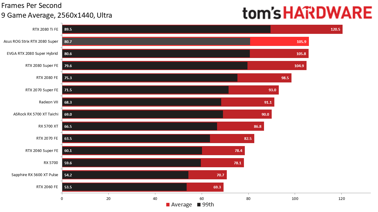
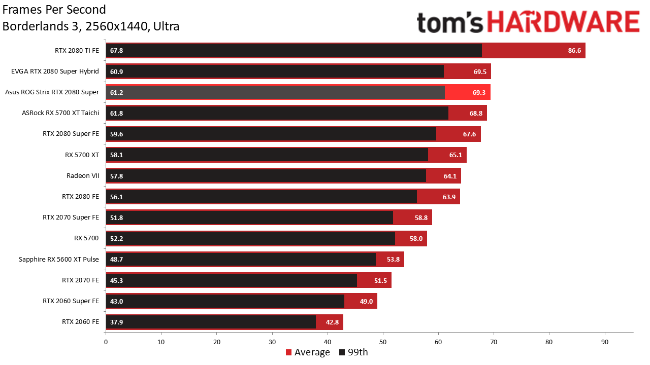
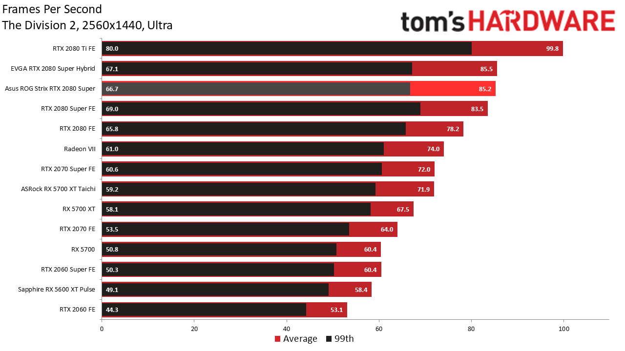
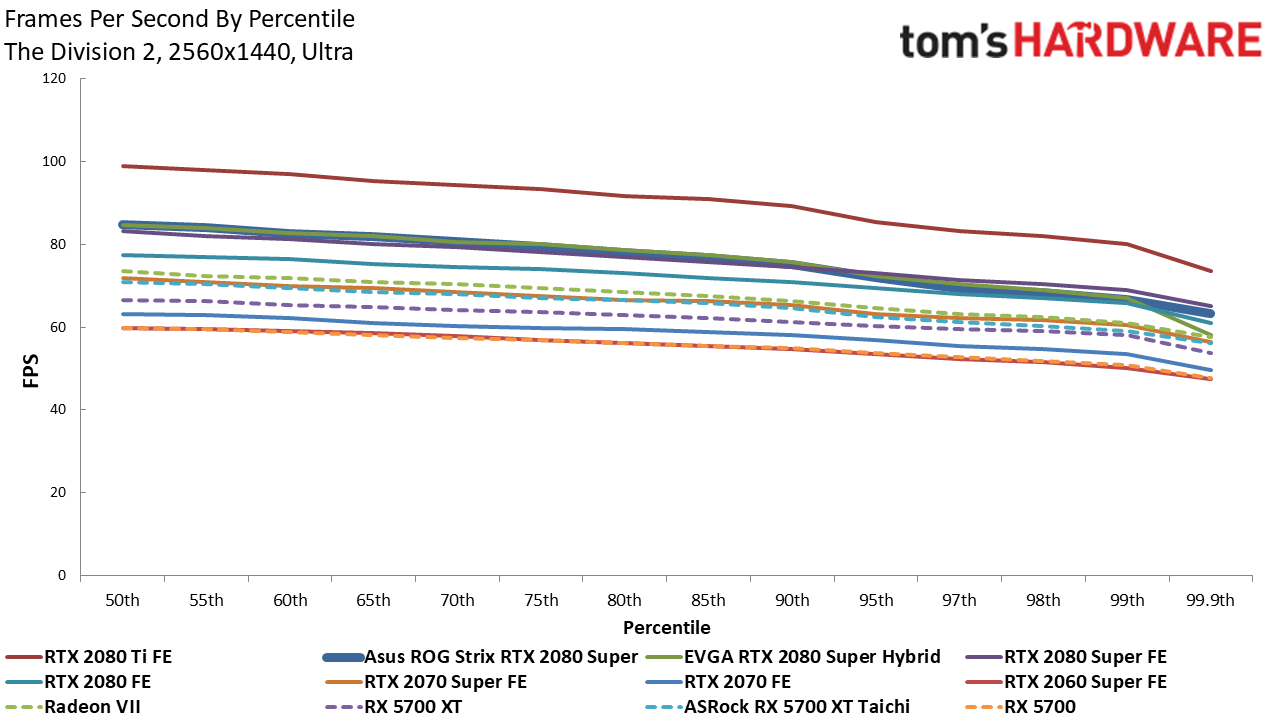
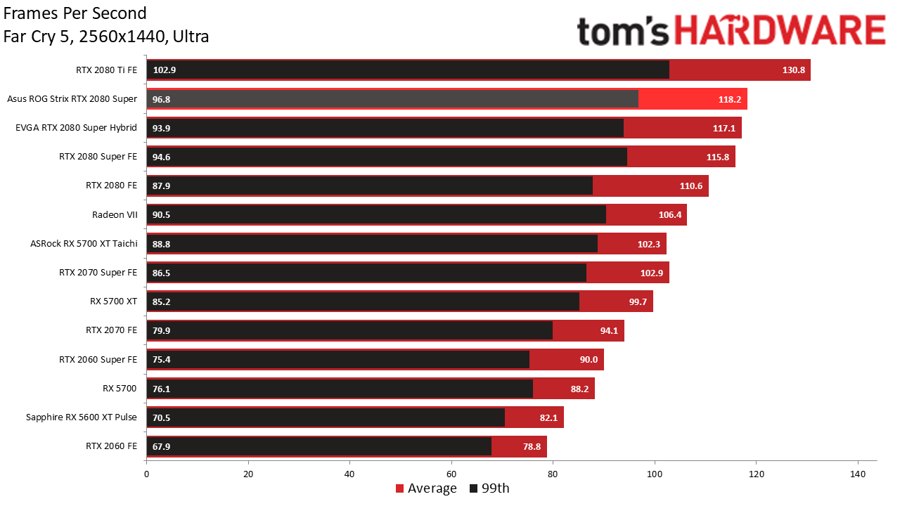
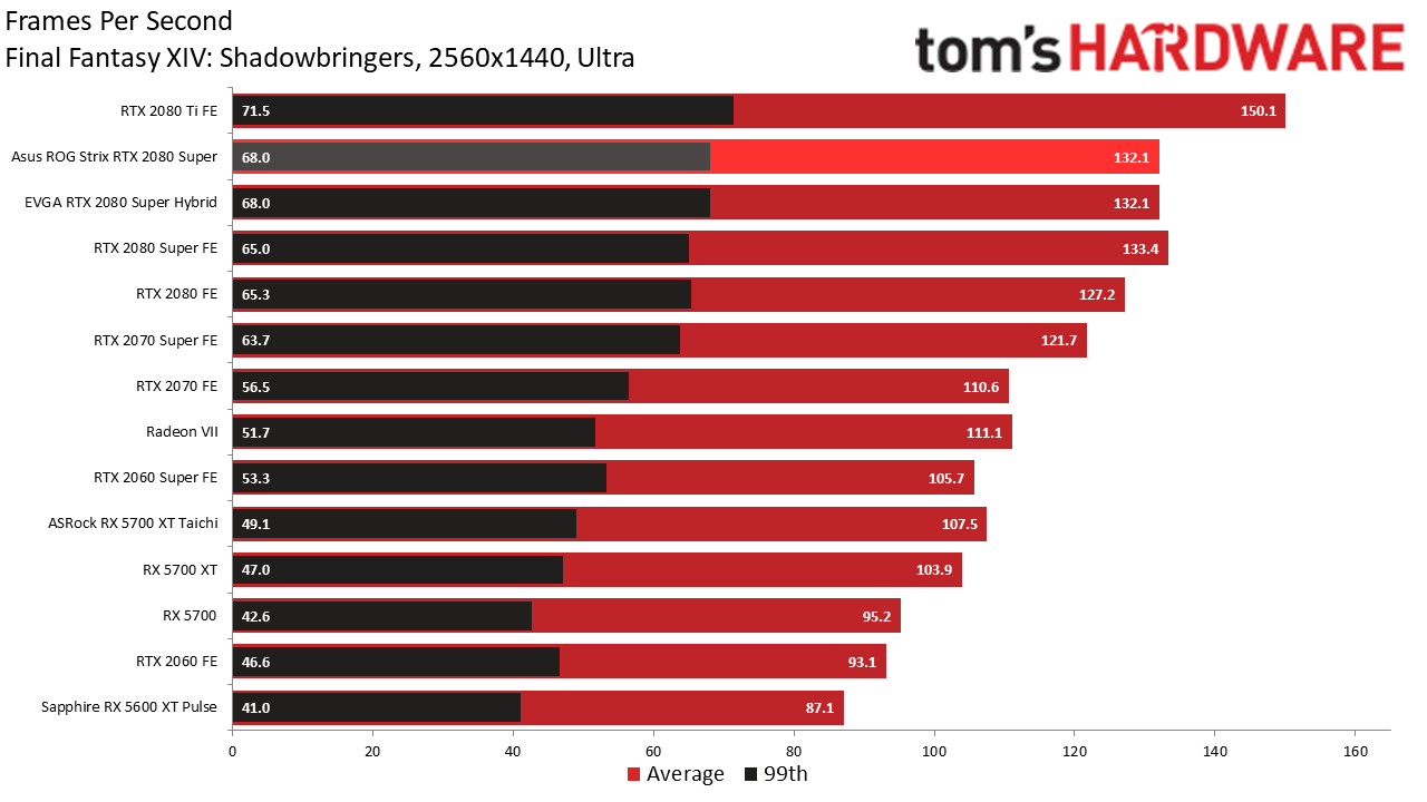
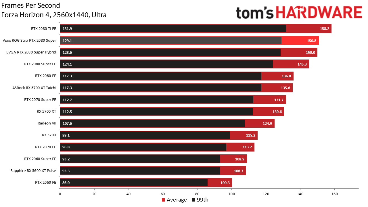
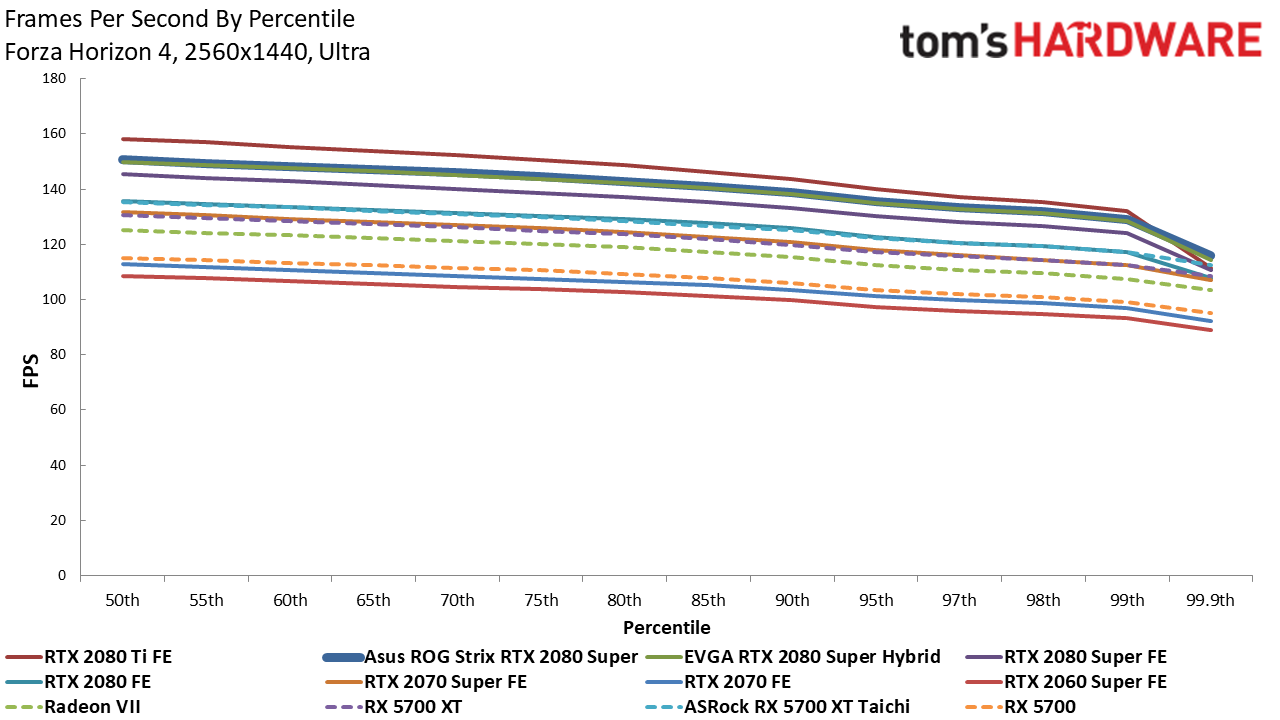
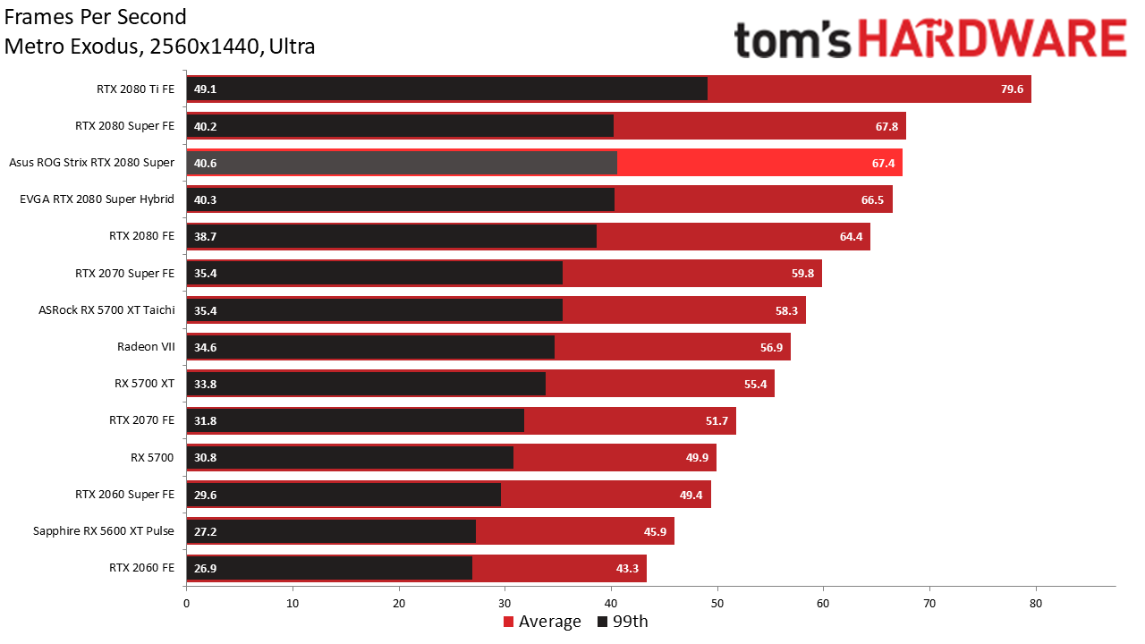
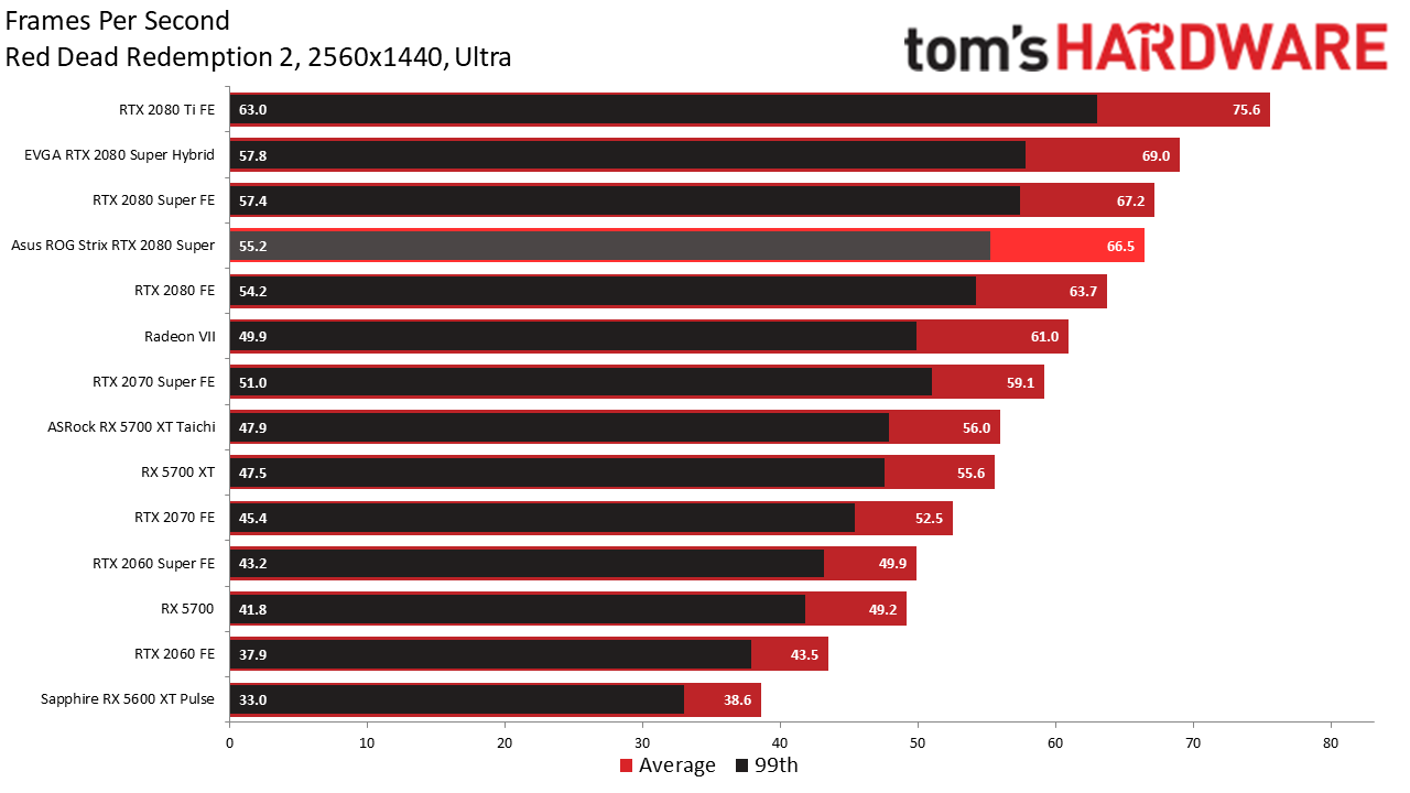
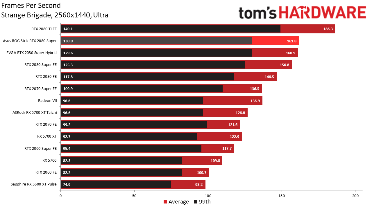
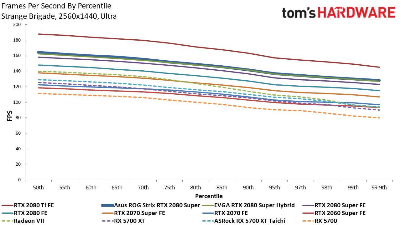
Starting off with the 1440p results, the Asus ROG Strix RTX 2080 Super OC averaged 105.9 fps across all games in our testing suite at ultra settings. Our air-cooled Asus ran just as fast as the hybrid-cooled EVGA at 105.8 fps and the RTX 2080 Super FE at 104.9 fps, with very little difference between any of these cards. All titles were well over 60 fps, with most averaging over 100 fps.
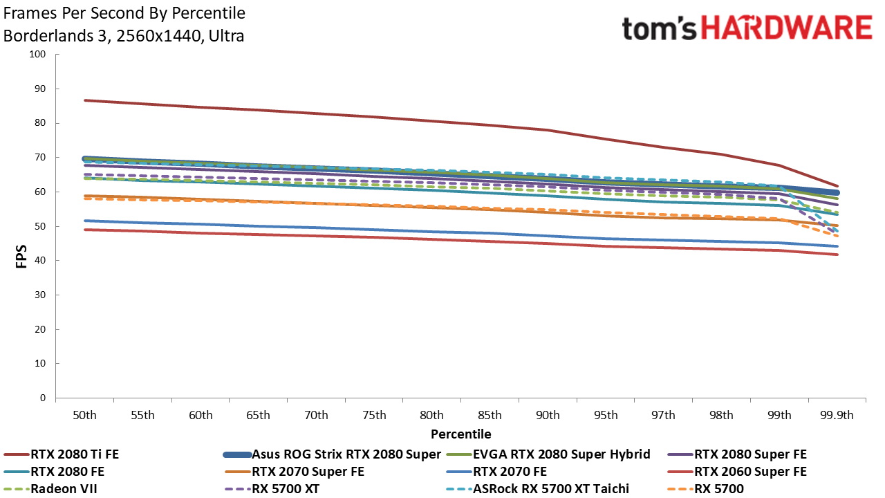
The RTX 2080 Ti continues to reign as the fastest consumer GPU, coming in about 15% faster, while the RTX 2080 FE is 7% slower, RTX 2070 Super FE is 12% slower, the RX 5700 XT Taichi brings up the rear at 15% slower. Between our RTX 2080 Supers, we do not see an appreciable difference performance-wise which is as we expect considering the similar clock speeds. We'll see a lot more differentiation when we get to the temperature and fan speed charts, though.
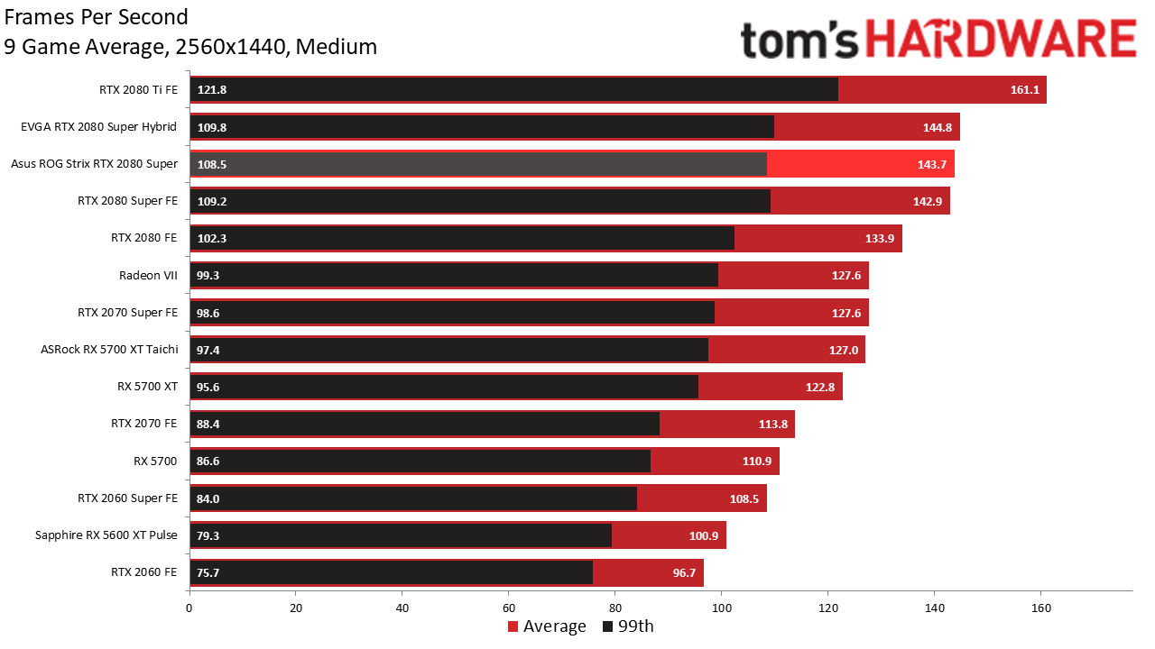
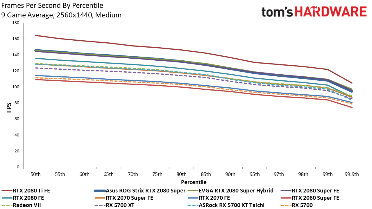
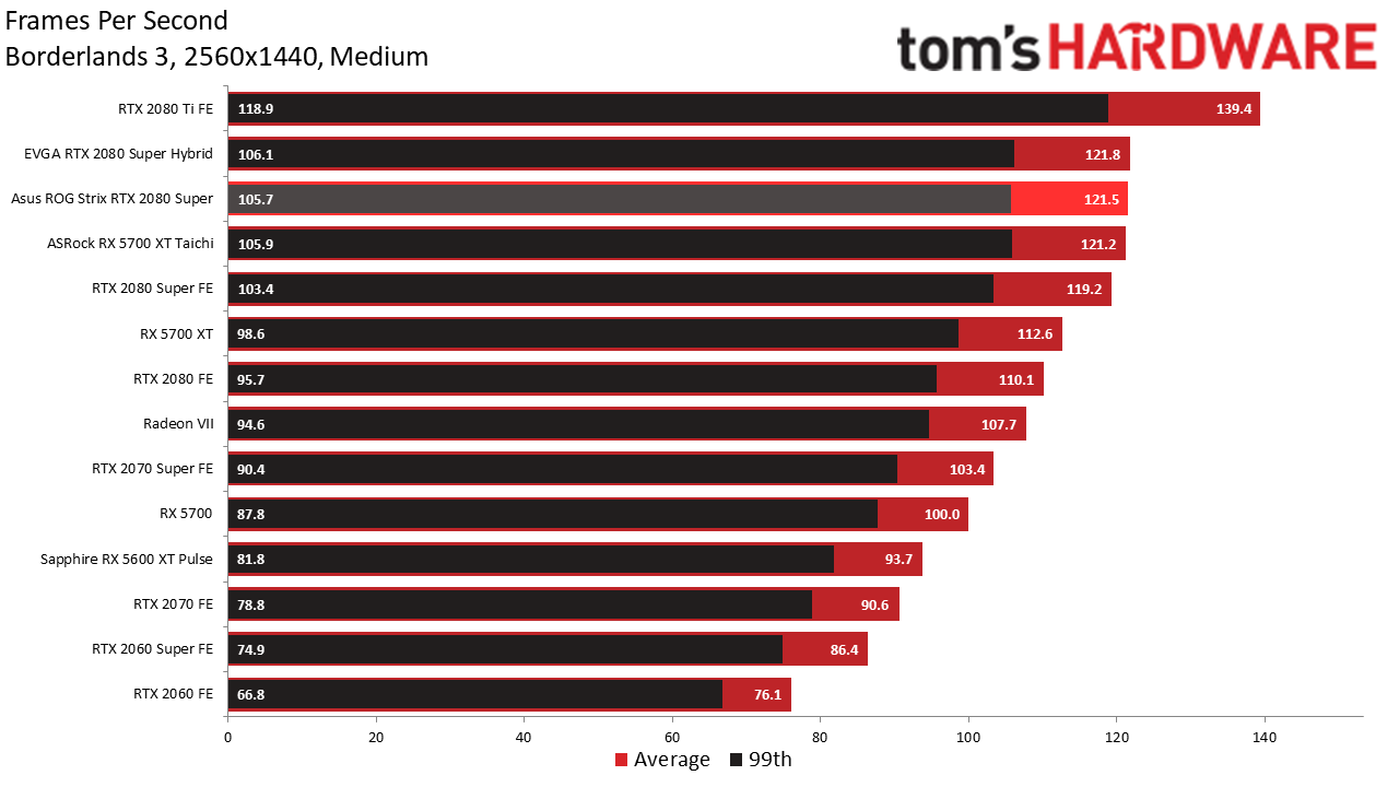
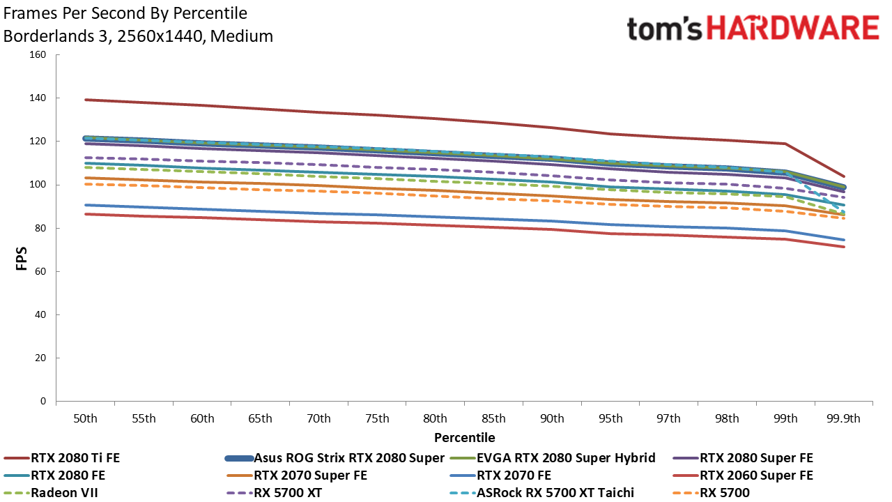
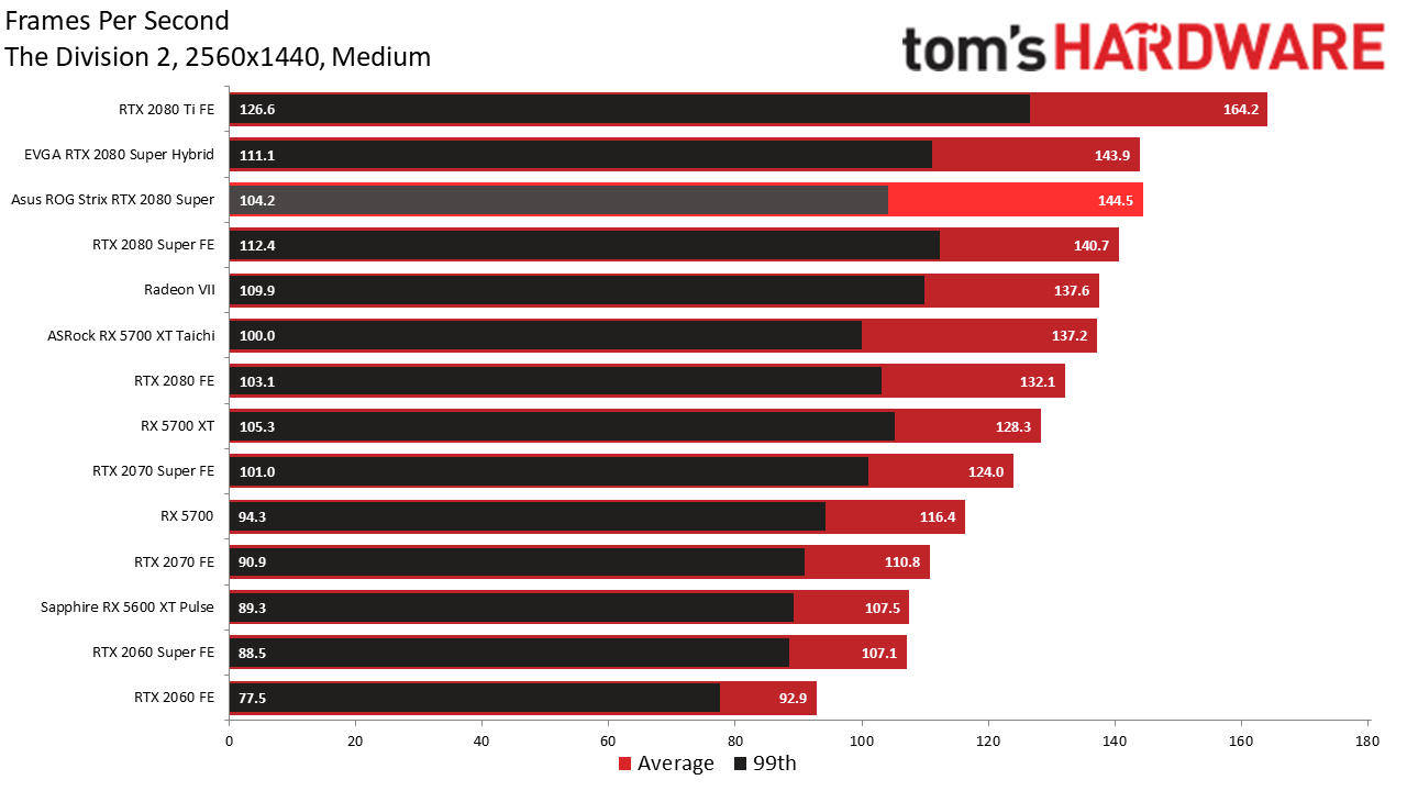
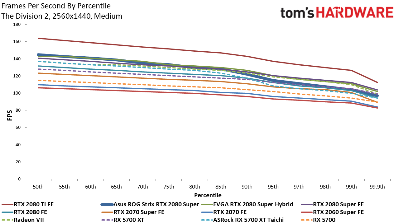
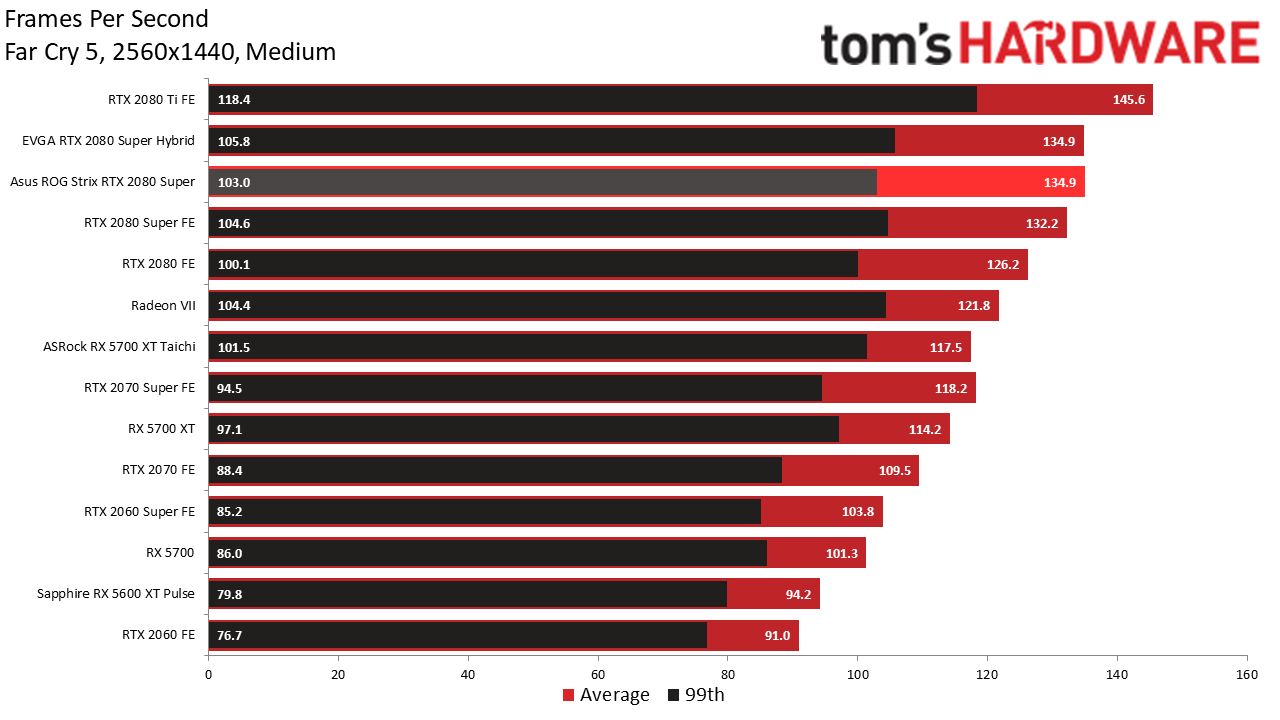
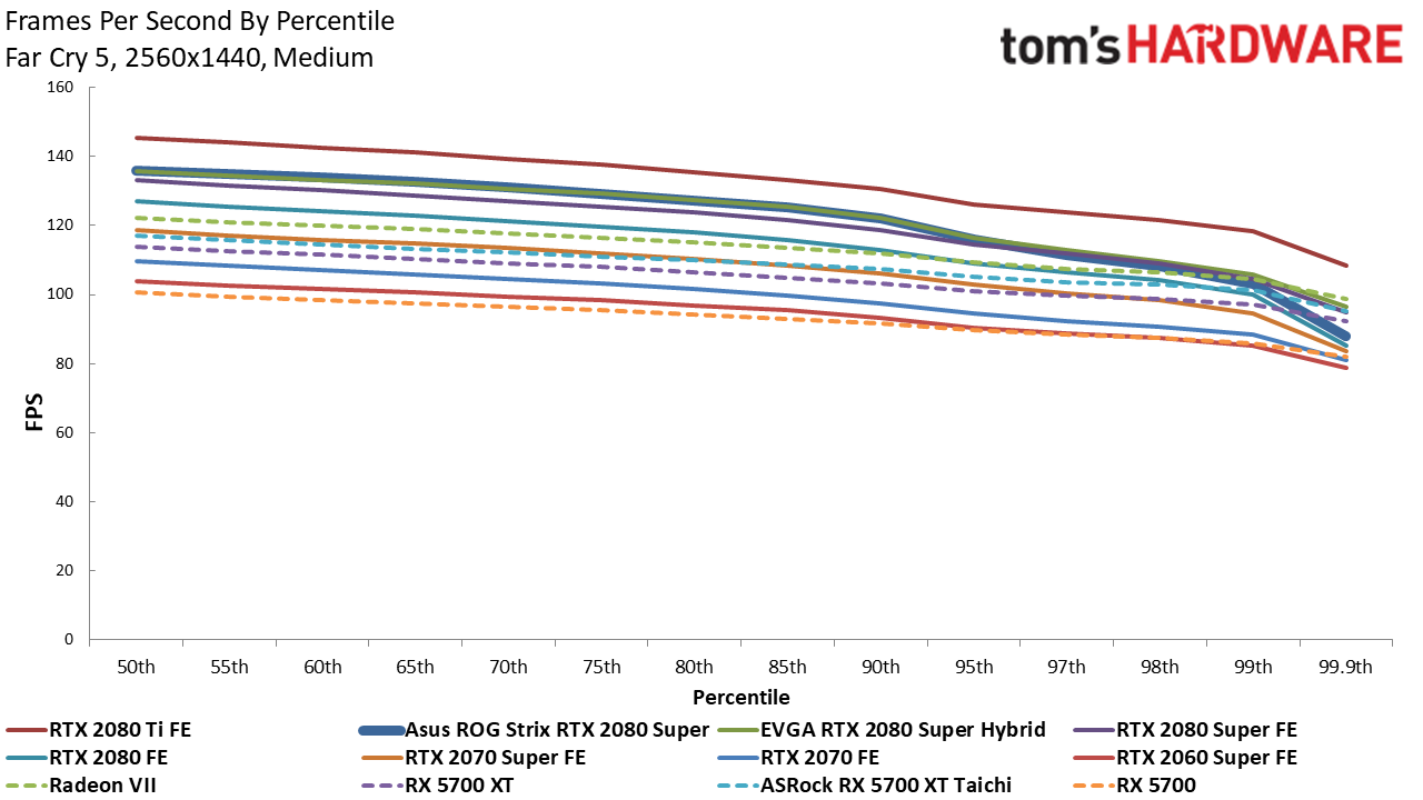
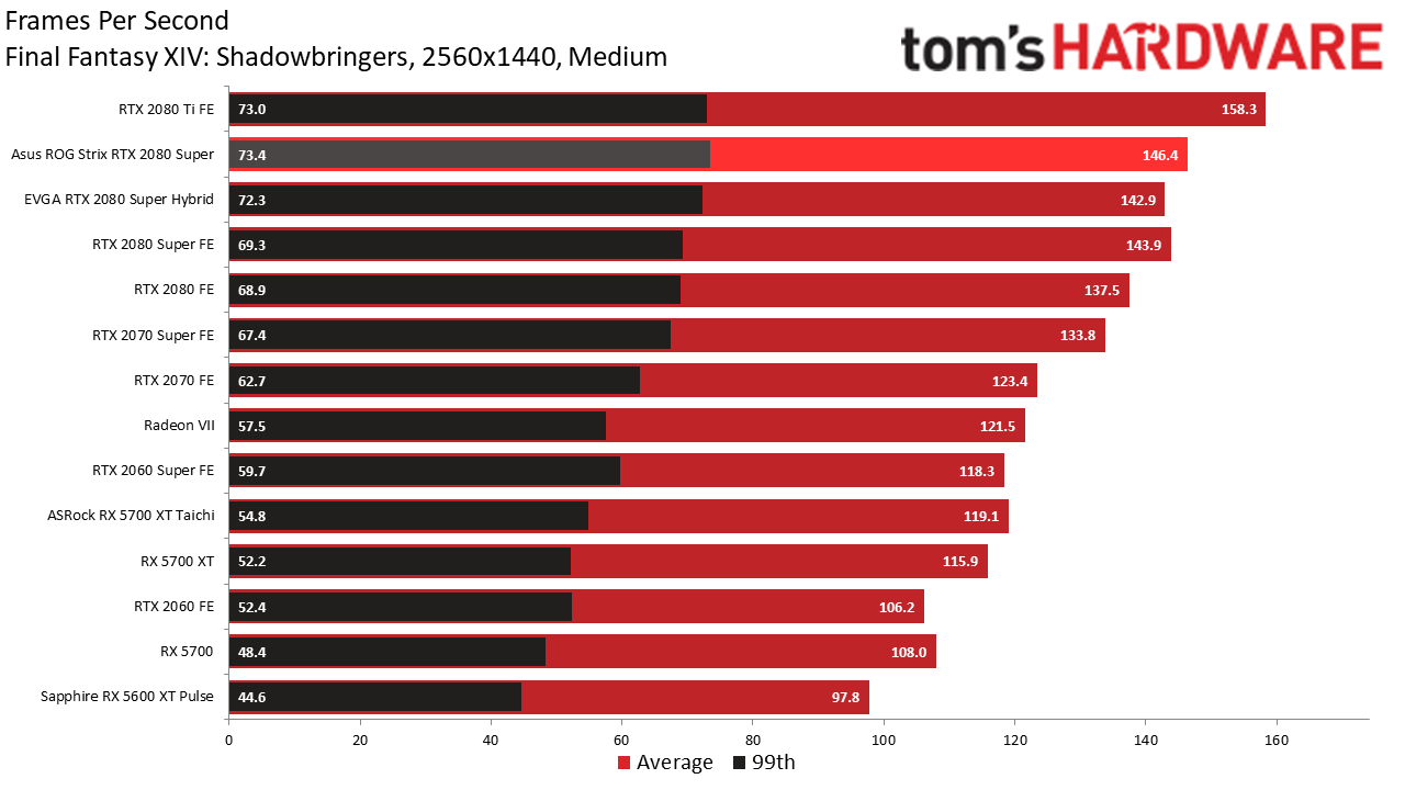
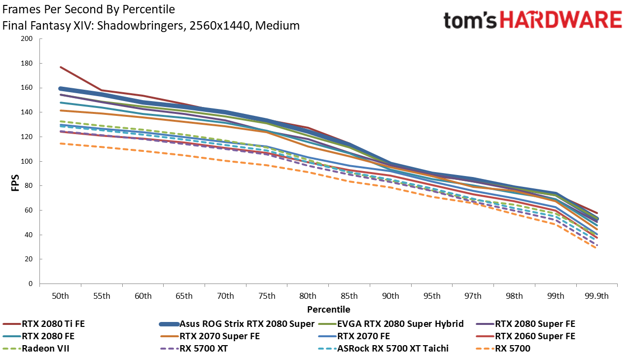
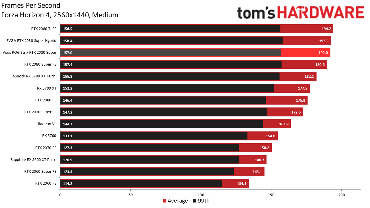
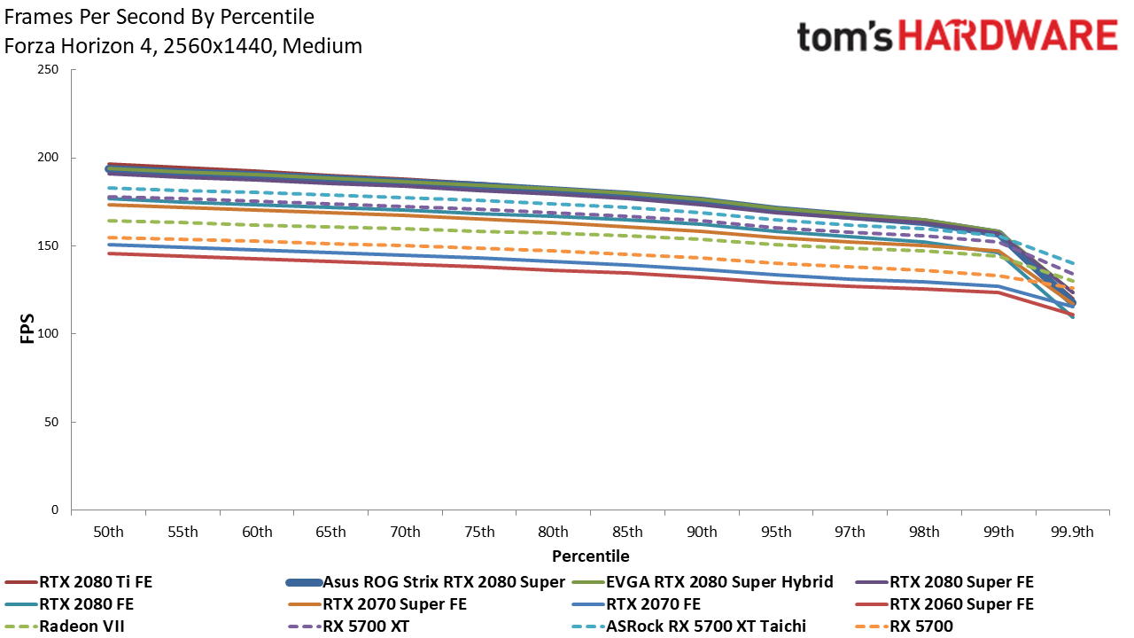
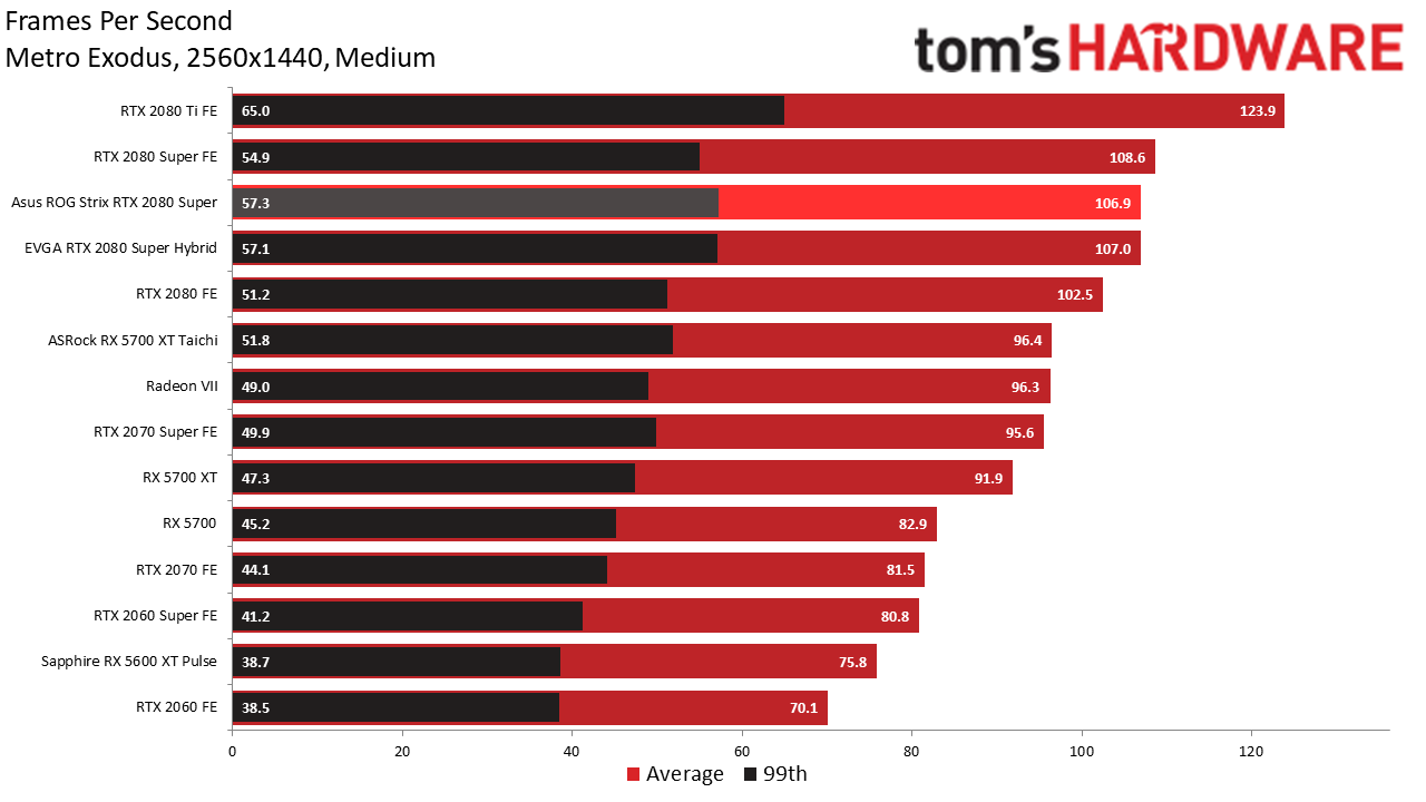
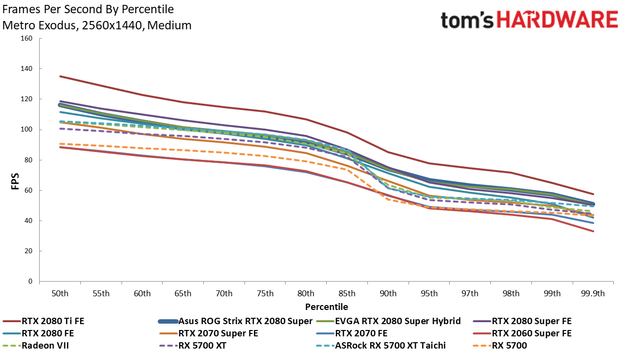
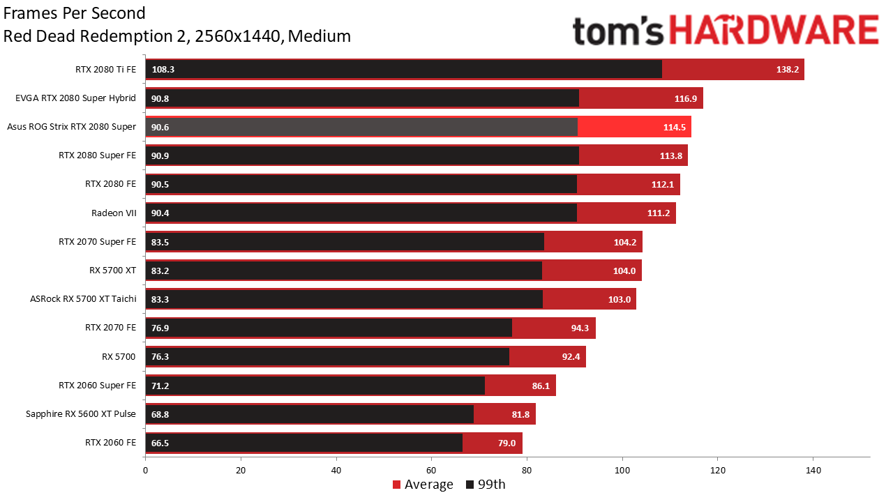
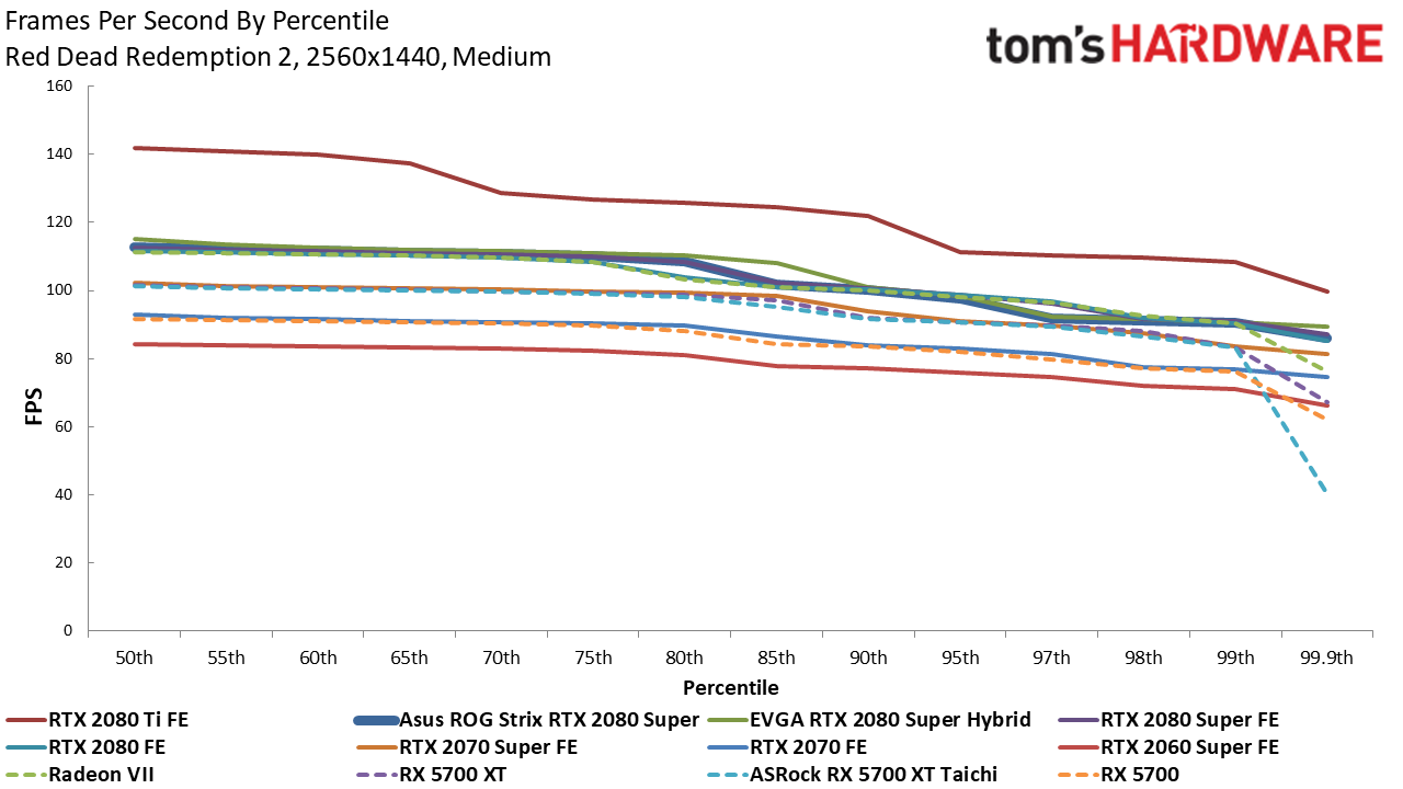
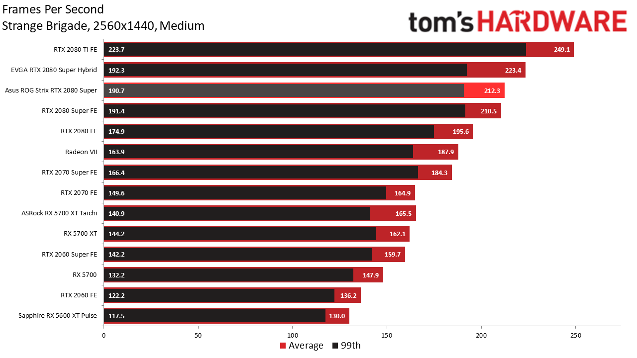
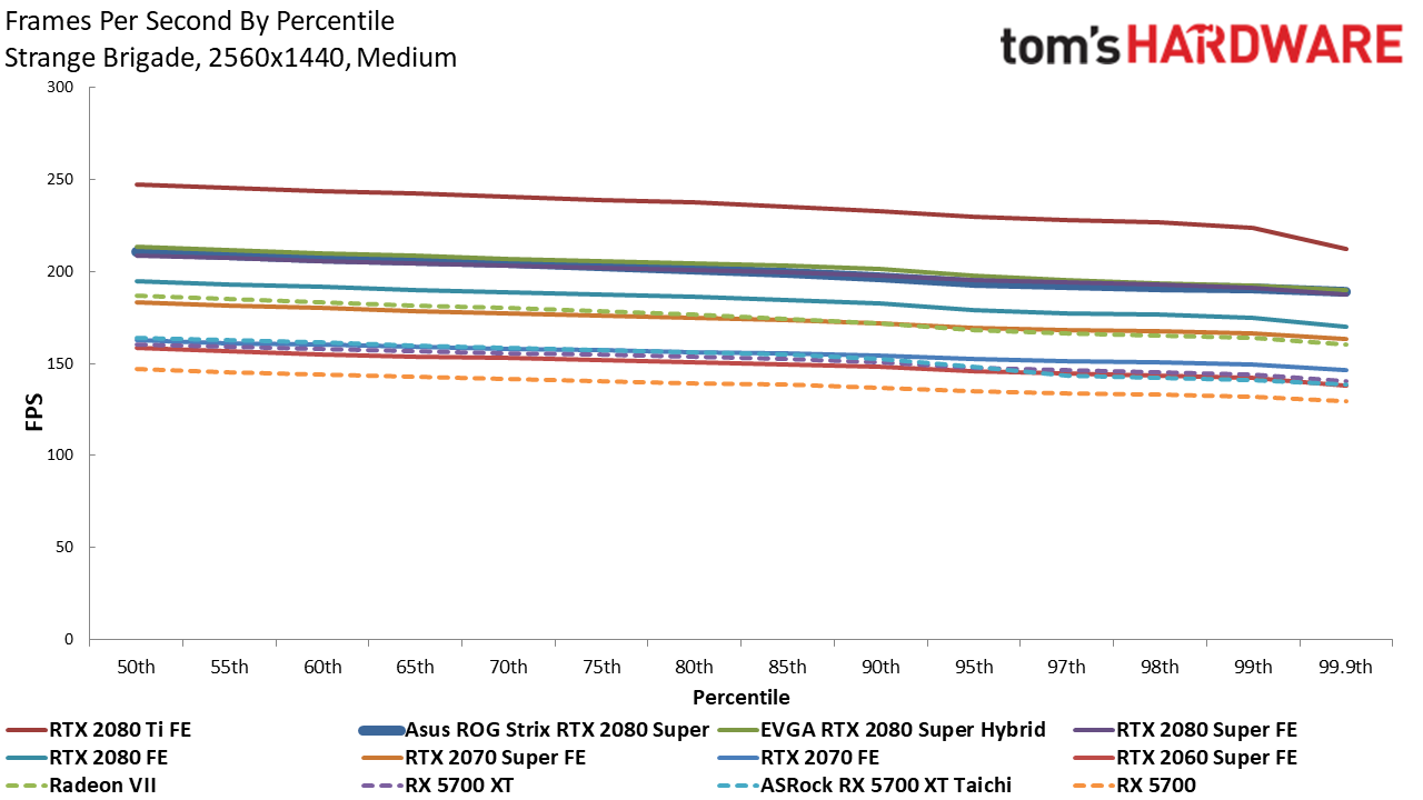
We're also including our 1440p medium testing results, which shows the range of performance you can expect from the various graphics cards. Dropping settings to medium boosts performance by around 35% on Asus ROG Strix 2080 Super OC, with a similar bump on many of the other GPUs. While it might look like it's nearly enough to maintain 144 fps framerates in games, the reality is that many games come up short. G-Sync or G-Sync Compatible (aka, FreeSync) displays will be your best bet for avoiding stutters or tearing with a 1440p display.
9 Game Average
Borderlands 3
The Division 2
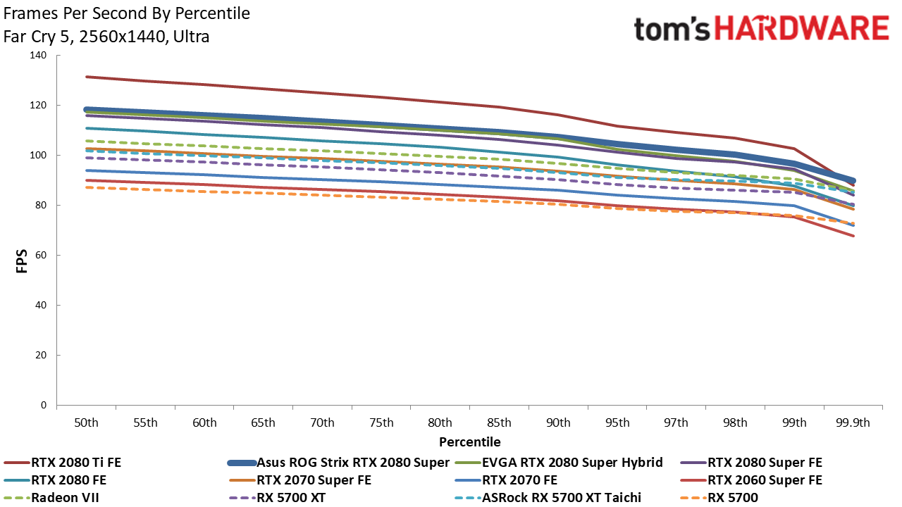
Far Cry 5
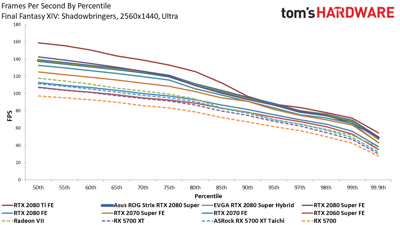
Final Fantasy XIV: Shadowbringers
Forza Horizon 4
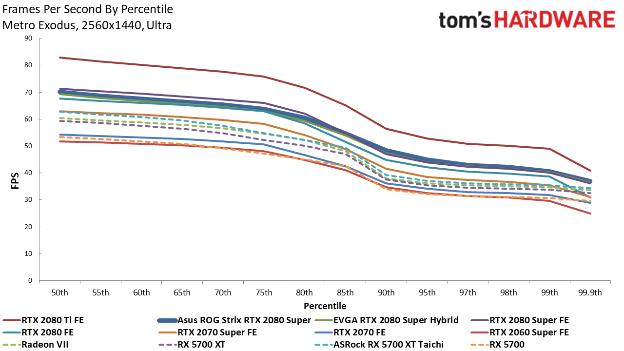
Metro: Exodus
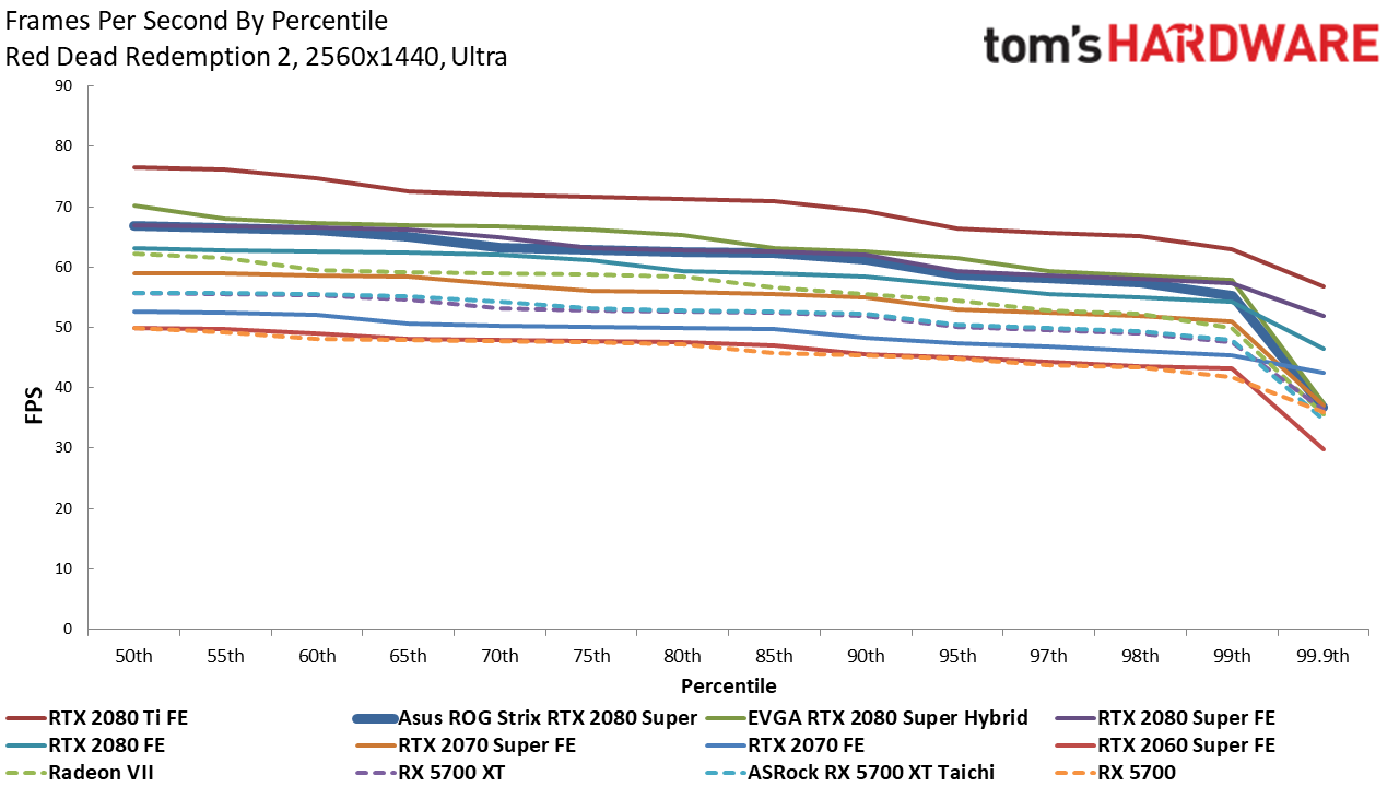
Red Dead Redemption 2
Shadow of the Tomb Raider
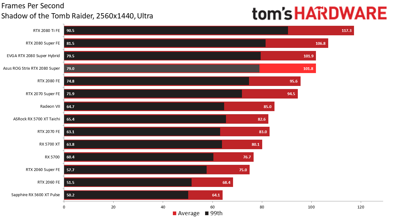
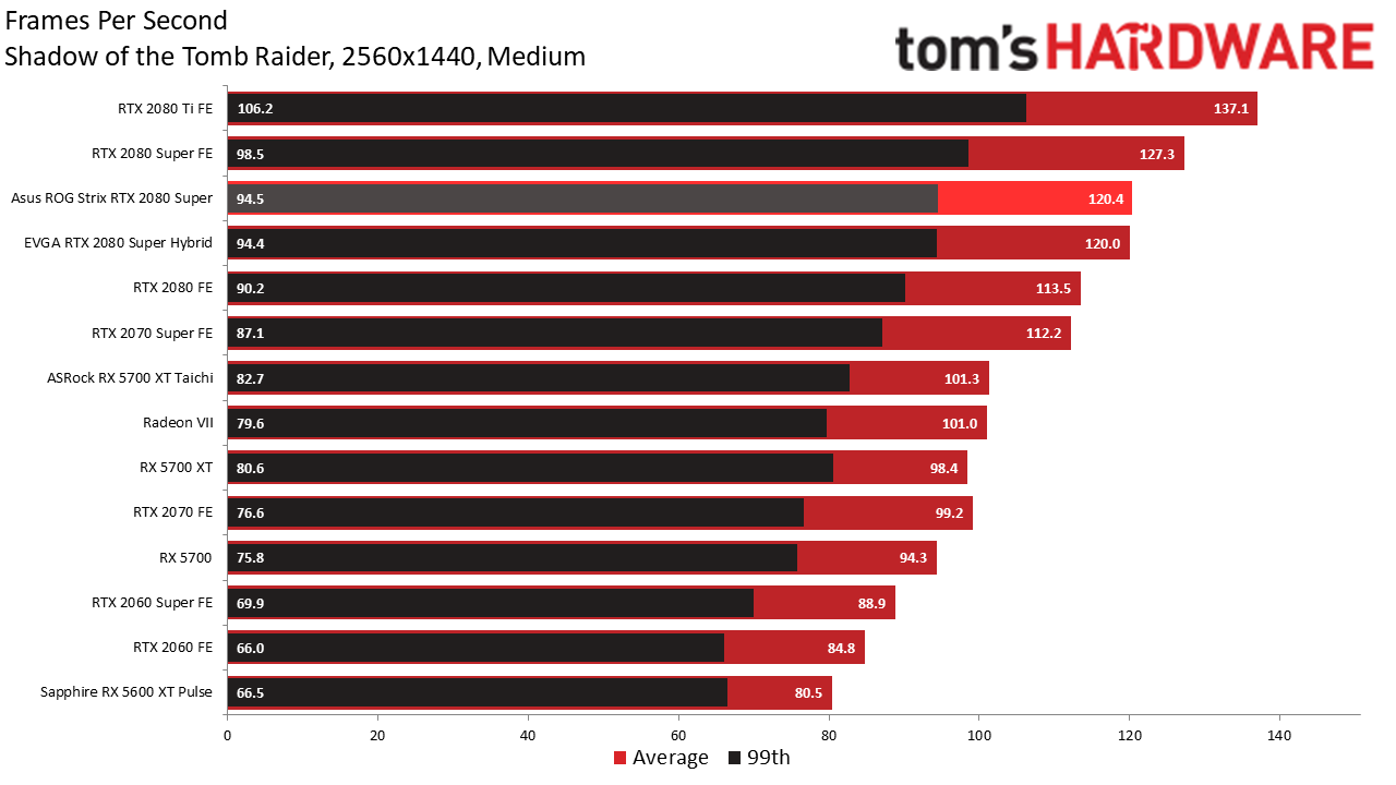
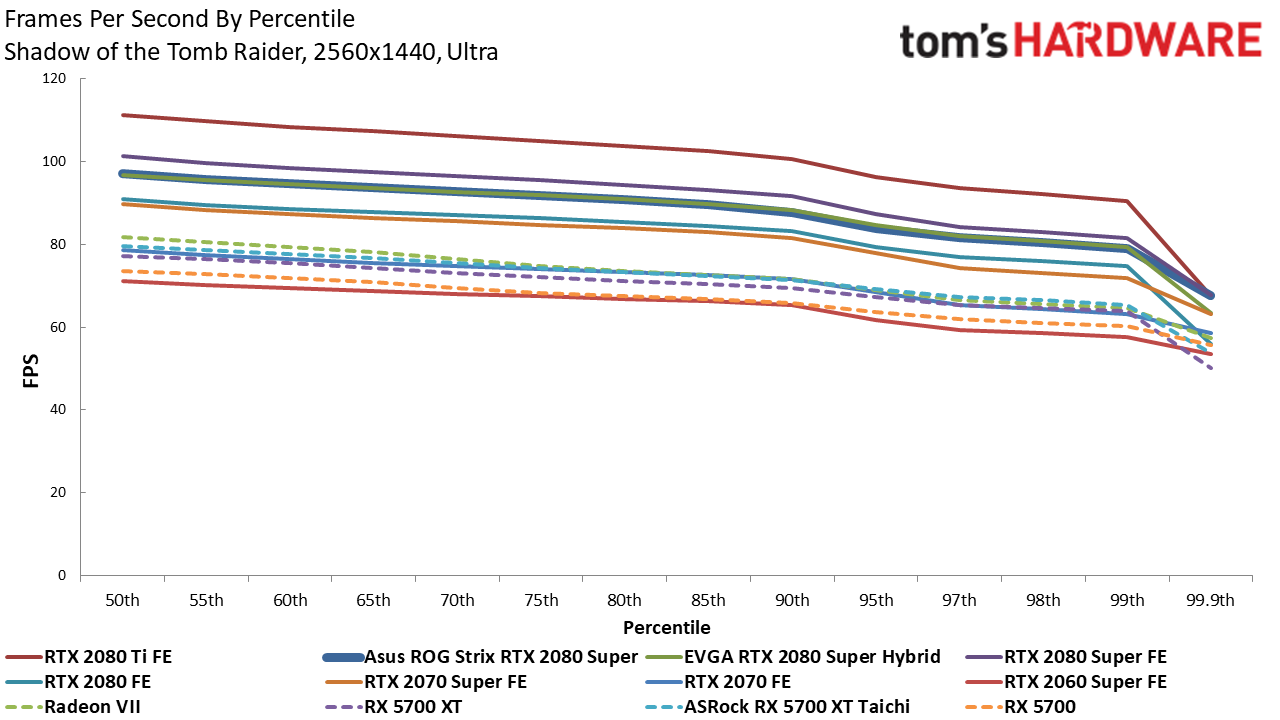
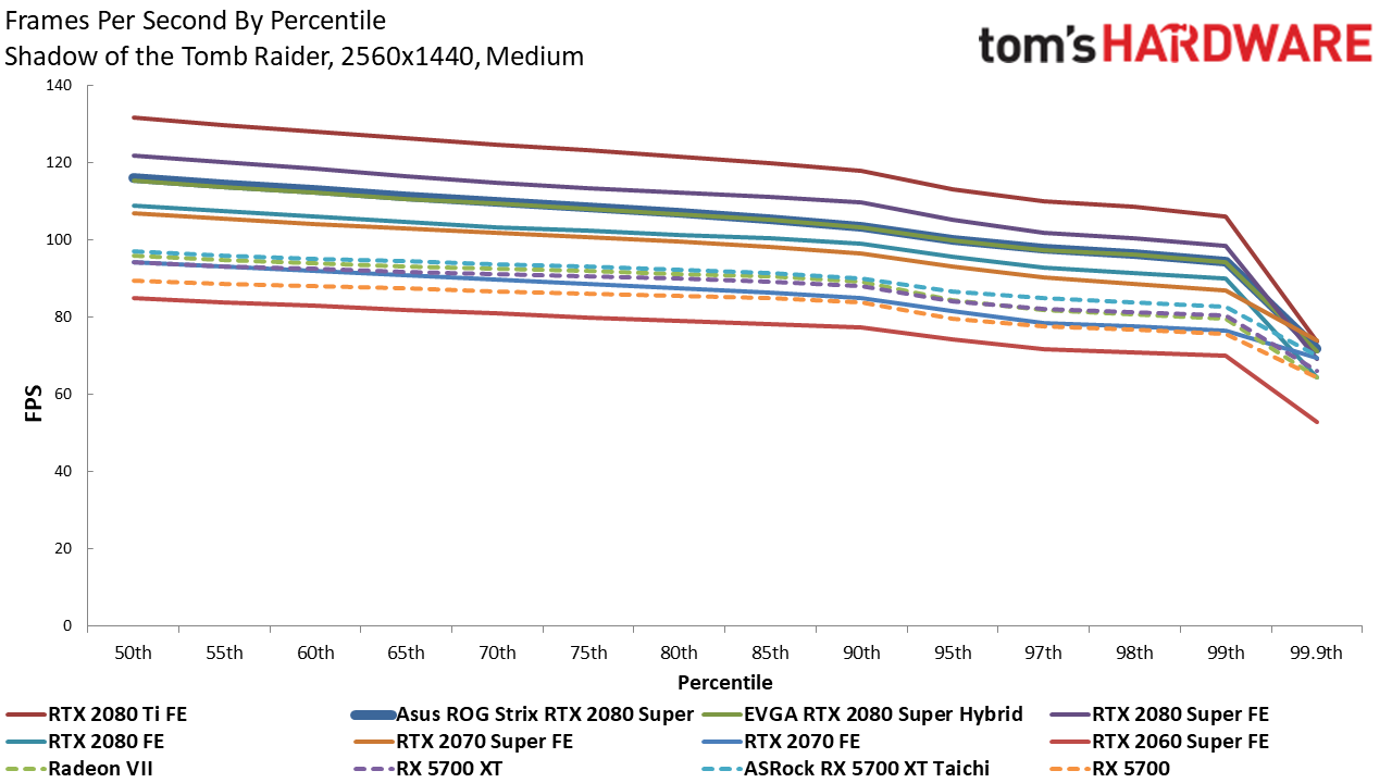
Strange Brigade
MORE: Best Graphics Cards
MORE: Desktop GPU Performance Hierarchy Table
MORE: All Graphics Content
Get Tom's Hardware's best news and in-depth reviews, straight to your inbox.
Current page: Asus ROG Strix RTX 2080 Super OC: 2560x1440 Gaming Performance
Prev Page Asus ROG Strix RTX 2080 Super OC: Overview, Features and Specifications Next Page Asus ROG Strix RTX 2080 Super OC: 4K Gaming Performance
Joe Shields is a staff writer at Tom’s Hardware. He reviews motherboards and PC components.
-
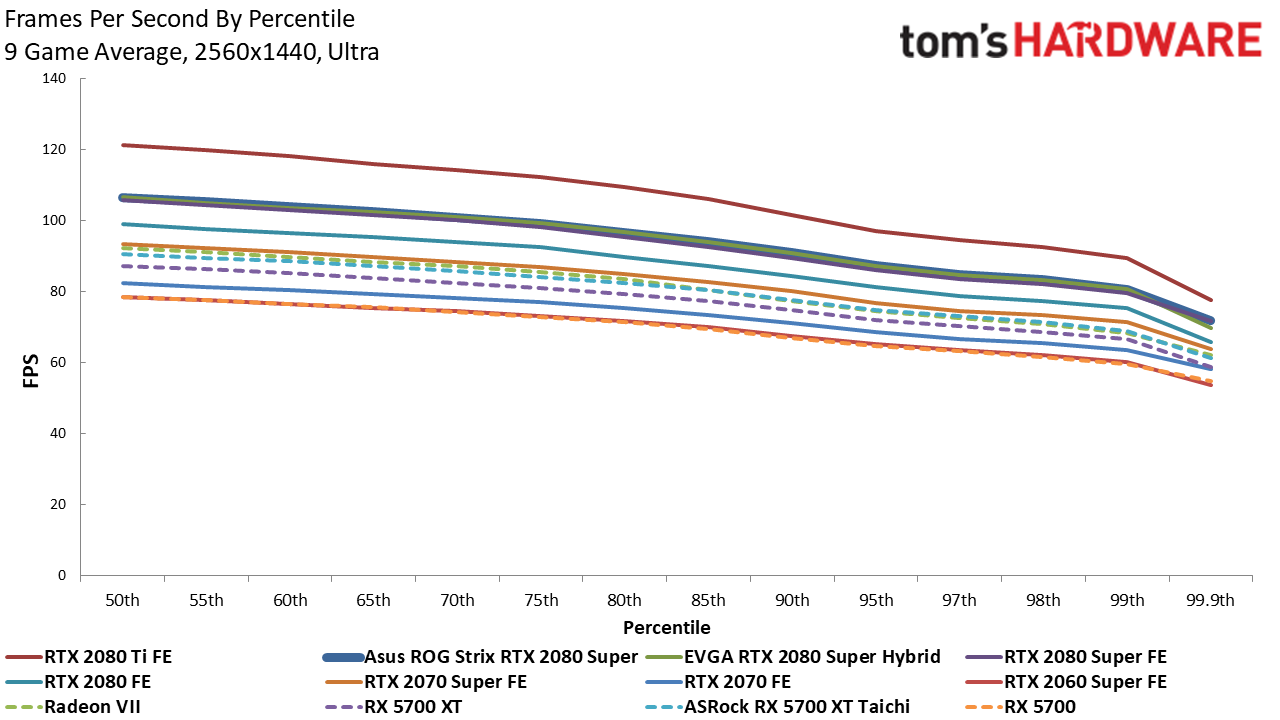
JarredWaltonGPU You'll notice we're moving to a new charting system, which will allow us to show more GPUs in the charts without a ton of effort. I'm quite pleased with my macro and VBA hacking in Excel that makes all of this possible. Comments or suggestions are welcome (constructive or otherwise). Distilling down tons of frametime logs into a digestible format is the end goal, and past experience suggests almost no one cared about some of the additional charts we used to provide.Reply -
vinay2070 This is not related to the graphs, but to the main landing page in general. I feel that TH website feels more 'texty' Large fonts of text with very little gaps between headlines and not enough images makes it not so pleasant to look at or read. For example I like how wccftech's site design is(though that is too much of images and less of text). A balance would be great. My preference would be between anandtech and wccftech (leaning almost towards anandtech). But then looks are totally subjective. Just sharing my thoughts.Reply -
JarredWaltonGPU Reply
Nearly everything related to presentation on the website is out of our hands -- it's controlled by Future, which has a standardized CMS for most of their sites. AnandTech is one of the exceptions -- transition to our Vanilla CMS has been indefinitely delayed. Anyway, are you saying we have too much text on our front page? The usual complaint is too many ads, which is also out of our hands.vinay2070 said:This is not related to the graphs, but to the main landing page in general. I feel that TH website feels more 'texty' Large fonts of text with very little gaps between headlines and not enough images makes it not so pleasant to look at or read. For example I like how wccftech's site design is(though that is too much of images and less of text). A balance would be great. My preference would be between anandtech and wccftech (leaning almost towards anandtech). But then looks are totally subjective. Just sharing my thoughts.
For articles, we try to mix in a few images and tables with the text every 3-5 paragraphs, but we do tend to get technical and sometimes just a bit long-winded. It's sort of the reputation Tom's has built of the years: go deep. Cheers! -
street0123 Reply
rJarredWaltonGPU said:Nearly everything related to presentation on the website is out of our hands -- it's controlled by Future, which has a standardized CMS for most of their sites. AnandTech is one of the exceptions -- transition to our Vanilla CMS has been indefinitely delayed. Anyway, are you saying we have too much text on our front page? The usual complaint is too many ads, which is also out of our hands.
For articles, we try to mix in a few images and tables with the text every 3-5 paragraphs, but we do tend to get technical and sometimes just a bit long-winded. It's sort of the reputation Tom's has built of the years: go deep. Cheers!
The website is completely unreadable with that Playerunknown Battlegrounds background. Until that comes off I will stay away from your site and refer everyone to other tech review and testing websites. -
Phaaze88 *sighReply
The Asus Tax strikes again...
Out of everything Asus I've tried/seen myself, the only thing I'm impressed with is the bios menu on their motherboards.
So popular and overrated. -
vinay2070 Reply
Not sure about the ads, most websites show so much ads, that its literally impossible to surf a website without an adblocker, especially toms. No offence, I am a tomshardware reader since the dial up era, but the site was a lot nicer back then.JarredWaltonGPU said:Nearly everything related to presentation on the website is out of our hands -- it's controlled by Future, which has a standardized CMS for most of their sites. AnandTech is one of the exceptions -- transition to our Vanilla CMS has been indefinitely delayed. Anyway, are you saying we have too much text on our front page? The usual complaint is too many ads, which is also out of our hands.
For articles, we try to mix in a few images and tables with the text every 3-5 paragraphs, but we do tend to get technical and sometimes just a bit long-winded. It's sort of the reputation Tom's has built of the years: go deep. Cheers!
Regarding the text part, the top part of the landing page looks a bit cluttered. Especially the headings on the right layout. The fonts dont have to be so big. Anybody who cant read smaller than that font will zoom in. But for 99% that is not a problem. Presentation becomes important. The same headings on anandtech are in a big grey box. Looks neat. Even the seperators (the 2 horizontal red lines) between section looks a bit kiddish, Its 2020, you can do much better than that. Then again, opinions are subjective. -
Phaaze88 Reply
I know that the ads are for the benefits of said sites and I don't mind supporting them by turning my blocker off, but some of them are so disruptive to the end user experience, to the point of PRESSURING the user into using adblockers.vinay2070 said:Not sure about the ads, most websites show so much ads, that its literally impossible to surf a website without an adblocker, especially toms. No offence, I am a tomshardware reader since the dial up era, but the site was a lot nicer back then.
Regarding the text part, the top part of the landing page looks a bit cluttered. Especially the headings on the right layout. The fonts dont have to be so big. Anybody who cant read smaller than that font will zoom in. But for 99% that is not a problem. Presentation becomes important. The same headings on anandtech are in a big grey box. Looks neat. Even the seperators (the 2 horizontal red lines) between section looks a bit kiddish, Its 2020, you can do much better than that. Then again, opinions are subjective.
Especially on Youtube, when I'm watching entertainment-type content. Something just happens to get a good laugh out of me, and then - BAM! A Manscaped ad.
That's so bloody annoying. I miss the days when the ads were just at the beginning and end of the content... -
watzupken What I don't understand about this page is when I am browsing on my laptop, whatever video that is playing will follow me wherever I scroll. There is a reason why people scroll away from the video in the first place, and even though it kind of minimized to a small box, it is still very annoying when there isn't a lot of screen estate on a laptop.Reply
Anyway back to this review, I am not sure why bother to review a RTX 2080 Super now since its been released for a long time. Typically we should expect good cooling with the ROB Strix version, though the price will turn most people away. There are other alternatives that are just as good if not better, instead of paying the Asus tax.