Why you can trust Tom's Hardware
Metro Exodus Testing
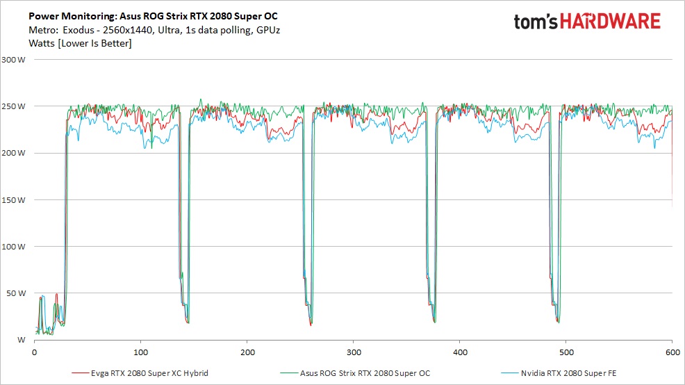
We used GPU-Z logging to measure each card's power consumption with the Metro Exodus benchmark running at 2560x1440 using the default Ultra settings. Future reviews will use Powenetics to record the real graphics card power consumption, but we tested the Asus card before the Powenetics hardware setup was ready.
We warm up the card prior to testing, and logging is started after settling to an idle temperature (about 10 minutes). The benchmark repeats a total of five times, which yields around 10 minutes of testing. In the charts, you'll see a few blips in power, temperature, fan speed, and clock rate that are a result of the benchmark ending one loop and starting the next.
During gaming, the Asus ROG Strix RTX 2080 Super OC averaged 246W, the highest of the three RTX 2080 Supers. The EVGA Hybrid card averaged 238W while the Founders Edition was the lowest at 232W. You wouldn't notice the power consumption difference between these cards on your electric bill, and the Asus larger cooler easily mitigated any additional heat from the increased power use.
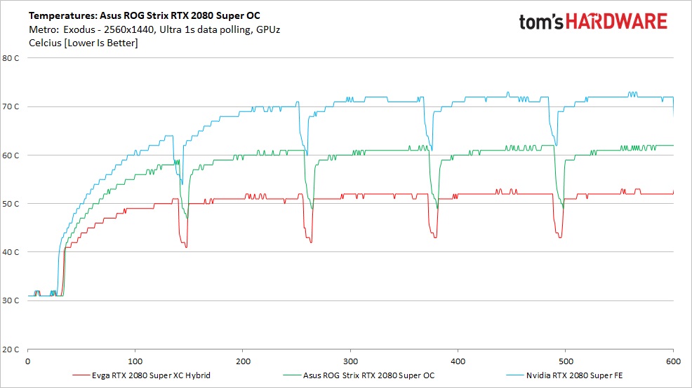
Temperatures during game testing reached a peak of 62C on the Asus ROG Strix card, which is 9C more than the EVGA Hybrid's 62C. Not surprisingly, the 2080 Super FE had the highest peak temperature of 72C. Nvidia's FE fan curve tends to be a bit conservative, opting for lower noise and higher temperatures. The larger cooler and triple fan setup of the Asus card easily beats it — provided of course that you have room in your case for such a large graphics card.
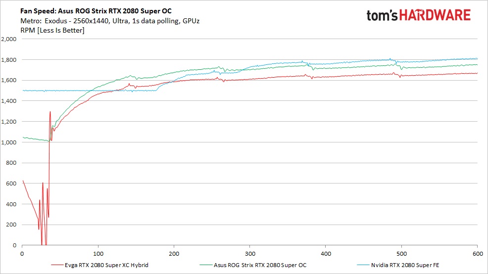
Fan speeds for the three RTX 2080 Super cards were relatively similar. The Asus ROG Strix hit 1,750 RPM and the Founders Edition ran faster at 2,000 RPM, while the EVGA card was slower at around 1,700 RPM. Note that the pump noise on the EVGA actually eclipses the fan noise, however, so fan speed isn't the only consideration.
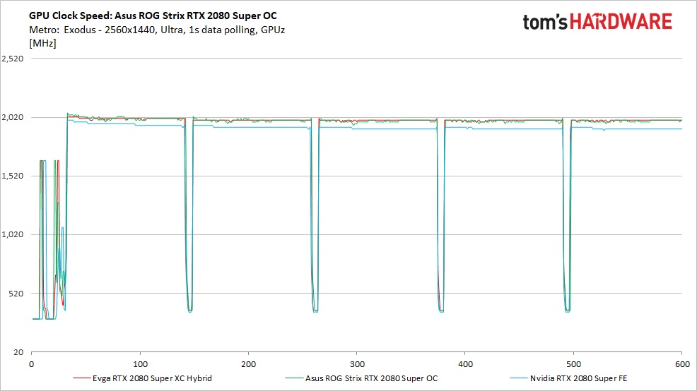
Average clock speeds for the Asus ROG Strix 2080 Super OC come in at 1,988 MHz, only five MHz behind the EVGA Hybrid card. That's mostly thanks to temperatures, as the hybrid card kept the GPU cooler than the air-cooled Asus. The RTX 2080 Super FE meanwhile clocks at an average speed of 1,929 MHz.
FurMark Testing
We also use FurMark to capture worst-case power readings. Although both Nvidia and AMD consider the application a "power virus," or a program that deliberately taxes the components beyond normal limits, the data we can gather from it offers useful information about a card's capabilities outside of typical gaming loads. For example, certain GPU compute workloads including cryptocurrency mining have power use that can track close to FurMark, sometimes even exceeding it.
Get Tom's Hardware's best news and in-depth reviews, straight to your inbox.
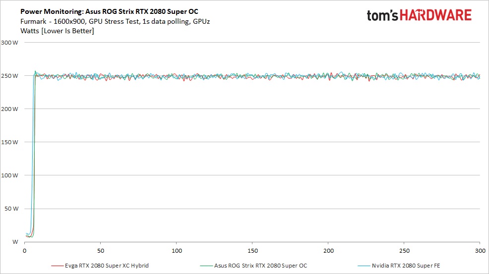
The differences between the cards shrank considerably when testing power use with Furmark. Both the EVGA and Asus RTX 2080 Supers averaged 247W while the Founders Edition made a big jump to 248W. Not surprisingly, at stock settings all three cards land close to the expected 250W recommended TDP.
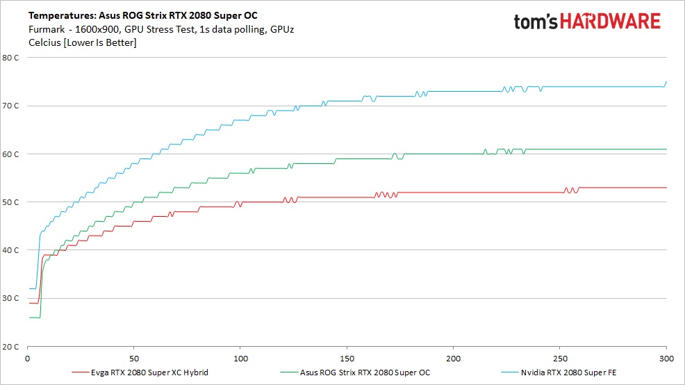
Temperatures when running Furmark weren’t much different than during the gaming test. Nvidia cards tend to throttle hard when running this stress test, so temperatures tend to be somewhere around what we found during the gaming test.The Asus ROG Strix 2080 Super peaked at 61C, the EVGA Hybrid at 53C, and the 2080 Super FE at 75C. All coolers are able to keep the cards running here, though the enhanced cooling on the Asus and EVGA cards definitely makes a difference.
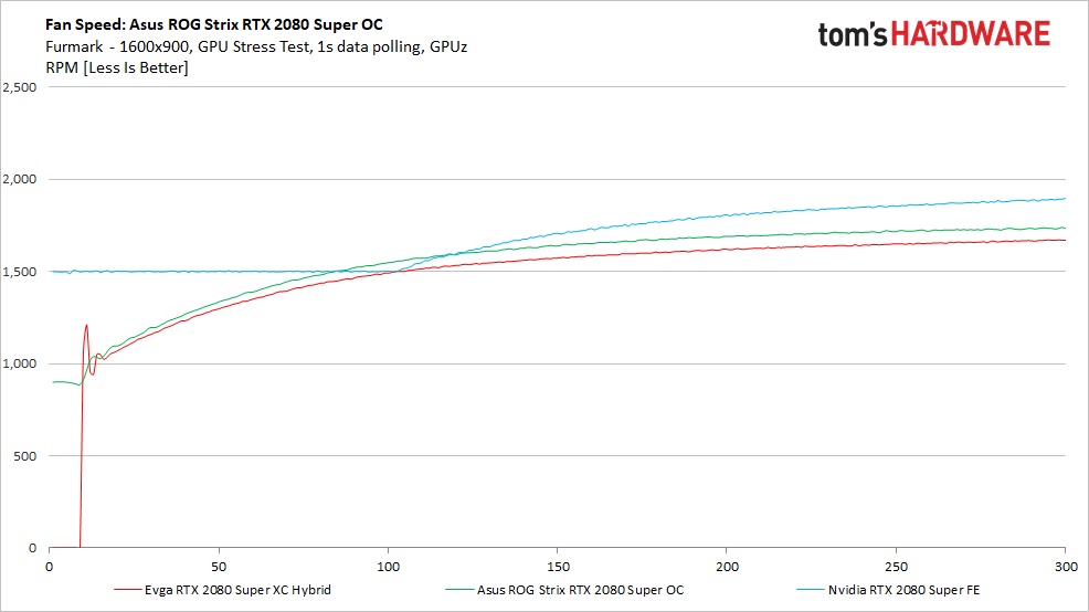
Like temperatures, not much changed with fan speeds. Fan speeds ramped up smoothly on the three cards, trying to manage thermals. Fan speed on the Asus card topped out at around 1,750 RPM, the EVGA card comes in just under 1,700 RPM, and the FE remains at the top (worst) spot with a slightly higher 1,850 RPM this time.
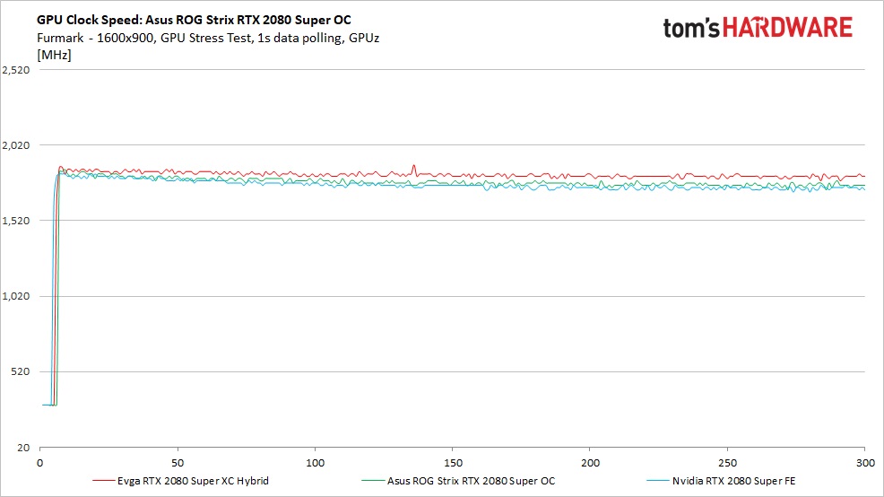
Clock speeds during Furmark dropped tremendously on these Nvidia video cards, as is normally the case. Here the the Asus ROG Strix averaged 1,776 MHz, which is quite a bit lower than the EVGA hybrid's 1,819 MHz but still above the Founders Edition's 1,677 MHz. A FurMark workload isn't typical of gaming use, however, so users can expect clock speeds during gaming to be closer to the Metro results.
MORE: Best Graphics Cards
MORE: Desktop GPU Performance Hierarchy Table
MORE: All Graphics Content
Current page: Asus ROG Strix RTX 2080 Super OC: Power Consumption, Fan Speed, Clock Rate and Temperature
Prev Page Asus ROG Strix RTX 2080 Super OC: 4K Gaming Performance Next Page Asus ROG Strix RTX 2080 Super OC: GPU Tweak II Software
Joe Shields is a staff writer at Tom’s Hardware. He reviews motherboards and PC components.
-
JarredWaltonGPU You'll notice we're moving to a new charting system, which will allow us to show more GPUs in the charts without a ton of effort. I'm quite pleased with my macro and VBA hacking in Excel that makes all of this possible. Comments or suggestions are welcome (constructive or otherwise). Distilling down tons of frametime logs into a digestible format is the end goal, and past experience suggests almost no one cared about some of the additional charts we used to provide.Reply -
vinay2070 This is not related to the graphs, but to the main landing page in general. I feel that TH website feels more 'texty' Large fonts of text with very little gaps between headlines and not enough images makes it not so pleasant to look at or read. For example I like how wccftech's site design is(though that is too much of images and less of text). A balance would be great. My preference would be between anandtech and wccftech (leaning almost towards anandtech). But then looks are totally subjective. Just sharing my thoughts.Reply -
JarredWaltonGPU Reply
Nearly everything related to presentation on the website is out of our hands -- it's controlled by Future, which has a standardized CMS for most of their sites. AnandTech is one of the exceptions -- transition to our Vanilla CMS has been indefinitely delayed. Anyway, are you saying we have too much text on our front page? The usual complaint is too many ads, which is also out of our hands.vinay2070 said:This is not related to the graphs, but to the main landing page in general. I feel that TH website feels more 'texty' Large fonts of text with very little gaps between headlines and not enough images makes it not so pleasant to look at or read. For example I like how wccftech's site design is(though that is too much of images and less of text). A balance would be great. My preference would be between anandtech and wccftech (leaning almost towards anandtech). But then looks are totally subjective. Just sharing my thoughts.
For articles, we try to mix in a few images and tables with the text every 3-5 paragraphs, but we do tend to get technical and sometimes just a bit long-winded. It's sort of the reputation Tom's has built of the years: go deep. Cheers! -
street0123 Reply
rJarredWaltonGPU said:Nearly everything related to presentation on the website is out of our hands -- it's controlled by Future, which has a standardized CMS for most of their sites. AnandTech is one of the exceptions -- transition to our Vanilla CMS has been indefinitely delayed. Anyway, are you saying we have too much text on our front page? The usual complaint is too many ads, which is also out of our hands.
For articles, we try to mix in a few images and tables with the text every 3-5 paragraphs, but we do tend to get technical and sometimes just a bit long-winded. It's sort of the reputation Tom's has built of the years: go deep. Cheers!
The website is completely unreadable with that Playerunknown Battlegrounds background. Until that comes off I will stay away from your site and refer everyone to other tech review and testing websites. -
Phaaze88 *sighReply
The Asus Tax strikes again...
Out of everything Asus I've tried/seen myself, the only thing I'm impressed with is the bios menu on their motherboards.
So popular and overrated. -
vinay2070 Reply
Not sure about the ads, most websites show so much ads, that its literally impossible to surf a website without an adblocker, especially toms. No offence, I am a tomshardware reader since the dial up era, but the site was a lot nicer back then.JarredWaltonGPU said:Nearly everything related to presentation on the website is out of our hands -- it's controlled by Future, which has a standardized CMS for most of their sites. AnandTech is one of the exceptions -- transition to our Vanilla CMS has been indefinitely delayed. Anyway, are you saying we have too much text on our front page? The usual complaint is too many ads, which is also out of our hands.
For articles, we try to mix in a few images and tables with the text every 3-5 paragraphs, but we do tend to get technical and sometimes just a bit long-winded. It's sort of the reputation Tom's has built of the years: go deep. Cheers!
Regarding the text part, the top part of the landing page looks a bit cluttered. Especially the headings on the right layout. The fonts dont have to be so big. Anybody who cant read smaller than that font will zoom in. But for 99% that is not a problem. Presentation becomes important. The same headings on anandtech are in a big grey box. Looks neat. Even the seperators (the 2 horizontal red lines) between section looks a bit kiddish, Its 2020, you can do much better than that. Then again, opinions are subjective. -
Phaaze88 Reply
I know that the ads are for the benefits of said sites and I don't mind supporting them by turning my blocker off, but some of them are so disruptive to the end user experience, to the point of PRESSURING the user into using adblockers.vinay2070 said:Not sure about the ads, most websites show so much ads, that its literally impossible to surf a website without an adblocker, especially toms. No offence, I am a tomshardware reader since the dial up era, but the site was a lot nicer back then.
Regarding the text part, the top part of the landing page looks a bit cluttered. Especially the headings on the right layout. The fonts dont have to be so big. Anybody who cant read smaller than that font will zoom in. But for 99% that is not a problem. Presentation becomes important. The same headings on anandtech are in a big grey box. Looks neat. Even the seperators (the 2 horizontal red lines) between section looks a bit kiddish, Its 2020, you can do much better than that. Then again, opinions are subjective.
Especially on Youtube, when I'm watching entertainment-type content. Something just happens to get a good laugh out of me, and then - BAM! A Manscaped ad.
That's so bloody annoying. I miss the days when the ads were just at the beginning and end of the content... -
watzupken What I don't understand about this page is when I am browsing on my laptop, whatever video that is playing will follow me wherever I scroll. There is a reason why people scroll away from the video in the first place, and even though it kind of minimized to a small box, it is still very annoying when there isn't a lot of screen estate on a laptop.Reply
Anyway back to this review, I am not sure why bother to review a RTX 2080 Super now since its been released for a long time. Typically we should expect good cooling with the ROB Strix version, though the price will turn most people away. There are other alternatives that are just as good if not better, instead of paying the Asus tax.
