Why you can trust Tom's Hardware
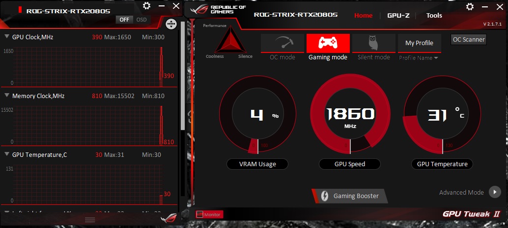
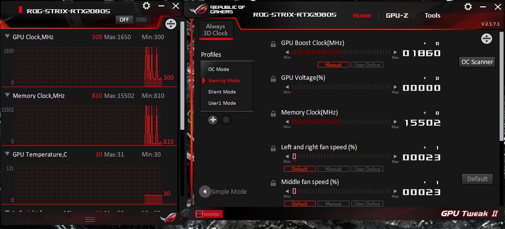
Asus, like other card partners, includes its own software for monitoring and tweaking video cards, called GPU Tweak II. This application controls the video card fan and clock speeds and includes monitoring capabilities. Users are able to use the integrated “OC Scanner” to automatically search for a stable overclock, or they can manually overclock. Fan speed curves, steps, and static speeds can be defined.


GPU Tweak includes a unique feature called Gaming Booster. This button, according to Asus, optimizes the system with one click, which entails adjusting windows visual effects, closing unnecessary system services, and optimizing system memory use without closing programs. On our test system, we didn’t see tangible improvements in our quick test, but we also have a high-end 8-core/16-thread CPU and 32GB of RAM — we’d expect to see more improvements on lower spec machines.
Overall, Asus GPU Tweak II works well for its intended purposes offering users a complete application for monitoring and controlling Asus (and other card partners) video cards.
MORE: Best Graphics Cards
MORE: Desktop GPU Performance Hierarchy Table
MORE: All Graphics Content
Get Tom's Hardware's best news and in-depth reviews, straight to your inbox.
Current page: Asus ROG Strix RTX 2080 Super OC: GPU Tweak II Software
Prev Page Asus ROG Strix RTX 2080 Super OC: Power Consumption, Fan Speed, Clock Rate and Temperature Next Page Asus ROG Strix RTX 2080 Super OC: Conclusion
Joe Shields is a staff writer at Tom’s Hardware. He reviews motherboards and PC components.
-
JarredWaltonGPU You'll notice we're moving to a new charting system, which will allow us to show more GPUs in the charts without a ton of effort. I'm quite pleased with my macro and VBA hacking in Excel that makes all of this possible. Comments or suggestions are welcome (constructive or otherwise). Distilling down tons of frametime logs into a digestible format is the end goal, and past experience suggests almost no one cared about some of the additional charts we used to provide.Reply -
vinay2070 This is not related to the graphs, but to the main landing page in general. I feel that TH website feels more 'texty' Large fonts of text with very little gaps between headlines and not enough images makes it not so pleasant to look at or read. For example I like how wccftech's site design is(though that is too much of images and less of text). A balance would be great. My preference would be between anandtech and wccftech (leaning almost towards anandtech). But then looks are totally subjective. Just sharing my thoughts.Reply -
JarredWaltonGPU Reply
Nearly everything related to presentation on the website is out of our hands -- it's controlled by Future, which has a standardized CMS for most of their sites. AnandTech is one of the exceptions -- transition to our Vanilla CMS has been indefinitely delayed. Anyway, are you saying we have too much text on our front page? The usual complaint is too many ads, which is also out of our hands.vinay2070 said:This is not related to the graphs, but to the main landing page in general. I feel that TH website feels more 'texty' Large fonts of text with very little gaps between headlines and not enough images makes it not so pleasant to look at or read. For example I like how wccftech's site design is(though that is too much of images and less of text). A balance would be great. My preference would be between anandtech and wccftech (leaning almost towards anandtech). But then looks are totally subjective. Just sharing my thoughts.
For articles, we try to mix in a few images and tables with the text every 3-5 paragraphs, but we do tend to get technical and sometimes just a bit long-winded. It's sort of the reputation Tom's has built of the years: go deep. Cheers! -
street0123 Reply
rJarredWaltonGPU said:Nearly everything related to presentation on the website is out of our hands -- it's controlled by Future, which has a standardized CMS for most of their sites. AnandTech is one of the exceptions -- transition to our Vanilla CMS has been indefinitely delayed. Anyway, are you saying we have too much text on our front page? The usual complaint is too many ads, which is also out of our hands.
For articles, we try to mix in a few images and tables with the text every 3-5 paragraphs, but we do tend to get technical and sometimes just a bit long-winded. It's sort of the reputation Tom's has built of the years: go deep. Cheers!
The website is completely unreadable with that Playerunknown Battlegrounds background. Until that comes off I will stay away from your site and refer everyone to other tech review and testing websites. -
Phaaze88 *sighReply
The Asus Tax strikes again...
Out of everything Asus I've tried/seen myself, the only thing I'm impressed with is the bios menu on their motherboards.
So popular and overrated. -
vinay2070 Reply
Not sure about the ads, most websites show so much ads, that its literally impossible to surf a website without an adblocker, especially toms. No offence, I am a tomshardware reader since the dial up era, but the site was a lot nicer back then.JarredWaltonGPU said:Nearly everything related to presentation on the website is out of our hands -- it's controlled by Future, which has a standardized CMS for most of their sites. AnandTech is one of the exceptions -- transition to our Vanilla CMS has been indefinitely delayed. Anyway, are you saying we have too much text on our front page? The usual complaint is too many ads, which is also out of our hands.
For articles, we try to mix in a few images and tables with the text every 3-5 paragraphs, but we do tend to get technical and sometimes just a bit long-winded. It's sort of the reputation Tom's has built of the years: go deep. Cheers!
Regarding the text part, the top part of the landing page looks a bit cluttered. Especially the headings on the right layout. The fonts dont have to be so big. Anybody who cant read smaller than that font will zoom in. But for 99% that is not a problem. Presentation becomes important. The same headings on anandtech are in a big grey box. Looks neat. Even the seperators (the 2 horizontal red lines) between section looks a bit kiddish, Its 2020, you can do much better than that. Then again, opinions are subjective. -
Phaaze88 Reply
I know that the ads are for the benefits of said sites and I don't mind supporting them by turning my blocker off, but some of them are so disruptive to the end user experience, to the point of PRESSURING the user into using adblockers.vinay2070 said:Not sure about the ads, most websites show so much ads, that its literally impossible to surf a website without an adblocker, especially toms. No offence, I am a tomshardware reader since the dial up era, but the site was a lot nicer back then.
Regarding the text part, the top part of the landing page looks a bit cluttered. Especially the headings on the right layout. The fonts dont have to be so big. Anybody who cant read smaller than that font will zoom in. But for 99% that is not a problem. Presentation becomes important. The same headings on anandtech are in a big grey box. Looks neat. Even the seperators (the 2 horizontal red lines) between section looks a bit kiddish, Its 2020, you can do much better than that. Then again, opinions are subjective.
Especially on Youtube, when I'm watching entertainment-type content. Something just happens to get a good laugh out of me, and then - BAM! A Manscaped ad.
That's so bloody annoying. I miss the days when the ads were just at the beginning and end of the content... -
watzupken What I don't understand about this page is when I am browsing on my laptop, whatever video that is playing will follow me wherever I scroll. There is a reason why people scroll away from the video in the first place, and even though it kind of minimized to a small box, it is still very annoying when there isn't a lot of screen estate on a laptop.Reply
Anyway back to this review, I am not sure why bother to review a RTX 2080 Super now since its been released for a long time. Typically we should expect good cooling with the ROB Strix version, though the price will turn most people away. There are other alternatives that are just as good if not better, instead of paying the Asus tax.