Ubuntu 11.10 Review: Benchmarked Against Windows 7
Three months have passed since the latest version of Ubuntu launched. With its classic desktop gone, Oneiric Ocelot is all Unity. The training wheels are off; no turning back now. Is Ubuntu ready for touchscreens? And how does it compare to Windows 7?
Oneiric: The Nightmarish
Unity Panel: Global Menu
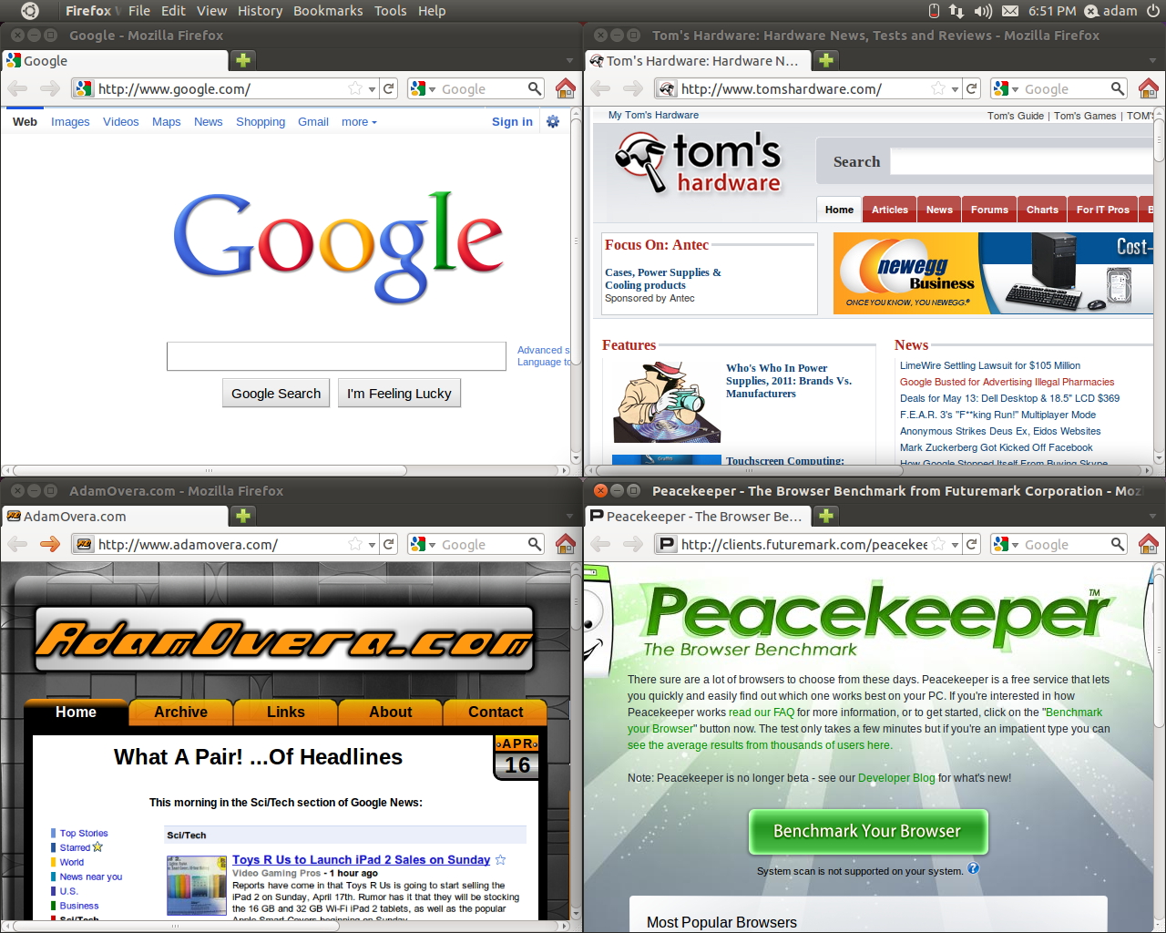
When Unity debuted in April's Ubuntu 11.04, it came with a controversial Mac OS X-style global menu to replace the traditional menu bar. While the global menu's behavior changes slightly, it is not for the better. In Ubuntu 11.04 (Natty Narwhal), Reviewed In Depth, we used the screenshot below to demonstrate how a global menu can cause confusion when using multiple instances of the same application.
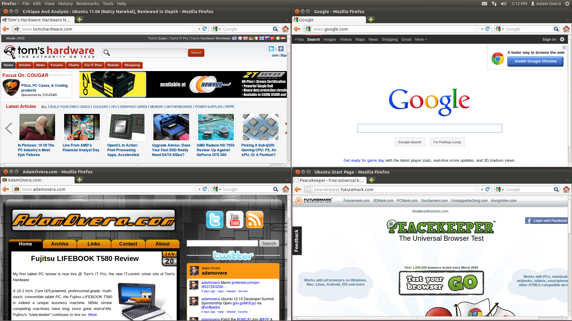
Notice that the window controls for the currently-focused window are highlighted while the others go dark. Although we felt this wasn't a good enough solution, it was something. Unfortunately, in Ubuntu 11.10 all window controls are highlighted. The screenshot below depicts the same situation as the one above, but in Oneiric:
Article continues belowNow there is no way to tell which window is active, and which global menu is being manipulated. In order to use the correct menus, you first have to click on the window you wish manipulate just to be sure you're on the right one.
Unity Dash
While the appearance and navigation of Dash are improved since Ubuntu 11.04, there is still no meaningful way of customizing it. What we want to see in future versions on Unity is a customizable home screen of user-defined shortcuts and applications, or simply a Favorites Lens. A way to add custom launchers, which was present in GNOME 2, is also remarkably missing from Unity.
uTouch
Get Tom's Hardware's best news and in-depth reviews, straight to your inbox.
Two uTouch gestures fail to work in the real world: two-finger scroll in Dash and two-finger tap in the Launcher. The sizing of menus in the Panel and the window controls are insufficient for touchscreen-only control.
Even though we exposed the global menu's reliance on hover as Unity's Achilles heel on slates in our last review, it still exists, hover-reliance and all. In a purely touch environment, there would be no cursor to position over on-screen elements, therefore, no hover.
Details
While there are many positives in the attention to detail in Oneiric, there are just as many negatives for the lack of it.
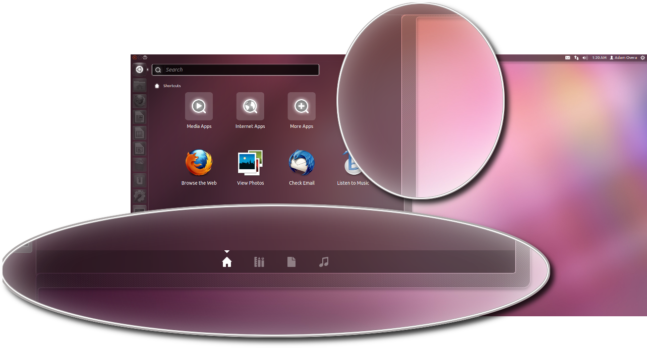
While the obfuscation transparency of the new Dash is certainly pretty, look closer at Dash's outline.
What's going on with all these lines? Don't they seem overly intricate, and just unnecessary? Now look at the Dash window controls:
Speaking of choppy on-screen elements, take a look at some of the application icons in Dash and the new Ubuntu Software Center:
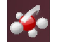
The larger icon size in Dash and the Ubuntu Software Center emphasize some of the downright ghastly third-party app icons.
Alright, so that's Ubuntu 11.10. Now let's see how it performs versus Windows 7.
Current page: Oneiric: The Nightmarish
Prev Page Oneiric: The Dreamy Next Page Test System Setup And Methodology-
Gamer Dude comptonThe best part of 11.10 is the renewed appreciation it gave me for Windows 7.LOL that bad uh well at leased there is an alternative if the Sopa takes awake my ripped Window 8 copy LOL.Reply -
jasonpwns That's the problem, I've always considered Windows king for gaming, but after looking at Doom 3, and the performance boost over Windows 7. Are we sure we're developing for the right platform? I mean games on Linux theoretically would run a lot better.Reply -
indian-art Happy with the benchmarks. I feel Ubuntu 12.04 will be even better.Reply
Just around a couple of months for its launch! -
malimbar One major irrelevancy in beginning of the article: while Mint overtook Ubuntu in Distrowatch, it's nowhere near the actual userbase: http://www.omgubuntu.co.uk/2012/02/stats-show-ubuntu-not-losing-ground-to-linux-mint/Reply
Interesting article otherwise, and very well done. I particularly like how it highlights major areas that ubuntu developers need to work on, but still gives ubuntu as a OS credit where it deserves it. It's more worthwhile IMO to review LTS releases (and one is coming up soon), but in the meantime it's great to see where Ubuntu is right now. -
rmpumper jasonpwnsThat's the problem, I've always considered Windows king for gaming, but after looking at Doom 3, and the performance boost over Windows 7. Are we sure we're developing for the right platform? I mean games on Linux theoretically would run a lot better.Reply
If you did not notice, all of the 3 tested games are OpenGL which is barely supported in Win7. How about we see some DirectX9 10 and 11 games before making silly conclusions? And in any case, who gives a rat's ass about Doom3 - 7 year old awful game? -
Gamer Dude jasonpwnsThat's the problem, I've always considered Windows king for gaming, but after looking at Doom 3, and the performance boost over Windows 7. Are we sure we're developing for the right platform? I mean games on Linux theoretically would run a lot better.To bad Microsoft has a Monopoly on DX architecture.Reply
