


Ergonomics
The design may be a bit nondescript, but the ergonomics isn't. The control buttons are grouped together on the façade. The OSD is very practical. There is a tilt adjustment, but no height adjustment.
Equipment And Connectivity

The monitor is also fairly well equipped, with a dual DVI/VGA output; but as is often the case the speakers used are of poor quality. We would have preferred to see a USB hub instead.
One Inch Added
The panel's color rendering was very good, but the default settings didn't produce accurate colors. You'll need to spend a little time tweaking them. We got a very good calibration curve with our own adjustments (Red=66, Green=39, Blue=40).
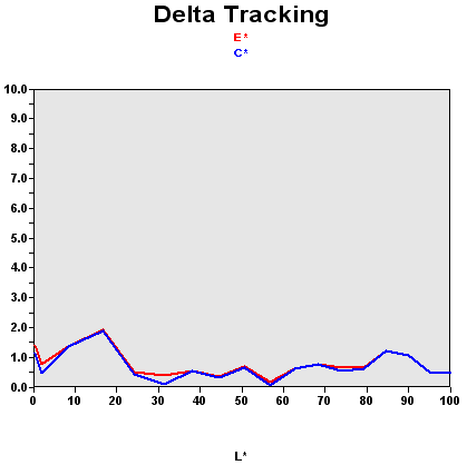
We should recall that this graph shows the difference between the requested color shade and the one displayed.
- If DeltaE >3, the color displayed is significantly different from the theoretical one, meaning that the difference will be perceptible to the viewer.
- If DeltaE <2, LaCie considers the calibration a success, with a slight difference remaining, but one that will be all but undetectable to the user.
- If DeltaE < 1, color fidelity is excellent.
Those manual values are very close to the default values, which suggests that Samsung might very well have sent the monitor from the factory that way. But you have to realize that monitor makers have a certain range of tolerance with default color adjustments, and this unit may be a little close to the limit as regards default color temperature. Still, if you're in doubt, it's better to adjust your display manually. When a monitor costs $530, surely you can afford to spend a little time to get the best possible color rendering out of it.
| Black spot | White spot | Contrast |
|---|---|---|
| 0.32 | 300 | 938: 1 |
The black level is excellent. And since the brightness is intense, the result is a very remarkable contrast. Samsung specifies 1000:1, and we measured 938:1. Kudos is in order. This monitor gets the benefit of the huge effort Samsung has made to improve the contrast of these displays. The 970P had already put the progress made into practice with a panel that was also close to 1000:1. However, at the risk of seeming like a nitpicker, I will point out that the panel's brightness is excessive at the calibration point. That makes it ideal for video, but for office applications, you'll have to adjust the brightness down, and in so doing you will lose a little color fidelity.
The monitor showed good contrast stability.
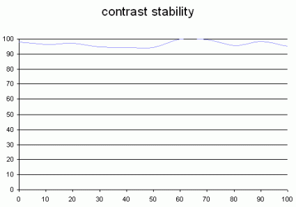
This curve indicates the contrast value measured at a given brightness adjustment on the OSD. In theory, brightness and contrast are two independent parameters, and good contrast is a requirement regardless of the brightness adjustment. Unfortunately such is not the case in practice. The brightness adjustment is shown on the X-axis, contrast on the Y-axis. Contrast is expressed here as a percentage of the maximum value measured using the ANSI test protocol.
Tested with the Gretag Eye-One Display 2, the 215TW had no big surprises in store. The performance we measured is in line with what we expected. However we did notice slight compression in the red channel as the light intensity increased.
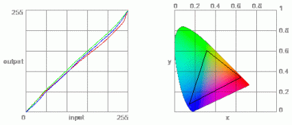
The color gamut represents the richness of the colors displayed. The corners of the triangle are the primary colors (in additive synthesis, of course). The surface of the triangle represents all colors that are displayable by combining the three primary colors with more or less intensity for each. So the greater the area of the triangle, the richer the colors.