Color, Contrast, Brightness, Gamut, Spatial Uniformity
For an entry-level unit, I have to say that this Samsung has astonishingly good color rendering. Without finicky adjustment, I was able to get excellent colorimetry.
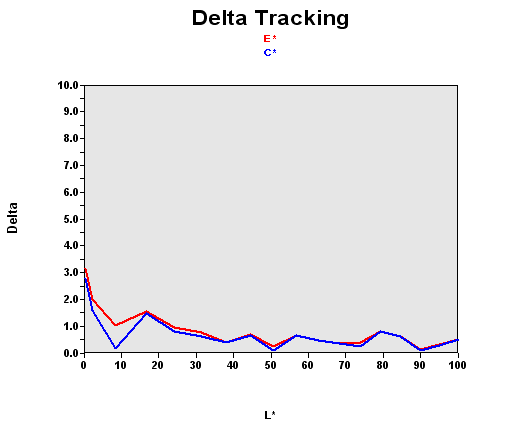
Let me remind you that this graph shows the difference between the desired color shade and the one actually displayed.
- If DeltaE >3, then the color displayed is significantly different from the one called for, meaning that the user will be able to perceive the difference.
- If DeltaE <2, LaCie considers the calibration a success, with a slight difference remaining, but one that will be all but undetectable to the user.
- If DeltaE < 1, color fidelity is excellent.
86% of the colors were perfect, 98% were good. Few monitors on the market today are capable of performance this good. The darkest colors were the most difficult to render correctly. Using a calibrator, I was able to improve the situation in shaded areas.
Contrast And Brightness
| Black spot | White spot | Contrast |
|---|---|---|
| 0.47 | 191.5 | 407: 1 |
This unit's contrast, however, doesn't hold up that well to comparison. 407:1 is a little short of current market standards. But the brightness is relatively well calibrated. That means that the unit will be comfortable for office use.
Gamut
Tested with the Gretag Eye-One Display 2 the monitor wasn't disappointing, but didn't really go beyond the bare minimum. Obviously, that isn't surprising at this price. Note also that the calibrator confirmed our visual impression that the display tended a little towards the greens.
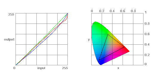
The color gamut represents the richness of the colors displayed. The corners of the triangle are the primary colors (in additive synthesis, of course). The surface of the triangle represents all colors that are displayable by combining the three primary colors with more or less intensity for each. So, the greater the area of the triangle, the richer the colors.